
Wall Art Guide, Wall Art Tutoriels
Sunset Wall Art: Dusk Evening Sky Horizon Photography
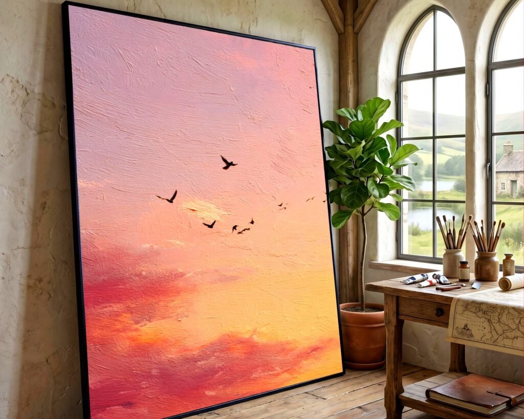
Sep
So I’ve been obsessing over sunset photography prints lately and honestly it started because a client asked me to find something for their west-facing living room and I went down this whole rabbit hole. Let me tell you what I’ve learned because choosing the right sunset wall art is weirdly more complicated than it should be.
The Whole Color Temperature Thing Nobody Tells You
Okay so first thing – and this is gonna sound weird but trust me – you need to look at your sunset photos at different times of day before you commit. I made this mistake with a gorgeous coral and purple dusk piece that looked AMAZING in the gallery at 2pm but in my client’s space with evening lighting it just looked…muddy? The warm tones in their room fought with the cool purples and it was a whole thing.
What actually works: If your room gets warm light (like those yellow-toned bulbs or actual sunset light coming through windows), go for sunset art that leans more orange, peach, and gold. The cool-toned sunsets with lots of purple and blue work better in rooms with cooler lighting or north-facing spaces.
I spent like three hours one Tuesday comparing prints and the ones with that golden hour glow right before the sun dips? Those are the most versatile. They play nice with basically any lighting situation.
Size Matters But Not How You Think
Everyone gets this wrong including me initially. You see a beautiful 16×20 sunset print online and think perfect but then it arrives and it’s just…there. Not making an impact.
Here’s what I tell people now: Sunset photography needs to be big enough that you feel like you’re looking through a window. That sense of horizon and expanse is literally the whole point. For a standard living room wall, you’re looking at minimum 30×40 inches. I know that sounds huge but hear me out.
The horizon line in sunset photos creates this natural division in the composition – usually the sky takes up about two-thirds and the land or water is the bottom third. If the print is too small, you lose that sweeping feeling and it just becomes a pretty picture instead of an experience.
My Actual Size Guidelines
- Above a sofa or bed: 40×60 inches or a triptych that spans 60+ inches total
- Dining room: 30×40 minimum, larger if the wall allows
- Office or smaller spaces: 24×36 works but go vertical if possible
- Gallery wall inclusion: 16×20 is fine here because it’s part of a bigger story
Canvas vs Metal vs Acrylic (I Have Opinions)
So this is where I’m gonna be really specific because I’ve tested all of these and they each do different things to the sunset colors.
Canvas gives you that traditional art feeling and it softens the colors slightly. The texture adds depth but – and this is important – it can make really vibrant sunsets look less dramatic. I use canvas when the photograph already has a lot of contrast and I want to make it feel more approachable. Also canvas is lighter which matters if you’re hanging something massive.
Metal prints though? Game changer for sunset photography. The colors are SO vivid it’s almost aggressive. I did a metal print of a Santorini sunset for someone and the oranges and pinks literally glow. The reflective quality makes it feel like the light is coming from inside the print. But here’s the catch – they show every fingerprint and they’re heavy. Like need proper wall anchors heavy.
Acrylic is my middle ground. You get that depth and color pop similar to metal but with a glossier, more refined look. The sunset seems to float inside the acrylic layers which is pretty cool. More expensive though, gotta be honest.
Oh and another thing – framed prints behind glass can create glare issues if you’re hanging them where light hits directly. I learned this the hard way with a client’s entryway where the afternoon sun just turned their gorgeous sunset photo into a mirror.
What to Actually Look for in the Photography Itself
Not all sunset photos are created equal and this is where you gotta be picky. I’ve seen so many overly edited sunset prints that look fake or too saturated. Your eye knows when something is off even if you can’t articulate why.
Cloud formations matter SO much. A sunset with interesting clouds – those wispy cirrus ones or dramatic storm clouds catching the light – those have way more visual interest than just a gradient sky. The clouds give your eye somewhere to travel in the composition.
Look for layers in the image. The best sunset photography has foreground, middle ground, and background. Maybe there’s a silhouette of trees or buildings, then the horizon line, then the sky. That depth keeps the piece interesting longterm.
Technical Stuff That Actually Matters
The photographer should be shooting in RAW format and you want high resolution files – minimum 300 DPI for printing. If you’re buying from somewhere like Etsy or directly from a photographer, ask about the file specs. A good sunset photo that’s properly exposed will have detail in both the bright sky and the darker foreground areas. If everything is blown out bright or the shadows are completely black with no detail, pass on it.
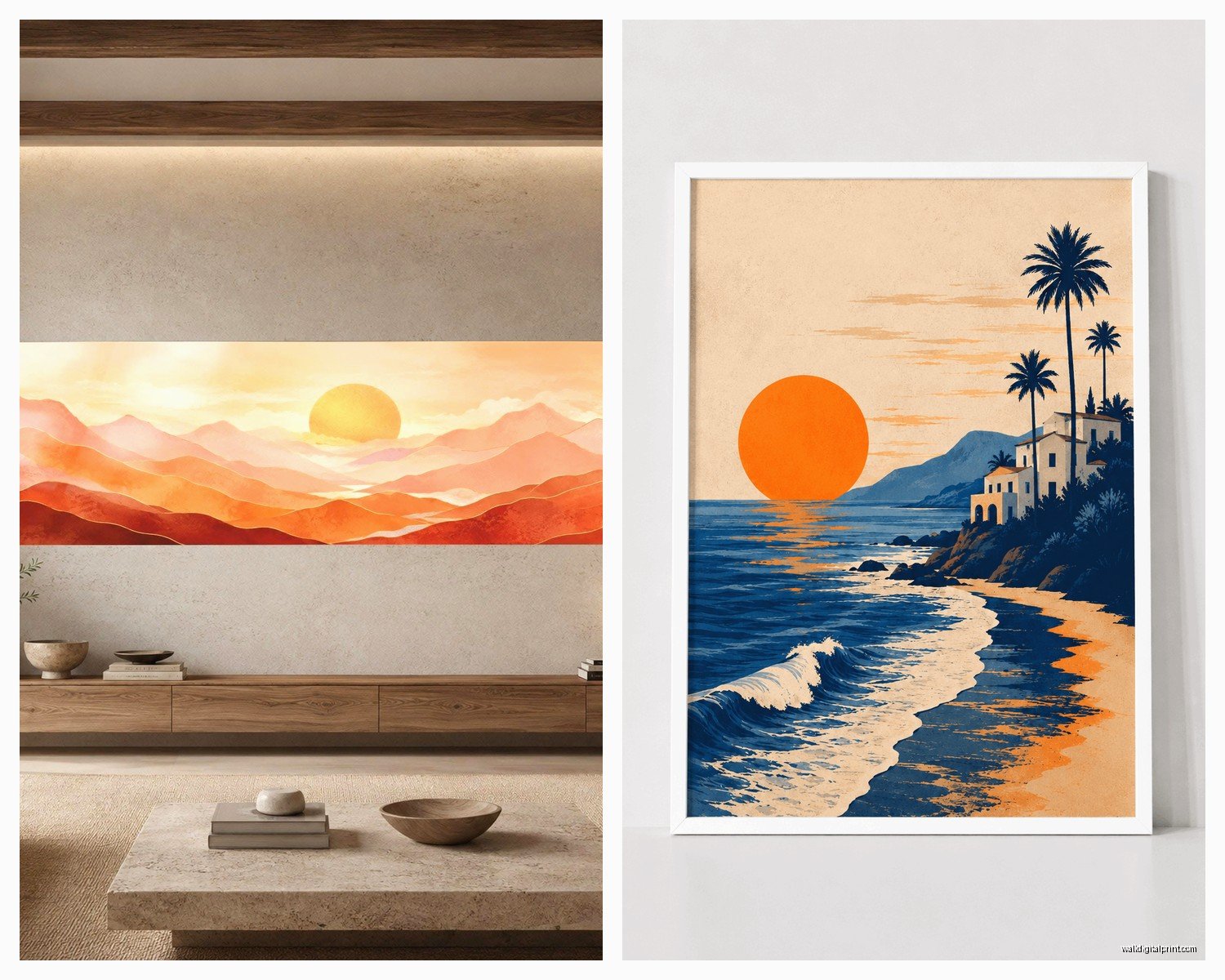
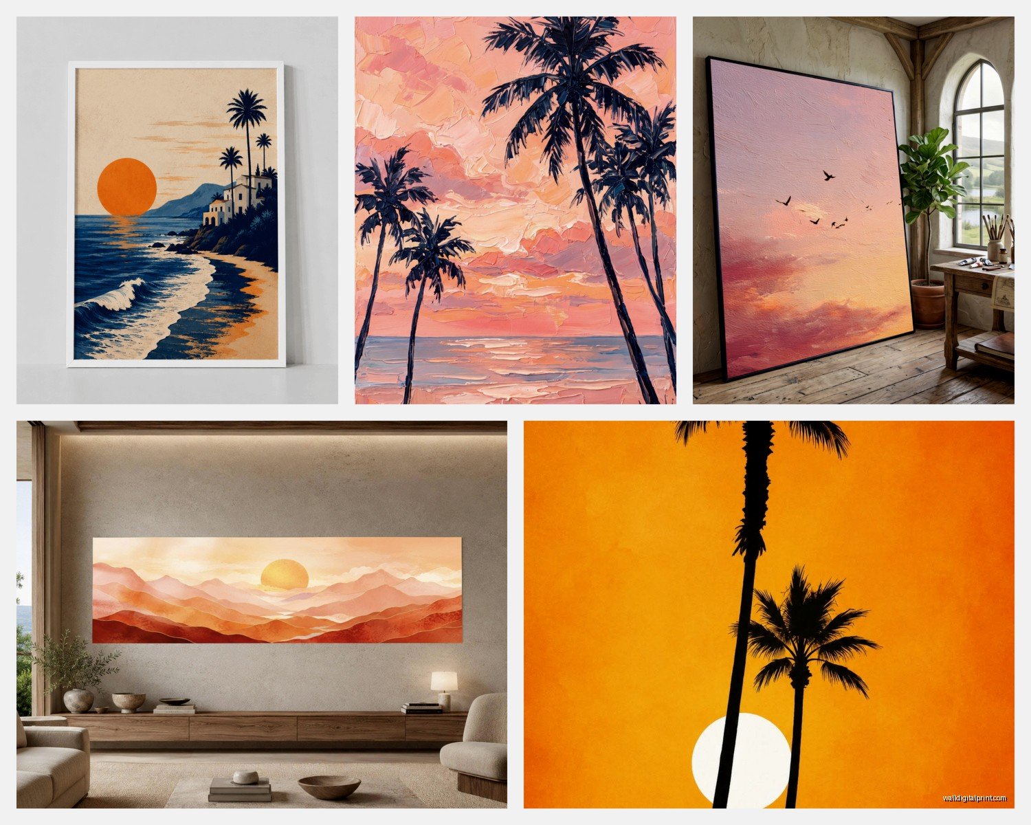
Where the Horizon Line Sits
This is something I notice now that I can’t unsee. The rule of thirds applies here – the horizon should be roughly one-third from either the top or bottom of the frame, not dead center. Center horizons feel static and boring.
If the horizon is in the lower third, you’re emphasizing the sky and that works great for dramatic cloud formations or really colorful sunsets. Upper third horizon means you’re showing more of the landscape or water, which can be beautiful if there’s something interesting happening down there – like tide pools or architectural elements catching the light.
Color Schemes and Room Matching
Okay so funny story, I was watching this design show while eating leftover pizza and they completely botched a sunset art installation by not considering the room colors and it drove me nuts.
If your room has cool grays, blues, navy: Look for sunset photography with more purple, lavender, and deeper blue tones. Those transition-to-night dusk scenes work perfectly.
Warm beiges, tans, creams: Go for golden hour sunsets with peachy orange and warm pink tones. The colors will harmonize instead of compete.
Bold colored rooms (like if you have a jewel-tone accent wall): Choose sunset art with one color that pulls from your room. If you have an emerald wall, find a sunset with some teal in the water or sky gradient.
All-white or minimal spaces: You can go dramatic here with really saturated sunset colors OR keep it subtle with a black and white or desaturated dusk scene. Both work because the room isn’t fighting for attention.
The Framing Debate
I go back and forth on this honestly. Frameless canvas wraps give you that modern gallery look and they’re having a moment. The image wraps around the edges so there’s no harsh border interrupting the horizon.
But frames can actually enhance sunset photography if done right. A thin black or dark wood frame creates a clean boundary that makes the colors pop more. It’s like the frame is a window looking out at the sunset. White or light frames can work but they sometimes compete with the lighter parts of the sky – depends on the specific image.
Float mounting (where the print appears to float inside the frame with a gap around it) looks really high-end with sunset photography. The shadow creates depth and it feels more expensive than it usually is.
Placement Strategy
Where you hang sunset art actually changes how effective it is. I’ve moved pieces around and had totally different reactions to the same print.
Best spots:
- Opposite windows – creates a visual balance and you’re not competing with actual outdoor light
- Above seating areas where people will spend time looking at it
- End of hallways – the horizon line draws your eye down the space
- Bedrooms on the wall opposite the bed – last thing you see before sleep
Avoid hanging sunset art where direct sunlight hits it for extended periods. UV damage is real and those vibrant colors will fade over time. I had someone ignore this advice and their gorgeous print faded to basically beige and pale blue within two years.
Mixing Multiple Sunset Pieces
If you’re doing more than one sunset photograph, they need to be from the same location or have a similar color palette. Random different sunsets from different places just looks like you couldn’t decide. But a series showing the progression from golden hour through dusk to twilight? That tells a story and looks intentional.
I did a three-piece installation once with sunsets from the same beach in Thailand, shot over three consecutive evenings. The colors shifted from warm to cool across the pieces and it created this beautiful flow along the wall.
Budget Reality Check
You can find decent sunset prints starting around $50-100 for smaller sizes but they’re usually mass-produced. Fine art photography prints from actual photographers start more like $200-500 depending on size and whether it’s a limited edition.
Metal and acrylic prints add $100-300 to whatever the base price is. Custom framing can easily double your total cost.
My advice: Spend more on one large statement piece than spreading your budget across multiple smaller cheap prints. One really good sunset photograph at 40×60 will have more impact than three mediocre 16x20s.
Questions to Ask Before Buying
Is this a limited edition or open edition? Limited editions hold value better but cost more upfront.
What’s the return policy? You need to see it in your space with your lighting. Period.
Who holds the copyright? Some places let you buy the digital file, others don’t.
What’s included – just the print or does it come ready to hang?
What’s the expected delivery time? Custom prints can take 3-4 weeks.
The Orientation Question
Most sunset photography is horizontal because that’s how horizons work, but vertical sunset shots can be stunning if you’ve got tall narrow wall spaces. Look for images where the photographer shot vertical and captured interesting cloud formations going upward or a dramatic reflection in water that extends the composition vertically.
Wait I forgot to mention – if you’re buying online, make sure you can see the full uncropped image before ordering. Some sites automatically crop to fit standard sizes and you might lose important parts of the composition. I’ve had clients receive prints where the sun itself got cropped out because the site defaulted to a different aspect ratio.
Maintenance and Longevity
Canvas prints need to be kept away from humidity – bathrooms are a no. Dust them gently with a microfiber cloth, never use cleaning products.
Metal prints can be wiped down but be careful with the edges, they can be sharp. Don’t use abrasive cleaners.
Acrylic needs special acrylic cleaner or just water, never Windex or alcohol-based stuff.
All sunset photography prints will last longer with UV-protective glazing if they’re framed under glass. It costs extra but it’s worth it for expensive pieces.
The thing is, sunset wall art should make you pause for a second when you walk by it. If you’re just hanging something because the wall is empty, save your money. But if you find a dusk photograph that gives you that same feeling you get watching an actual sunset – like time slows down for a minute – that’s the one to buy.
