
Wall Art Guide, Wall Art Tutoriels
Harley Davidson Wall Art: Motorcycle Biker Rebel Brand
Sep
So I just spent like three hours yesterday helping a client figure out how to do Harley Davidson wall art in his garage without making it look like a teenager’s bedroom, and honestly? There’s a way to do this that actually looks sophisticated instead of just slapping up some random motorcycle posters.
The Thing About Harley Wall Art That Nobody Tells You
Okay so first off, the biggest mistake people make is going too literal. Like, you don’t need five different pieces all screaming HARLEY DAVIDSON in chrome letters. I learned this the hard way when I was staging a loft in Brooklyn and the owner had this massive collection of Harley stuff that just…competed with itself? Every piece was yelling for attention.
The trick is mixing vintage with modern, and balancing the rebel aesthetic with actual design principles. You can totally channel that biker culture vibe without your wall looking like the inside of a dive bar (unless that’s what you’re going for, then honestly go for it).
What Actually Works: The Different Types
Vintage Patent Prints and Technical Drawings
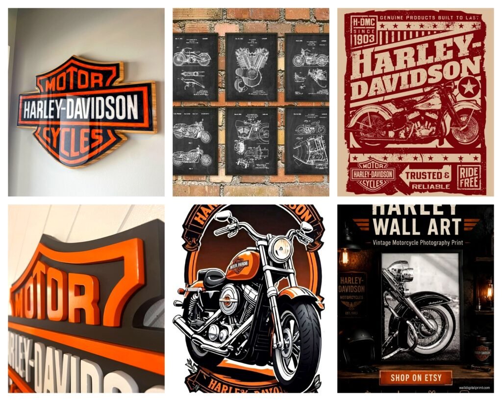
These are my absolute favorite and I put them in like half my projects now. The old patent drawings from Harley’s early motorcycles – we’re talking 1920s through 1950s – they have this incredible industrial elegance. You can find them as prints on Etsy or even just download high-res versions and get them printed at a local print shop.
I usually do a set of three in thin black frames. Put them in your office or garage and suddenly you’ve got this sophisticated nod to motorcycle history without the aggressive branding. My cat knocked one off the wall last week and I was genuinely upset about it, which tells you how much I actually like these.
The technical drawings show engine components, frame designs, transmission systems. They’re conversation starters because people actually stop and look at the detail.
Metal Signs and Tin Reproductions
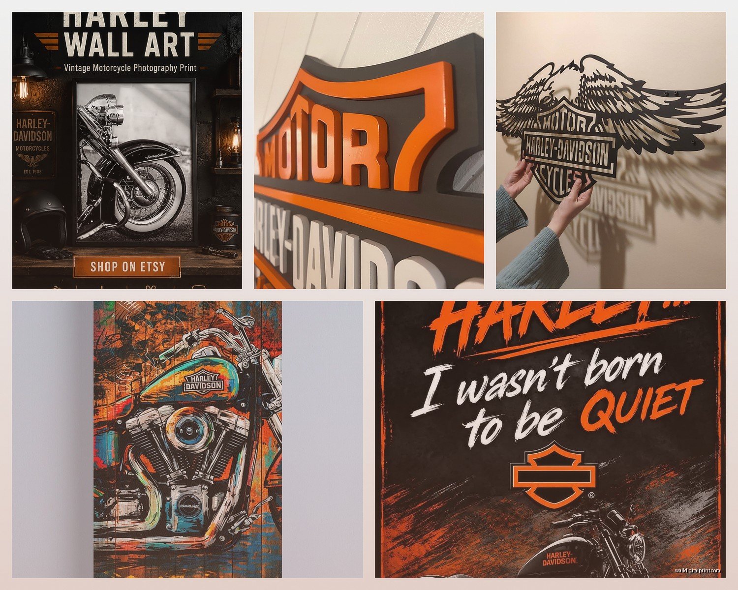
Okay so these can go either really right or really wrong. The vintage-style tin signs – the ones that look like old gas station or dealership signage – can be amazing if you treat them like actual art pieces instead of just…decoration.
What I do: get ONE really good quality metal sign, something with authentic vintage graphics from the 40s or 50s. Not the mass-produced stuff from Target (though I’ve definitely used those in a pinch). Mount it properly with the right hardware so it sits flat against the wall. Don’t just lean it on a shelf where it’s gonna fall every time someone walks by.
The distressed look works here. You want it to look like it came from an actual old garage or dealership. But here’s the thing – if everything in your space is distressed and vintage, it gets exhausting to look at. Balance it with clean modern elements.
Canvas Prints and Photography
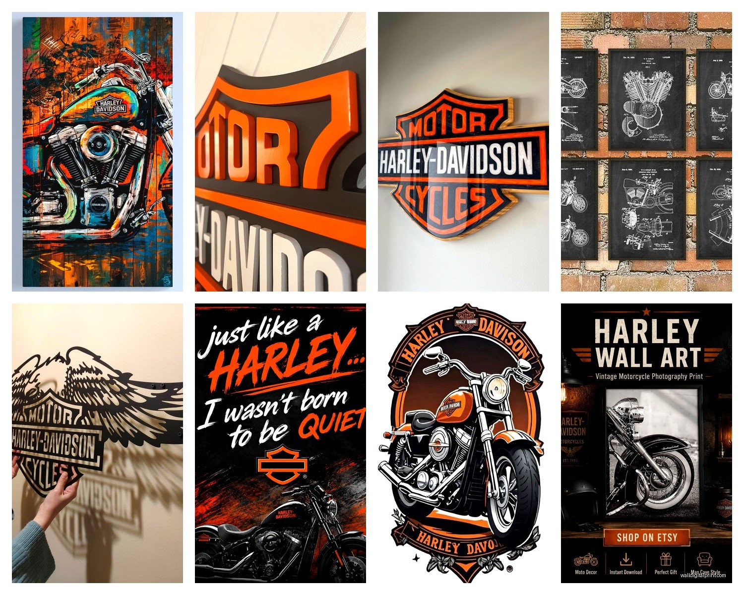
This is where people usually start, and it’s fine, but you gotta be selective. There are approximately ten million canvas prints of Harley motorcycles available online and about 95% of them look exactly the same – aggressive angle, chrome details highlighted, usually black and white with some orange accents.
If you’re going this route, look for actual photography with interesting composition. I found this one print that’s just a close-up of a vintage Harley tank with the original pinstriping, and the way the light hits it…it’s actually beautiful instead of just “motorcycle poster.”
Size matters here too. Don’t get a tiny 16×20 canvas and expect it to anchor a whole wall. Go big – at least 30×40 if it’s gonna be a focal point. Or do a triptych situation with three related images.
The Black and White Question
Everyone defaults to black and white for motorcycle art because it feels more “artistic” I guess? But sometimes color is actually better. If you’ve got a piece that shows the classic Harley orange or the vintage two-tone paint jobs, embrace it. Just make sure the colors in the art connect to something else in your room – a throw pillow, a rug, whatever.
Layout Ideas That Don’t Look Cluttered
This is gonna sound weird but I actually sketch out wall arrangements on my iPad before I hammer a single nail. Because once you’ve put 15 holes in drywall, you’re committed.
The Gallery Wall Approach
Mix different types of Harley art – a metal sign, a patent print, maybe a small framed photograph, a vintage ad reproduction. But use matching frames to tie it together. All black frames or all natural wood. This gives you variety without chaos.
Keep the spacing consistent – I use about 2-3 inches between frames. Lay everything out on the floor first and take a picture from above. That’s your template.
Oh and another thing – don’t go all the way to the ceiling unless you have really high ceilings. Leave some breathing room at the top. The center of your arrangement should be at eye level, roughly 57-60 inches from the floor.
The Statement Piece Method
Sometimes one big piece is better than a whole collection. I did this in a client’s man cave (I hate that term but that’s literally what he called it) where we found this massive vintage Harley dealership sign – like 4 feet wide. Mounted it on the main wall, flanked it with two simple wall sconces, and called it done.
The rest of the room could be more casual because that wall was handling all the visual weight. It’s less fussy than trying to arrange multiple pieces.
Where to Actually Buy This Stuff
Okay so I’m always hunting for wall art and here’s what I’ve learned:
Etsy: Best for vintage prints, patent drawings, and reproductions of old ads. You can find digital downloads and print them yourself which saves money. Quality varies wildly though – check the seller reviews and look at their other listings to see if they’re legit.
eBay: Great for actual vintage signs and authentic dealership memorabilia, but you’re gambling on condition. I bought a rusted metal sign once that looked cool in photos but was literally falling apart when it arrived.
Official Harley Davidson stores: They have licensed art that’s decent quality but pretty expensive. The upside is it’s officially licensed so the graphics are accurate and high-quality. Downside is everyone else has the same stuff.
Local antique shops and flea markets: This is where I find the coolest pieces honestly. Old motorcycle magazines you can frame, vintage photographs, regional dealership stuff that’s actually rare. It takes more time but the hunt is part of the fun.
Society6 and Redbubble: Good for modern interpretations and artist takes on Harley imagery. Less authentic-vintage vibes, more contemporary art that happens to feature motorcycles.
The Framing Situation
Don’t skip proper framing. I see people print stuff at home and just tape it to the wall or use those command strip poster hangers and it looks…not great. Even a simple black frame from Michael’s makes a huge difference.
For patent prints and vintage ads, I usually do a white or cream mat with a thin black frame. It gives the piece some breathing room and looks intentional. For metal signs, mount them on a small wood backing if they’re flimsy – it adds depth and keeps them from looking cheap.
My client canceled yesterday so I spent an hour comparing frame prices and honestly just go to Michael’s or Hobby Lobby with their 50% off coupons. Custom framing is beautiful but expensive and for this kind of stuff, standard sizes work fine.
Floating Frames for Canvas
If you’re doing canvas prints, consider floating frames – where the canvas sits inside the frame with a small gap. It looks more finished than just a raw canvas edge. Not necessary, but it elevates the whole thing.
Making It Work in Different Spaces
Garage/Workshop: This is the obvious spot and you can honestly go harder here. Multiple pieces, bigger sizes, more aggressive imagery. Just keep it organized – use a grid layout or symmetrical arrangement so it doesn’t look chaotic.
Home Office: Patent prints and vintage photography work best. Keep it sophisticated. Maybe one metal sign if it’s understated.
Living Room: Possible but tricky. You gotta balance it with other design elements. I did this in a industrial-style loft where the Harley art fit the overall aesthetic. In a traditional living room? Probably skip it unless you’re fully committing to a specific style.
Man Cave/Basement Bar: Go wild honestly. This is the space for your full collection, neon signs, the works.
Bedroom: I’ve done this once, with subtle black and white photography above the bed. Very minimal. Most people should probably avoid this unless your whole bedroom aesthetic is industrial or deliberately masculine.
Color Coordination and Balance
Even rebel biker aesthetic needs some design principles. If you’re using pieces with the classic Harley orange, make sure that orange appears somewhere else in the room. Could be a vintage oil can on a shelf, could be throw pillows, whatever. It creates visual cohesion.
Black, chrome, leather – these are your neutral base colors. They work with almost anything. The orange is your accent. Don’t let the orange dominate unless you really love it because it’s a strong color that can overwhelm a space.
Wait I forgot to mention – if you’re hanging stuff in a garage, consider temperature and humidity. Canvas can warp, cheap prints fade. Metal signs are actually the most durable option for garage conditions.
DIY Options That Don’t Look DIY
You can make your own Harley wall art and have it look professional if you do it right. Get high-resolution images of vintage ads or patent drawings – lots are public domain now. Print them at a professional print shop on good quality paper. Frame them properly. Boom.
I’ve also done this thing where you take vintage motorcycle parts – like an old license plate, a piece of chrome trim, whatever – and mount them in shadow boxes. It’s three-dimensional wall art that’s actually unique because it’s real parts.
Common Mistakes to Avoid
Don’t buy everything at once. Start with one or two pieces and live with them. See what actually works in your space before you commit to a whole gallery wall.
Don’t ignore scale. A tiny print on a huge wall looks lost. A massive sign in a small room is overwhelming.
Don’t forget about lighting. Wall art needs proper lighting to look good. Add picture lights or adjust your existing lighting to highlight your pieces.
Don’t mix too many styles. Vintage is vintage. Modern is modern. You can mix them but be intentional about it.
The whole point is creating a space that reflects your interest in Harley Davidson and motorcycle culture without it looking like you just bought everything in the gift shop at Sturgis. It’s totally possible to do this with style and sophistication – you just gotta be selective and thoughtful about what you’re putting up and how you’re arranging it.
