Wall Art Guide, Wall Art Tutoriels
Wolf of Wall Street Wall Art: Movie Finance Motivational
Oct
So I’ve been getting asked about Wolf of Wall Street art constantly lately and honestly I wasn’t expecting this to become such a thing in my consultations but here we are. Last week I had THREE different clients ask me about incorporating it into their home offices and one guy’s man cave situation, so let me just dump everything I know about making this work without looking like you’re having a midlife crisis or running a sketchy crypto startup from your spare bedroom.
The Different Styles You’ll Actually Find
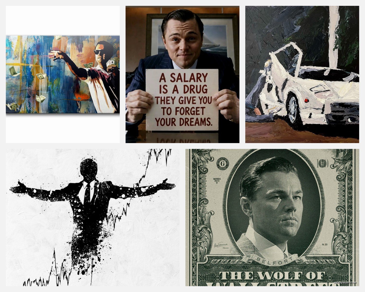
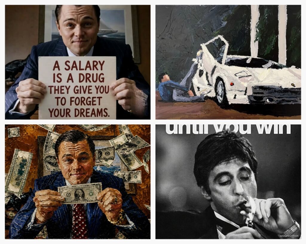
Okay so first thing – there’s like five main categories of this stuff and they’re NOT all created equal. You’ve got the movie poster reproductions which are pretty straightforward, the quote prints (usually Jordan Belfort screaming something about money), those minimalist line art versions of Leo, the actual film stills, and then what I call the “finance bro aesthetic” pieces that just use the vibe without direct movie imagery.
The quote prints are everywhere and honestly most of them are tacky as hell. “I’m not leaving” in giant letters might seem motivational at 11pm when you’re scrolling Etsy but in your actual office at 2pm on a Tuesday it reads very different. I learned this the hard way with a client who installed one and his wife made him take it down within a week because apparently their dinner guests kept side-eyeing it.
Where to Actually Buy This Stuff
Etsy is gonna be your main source and the quality varies WILDLY. I’ve ordered from probably 15 different sellers at this point for various projects and my cat knocked over my coffee while I was comparing prints last month which actually helped me figure out which ones were actually water resistant, so there’s that.
The print-on-demand sellers are hit or miss. Look for shops that show actual photos of the print in a frame, not just digital mockups. If they only show the design floating on a white background, skip it. You want to see texture, how the colors actually print, whether the blacks are truly black or that weird grayish situation.
Sellers I’ve had good experiences with:
- Shops that specialize in movie art generally (not just Wolf of Wall Street)
- Places that offer museum-quality giclée prints – yes they’re more expensive but the difference is noticeable
- Sellers who list the actual paper weight and type (this matters more than you’d think)
Society6 and Redbubble have options but they’re very… algorithm-generated feeling? The designs are fine but they lack the curatorial aspect. Though I will say their framing options are convenient if you don’t wanna deal with that separately.
The Framing Question Nobody Asks But Should
This is gonna sound weird but the frame makes or breaks whether this looks intentional or college-dorm-poster. I cannot stress this enough. A $30 print in a $150 frame reads completely different than a $150 print in a $30 frame.
For Wolf of Wall Street stuff specifically, you want clean lines. Black metal frames work best – they give it that gallery edge without trying too hard. Wood frames can work but they soften the whole thing and these images are inherently aggressive, so you’re fighting the energy.
Oh and another thing – size matters here more than with other art. Too small and it looks apologetic, like you’re embarrassed about it. Too big and you’re That Guy. For a home office I usually recommend 24×36 inches max. For a larger space like a living room where it’s part of a gallery wall situation (we’ll get to that) you can go bigger.
Matting or No Matting
Skip the mat. These images are bold and graphic, the mat creates distance and formality that works against the whole point. You want edge-to-edge in the frame.
Making It Not Look Ridiculous
Okay so here’s where I’ve developed some actual rules through trial and error. A single Wolf of Wall Street print on an otherwise empty wall is a choice that says specific things about you. Not always bad things but… specific things.
Option 1: The Gallery Wall Approach
This is what I recommend most often. Mix the Wolf of Wall Street piece with other elements:
- Other classic film art (Goodfellas, Godfather, even something like Blade Runner for contrast)
- Abstract pieces in the same color palette – lots of these prints are heavy on blacks, whites, golds
- Personal photos in black and white
- Vintage stock certificates or currency art for the finance theme without being so on-the-nose
I did this in a client’s office last year where we centered a minimal Leo portrait, surrounded it with vintage New York Stock Exchange photographs, some abstract gold leaf pieces, and a few personal photos from his actual career. The Wolf of Wall Street piece became part of a narrative instead of the whole statement.
Option 2: The Conversation Piece
If you’re gonna do a single piece, commit to it being THE piece in that room. Good lighting is essential – picture lights or track lighting that actually highlights it. And it needs to be in a space where the context makes sense. Home office, yes. Personal gym, surprisingly works. Bedroom… I mean I guess if that’s your thing but I’m gonna judge you a little.
The Specific Pieces That Actually Work
Let me break down what I’ve seen work in real spaces versus what looks good on a screen:
The screaming Leo shots – you know the ones – are very hard to pull off. They’re visceral and intense and unless you have a very specific aesthetic going on they overwhelm everything else. I had a client insist on the yacht scene screaming image and we made it work but only because his whole office was this dark, moody, leather-and-whiskey situation anyway.
The boardroom scenes print better and feel more sophisticated. There’s one of the stratton oakmont floor that’s all blues and organized chaos that actually looks really compelling as a large print.
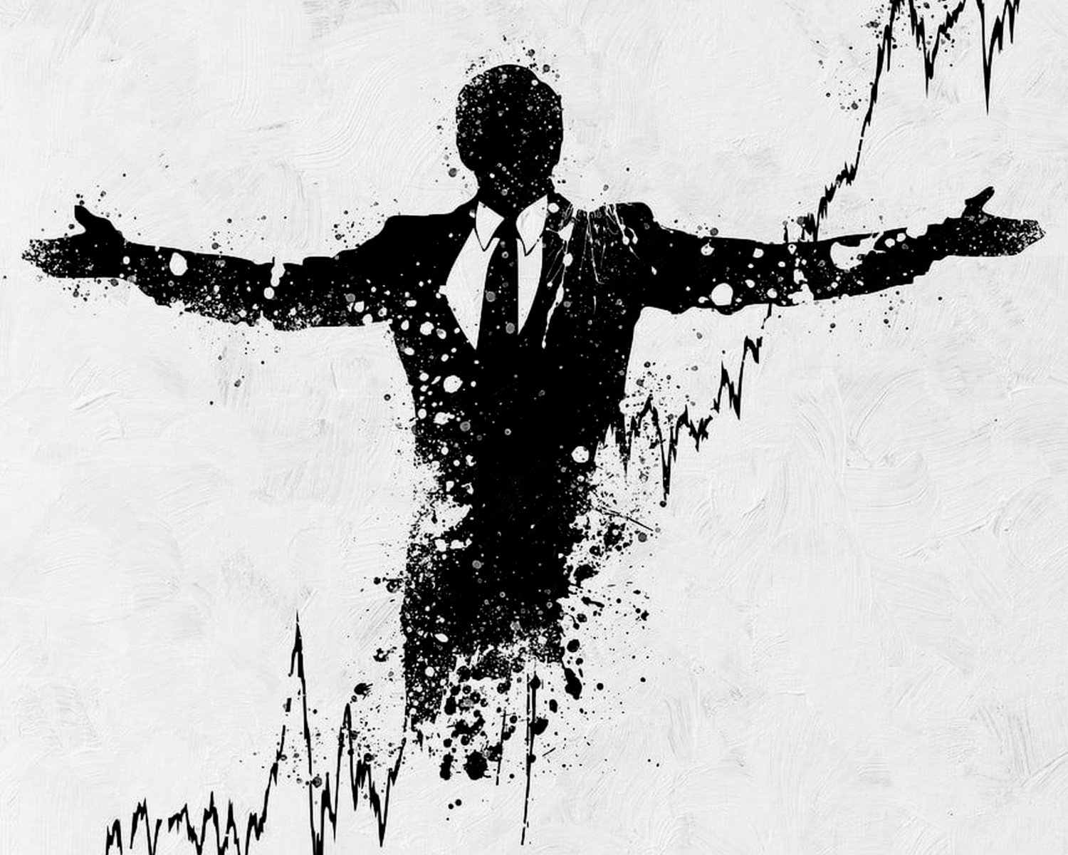
Minimalist line drawings of Leo or the logo treatments work best for most people because they reference without screaming about it. You get the cultural touchstone without the full commitment.
Wait I forgot to mention – there are artists on Instagram who do really interesting reinterpretations. Not straight movie stills but artistic takes on the themes. Search hashtags like #moviefinanceart or #wallstreetart and you’ll find people doing original work that captures the energy without being so literal.
Color Palette Considerations
Most of these prints are gonna be heavy on blacks, whites, and that specific teal-blue color grade the movie used. Some have the gold/champagne tones from the party scenes. You gotta think about what’s already in your space.
If you’ve got warm wood tones and earth colors, the blue-heavy prints are gonna clash. Look for the warmer scenes or go black and white. If your space is modern with cooler tones, you’ve got more flexibility.
I was watching The Bear the other night and got distracted thinking about how restaurant spaces use art versus office spaces and honestly the principles apply here too – high-energy images need breathing room in the space or they create visual stress.
Actual Color Combinations I’ve Used Successfully:
- Wolf of Wall Street print + charcoal gray walls + black furniture + gold accents
- Black and white version + white walls + natural wood + plants (the plants soften it)
- Blue-toned print + navy accent wall + brass fixtures + leather
The Canvas vs. Print Debate
Canvas wraps are popular for these but I’m gonna be honest – for this specific imagery, I prefer framed prints. Canvas feels too casual for something that’s already walking the line of being too casual for a professional space. The frame adds legitimacy.
That said, if you’re doing a man cave or personal gym situation, canvas works fine and saves money on framing.
Lighting This Stuff Properly
Okay so funny story – I installed what I thought was the perfect Wolf of Wall Street piece for a client and he hated it for two weeks until we fixed the lighting. The overhead fluorescent was creating glare and washing out all the contrast. We added a picture light and suddenly it looked intentional and gallery-quality.
You want directional lighting, not overhead. Picture lights, track lighting, or even a well-placed floor lamp that bounces light off the wall. Avoid direct sunlight because these are usually printed with regular inks that’ll fade.
What NOT to Do
Don’t:
- Mix it with unrelated motivational quotes – this creates confused messaging
- Put it in your kid’s playroom (yes someone asked me this)
- Combine it with sports memorabilia unless you’re very carefully curating a “things I love” gallery wall
- Use it as the only art in a client-facing office – it’s too polarizing
- Get the bootleg prints from Amazon that use screencaps – they look pixelated and cheap
The Amazon thing is real – the quality difference between a proper print from an Etsy seller who knows what they’re doing versus a dropshipped Amazon print is massive. I’ve compared them side by side and the Amazon ones are always muddy and the colors are off.
Alternative Options Nobody Talks About
If you want the energy without the literal movie reference, there’s vintage stock market art, old NYSE photos, abstract pieces that use similar color palettes and aggressive composition. I’ve also used vintage Rolex advertisements, classic car posters, and architectural photography of Manhattan to create a similar vibe.
There’s this one artist who does geometric interpretations of wealth and ambition themes that capture the Wolf of Wall Street feeling without any movie imagery at all. Can’t remember their name but they’re on Saatchi Art.
Sizing for Different Spaces
Home office: 24×36 or 20×30 works for most walls
Large living room: You can go up to 40×60 but seriously think about whether you want something that intense that large
Bedroom: If you must, keep it under 20×30
Gym/personal space: Whatever feels right honestly, rules are more flexible here
The rule I tell people is measure your wall, divide by three, that’s your max width for a single piece. It’s not a hard rule but it prevents the piece from dominating too much.
The Price Reality Check
You can find prints for $25-30 on the cheap end but they’re gonna be basic digital prints on regular paper. Mid-range is $75-150 for good quality giclée prints on proper paper. High end gets into $300+ for limited editions or original reinterpretations.
Framing adds another $50-300 depending on size and quality. I know that sounds like a lot but this is art you’re putting on your wall, not a poster you’re thumbtacking up.
My client canceled yesterday so I spent an hour comparing the different paper types and honestly for this specific imagery, you want something with a slight texture – smooth makes it look too much like a poster, heavy texture fights with the photographic quality. Look for “fine art paper” or “cotton rag” in the listings.
The Controversial Take
Sometimes the best Wolf of Wall Street art doesn’t actually show anything from the movie. The themes – ambition, excess, New York finance culture, that specific brand of American capitalism – can be represented in more subtle ways that age better and work in more contexts.
I’ve done entire office designs around the energy of that movie without using a single direct reference. Vintage maps of Manhattan, abstract gold paintings, photography of architectural details from the Financial District, even the right typography choices in other art pieces.
But if you want the actual movie imagery because it means something to you or represents a specific mindset you’re cultivating, then own it and do it right with proper framing and placement.
Just maybe don’t put it in the room where you’re trying to impress your in-laws.