Wall Art Guide, Wall Art Tutoriels
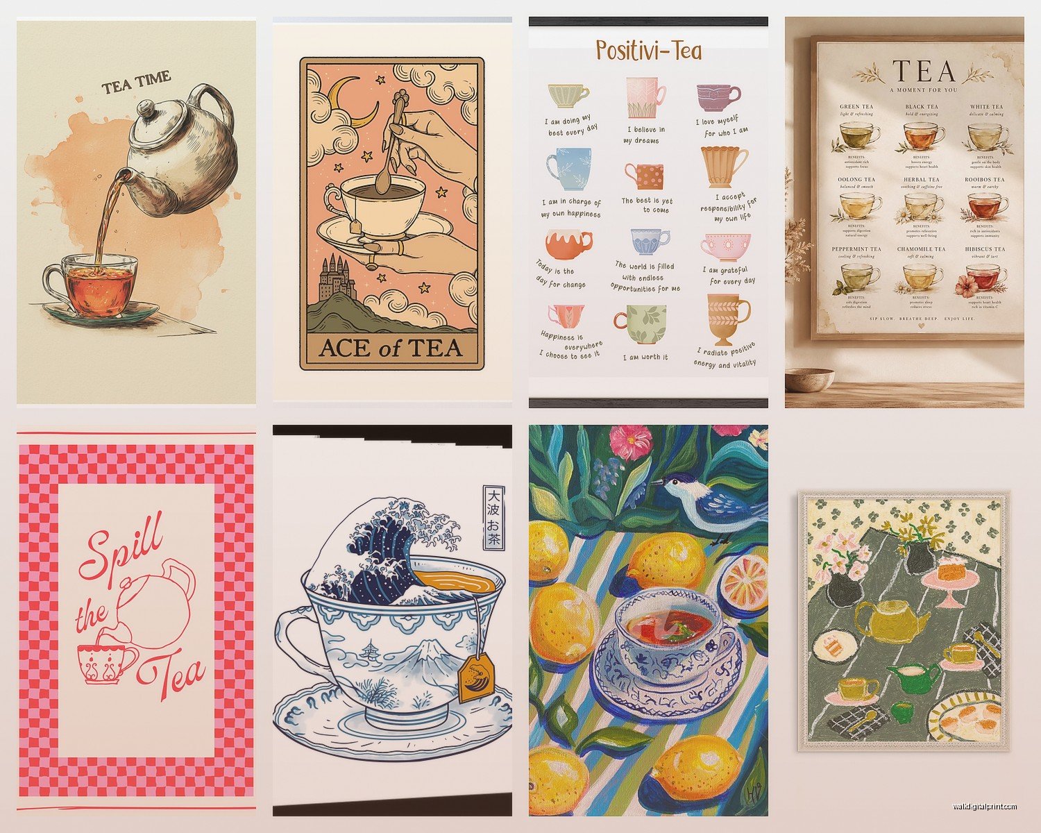
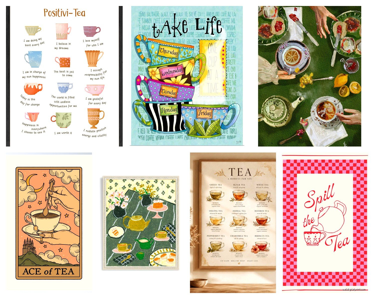
Tea Wall Art: Teapot Cup Zen Kitchen Break Room Decor
Oct
So I’ve been obsessing over tea wall art lately because honestly, there’s something about a good teapot print that just makes a space feel more intentional without being too precious about it, you know?
Why Tea Art Actually Works in Spaces
Okay so here’s the thing – tea imagery hits this sweet spot between vintage charm and modern minimalism. I was working with a client last month who wanted her break room to feel less like a sad corporate afterthought, and we ended up going with this whole tea-themed gallery wall situation. It completely transformed the vibe without requiring a huge budget or like, knocking down walls or whatever.
The secret is that teapots and cups have these inherently interesting shapes. Curves, spouts, handles – they create visual interest even when the color palette is super simple. Plus there’s that whole cultural thing where tea = taking a pause, being mindful, all that stuff people are desperate for these days.
What Actually Looks Good vs What You Think Will Look Good
I’m gonna be real with you – when I first started curating tea art, I made some questionable choices. Bought this massive vintage-style teapot canvas from a big box store that looked amazing online but in person it was just… aggressively orange? Like traffic cone orange. Had to return it.
Here’s what I’ve learned works:
Botanical Tea Prints
These are prints that combine tea elements with herbs, flowers, leaves. They’re having a major moment right now and for good reason. The ones with watercolor tea cups surrounded by chamomile or mint illustrations? Those work in literally every space I’ve tried them in. Kitchen, obviously, but also home offices where you want it to feel calm but not boring.
I found this one artist on Etsy – can’t remember the shop name right now, my dog is literally stepping on my keyboard – but they do these gorgeous prints where the steam from the teacup turns into botanical elements. It’s subtle enough that it doesn’t read as cheesy.
Minimalist Line Art
Single line drawings of teapots or cups. These are perfect if your space is already kinda busy or you’ve got a lot of pattern happening with tiles or wallpaper. I used a set of three black line art prints in a client’s kitchen that had super colorful backsplash, and it balanced everything out without competing.
The key with these is to go bigger than you think. A tiny minimalist print just looks like you forgot to decorate. I usually recommend at least 16×20 for a single print, or a set of three 11x14s.
Vintage Tea Advertisement Posters
Okay this is gonna sound weird but the old tea company advertisements from like the 1920s-1950s are absolutely stunning. Think Lipton, PG Tips, those old British tea brands. The typography alone is worth it, plus the color palettes are usually muted enough that they work with modern interiors.
I scored a reproduction of a 1930s Twinings poster at an antique market for like twenty bucks and it’s one of my favorite pieces. The thing is, you gotta make sure it’s properly framed – cheap frame = looks like dorm room decor. Spend the extra $40 on a decent frame.
Asian-Inspired Tea Ceremony Art
This is tricky because it can veer into cultural appropriation territory real quick if you’re not thoughtful about it. But authentic representations of Japanese or Chinese tea ceremonies, especially vintage woodblock prints or contemporary art by Asian artists, can be really beautiful.
I worked with a zen-style break room last year where we used a simple sumi-e painting of a tea bowl. Just black ink on white background, super restrained, incredibly calming. The company did meditation sessions in there and everything.
Just please don’t do the thing where you slap random Chinese characters on your wall that you can’t read. I’ve seen it too many times and it’s not great.
Where to Actually Buy This Stuff
Oh and another thing – where you source your tea art matters way more than I initially thought.
Etsy is honestly your best bet for unique stuff. You can find independent artists doing really cool interpretations. Search terms that work: “tea print,” “teapot art,” “tea botanical,” “vintage tea poster.” Filter by your color scheme and you’ll find something.
Society6 and Redbubble are good for more contemporary designs. Lots of artists upload their work there and you can get it printed on different sizes, even on canvas or metal prints. I got a really cool geometric teapot design from Society6 that’s basically abstract shapes but you can still tell it’s a teapot? Hard to explain but it works.
Antique shops and flea markets if you want actual vintage stuff. I love the hunt but you gotta be willing to dig through a lot of weird cat paintings to find the good tea-related pieces.
Museum gift shops – wait I forgot to mention this earlier but museum reproduction prints are incredible quality and nobody thinks to look there. The Met has amazing vintage tea advertisement prints in their online store.
How to Arrange Tea Art Without It Looking Like a Theme Restaurant
This is where people mess up. They get so excited about the tea theme that they go overboard and suddenly their kitchen looks like a British tearoom threw up on the walls.
The Gallery Wall Approach
Mix your tea prints with other stuff. I know this seems counterintuitive but hear me out – if you’ve got three tea-related prints, add in maybe two botanical prints that aren’t tea-specific, or a vintage kitchen scale illustration, or even just an abstract piece that pulls the same colors.
I did this in my own kitchen actually. Two tea prints, one lemon botanical, one abstract piece with similar colors, and a vintage kitchen utensil illustration. It feels cohesive without being matchy-matchy or too theme-y.
Spacing matters too – I use the 2-3 inch rule between frames. Any closer and it feels cluttered, any further and they don’t read as a collection.
The Statement Piece Method
One big awesome print instead of a collection. This works great in smaller spaces or if you’re decorating a break room where you don’t wanna overwhelm people on their coffee break.
I recently put a huge 30×40 inch vintage tea advertisement in a corporate break room and it became this whole conversation starter. People would actually take their breaks in there instead of eating at their desks. Which like, wasn’t even the goal but the HR person was thrilled.
The Shelf Styling Situation
If you’ve got open shelving in your kitchen or break room, you can prop smaller tea prints on the shelves between actual teapots or mugs. This is my favorite approach because it feels collected and personal rather than overly designed.
Mix frame colors here – all matching frames can look too rigid. I like one gold, one black, one natural wood, that kind of thing.
Framing and Hanging Because This Part Is Actually Important
Okay so funny story, I once hung a beautiful tea print with command strips and the humidity from the kettle kept making it fall down. Three times in one week. Finally invested in proper picture hanging hardware and haven’t had a problem since.
For kitchens and break rooms specifically:
You gotta think about moisture and heat. If you’re hanging near a stove or kettle, use glass-front frames rather than just canvas. The glass protects the print from steam and grease particles floating around.
Also – and this seems obvious but I’ve made this mistake – don’t hang paper prints directly above where you’re boiling water. The steam will literally warp the paper over time. I learned this the hard way with a print I loved.
Frame quality matters:
IKEA frames are fine for most situations honestly. Their RIBBA frames are like $15 and they work. But if you’ve got an expensive print or something you really love, spend more. Michael’s has good sales constantly – I never pay full price there, just wait for the 50% off framing sale.
Metal frames look really sharp with minimalist tea line art. Wood frames work better with vintage tea posters or botanical prints.
Hanging Height
The center of your artwork should be at eye level, which is usually around 57-60 inches from the floor. But in a kitchen or break room where people are often standing at counters, you can go a bit higher.
I usually do 60-63 inches in kitchen spaces. Just measure from the center of where the art will be, not the top of the frame. This trips people up constantly.
Color Coordination Without Making It Boring
Your tea art doesn’t have to match your kitchen colors exactly, but it should work with them. I’ve got a whole system for this that’s probably overkill but whatever, it works.
Pull 2-3 colors from your existing space and look for prints that include at least one of those colors. Like if you’ve got white cabinets, black counters, and brass hardware, look for tea prints with black line work, warm cream backgrounds, or gold accents.
But then – and this is key – add one unexpected color through your art. Maybe a dusty pink or sage green or navy. This keeps it from looking too coordinated and boring.
I’m currently watching this design show while typing this and they just did exactly this with a kitchen makeover, it’s so validating when I see my theories confirmed on TV.
DIY Options If You’re Crafty or Broke or Both
You can make your own tea art and honestly some of my favorite pieces are DIY.
Vintage tea box labels – if you drink fancy tea, save the packaging. Some of those labels are gorgeous. I’ve framed Harney & Sons labels, Fortnum & Mason boxes, even a beautiful French tea tin label. Instant vintage art for free.
Tea bag arrangement – this sounds weird but stick with me. Get a shadow box frame, arrange different tea bags in an interesting pattern or grid, and boom. Actual tea art made from tea. I did this with all different herbal tea bags in various colors and it’s genuinely cool looking.
DIY prints from public domain images – search “vintage tea advertisement public domain” and you’ll find tons of images you can legally download and print. Take the file to a print shop or even print at home if you’ve got a decent printer. I use Staples for large format printing when I don’t wanna deal with my home printer.
Specific Spaces and What Works Where
Home Kitchen
You’ve got more flexibility here since it’s your space. I like mixing tea art with food photography or recipe prints. Creates this whole culinary narrative thing.
Near the coffee/tea station specifically, smaller prints work well. Like 8×10 or 11×14. You’re creating a little moment in that corner.
Office Break Room
Keep it simple and professional but not boring. One or two medium-large prints rather than a complicated gallery wall. You want people to feel calm when they walk in, not like they need to analyze your art choices.
Neutral color palettes work best here – black and white, sepia tones, muted greens and blues.
Dining Room
This is where you can get a little fancier. Larger vintage tea posters work great here, or a whole gallery wall situation if you’ve got the space.
I did a client’s dining room with five different vintage tea advertisement prints from different decades, all in matching black frames. Created this cool timeline effect while staying cohesive.
Maintenance and Longevity
Nobody talks about this but tea art in kitchens gets grimy. Even with glass-front frames, dust and cooking residue builds up.
Clean your frames like every 2-3 months with glass cleaner. Just spray on a cloth, not directly on the frame because liquid can seep in.
If you’ve got paper prints without glass protection, consider replacing them every few years if they’re in high-moisture areas. They’ll start looking dingy and yellowed.
Also UV-protective glass is worth it if you’ve got windows near your art. Prevents fading. Costs more upfront but your prints will look good for years longer.
What to Avoid
Word art that says “But first, tea” or similar cutesy phrases – it’s been done to death and it reads very 2014 Pinterest.
Anything too literal – like a photograph of someone drinking tea. Unless it’s artistically interesting, it usually just looks like a stock photo.
Too many different styles together – vintage advertisement + modern minimalist + botanical watercolor all in one space gets chaotic. Pick one or two styles max.
Fake metal signs that are trying too hard to look vintage – you know the ones. Usually have rivets printed on them. They almost never look as good in person as they do online.
Wait I forgot to mention – scale is everything. I see people put these tiny 5×7 prints on huge empty walls and it just looks lost. If you’ve got a big wall, you need either one large piece (like 24×36 minimum) or a collection of smaller pieces arranged together.
The other thing is thinking about the vibe you actually want. Zen and calming? Go minimal with lots of white space in your prints. Cozy and vintage? Warmer tones and more detailed illustrations. Energizing and modern? Bold colors and graphic designs.
I’ve been rambling but honestly tea wall art is one of those things that seems simple but has way more nuance than people expect, and getting it right makes such a difference in how a space feels.