Wall Art Guide, Wall Art Tutoriels
Beautiful Wall Art for Bedroom: Stunning Sleep Space Designs
Oct
So I’ve been obsessing over bedroom wall art lately because honestly my own bedroom looked like a sad hotel room for way too long, and let me tell you what actually works versus what just looks good on Pinterest.
Size Matters Way More Than You Think
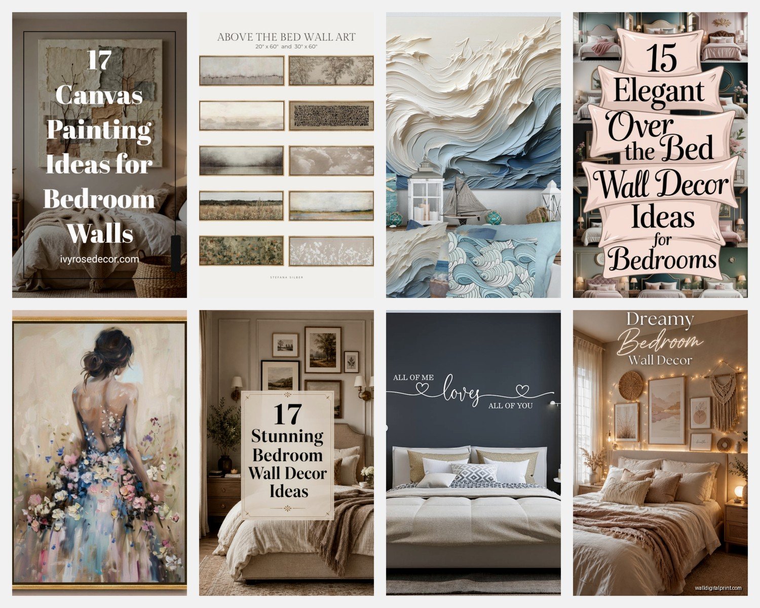
Okay first thing – everyone goes too small with their art. Like, I see it constantly and it drives me nuts. You want your main piece to be at least 2/3 the width of your furniture below it. So if you’ve got a queen bed that’s 60 inches wide, you’re looking at art that’s minimum 40 inches across. Or you do a gallery wall that takes up that same visual weight.
I made this mistake in my first apartment and had these tiny 16×20 prints above my bed and my mom came over and was like “is that temporary?” which was… yeah. Brutal but fair.
The Actually Good Size Combinations
For above the bed specifically, here’s what I’ve tested and what clients respond to:
- One large piece: 40×60 or bigger for queen/king beds
- Diptych or triptych: Three 20×30 pieces with 2-3 inches between them
- Two medium pieces: 24×36 each, hung side by side
- Gallery wall: Mix of sizes but contained in an invisible rectangle about 50-60 inches wide
The height thing is easier – hang your art so the center is at eye level, which is usually 57-60 inches from the floor. Above a bed though, you want the bottom of the frame about 6-8 inches above your headboard. Any higher and it looks like it’s floating away, any lower and you might bonk it with your pillow.
What Actually Looks Good When You’re Trying to Sleep
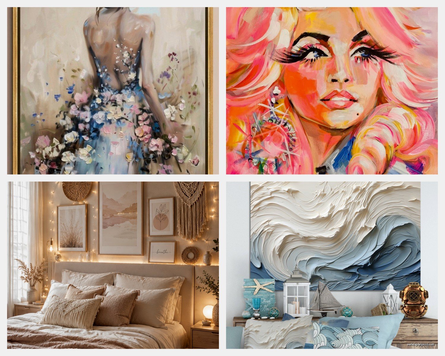
Here’s the thing nobody tells you – bedrooms need calmer art than living spaces. I had this incredibly vibrant abstract piece with reds and oranges that I LOVED, moved it to my bedroom, and couldn’t sleep well for like two weeks before I figured out why. Your brain processes that visual stimulation even when you’re trying to wind down.
Colors That Won’t Keep You Awake
Stick with:
- Blues and greens (obvious but true – they actually do calm your nervous system)
- Soft neutrals – grays, beiges, whites with texture
- Muted earth tones – terracotta, sage, dusty pink
- Black and white if you want drama without the stimulation
That said, if you’re someone who needs more energy in the morning, a piece with some warmer tones on the wall opposite your bed can actually help. Just not where you’re staring at it while trying to fall asleep.
The Actual Art Styles Worth Considering
Oh and another thing – the style matters as much as the subject. Here’s what I’ve curated for bedrooms that actually works:
Abstract and Minimalist Pieces
These are having a huge moment and for good reason. A simple line drawing or watercolor wash doesn’t demand attention but still fills the space. I found this amazing Etsy shop last month (my dog was sick so I was up at 3am scrolling) that does custom abstract pieces in your color palette. Takes like 6 weeks but worth it.
The benefit here is abstraction doesn’t tell a story that keeps your brain engaged. It just… exists prettily.
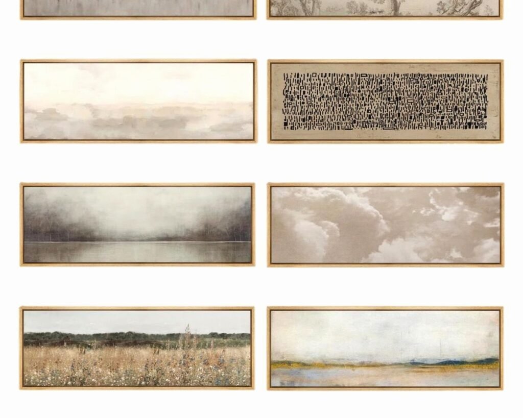
Landscape Photography or Paintings
Horizons are incredibly soothing. Something about that horizontal line calms people down. I’ve used ocean scenes, mountain ranges, desert landscapes – all work beautifully. Just avoid anything too dramatic like storm scenes or intense sunsets that are super saturated.
Botanical Prints
Okay so this is gonna sound weird but I was watching this documentary about biophilic design and it basically confirmed what I already knew – images of nature reduce stress. Vintage botanical prints, modern leaf photography, pressed flower art, all of it works.
My bedroom has these three large fern prints in simple black frames and I swear I sleep better. Could be placebo effect, don’t care, still works.
Typography and Quotes
Controversial opinion: most quote art is terrible. But if you find something genuinely meaningful to you in a minimalist typeface, it can work. Just please avoid the “live laugh love” energy. I did a custom piece for a client with coordinates of where she got married in a simple font and it was actually really lovely and personal without being cheesy.
Framing Because It Actually Makes or Breaks Everything
So here’s where people mess up constantly – they’ll spend $200 on a print and then put it in a $15 frame from Target and wonder why it looks cheap. The frame is like 40% of the visual impact.
Frame Colors That Work
- Black frames: Classic, make colors pop, work with literally everything
- Natural wood: Adds warmth, great for bohemian or Scandi vibes
- White frames: Clean and modern, best for colorful art or black and white photos
- Gold/brass: Use sparingly and only if your room has other warm metallics
I’ve started using framebridge for most things because honestly the quality difference is noticeable and they’re not even paying me to say that. The museum-quality acrylic actually matters.
Wait I forgot to mention – if you’re doing a gallery wall, stick to one frame color. Maybe two if you really know what you’re doing. Three or more and it looks chaotic.
Gallery Walls Without Losing Your Mind
Okay so gallery walls look amazing but they’re genuinely annoying to install. Here’s how I do it without making a million holes:
First, trace all your frames on paper (or use the paper that comes with them if you ordered online). Tape the paper to the wall in different arrangements until you find one you like. I literally spend hours on this part, moving things around while half-watching whatever’s on Netflix.
Gallery Wall Layouts That Actually Work
Grid layout: Same size frames, equal spacing, very clean and modern. Easiest to execute. I did this with six 16×20 frames in my guest room and it took like 45 minutes total.
Salon style: Different sizes, tighter spacing, more organic. This is what you see on Instagram constantly. It’s beautiful but plan for like 3 hours of your life you’re not getting back. And a lot of nail holes.
Horizontal line: Different heights but all aligned along one horizontal line (usually the center or bottom of frames). Good compromise between organized and interesting.
The spacing sweet spot is 2-3 inches between frames for salon style, 3-4 inches for more formal grid arrangements.
Where to Actually Buy Art That Doesn’t Cost Your Entire Paycheck
Let me break down the sources I actually use because there’s so much overpriced stuff out there:
Etsy
My go-to for printable art. You download it, print it at your local print shop (I use a local place that does 24×36 prints for like $8), frame it yourself. Total cost for a large piece of art: maybe $50-70 including the frame if you’re smart about it.
Search terms that work: “abstract printable art,” “minimalist bedroom art,” “botanical print digital download”
Society6 and Minted
More expensive but they print and frame for you. Quality is genuinely good. Wait for their sales though – they have like 30% off constantly.
Local Art Fairs and Student Shows
This is where I find the most unique stuff. Art students sell pieces for reasonable prices and you get something nobody else has. Plus you’re supporting actual artists which feels good.
Your Own Photos
Honestly some of my favorite bedroom art is just personal photos printed large. That trip to Iceland, your grandmother’s garden, whatever. Makes it actually meaningful. Just make sure the resolution is high enough – you need at least 150 DPI at the size you’re printing.
The Weird Stuff That Works
Okay so funny story, I had a client who was super resistant to traditional art and we ended up doing this whole wall of vintage mirrors in different shapes and sizes. Technically not “art” but it looked incredible and made the small bedroom feel twice as large. Sometimes you gotta think outside the frame, literally.
Alternative Wall Art Ideas
- Textile wall hangings – macramé, woven pieces, vintage quilts mounted on rods
- Floating shelves with small art pieces you can rotate out
- Large-scale maps, especially vintage ones
- Architectural drawings or blueprints
- Your kid’s art in nice frames (actually can look really cool if curated)
Lighting Your Art Because What’s the Point If You Can’t See It
This gets overlooked constantly but art needs proper lighting. I installed picture lights above two large pieces in my bedroom and the difference is insane. You can get battery-operated LED picture lights now so you don’t need to hire an electrician.
Or just make sure your general bedroom lighting hits the art well. Avoid direct sunlight though because it’ll fade everything over time. I learned this the hard way with a beautiful watercolor that’s now about 40% less vibrant than it was two years ago.
Common Mistakes I See Literally All the Time
Hanging art too high: Eye level means eye level, not ceiling level
Ignoring the room’s existing colors: Your art should pull from colors already in your bedding, curtains, or furniture
Overcrowding: Negative space is your friend, you don’t need to fill every wall
Mismatched styles: A modern abstract piece next to a traditional landscape painting next to a graphic poster is just… chaos
Forgetting about scale in small rooms: One large piece actually makes a small bedroom feel bigger than lots of small pieces
Making It Feel Cohesive
The trick to making bedroom art feel intentional rather than random is repetition. Repeat colors, repeat frame styles, or repeat themes. My bedroom has all nature-themed art in black frames with white mattes. Simple formula, looks pulled together.
You can also create cohesion through subject matter – all abstracts, all black and white photography, all vintage botanical prints. Just pick a lane and stay in it for that room.
And honestly if you’re stuck, start with your bedding or curtains and pull 2-3 colors from there for your art palette. Makes the whole room feel connected.
The other thing is don’t rush it. I’ve had blank walls for months while I figured out what actually belonged there. Better to live with empty walls than fill them with stuff you’re gonna want to replace in six months. Though I know that’s hard when you just wanna feel done with decorating already.
Just remember your bedroom is literally where you start and end every day so it’s worth getting the art right even if it takes a while to figure out what “right” means for you.