
Wall Art Guide, Wall Art Tutoriels
Tropical Prints Wall Art: Island Palm Jungle Poster Gallery
Oct
So I’ve been completely obsessed with tropical prints lately and honestly it started because I needed to fix this weird wall situation in my apartment but now like half my client consultations involve palm leaves somehow. Let me walk you through what actually works because I’ve made some expensive mistakes.
Picking Prints That Won’t Look Like a Beach Bar
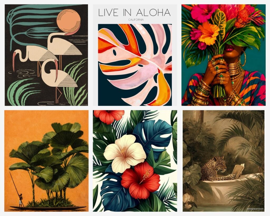
Okay so the first thing is you gotta figure out if you want actual vintage botanical prints or the more modern graphic stuff. They’re completely different vibes. The vintage botanical ones are those detailed palm frond illustrations that look like they came from an old science textbook, and honestly those work in almost any space because they read more sophisticated than “tropical.” I found some amazing ones on Etsy from this shop that sources actual antique botanical drawings and…wait I forgot to mention, make sure you’re checking if you’re buying a digital download or an actual print because I definitely bought three digital files once thinking they were gonna show up in my mailbox.
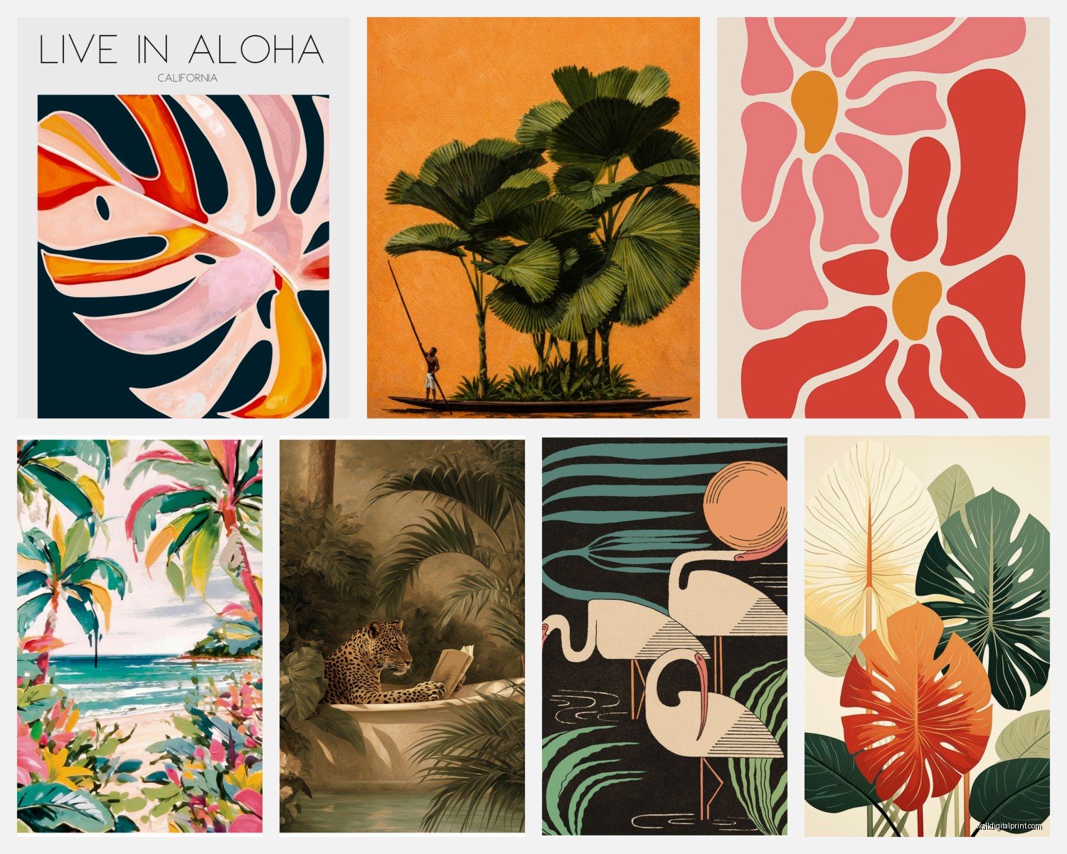
The modern graphic ones are bolder, usually have that flat color palette thing going on. Monstera leaves, banana leaves, palm fronds in like coral pink or emerald green. These can look incredible but they’re also easier to mess up because if your room already has a lot of pattern they can fight with everything else.
Size Actually Matters More Than You Think
This is where I see people mess up constantly. You cannot put a tiny 8×10 print on a huge empty wall and expect it to look intentional. I learned this the hard way in my own living room and my cat kept knocking it off anyway so. Here’s what I do now:
- Big statement walls need at least 24×36 inches or a gallery wall situation
- Above furniture you want the art to take up like two-thirds to three-quarters of the furniture width
- Small walls or tight spaces can handle 11×14 or 16×20
- Hallways are weird because you walk past them so multiple smaller prints usually work better than one big one
I have this one client who insisted on getting these massive 40×60 palm prints for her bedroom and honestly it worked but only because her ceilings are like 10 feet high. In a normal 8-foot ceiling room that would’ve been overwhelming.
Creating a Gallery Wall Without Losing Your Mind
Gallery walls with tropical prints can look amazing or completely chaotic and there’s like a very thin line between them. What I do is lay everything out on the floor first, which sounds obvious but you’d be surprised how many people just start hammering nails.
The easiest formula is picking one main large print and then surrounding it with smaller ones. I usually go with one 24×36, two 16x20s, and three 8x10s for a standard gallery wall above a couch. Mix your palm types too—don’t do all the same leaf. Combine a monstera with a banana leaf with a palm frond with maybe one tropical flower print.
Frame Matching vs Mismatching
Okay so funny story, I used to think all frames had to match perfectly and then I saw this setup at an art gallery opening where they mixed black, white, and natural wood frames and it looked so much more collected and interesting. Now that’s what I recommend to almost everyone.
The trick is picking a max of three frame colors and keeping the style consistent. So like all thin frames or all chunky frames, but the colors can vary. White frames keep things feeling light and beachy, black frames add more contrast and drama, natural wood feels organic and brings warmth.
Oh and another thing—you don’t need glass for prints in most cases. I actually prefer without glass for that more casual gallery vibe unless you’re using actual expensive botanical prints that need protection.
Where to Actually Buy This Stuff
I’ve ordered from probably 20 different places at this point so here’s what I’ve learned. Etsy is great for digital downloads which you can then print at a local print shop or online. The quality control is better when you can choose your own printer honestly. I use a local place that does matte printing on heavy cardstock and it looks way more expensive than it is.
For ready-made framed prints, Society6 has tons of tropical options and their quality is pretty consistent. A bit pricey but the frames are decent. Desenio is another one I use a lot—they’re based in Europe but ship to the US and their tropical botanical collection is really good. More affordable than Society6.
If you want something more unique, there are artists on Instagram selling original tropical prints. I found this one artist who does watercolor palm leaves that are gorgeous but you’re gonna pay $150-300 per print. Worth it if you want something nobody else has though.
Target actually has some surprisingly decent tropical prints in their Project 62 line if you’re on a budget. They’re not gonna blow anyone’s mind but for like $30 framed they’re solid.
Color Coordination Without Being Matchy-Matchy
This is where it gets fun because you can either go full maximalist or keep it really restrained. I’m watching this design show right now where they always do the all-white-frames-with-green-prints thing and it works but it’s kinda safe.
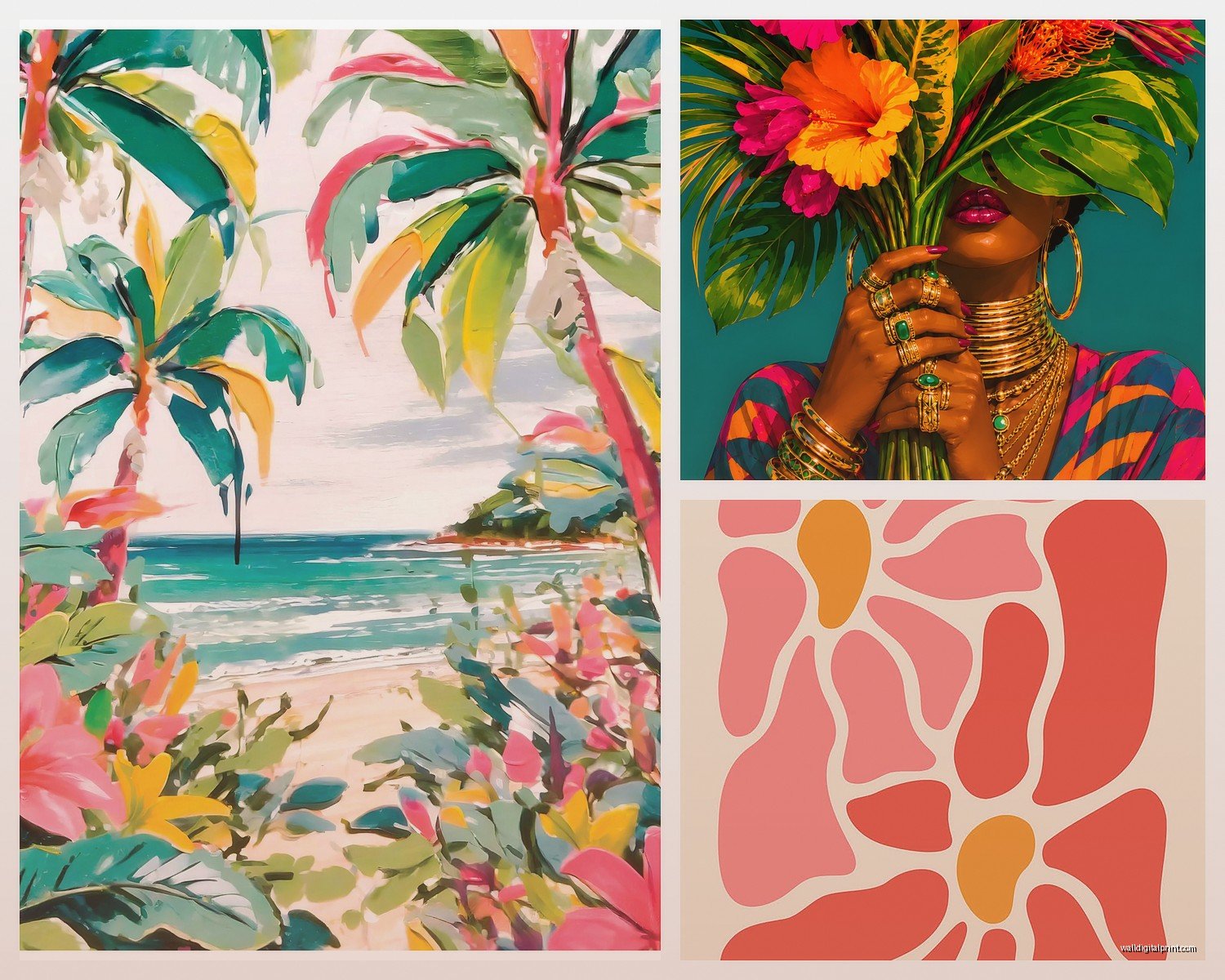
What I’ve been doing lately is pulling one accent color from your room and finding prints that incorporate it. So if you have coral pillows, look for tropical prints with coral flowers or sunset backgrounds. If your room is mostly neutrals, you can go wild with the print colors because they’ll become your color story.
My living room is mostly gray and white and I did a gallery wall with prints that have pops of yellow, coral, and teal in them and it totally transformed the space. Brought in all this color without committing to painting walls or buying a new couch.
The Whole Matting Question
Mats make everything look more finished and professional but they also add cost and bulk. For tropical prints I usually skip the mat if I’m going for a more casual beachy vibe. The art goes right to the edge of the frame and feels more modern.
But if you’re mixing different sized prints in a gallery wall, mats can help unify everything. Like you can put an 8×10 print in an 11×14 frame with matting and suddenly it matches the scale of your other pieces better.
Placement Strategies That Actually Work
The whole “hang art at eye level” rule is kinda outdated honestly. It depends so much on your space. In a dining room where people are sitting, you want art lower. In a hallway where you’re walking, higher works better.
For tropical prints specifically, I love them in unexpected places. Bathrooms are perfect because they handle humidity well if they’re just paper prints in frames. That steamy tropical vibe makes sense there. I have a palm print in my powder room and everyone comments on it.
Bedrooms are obvious but don’t just do the over-the-bed thing. Try a gallery wall on a side wall or even leaning large prints on a dresser or shelf. The leaning thing is having a moment and it’s way easier than measuring and drilling.
Mixing Tropical with Other Art Styles
You don’t have to commit to full tropical everything. I actually think mixing one or two tropical prints with other styles looks more sophisticated. Like pair a palm print with some abstract art or black and white photography. The tropical piece becomes an accent rather than a theme.
One of my favorite combinations is vintage botanical tropical prints mixed with modern line drawings. The different styles play off each other and it feels more curated.
Lighting Makes or Breaks It
This is gonna sound weird but lighting matters SO much with tropical prints and nobody talks about it. If you have a dark room and you add dark green palm prints, everything’s gonna feel heavy. You need either natural light or good artificial lighting to make the colors pop.
I installed picture lights above my gallery wall and it completely changed how the prints looked at night. Those battery-operated LED picture lights from Amazon work great if you don’t wanna deal with wiring. Like $25 and suddenly your art looks like it’s in a real gallery.
Seasonal Rotation Thing I Do
Okay so this might be extra but I keep some tropical prints that I swap out seasonally. The really bright ones with flowers and vibrant colors come out in spring and summer. In fall and winter I switch to more muted botanical prints with deeper greens and browns. It keeps things feeling fresh without redecorating entirely.
I store the off-season prints in a portfolio case under my bed. Takes like 20 minutes to swap them out and suddenly the whole room feels different.
The Digital Download Route
If you’re crafty or just wanna save money, buying digital downloads and printing them yourself is the way to go. You can get beautiful high-resolution tropical prints on Etsy for like $5-10. Then take the file to a print shop or use an online service like Printful or Nations Photo Lab.
The quality depends on the file resolution so make sure you’re getting at least 300 DPI. And size matters—a file meant for 8×10 is gonna look pixelated if you try to print it at 24×36.
I usually get files printed on matte cardstock or if I’m feeling fancy, textured fine art paper. Then frame them in Ikea frames because honestly their Ribba and Hovsta frames are perfectly fine for most situations.
Common Mistakes to Avoid
Hanging everything too high is the biggest one I see. People think art should be way up on the wall but then it floats awkwardly and doesn’t relate to the furniture. The center of your art should be around 57-60 inches from the floor, which is average eye level.
Another thing is buying prints that are too small for the space. It’s better to go bigger than you think you need. A large print feels confident and intentional. A tiny print on a big wall just looks like you ran out of money or ideas.
And please don’t buy those pre-made sets of four prints in identical frames unless you’re really sure about them. They can look generic and hotel-ish. Mix it up a bit even if you’re keeping the same color scheme.
When to Stop Adding More
I tend to overdo things so I have to remind myself of this too. You don’t need tropical prints on every wall. Pick one or two key areas and let them shine. The rest of your space can be neutral or have different art styles.
My rule is if you walk into the room and the prints are the first thing you notice, you might have too many. They should feel like they belong there, not like they’re screaming for attention. Unless that’s the vibe you want, which is also totally valid.
Anyway, start with one or two pieces and see how you feel. You can always add more but taking things down once they’re up is annoying and leaves holes in your walls. Trust me, I’ve been there way too many times and my landlord is not happy about it.
