Wall Art Guide, Wall Art Tutoriels
Sky Wall Art: Clouds Blue Atmosphere Heaven Photography
Oct
So I’ve been obsessing over sky photography prints lately and honestly it started because a client asked me to find something “peaceful but not boring” for their bedroom and I fell down this whole rabbit hole of cloud art that I’m still not completely out of.
Why Sky Art Actually Works When Other Stuff Doesn’t
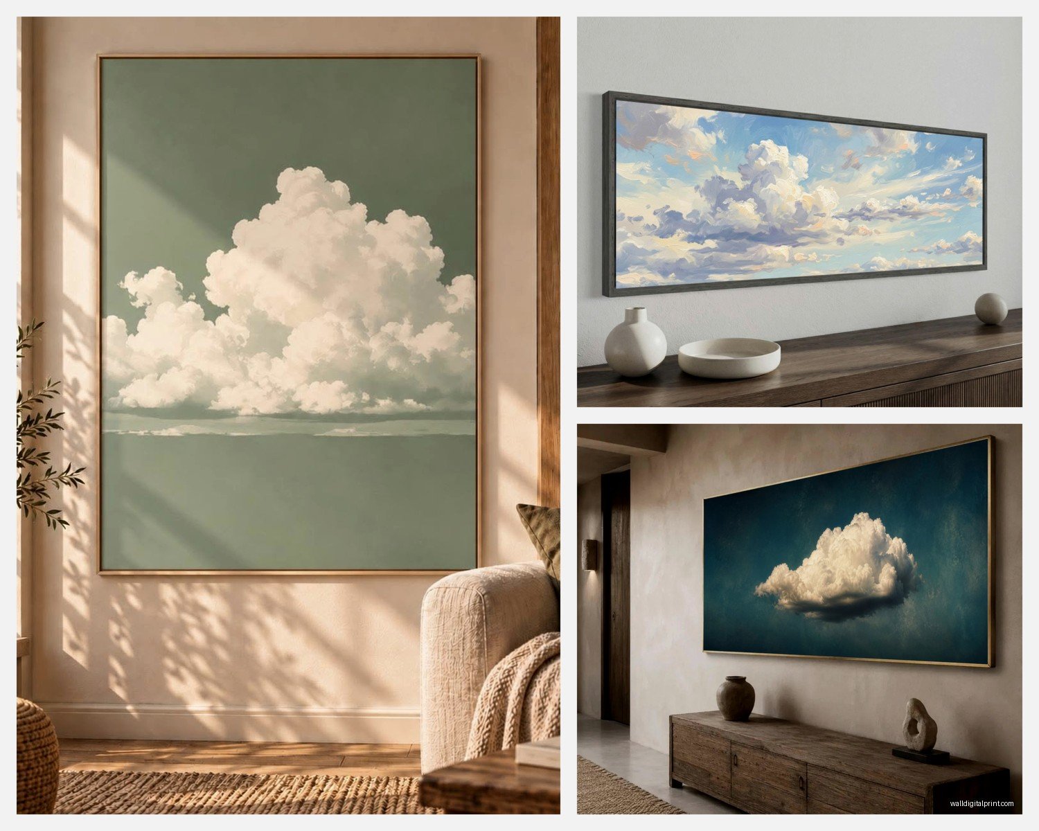
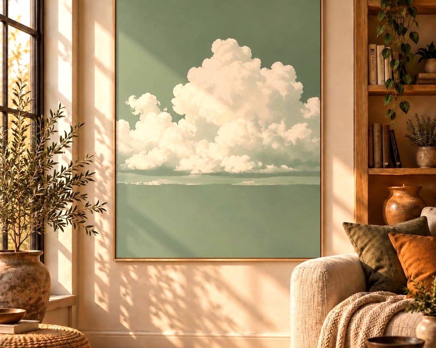
Here’s the thing about sky and cloud photography—it gives you that expansive feeling without being too literal. Like, ocean scenes can feel vacation-y, forests sometimes read too dark, but sky? Sky just opens up a room. I’ve used it in tiny apartments where the ceiling felt like it was closing in, and suddenly the whole space breathes differently.
The blue tones are naturally calming without being cold if you pick the right shade. I learned this the hard way after ordering what I thought was a “soft blue sky” print that arrived looking like a screensaver from 2003. Too digital, too saturated. You want those subtle gradations.
What Actually Matters When You’re Shopping
Okay so you’re scrolling through Etsy or wherever at 10pm trying to decide between like seventeen different cloud photos. Here’s what I look at:
The Actual Cloud Formation
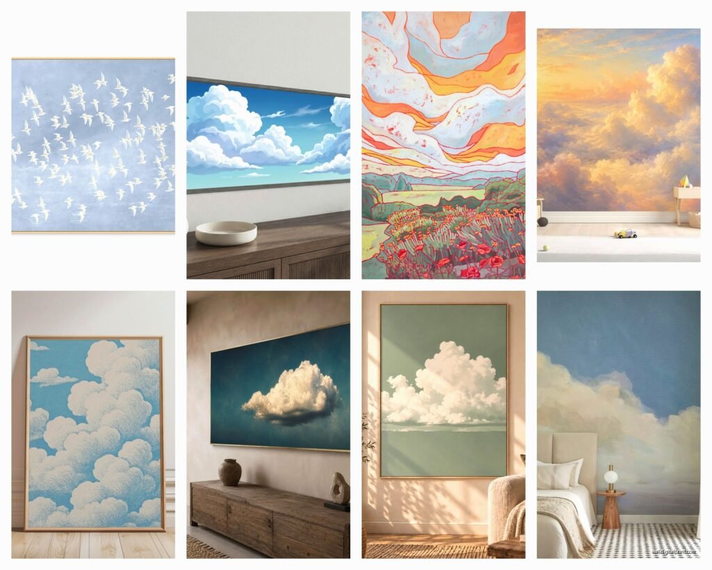
Wispy cirrus clouds photograph completely different than those big puffy cumulus ones. The wispy ones are more minimalist, almost abstract—they work in modern spaces, next to clean-lined furniture. My friend Sarah has one over her Scandinavian-style sofa and it’s perfection.
The big fluffy clouds are more dramatic. They need space to breathe. I used a massive cumulus print in a loft with 12-foot ceilings and it became the whole room’s focal point. Same print in a standard 8-foot ceiling room felt… heavy.
Storm clouds are their own category and honestly? They’re tricky. I love them but they can drag a room’s mood down if you’re not careful. I did a dark storm photography piece in a home office once and the client called me three weeks later saying they felt stressed every time they sat down to work. We swapped it for a sunset sky and problem solved.
Time of Day Matters More Than You’d Think
Golden hour sky shots have those peachy-pink tones that photograph beautifully but can clash with certain paint colors. I learned this when I put one in a room with greige walls and it just looked… off. The warm tones fought with the cool undertones in the greige.
Midday bright blue skies are the safest bet honestly. They’re neutral enough to work almost anywhere but still interesting. You’re not gonna wow anyone but you’re also not gonna regret it six months later.
Twilight/dusk skies with deep blues and purples—these are stunning but they need the right lighting in the room. In a dim room they disappear. You need either really good natural light or excellent artificial lighting to make them pop.
Size and Placement (This Is Where Everyone Messes Up)
I cannot tell you how many times someone shows me a sky print they bought and it’s like… 16×20 on a massive empty wall. It just floats there looking lost and sad.
For above a bed: you want something at least 40-48 inches wide. I usually go bigger. The sky is literally infinite so a tiny representation of it feels wrong somehow? Like you’re looking through a porthole instead of experiencing the expanse.
For living rooms over a sofa: two-thirds the width of your sofa is the standard rule but with sky photography I actually go a bit bigger sometimes. The whole point is that expansive feeling.
Random wall space: this is where you can play with a series. I did three vertical cloud prints in a narrow hallway once and it created this cool rhythm as you walked through. Each one was a different cloud formation but same color palette.
The Canvas vs. Print Debate
Okay so canvas gives you that gallery-wrapped edge which means no frame needed. It’s cleaner, more modern. But here’s what nobody tells you—canvas can look cheap if the printing quality isn’t there. The texture can muddy up those subtle cloud details you actually want to see.
I’m gonna be honest, I usually go with a high-quality photographic print behind glass in a simple frame. Yeah it’s more expensive. Yeah it’s heavier and harder to hang. But the detail and color accuracy? So much better.
Metal prints are having a moment and for sky photography they can be really cool because they have this luminous quality. The colors pop differently. I used one in a contemporary bathroom and the way it caught the light was almost three-dimensional. But they’re pricey and the modern look doesn’t work in traditional spaces.
Where to Actually Find Good Ones
I’ve bought from basically everywhere at this point. My cat knocked over my coffee while I was browsing last week and I panic-bought something at 2am that I’m now stuck with, so learn from my mistakes.
Etsy has tons of independent photographers and you can often get custom sizes. The quality varies wildly though. Always check reviews and ask for a proof if you’re spending more than like $100. I found this amazing photographer in Iceland who does these incredible atmospheric shots but shipping took six weeks.
Society6 and similar print-on-demand sites are convenient because they handle everything—printing, framing, shipping. Quality is consistent which is good but not always great. I use them for less important spaces or when budget is tight.
Local photographers at art fairs or galleries—this is actually my favorite way because you see the print quality in person. Plus you can ask them about their process, what paper they use, all that nerdy stuff. I bought a series of three cloud studies from a photographer at a street fair and they’re still some of my favorite pieces.
What to Ask Before You Buy
- What’s the actual DPI if it’s being printed at X size (you want at least 150, preferably 300)
- What type of paper or canvas (this matters more than people think)
- Is it archival quality (unless you want it fading in three years)
- What’s the return policy (crucial for online ordering because colors never look the same on screen)
The Color Situation
This is gonna sound weird but take a photo of your wall in natural light and look at sky prints on your phone next to that photo. I started doing this after ordering a “white cloud on blue sky” print that arrived and looked green next to my client’s cool white walls. The sky in the photo had warm undertones I didn’t notice on my laptop screen.
If your room has warm lighting, those crisp blue skies can look cold and unwelcoming at night. If you have cool LED lighting, warm sunset skies might look muddy.
I did a bedroom recently where we specifically chose a sky print with both warm and cool tones—sunrise with pink clouds but still that blue atmosphere. It worked in both daylight and lamplight.
Styling Around Sky Art
The beauty of sky photography is it’s pretty versatile but you can absolutely make it look awkward if you’re not careful.
What works:
- Natural materials—wood, linen, cotton, rattan
- Neutral color palettes (whites, creams, grays, natural wood tones)
- Minimal styling—sky art is pretty but it’s also kind of a statement piece, don’t crowd it
- Plants (the nature-to-nature connection just makes sense)
- Simple modern frames or no frame at all
What’s harder to pull off:
- Busy patterns competing with the clouds
- Too many other landscape photos (it gets redundant)
- Ornate traditional frames (unless you’re specifically going for that contrast)
- Dark moody color schemes (the light airy sky fights with it)
I had a client who wanted sky art in an all-black bedroom and we made it work but we had to go with a dramatic storm cloud image and light it really specifically. It wasn’t the breezy peaceful vibe most people want from sky photography.
Mixing Sky Art With Other Pieces
Gallery walls with sky photography can be amazing or a disaster. I did one where we mixed cloud close-ups with abstract art in similar blue tones and it created this dreamy cohesive look.
But I’ve also seen people try to mix sky photography with family photos, travel posters, and random prints and it just looks like… a Pinterest board threw up on the wall. Sky photography has a certain ethereal quality that gets lost when it’s crammed between your kid’s handprint art and a motivational quote.
If you’re gonna mix it with other art, stick to a color story or a theme. All nature photography. All blues and whites. All abstract interpretations of natural elements. Something that ties it together.
The Practical Hanging Part
Sky photography is usually pretty big (because again, that expansive feeling) which means it’s heavy. Don’t use those cheap sawtooth hangers. Just don’t.
I use D-rings and picture wire for anything over 24 inches, anchored into studs when possible. For drywall you need actual wall anchors rated for the weight. I watched a massive cloud print fall off a wall during an open house once because someone used a tiny nail and it was… not great.
For really large pieces, consider a French cleat system. It’s more work upfront but so much more secure and you can adjust positioning easily.
Measure from the center of the print to where you want the center to sit on the wall (usually 57-60 inches from the floor, which is gallery standard). Mark it, use a level, don’t eyeball it. I’ve eyeballed it. It’s never actually level even though it looks like it will be.
Budget Real Talk
You can get a decent sky print for like $30-50 unframed from print-on-demand sites. It’ll be fine. Not amazing, but fine. Good for a rental or a room you’re not precious about.
$100-200 gets you better quality—nicer paper, better color accuracy, maybe a simple frame. This is my sweet spot for most projects.
$300+ you’re getting into limited edition prints, larger sizes, premium framing, or original photographs. Worth it if it’s a statement piece in your main living space or bedroom.
I’ve spent $600 on a single large-scale cloud photograph and zero regrets. I’ve also spent $35 on a Society6 print that I’m perfectly happy with. It depends on the room and the purpose.
Stuff I Wish Someone Told Me Earlier
UV-protective glass is worth it if your print gets direct sunlight. I didn’t do this once and a beautiful twilight sky print faded to basically gray in like eighteen months.
White clouds on pale blue can photograph really differently than they look in person. Always ask for a digital proof before printing.
Horizontal orientation is traditional but vertical sky prints can be really dramatic in the right space. I used a tall vertical storm cloud print in a narrow entryway and everyone comments on it.
If you’re DIY framing, buy the frame first then order the print to fit. I did it backward once and ended up with a 23×35 print and no frame that size exists in stores apparently.
Those pre-made frame-and-mat combos from craft stores rarely work well for sky photography because the mat adds distance and makes the sky feel even more removed. I usually go frameless or simple frame with no mat.
Oh and another thing—consider the season. I know that sounds silly but a bright summer sky in a dark winter room can feel jarring. Some people swap their art seasonally which is extra but I get it.
Just start with one piece you really love, in a room where you spend a lot of time, and see how it makes you feel. Sky photography is pretty forgiving honestly—it’s hard to completely mess up because the subject matter is inherently calming and beautiful. Even a mediocre sky print is still gonna be more interesting than a blank wall.