Wall Art Guide, Wall Art Tutoriels
Wall Art Panels for Living Room: Multi-Section Main Space
Oct
So I’ve been obsessing over multi-panel wall art for living rooms lately and honestly, it’s one of those things that seems simple until you’re standing there with a tape measure at 9pm wondering why nothing looks right.
The Sizing Thing Everyone Gets Wrong
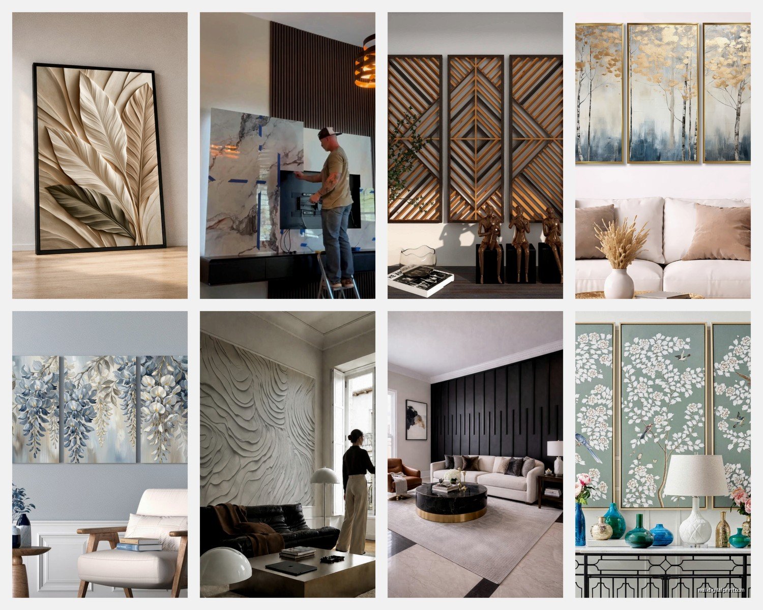
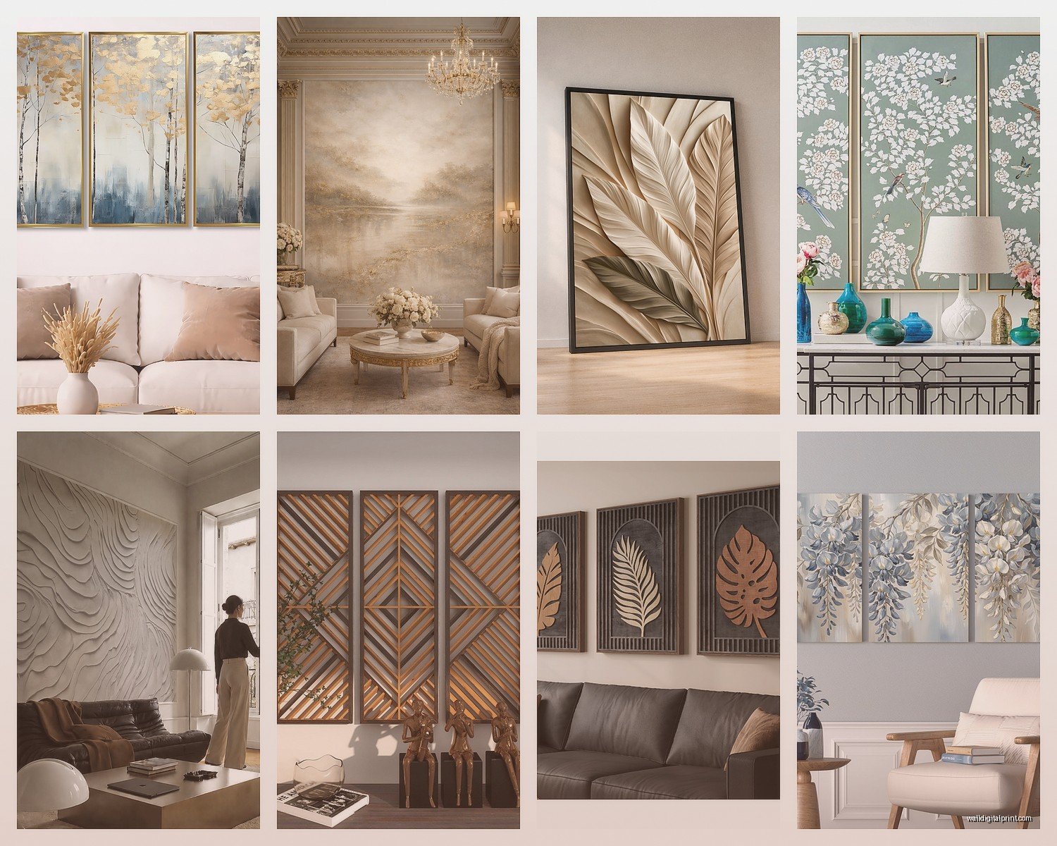
Okay so first thing – people always buy panels that are too small. Like, always. I did this in my own place before I knew better and ended up with these three tiny canvases that looked like they were floating nervously above my couch. The rule I use now with clients is that your multi-panel setup should take up about two-thirds to three-quarters of your furniture width. So if you’ve got an 8-foot sofa, you’re looking at roughly 5-6 feet of total wall art width when you account for the spacing between panels.
But here’s where it gets tricky – that measurement includes the gaps between panels. Most people forget this and end up with something way bigger than their wall space. I usually do 2-3 inches between each panel, sometimes up to 4 inches if the panels are really large, like over 30 inches each.
Three Panel vs Five Panel Situations
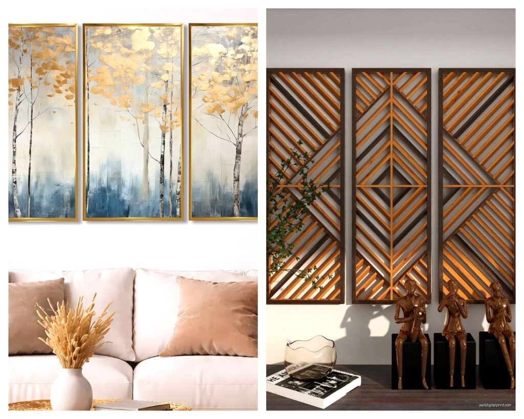
Three-panel sets (triptychs, if we’re being fancy) work best for most living rooms. They’re easier to hang, they don’t overwhelm smaller spaces, and honestly they’re just more forgiving if you mess up the spacing slightly. I’ve used them over sofas, behind console tables, basically anywhere you need a horizontal spread.
Five-panel sets are dramatic but you need the wall space for them. I’m talking at least 10-12 feet of clear wall, and the room itself should be pretty sizeable. Put a five-panel set in a small living room and it’s gonna feel like the walls are closing in. My client Sarah tried this last year and we had to return them because her 12×14 living room just couldn’t handle it… ended up going with a three-panel instead and it looked so much better.
Oh and another thing – odd numbers generally look more balanced than even numbers. Four-panel sets can work but they need really careful planning or they end up looking too symmetrical and kinda corporate.
The Hanging Process Nobody Talks About
Alright so hanging these things. You need a level, painter’s tape, a pencil, and honestly? A second person. I’ve tried doing five-panel sets alone and it’s just frustrating.
Start by finding your center point on the wall. For above a sofa, the center of your entire arrangement should be about 8-10 inches above the sofa back. Some people say 6 inches but that always looks too tight to me. The middle panel (if you have an odd number) goes in the center position.
Here’s my actual process that works:
- Measure your total wall space and furniture width
- Cut pieces of painter’s tape the exact size of each panel
- Stick them on the wall in your planned arrangement
- Step back like 10 feet and look at it
- Adjust the tape until it looks right
- Mark the top center of each tape piece with pencil
- Measure down from that mark to where your hanger needs to go
The tape method saved my life because I used to just eyeball it and inevitably one panel would be half an inch higher than the others and it would drive me insane.
What Actually Looks Good Content-Wise
This is gonna sound weird but abstract landscapes work better than you’d think for multi-panel setups. They flow across panels naturally and you don’t have to worry about important details getting cut off at panel edges. I’m obsessed with those ocean wave sets right now – the ones with teal and gold accents. They work in modern spaces but also in more traditional rooms if you pick the right frame color.
Photography panels can be stunning but you gotta be careful. A cityscape that’s split across three panels? Beautiful. A portrait of a face split across panels? Usually awkward unless the artist specifically designed it that way.
Geometric and abstract art is the safest bet honestly. You can’t really mess it up, it works with most color schemes, and it doesn’t go out of style as fast as something super trendy.
Color Coordination Without Being Matchy-Matchy
You want at least one or two colors from your panels to appear elsewhere in the room, but don’t go crazy trying to match everything. I just finished a living room where we used navy and gold panels, and we pulled in navy through throw pillows and a gold finish on the coffee table legs. That was enough.
The panels themselves don’t have to match your room perfectly – actually, they shouldn’t be exactly the same colors as everything else or they’ll just blend into the background. Pick art that has some of your room colors but also introduces something new.
Frame vs Canvas vs Acrylic
Okay so framed panels look more traditional and finished. They add weight (literally and visually) to your wall. Go with black frames for modern spaces, wood frames for warmer traditional rooms, and white or metallic frames for… actually white frames are tricky, they only really work in very specific aesthetics.
Unframed canvas has that gallery-wrapped edge thing going on where the image continues around the sides. These feel more casual and contemporary. They’re also lighter and easier to hang which matters when you’re dealing with five separate pieces.
Acrylic or metal prints are having a moment right now. They’re sleek, they reflect light in interesting ways, and they feel expensive even when they’re not. But they show fingerprints like crazy and if you have kids or pets who might brush against them… yeah, you’ll be cleaning them constantly. My cat knocked into my acrylic print last month and now there’s a nose smudge I can’t fully get off.
The Spacing Formula That Actually Works
I mentioned 2-3 inches earlier but let me break this down more. For three-panel sets where each panel is around 16×20 inches, I do 2.5 inches between panels. For larger panels like 24×36, I go up to 3-4 inches. The bigger the panels, the more breathing room they need.
Here’s what nobody tells you though – the space between panels should stay consistent, but the overall arrangement doesn’t have to be perfectly level if you’re going for a more modern look. I’ve done staggered arrangements where the middle panel hangs slightly lower than the side panels, maybe 2-3 inches. It creates movement and works really well with abstract art.
For five-panel sets, sometimes the middle panel is larger and the outer panels gradually get smaller. In those cases, the bottoms usually align rather than the tops, and it creates this cool cascading effect.
Budget Reality Check
You can find decent multi-panel sets for anywhere from like $50 to $500+. The cheap ones (under $80 for a three-panel set) are usually thin canvas that might arrive wrinkled or with printing issues. I’ve had okay luck with some budget options from online retailers, but you’re gambling a bit.
The $150-300 range is where you get better print quality, sturdier frames, and the colors actually look like the online photos. This is my sweet spot for most clients who want something good but aren’t trying to spend a fortune.
Over $500 and you’re getting into original art territory or really high-end prints with special finishes. Worth it if you have the budget and you’re planning to stay in your place for a while.
DIY Option If You’re Crafty
Okay so funny story, I made my own multi-panel set last winter when I was bored and it actually turned out decent. Bought three blank canvases from the craft store (they were having a 50% off sale), used acrylic paints in colors that matched my living room, and just did an abstract design across all three. The trick is to lay all the canvases next to each other while you paint so the design flows naturally.
It’s not gonna look professional unless you have actual painting skills, but for a home office or a more casual space? Totally works and costs like $40 total.
Common Mistakes I Keep Seeing
Hanging them too high. I can’t stress this enough. The center of your art should be at eye level, which is usually around 57-60 inches from the floor. When it’s above furniture, you adjust down from there, but I still see people hanging stuff way up near the ceiling and it looks so disconnected from the rest of the room.
Not considering the room’s viewing angles. You might hang your panels to look perfect from the main seating area, but then you walk in from the hallway and the spacing looks off. Walk around your room and check from multiple angles before you hammer in those nails.
Mixing too many styles. If you’re doing multi-panel art, that’s already a statement piece. Don’t also have three other random art pieces on the same wall competing for attention. Let your panels be the focal point.
Using those cheap plastic hooks rated for like 5 pounds when your panels are definitely heavier. Just use proper picture hangers or wall anchors depending on your wall type. Drywall anchors are your friend if you’re not hitting studs.
What Works in Different Living Room Styles
For modern minimalist spaces, go with black and white photography panels or geometric abstracts. Clean lines, limited color palette, maybe some metallic accents. Keep frames simple or skip them entirely.
Traditional living rooms do well with landscape scenes, botanical prints, or classical art reproduced across panels. Wood frames in walnut or cherry tones look great here.
Bohemian or eclectic spaces can handle more color and pattern. Think vibrant abstracts, mixed media looks, or even tapestry-style panels. You can get away with mixing frame colors in boho spaces too.
Industrial style rooms need something with edge – black and white cityscapes, abstract metallics, or even vintage advertising prints split across panels. Metal frames or frameless options work best.
The Lighting Consideration
This is something I forgot to mention earlier but it matters – if your living room has a lot of natural light, be careful with glossy finishes on your panels. They’ll create glare at certain times of day. Matte or satin finishes are more forgiving.
If you’re gonna light your panels with picture lights or track lighting, factor that into your hanging height and spacing. The light should hit the art evenly, which sometimes means adjusting your panel positions slightly.
Wait I should mention – some multi-panel sets come with LED backlighting now, which sounds gimmicky but can actually look really cool in the right space. Saw this at a client’s house where they had a three-panel city skyline with subtle backlighting and it created this nice glow effect at night. Not for everyone but worth considering if you want something different.
Seasonal Switching Strategy
Some people buy multiple sets and switch them out seasonally. I have one client who does warm-toned abstracts in fall/winter and switches to coastal blues in spring/summer. It’s extra, but if you get bored easily and have storage space, why not. Just make sure you’re using the same hanging hardware positions so you’re not making new holes every time you switch.
Okay so that’s basically everything I’ve learned from hanging way too many of these things in the past few years. The main thing is just to measure twice, use that painter’s tape method, and don’t be afraid to adjust before you commit to hammering anything into your walls.