Wall Art Guide, Wall Art Tutoriels
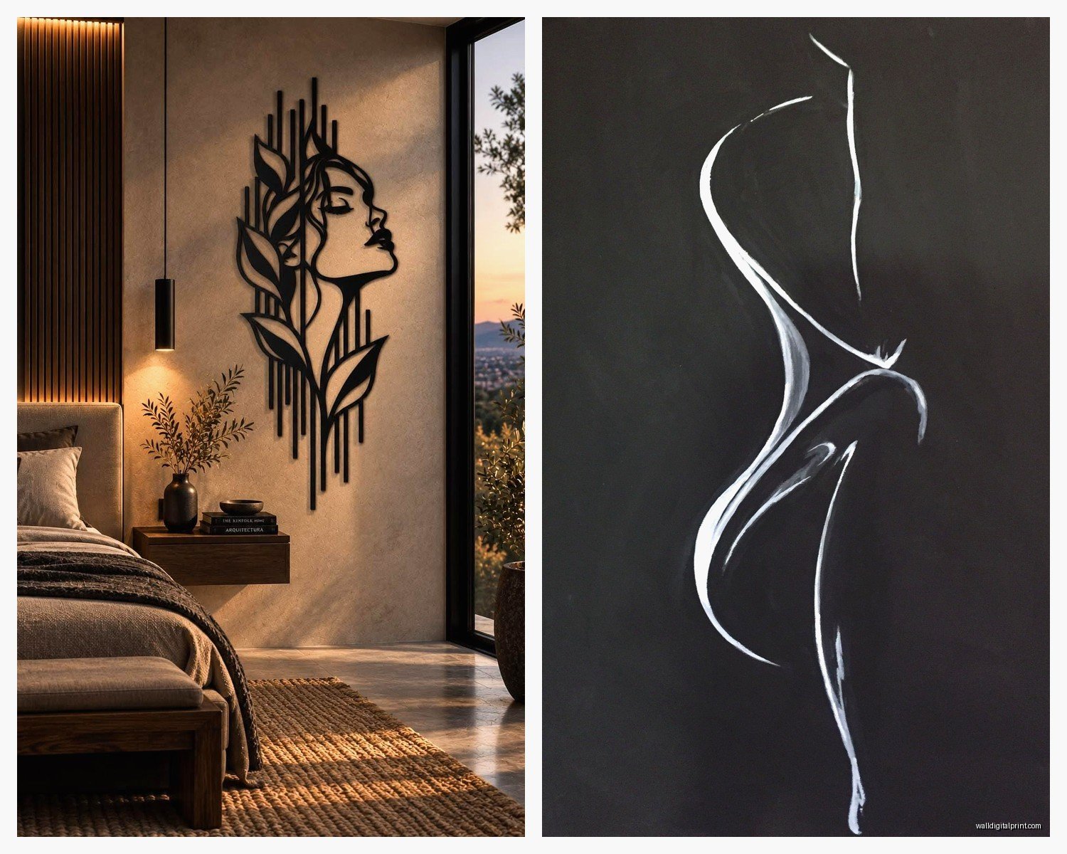
Female Silhouette Wall Art: Woman Figure Shadow Profile
Oct
So I’ve been obsessing over female silhouette wall art lately and honestly it started because a client wanted something “elegant but not too formal” and I went down this whole rabbit hole. Let me just dump everything I learned because picking the right piece is actually way more complicated than it looks.
Figure Out Your Actual Style First
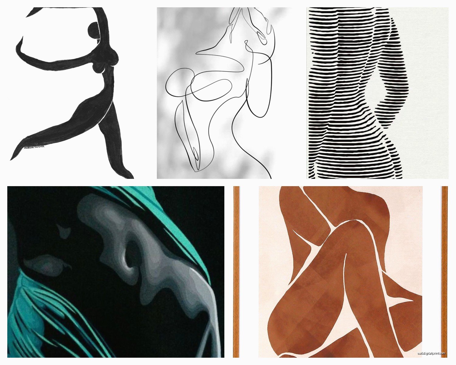
Okay so this sounds obvious but you gotta be honest about what you’re actually going for. I see people buy these gorgeous minimalist line drawings and then their room is like… full cottage core, and it just doesn’t work. Female silhouettes come in basically a few categories:
- The super minimal single-line continuous drawings (very trendy right now)
- Filled black silhouettes, like actual shadow profiles
- Abstract/geometric interpretations of the female form
- Vintage-style cameo profiles (think Jane Austen era)
- Modern artistic nudes with partial shadowing
I made the mistake of buying three different line art pieces from Etsy last month and they all arrived and… they clashed with each other so badly. One was thick lines, one was super delicate, one had this weird mixed media thing going on. They’re all in my storage closet now which is just embarrassing.
Size Actually Matters Way More Than You Think
This is gonna sound weird but I measure everything now with painter’s tape before I buy. Like I’ll cut pieces of tape to the exact dimensions and stick them on the wall because our brains are terrible at visualizing measurements. A 24×36 print sounds huge when you’re ordering online but then it shows up and looks like a postage stamp on your wall.
For female silhouette art specifically, I’ve found:
- Above a bed or sofa: you want at least 2/3 the width of the furniture, so probably 40-60 inches wide
- Narrow wall spaces: vertical orientations work better, go for something 12×36 or 16×48
- Gallery walls: mix sizes but keep one “anchor” piece that’s at least 20×24
- Small accent walls: a single statement piece around 30×40 looks intentional
My living room has this awkward space next to the window and I tried a 16×20 there first and it just looked lost. Went up to 24×36 and suddenly the whole corner made sense.
Material and Medium Changes Everything
Oh and another thing – the material you choose completely transforms the vibe. I’ve tested most of these at this point:
Canvas prints give you that gallery feel but they can look cheap if the print quality is bad. Make sure you’re getting at least 300 DPI resolution. I learned this the hard way with a gorgeous profile I found on Etsy that arrived looking pixelated and fuzzy. The seller was great about refunds but still.
Framed prints are my go-to now because you have more control. You can pick your mat color, frame finish, everything. Black frames with white mats are classic for silhouette art, but I did a gold frame with a cream mat recently and it elevated this simple woman’s profile into something that looks way more expensive than it was.
Metal prints are having a moment and they work really well for modern silhouettes. The way light hits them is pretty cool, adds dimension. But they’re pricey and if your style is more traditional or bohemian, they’ll feel out of place.
Acrylic prints have this depth that’s hard to describe… the image kind of floats? They’re stunning for minimalist line drawings. I used one in a client’s office and people always ask about it.
Wait I forgot to mention – if you’re going the canvas route, stretched canvas looks more finished than rolled canvas that you have to frame yourself. Unless you’re actually gonna take it to a framer, which honestly most people don’t end up doing.
Where to Actually Buy These Things
Okay so funny story, I’ve probably ordered from like 15 different places testing this out. Here’s what I’ve learned:
Etsy is great for unique pieces and you’re supporting independent artists which feels good. But quality is wildly inconsistent. Read the reviews, look at customer photos, and don’t be afraid to message the seller with questions. I always ask about paper weight for prints (you want at least 200gsm) and whether they use archival inks.
Society6 and Redbubble have tons of options and you can get the same design on different materials which is helpful for testing. The quality is pretty reliable but it’s all print-on-demand so nothing feels super special or unique.
Desenio and Printler if you want that Scandinavian minimal vibe. Their silhouette art is chef’s kiss, very clean and modern. Shipping takes forever though if you’re not in Europe.
Local art fairs are actually where I’ve found my favorite pieces. There’s something about seeing the actual artwork in person… plus you can talk to the artist about custom sizing sometimes.
My cat just knocked over my coffee so there’s that… anyway.
Placement Tips That Actually Work
The standard “hang at eye level” rule kinda works but also kinda doesn’t for silhouette art. These pieces are meant to be contemplative, you know? I usually go slightly lower than traditional eye level, around 57-60 inches to the center of the artwork.
For female profile silhouettes specifically, think about the direction she’s facing. I know this sounds super specific but if the profile faces into the room, it creates this welcoming feeling. If she faces toward a wall or corner, it can feel closed off. I switched one piece in my bedroom because the woman was facing the wall and it just felt… wrong? Hard to explain but it mattered.
Bathroom – yes actually! A small elegant silhouette in the bathroom can be gorgeous. Just make sure it’s properly sealed or framed with glass if you have a steamy shower situation.
Bedroom – over the bed is classic but I also love a silhouette on the wall opposite the bed so it’s the first thing you see when you wake up. Makes getting up slightly less terrible.
Entryway – a bold female form silhouette makes such a statement here. Sets the tone for your whole place.
Home office – I put a series of three small profile silhouettes above my desk and they’re somehow both inspiring and calming? Don’t ask me how that works.
Color Considerations Beyond Just Black
Everyone thinks silhouette art has to be black but that’s actually not true at all. I’ve been experimenting with:
- Navy blue silhouettes on cream – sophisticated and softer than stark black
- Terracotta or rust colored figures – very earthy and warm
- White or cream silhouettes on dark backgrounds – dramatic and unexpected
- Metallic gold or copper outlines – adds glamour without being over the top
The black-on-white classic never goes out of style though. It’s like the little black dress of wall art.
Mixing and Matching Without It Looking Messy
Wait I forgot to mention earlier – if you’re doing multiple pieces, you gotta have a unifying element or it’ll look like you just grabbed random stuff. That element could be:
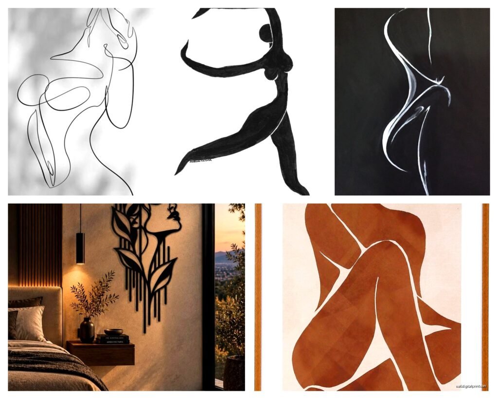
The color palette (all pieces use the same 2-3 colors), the style (all line drawings OR all filled silhouettes, not mixed), the frames (matching frames make mismatched art look intentional), or the subject matter (all female forms in different poses).
I made a gallery wall last month with five different female silhouettes and the trick was keeping them all in the same color family – blacks, grays, and one deep burgundy accent. Different artists, different styles, but it worked because of that color cohesion.
DIY Option If You’re Feeling Crafty
Okay so this is gonna sound weird but you can actually make your own silhouette art and it’s not that hard? I did this when I was binge-watching that Netflix show about the chess player and needed something to do with my hands.
You need a photo with good lighting and contrast, photo editing software (even free stuff like GIMP works), and a way to print large format or you can use a projector. Convert the photo to high contrast black and white, clean up the edges, and boom – custom silhouette. I did one of my best friend in profile as a birthday gift and she cried, it was very sweet.
There are also these peel-and-stick vinyl silhouettes you can buy that go directly on the wall. They’re removable which is great for renters. I used them in a staging project and they photographed beautifully. The application is kinda tricky though – you gotta really smooth out all the bubbles or it looks amateur.
Common Mistakes I See Everyone Make
Hanging it too high – seriously, lower than you think
Choosing a frame that’s too ornate – let the silhouette be the focus
Not considering the negative space – the empty space around the figure is part of the art
Buying without considering what’s already on nearby walls – step back and look at the whole room
Getting caught up in trends – that super specific minimalist boob line drawing might feel dated in two years
I’m probably forgetting stuff but that’s the main things. Oh! Lighting. You need decent lighting for silhouette art because shadows and darkness are literally part of the aesthetic. A picture light or even just making sure there’s good ambient light in the room makes such a difference.
The investment range is wild too – you can find printable downloads for like $5 or original charcoal silhouettes for thousands. I usually tell people to spend around $50-150 for a quality print with framing unless it’s a really special piece or large statement artwork.
Just start with one piece you genuinely love and build from there. Don’t try to do a whole gallery wall at once because your taste will probably evolve as you live with the first piece. That’s what happened to me anyway – I bought one minimal line drawing of a woman’s profile and now somehow I have 12 pieces and I’m still not done apparently.