Wall Art Guide, Wall Art Tutoriels
Printable Fashion Wall Art: Free Style Downloads
Oct
So I’ve been downloading printable fashion wall art for like three years now and honestly it’s become kind of an obsession. My living room wall started with one Chanel print and now I have this whole gallery situation happening that cost me basically nothing except printer ink.
Where to Actually Find the Good Free Stuff
Okay so first thing – not all free printables are created equal. I learned this the hard way when I downloaded what looked like a gorgeous Dior illustration and it printed out all pixelated and weird. You need to look for files that are at least 300 DPI, which stands for dots per inch. Anything less and it’s gonna look blurry when you print it larger than like a postcard.
Unsplash and Pexels are my go-to spots for high-resolution fashion photography. They’re not specifically printable art sites but the quality is insane. I found this incredible black and white photo of vintage Vogue magazines stacked up and printed it as an 11×14 and it’s literally one of my favorite pieces. The search terms matter though – try “fashion flat lay,” “vintage fashion,” “designer bags,” stuff like that.
Pinterest is obviously where everyone starts but here’s the thing… you gotta reverse image search half of what you find there because people pin stuff without linking to the actual high-res version. I use Google’s reverse image search constantly. You right-click the image (or long press on mobile) and search for it, then look for the largest file size available.
Sites I Actually Use Weekly
- The Graphics Fairy – she has tons of vintage fashion illustrations that are public domain
- Rawpixel – their free section is surprisingly good, lots of vintage Vogue covers
- Met Museum and Rijksmuseum – both have free download sections with fashion illustrations from like the 1800s that look SO expensive when framed
- Etsy freebies – some shops offer free samples, just filter by price: low to high
Oh and another thing, Creative Market does free goods every week. You have to sign up but they email you six free designs every Monday and there’s usually at least one fashion-related thing. I got this amazing set of perfume bottle illustrations last month.
The Printing Part That Everyone Messes Up
Okay so this is where I see people waste money. Your home printer is fine for smaller prints (like 5×7 or 8×10) if you use the right paper. I use HP Premium Plus Photo Paper and it makes such a difference compared to regular printer paper. It’s like $15 for 25 sheets on Amazon which sounds expensive but it’s still way cheaper than buying pre-made art.
For anything bigger than 8×10 though, just go to a print shop. I use my local FedEx Office and the quality is chef’s kiss. An 11×14 costs like $3 to print. A 16×20 is around $8. Compare that to buying a fashion print on Etsy for $30 plus the printing cost they build in.
Wait I forgot to mention – when you’re saving files for printing, make sure you’re getting them in the right format. PDFs and high-res JPEGs work best. PNG files are fine too but they’re usually bigger file sizes. And please, PLEASE don’t try to print something you screenshot from Instagram. I did this once with a Hermès scarf design and it looked terrible, all grainy and sad.
My Actual Process Start to Finish
So let’s say you found a print you love. Here’s what I do:
- Check the file size – if it’s under 1MB it’s probably too small for printing
- Open it in Preview (Mac) or Paint (Windows) and check the dimensions in inches at 300 DPI
- Decide what size frame you want – I buy frames first now because I learned that finding a 13×17 frame is basically impossible
- Adjust the image size if needed (I use Canva’s free version for this, super easy)
- Print a test on regular paper first to check colors and positioning
- Print the final version on photo paper or take the file to a print shop on a USB drive
The color thing is real by the way. Your screen shows colors differently than they print. I had this beautiful blush pink Prada print that came out way more orange when I printed it at home. Now I always do a regular paper test first.
Frame Situations That Actually Work
This is gonna sound weird but don’t sleep on thrift stores for frames. I found three matching gold frames at Goodwill for $4 each and they look like something from Anthropologie. Just clean the glass really well and maybe spray paint the frame if it’s dated.
IKEA’s RIBBA frames are like the unofficial official frames of the printable art world. They’re cheap, they look clean and modern, and they come in all the standard sizes. I have probably twelve of them throughout my apartment. The black ones especially make fashion prints look really high-end.
Framebridge has this thing where your first frame is 15% off and honestly their quality is amazing if you want to splurge on one statement piece. I did this with a large Chanel No. 5 illustration for my bedroom and it looks like I paid hundreds for it.
Oh and matting makes EVERYTHING look more expensive. You can buy pre-cut mats on Amazon for like $6. An 8×10 print in an 11×14 frame with matting suddenly looks gallery-worthy.
Style Combinations That Don’t Look Messy
Okay so you’ve got your prints… now what? I see a lot of people just randomly stick fashion prints everywhere and it looks chaotic. Here’s what actually works:
The monochrome approach: All black and white prints in matching black frames. This is literally foolproof. I did my hallway this way with vintage fashion sketches and it looks so cohesive.
The color story method: Pick 2-3 colors and only use prints that fit that palette. My office is all blush pink, cream, and gold fashion illustrations. Very Parisian apartment vibes.
The size variation thing: Mix large and small frames but keep the style consistent. Like all gold frames in different sizes, or all floating frames. The varying sizes add interest but the matching frames keep it from looking random.
My cat knocked over one of my frame arrangements last week and honestly it forced me to rearrange everything and it looks better now, so maybe chaos is good sometimes? I dunno.
Specific Print Ideas That Work
Since I’m literally looking at my walls right now, here’s what actually gets compliments:
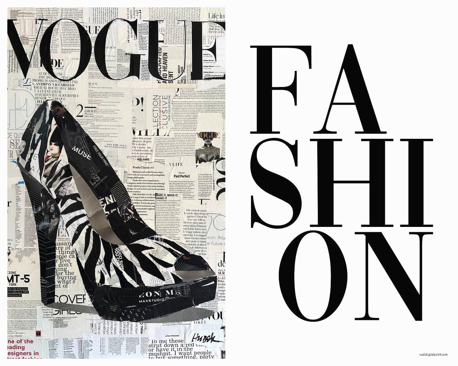
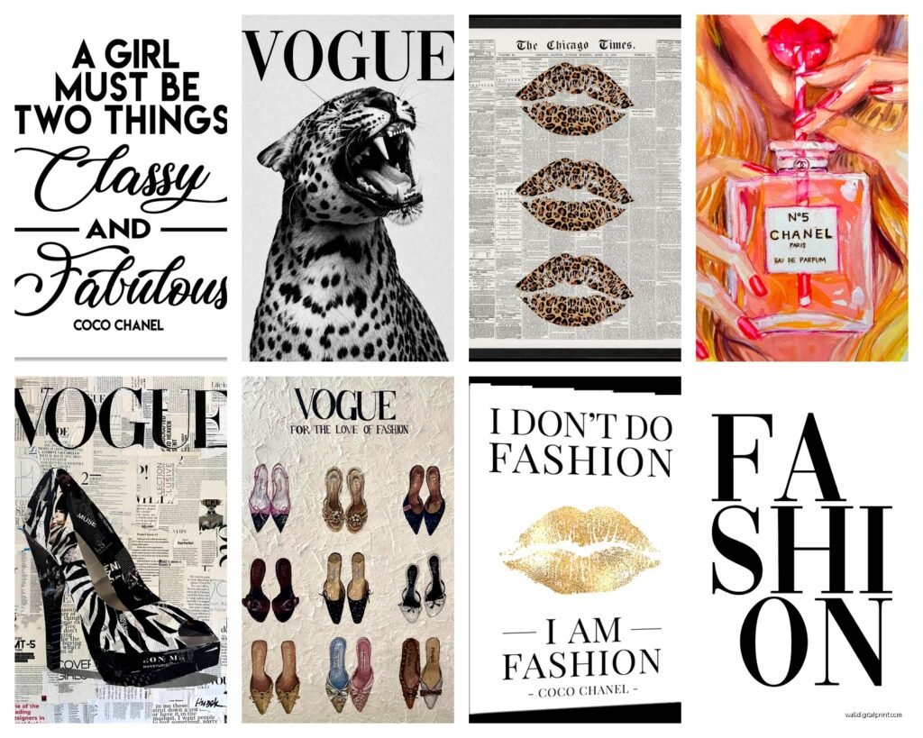
- Vintage Vogue or Harper’s Bazaar covers – the 1950s-70s ones especially
- Fashion illustration sketches (the loose, watercolor style ones)
- Designer bag flat lays – Chanel, Hermès, Dior
- Perfume bottle collections
- High heel illustrations in profile
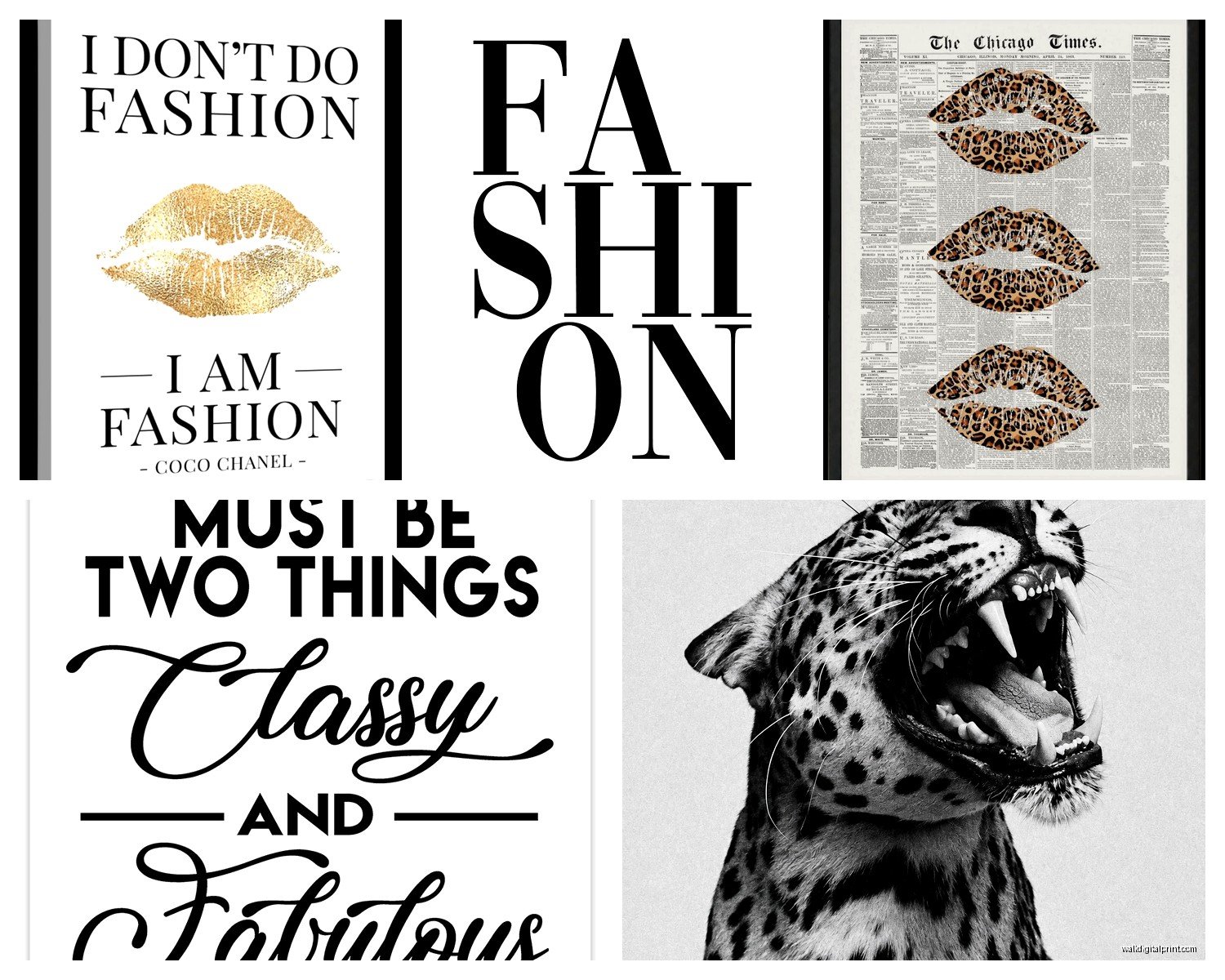
- Fashion quotes in pretty typography (but not the cheesy ones, more like actual Coco Chanel quotes)
- Vintage fashion advertisements
- Fabric swatches or pattern designs
The stuff that doesn’t work as well in my experience: anything too trendy or with current models (it dates itself), super colorful busy patterns (hard to match with decor), anything with visible watermarks obviously.
The Copyright Thing I Should Probably Mention
So legally speaking, you can’t just download any image off Google and print it for your wall. Technically. In reality, if you’re printing something for personal use in your own home, no one’s coming after you. But if you’re doing this for a client or selling stuff, you need to use public domain images or properly licensed ones.
Public domain means the copyright has expired – usually things from before 1928 in the US. That’s why all those vintage fashion illustrations are safe. The museum websites I mentioned earlier specifically say their images are free to use. And sites like Unsplash have licenses that allow personal printing.
I’m not a lawyer obviously, this is just what I’ve figured out through my own research and talking to other designers. When in doubt, look for the license info or stick to sites that explicitly say “free for personal use.”
Troubleshooting the Common Problems
Colors look different when printed: Your monitor is probably way brighter than your prints will be. I adjusted my monitor brightness down and it helps me preview more accurately. Also some print shops let you request a proof before they do the final print.
Image is too small for your frame: You can sometimes upscale images using AI tools now. I’ve used Bigjpg.com for this and it works decently well for illustrations, less so for photographs. Or just accept you need a smaller frame.
Prints look cheap in the frame: It’s usually the paper quality or the frame quality. Upgrade one or both. A $3 print on good photo paper in a $15 frame looks way better than a $3 print on copy paper in a $3 frame.
Can’t decide on a layout: Tape paper templates to your wall first. Seriously, this saves so much time and wall damage. I use painter’s tape and newspaper cut to frame sizes.
Wait okay so funny story – I once spent two hours arranging four prints on my wall, stepped back, and realized they spelled out “HELP” unintentionally because of how the designs lined up. Had to completely redo it but my sister still brings it up.
Making It Look Intentional vs Collected
There’s this fine line between “curated gallery wall” and “I printed random stuff from Pinterest.” The difference is honestly just repeating elements. Same frames, or same color palette, or same subject matter, or same orientation (all vertical or all horizontal).
I have one wall that’s all fashion illustrations in the same sketchy style, all in white frames, all the same size. Super matchy but it works. Then I have another wall that’s all different – vintage ad, modern photo, illustration – but they’re all black and white so it still feels cohesive.
The rule I follow is: if you’re mixing styles, keep frames consistent. If you’re mixing frames, keep the art style consistent. Mixing both usually looks messy unless you really know what you’re doing.
Also odd numbers work better for arrangements. Three prints, five prints, seven prints. Even numbers can work but they need to be really symmetrical or they look off-balance.
My workspace has nine small prints (all 5×7) in a grid and it’s one of my favorite things. Cost me maybe $30 total including frames from IKEA. People assume it’s expensive custom art and I’m just like… yeah I printed these on a Tuesday afternoon while watching Netflix.
The best part about printable art is you can change it whenever you want. I swap out prints seasonally sometimes – more colorful fashion illustrations in summer, moody black and white stuff in winter. Try doing that with expensive art and you’d go broke. This way it’s just the cost of printing and maybe some new frames if you want different sizes.