Wall Art Guide, Wall Art Tutoriels
Wall Art for Dining Room Contemporary: Modern Eating Space
Oct
So I’ve been obsessing over dining room wall art lately because honestly, getting it wrong makes the whole space feel like a doctor’s waiting room, and I’ve seen this happen too many times. Let me just dump everything I know about this.
The Size Thing Everyone Gets Wrong
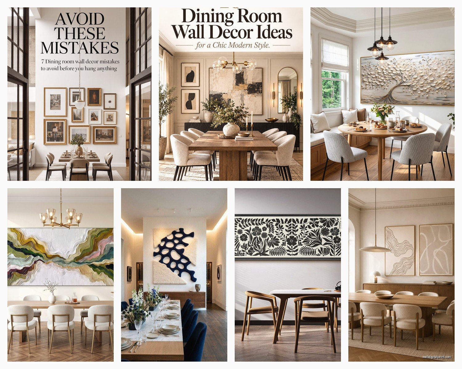
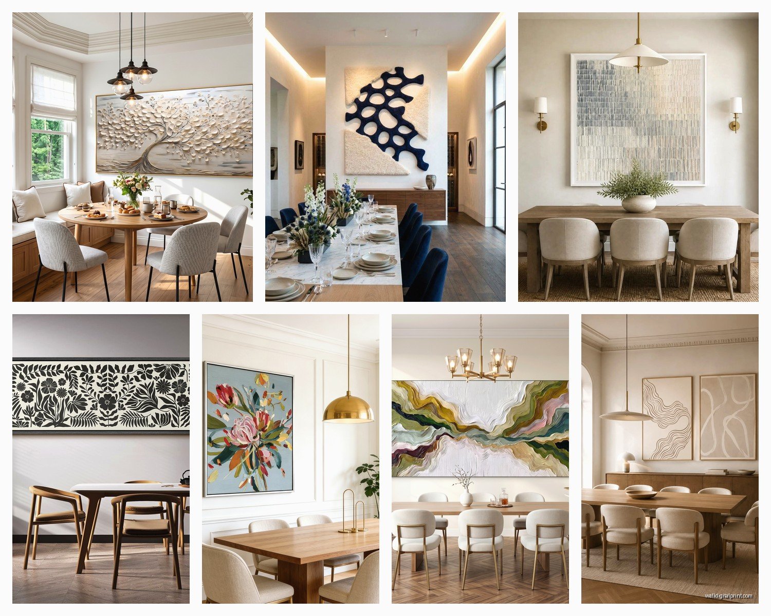
Okay so here’s what drives me crazy. People buy art that’s way too small. Like, I get it, you’re scared of commitment, but that 16×20 print above your dining table just looks sad and lost. Here’s the actual rule I use: your art should take up about two-thirds to three-quarters of your wall space width-wise. So if your dining table is 60 inches, you’re looking at art that’s around 40-45 inches wide minimum.
Or go with a gallery wall situation but then you need to think of the whole collection as one piece, you know? The entire grouping should hit that two-thirds mark.
I learned this the hard way when I hung this beautiful abstract piece in my own dining room and it looked like a postage stamp for like three months before I admitted defeat and sized up. My dog kept staring at it like even he knew something was off.
Statement Pieces vs Gallery Walls
One big piece is honestly easier if you’re not super confident about arranging stuff. I usually tell people to go this route first. Look for:
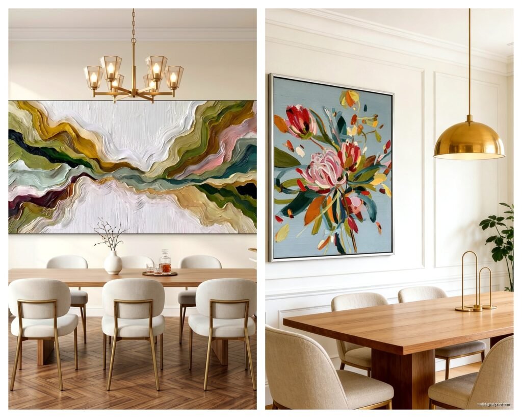
- Large scale abstracts in blacks, whites, grays with maybe one accent color
- Oversized photography, black and white works really well
- Contemporary line drawings, the minimalist ones are huge right now
- Textural pieces like woven fiber art or 3D installations
Gallery walls are trickier but they let you mix styles and price points which is nice when you’re not trying to drop $800 on one piece. I usually do odd numbers, like 3, 5, or 7 pieces, and keep them within the same color family even if the styles are different.
What Actually Works in Contemporary Spaces
The contemporary look is clean, right? So you don’t want anything too busy or traditional. Skip the ornate frames and pastoral landscapes unless you’re doing it ironically, which… just don’t.
What I’m seeing work really well:
Abstract expressionism – Bold brushstrokes, limited color palette. Think navy, charcoal, cream, maybe a pop of rust or emerald. These add energy without being chaotic.
Line art – Simple black lines on white or cream backgrounds. Faces, bodies, botanicals done in that continuous line style. Super elegant and they photograph well if you’re into that.
Geometric patterns – Circles, triangles, clean shapes. But keep it sophisticated, not like elementary school art class, you know what I mean?
Black and white photography – Architecture, nature, abstract compositions. Large format looks incredible and feels timeless.
Monochromatic paintings – All one color in different shades. I did this textured cream-on-cream piece for a client and it’s stunning in person, though it photographs like nothing.
Color Coordination Without Being Matchy-Matchy
Okay so funny story, I used to match art to throw pillows and it looked so staged and terrible. Here’s what actually works:
Pull one or two colors from your art and echo them elsewhere, but not everywhere. Like if your art has a terracotta accent, maybe your dining chairs have terracotta cushions OR there’s a terracotta vase on the sideboard. Not both. And definitely not terracotta napkins too because then it’s a theme restaurant.
Neutrals are your friend. If your dining room is mostly white, gray, beige, black, whatever, you can go bolder with art. But if you’ve already got colorful furniture or wallpaper, keep the art more subdued.
I’m currently watching this show where they just paint everything gray and honestly the dining rooms look better than half the ones I see that are trying too hard with color.
Metallics Are Tricky
Gold and silver frames can work but they gotta be the right tone. Brushed brass or matte gold is very contemporary. Shiny yellow gold reads traditional. Silver works if it’s sleek and modern, not ornate.
Or just skip frames entirely. Canvas wraps, floating frames, or mounting prints directly to boards is very now and saves money usually.
Lighting Makes or Breaks Everything
Wait I forgot to mention this earlier but lighting is like 50% of whether your art looks good. You can have the perfect piece and if it’s in a dark corner it might as well not exist.
Picture lights are classic but they can look fussy. I usually prefer:
- Track lighting or rail systems you can adjust
- Recessed lights with adjustable trim
- Wall washers that illuminate the whole wall evenly
- Even just making sure your chandelier or pendant lights are positioned to cast light on the wall
If you’re renting or don’t wanna deal with electrical, battery-operated picture lights have gotten surprisingly good. There’s this one brand… I can’t remember the name but it’s on Amazon and it’s like $40 and actually works.
Where to Actually Buy This Stuff
This is gonna sound weird but some of my favorite contemporary pieces come from places you wouldn’t expect.
Minted has really elevated their game. Limited edition prints, good quality, and they do custom framing that doesn’t look cheap.
Artfully Walls does this rental program which is perfect if you get bored easily or wanna test before committing.
Society6 and Etsy for independent artists. You can find really unique stuff and support actual people instead of mass-produced whatever. Just read reviews about print quality because it varies wildly.
West Elm and CB2 for the safe contemporary choices. Nothing groundbreaking but they know their aesthetic.
Local galleries and art fairs if you want original work. I know it’s more expensive but the energy is different, and you can actually meet the artist which is cool.
Online auctions and estate sales for vintage contemporary pieces from the 60s-80s. There’s amazing stuff out there for reasonable prices if you’re patient.
Oh and another thing, print-on-demand sites let you upload your own photos or designs. I’ve done custom family photos printed huge and in black and white and it looks way more artistic than you’d think.
The Actual Hanging Process
Center your art at eye level, which is usually around 57-60 inches from the floor to the center of the piece. But in dining rooms, people are sitting, so sometimes I go slightly lower, like 56 inches.
If you’re hanging above a sideboard or buffet, leave 6-8 inches between the furniture and the bottom of the frame. Any more and they look disconnected, any less and it’s crowded.
Use proper hardware. Please. Not those sad little sawtooth hangers that come with cheap frames. Get:
- D-rings and wire for anything under 20 pounds
- Heavy duty wall anchors if you’re not hitting studs
- French cleats for anything really heavy or expensive
- A level because eyeballing it never works, I’ve tried
For gallery walls, trace your frames on paper, tape the paper to the wall, arrange it until it looks right, then mark your nail holes through the paper. Way easier than guessing.
Stuff That’s Trendy Right Now
Look, trends are whatever, but if you wanna know what’s happening in contemporary dining rooms:
Organic shapes and forms – Blobs, curves, abstract bodies. Very popular and actually pretty timeless despite being trendy.
Earth tones – That whole terracotta, sage, ochre, clay palette. Works beautifully in dining spaces.
Maximalist gallery walls – Like salon-style hanging with frames touching or overlapping. Harder to pull off but looks amazing when done right.
Textile art – Weavings, macramé, fiber art. Adds texture and warmth which dining rooms often need.
Digital art and NFTs – Okay this is still niche but digital frames displaying rotating art are becoming a thing. I’m not totally sold but I’ve seen it work.
Oversized botanical prints – But contemporary ones, not vintage-y. Think dramatic close-ups or abstract plant forms.
What’s Feeling Dated
Honestly those “EAT” signs and the fork/spoon/knife wall decor. It’s too literal. Your dining room doesn’t need to announce what it is.
Also those inspirational quote prints in script fonts. Just… no.
The distressed farmhouse vibe is fading too, unless you’re actually going full farmhouse, which isn’t contemporary anyway.
Mixing Styles Without Looking Confused
You can totally mix contemporary art with other styles of furniture. Actually it usually looks better than matching everything.
Mid-century modern furniture with contemporary abstract art? Perfect.
Industrial dining table with minimalist line drawings? Great.
Even traditional dining chairs can work with modern art if the art is sophisticated enough and the room has other contemporary elements.
The key is intentionality. It should look like you chose each piece deliberately, not like you just hung whatever you had.
Budget Real Talk
You don’t need to spend thousands. Seriously. Some of my favorite dining room art installations cost under $200 total.
Frame your own prints – IKEA frames are fine, really. Or check HomeGoods and TJ Maxx, they sometimes have great frames.
Print your own art from digital downloads. There are so many artists selling digital files for like $5-15 and you can print them at any photo lab or even Staples.
Thrift stores and secondhand shops are goldmines. You can paint over ugly art or just use the frames.
DIY abstract art is easier than you think. Canvas, acrylic paint, painter’s tape for clean lines. I’ve done this with clients who were nervous and it always turns out cool because abstract is forgiving.
Student art shows and community college galleries have original work for reasonable prices.
Oh wait, I forgot to mention poster sales at museums. They sell high-quality prints of famous works for like $20-30. Get it framed nicely and it looks expensive.
Common Mistakes I Keep Seeing
Hanging stuff too high. I already mentioned this but it’s the number one problem.
Not considering the view from the table. You’re gonna be staring at this while you eat, make sure it’s positioned right from a seated perspective.
Ignoring scale completely. Tiny art, huge wall. Or worse, huge art, tiny wall so it overwhelms everything.
Forgetting about the ceiling height. In rooms with high ceilings, you might need to go bigger or hang things higher than standard or it all looks bottom-heavy.
Choosing art you think you “should” like instead of what you actually like. Your dining room, your rules.
Not securing stuff properly and then it falls during dinner parties. Very embarrassing, trust me.
The Vibe Thing
Think about how you use your dining room. Formal dinner parties? Go more sophisticated and dramatic. Casual family meals? You can be more playful.
Contemporary doesn’t mean cold. You can keep it warm with the right art choices – organic shapes, warm neutrals, textural pieces, wood frames instead of metal.
And honestly sometimes the best contemporary art for dining rooms is stuff that makes you hungry in a weird way. Rich colors, lush compositions, sensory textures. Not literal food art, but things that feel abundant and alive.
My client canceled last week so I spent like an hour comparing different abstract prints for my own space and I kept coming back to ones that had this depth and richness to them, layers of color and texture that make you wanna keep looking.
That’s really what you want – art that rewards attention, that reveals something new each time you sit down to eat. Not something you stop noticing after a week.
Anyway that’s basically everything I know about this. The main thing is just to commit to proper scale and hang it at the right height and you’re already ahead of like 80% of people.