Wall Art Guide, Wall Art Tutoriels
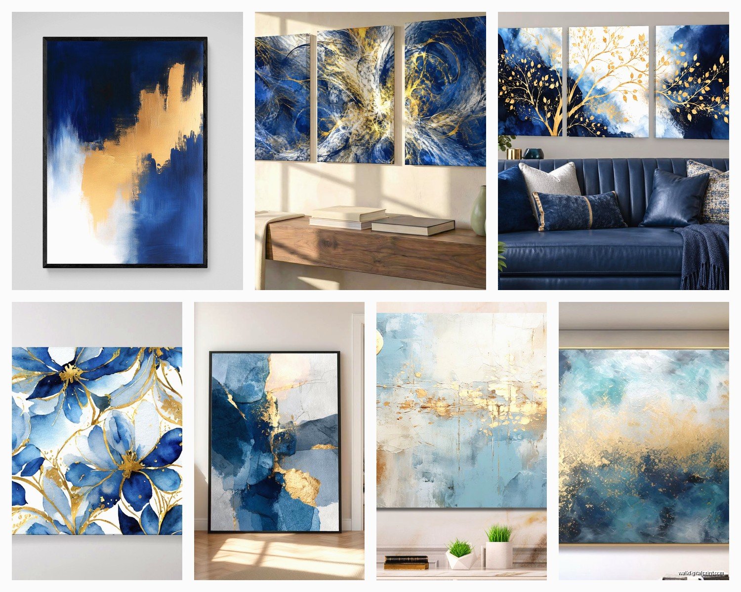
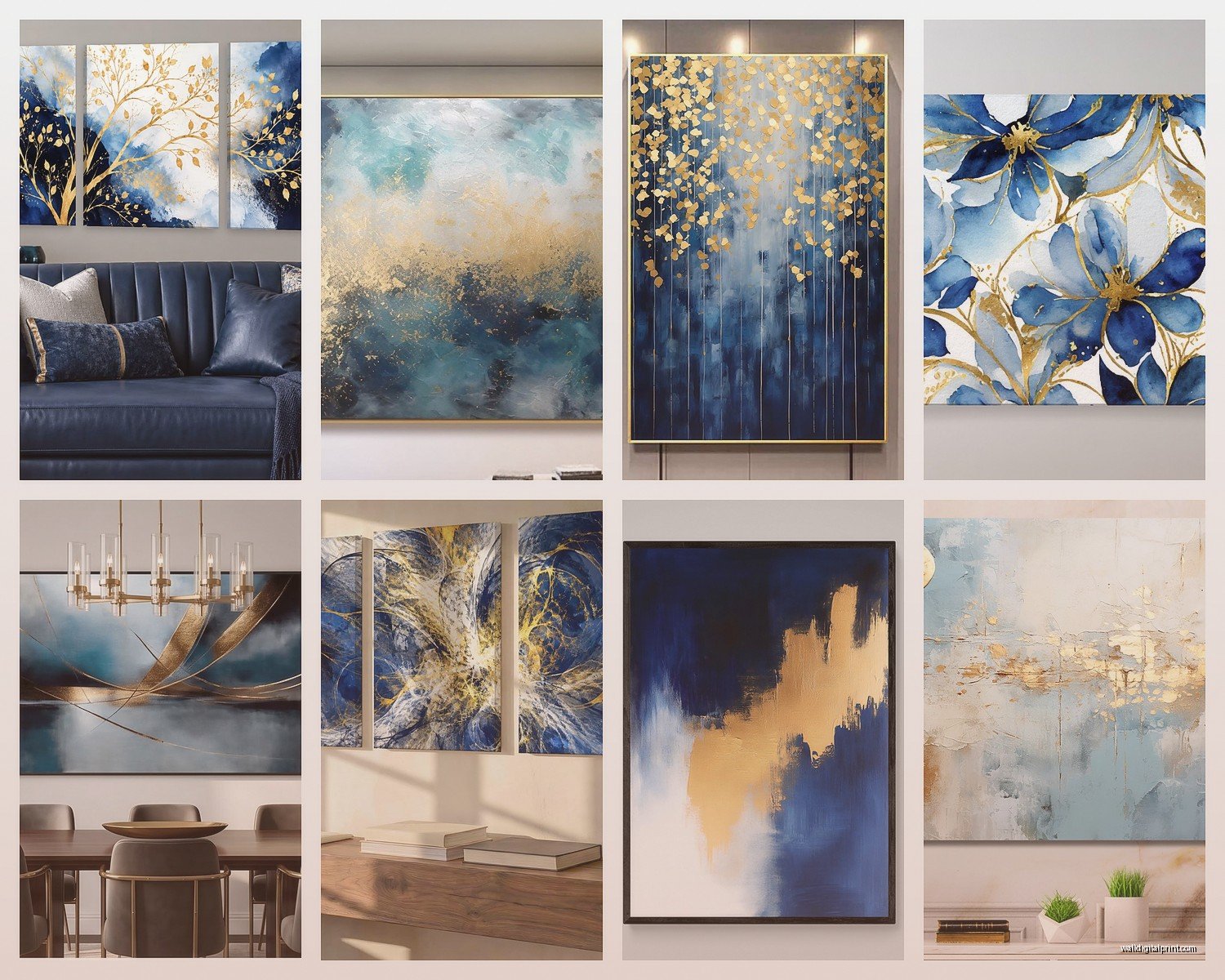
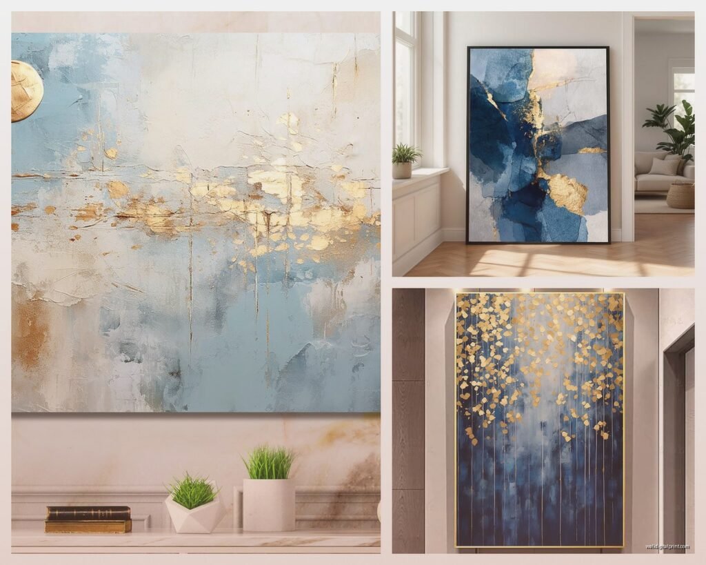
Blue and Gold Wall Art: Ocean Sky Metallic Luxury Combo
Oct
So I’ve been absolutely obsessed with blue and gold wall art lately and honestly it started because this client wanted something that felt “luxury hotel meets coastal calm” and I was like okay that’s actually…specific but also perfect? Anyway I went down this whole rabbit hole and now I’m gonna dump everything I learned on you because it’s way easier than people think but also there are some tricks.
Why This Combo Actually Works
Okay so the blue and gold thing isn’t just pretty, it’s got actual color theory behind it. Blue is inherently calming right, but it can read cold or flat if you’re not careful. Gold brings in warmth and catches light in a way that makes the whole composition feel alive instead of just…painted. The metallic element is key here because it shifts depending on the time of day and where your light sources are.
I tested this in my own living room first because I’m not gonna recommend something I haven’t lived with, and the way the gold catches afternoon light through west-facing windows? Completely different piece at 3pm versus 7am. My cat also approves because apparently she likes staring at reflective surfaces but that’s not really relevant.
Picking Your Blue Tones
This is where people mess up immediately. Not all blues work with gold and not all golds work with blues.
Navy and deep sapphire blues pair best with warmer golds, like that 14k gold color or even rose gold if you’re feeling adventurous. These create drama and work amazing in dining rooms or bedrooms where you want sophistication.
Teal and turquoise need cooler champagne golds or pale metallics. Too warm and it starts looking like a bad mermaid theme from 2015. I learned this the hard way with a piece I bought from this Etsy seller and had to return because the gold was too brassy against the turquoise and it just looked cheap.
Sky blues and powder blues are trickier than you’d think. They need substantial gold presence or they disappear. Like you need chunky gold leaf application or really bold metallic strokes otherwise the whole thing reads as just…blue.
Ocean blues which is kinda the sweet spot for this whole trend sit somewhere between navy and turquoise and they’re the most forgiving. They work with almost any gold tone which is why you see them everywhere right now.
Texture Matters More Than You Think
Flat printed blue and gold art is fine I guess but it doesn’t give you that luxury factor. You need actual texture and dimension.
Resin art is huge right now and for good reason. The depth you get from layered resin with gold leaf suspended in it or gold alcohol inks mixed through creates this almost 3D effect. I have one above my console table that’s ocean blue resin with gold leaf pieces throughout and people literally stop and touch it to see if it’s glass.
Canvas with heavy gel medium is another good option. Artists use thick gel to create waves or abstract shapes then add gold leaf on top. The texture catches shadows which adds another dimension entirely. Way more interesting than flat canvas prints.
Metallic paper prints are the budget-friendly version but you gotta frame them right. Regular glass flattens the metallic effect so you need spacers in the frame to create depth between the print and glass. This little trick makes a $40 print look like a $400 piece, not even kidding.
Oh and another thing, acrylic panels are becoming popular for this style. The art is printed on the back of clear acrylic so you get this glossy dimensional look and the gold elements seem to float. They’re pricey but the effect is pretty stunning.
Size and Scale Guidelines
Okay so this is gonna sound obvious but I see people mess this up constantly. Blue and gold art tends to be statement art, not filler art. You’re not buying something to fill a random gap.
For over a sofa you want something that’s at least two-thirds the width of the sofa. I actually prefer going closer to three-quarters because the bold color combo can handle it. If you go too small it looks like you’re afraid of the colors.
Single large scale pieces work better than gallery walls for this style, at least in my opinion. The whole vibe is about luxury and impact and gallery walls can dilute that unless you’re really careful about cohesion. That said I did do a gallery wall for a client with all ocean-themed blue and gold pieces in matching gold frames and it worked because everything was tonal.
Vertical pieces are underrated for this combo. A tall vertical blue and gold piece in an entryway or narrow wall space feels grand in a way that horizontal doesn’t always achieve.
Specific Placement Ideas That Actually Work
Above the bed: This is probably the most popular spot and for good reason. The calming blue helps with sleep vibes while the gold adds glamour. Go big here, like 48 inches wide minimum for a queen bed. I have a client who did an enormous abstract ocean piece with gold leaf and it’s basically the only art in her bedroom and it’s perfect.
Dining room: Blue and gold reads formal enough for dining spaces without being stuffy. The key is picking deeper blues here, not the light coastal vibes. You want richness when people are gathered around a table.
Bathroom: Okay hear me out because this sounds weird but a smaller blue and gold piece in a bathroom is unexpectedly luxurious. The moisture isn’t great for canvas so go with framed prints under glass or acrylic pieces. It turns a boring bathroom into a powder room situation.
Home office: Blue supposedly helps with focus and creativity and the gold keeps it from feeling too corporate. I put a blue and gold abstract piece behind my desk and I definitely feel fancier on Zoom calls now.
Finding Quality Pieces Without Spending Rent Money
So here’s the thing about blue and gold wall art, the price range is absolutely wild. You can spend $30 or $3000 and honestly sometimes the expensive stuff isn’t even better quality which is frustrating.
Etsy is your friend but you gotta know how to shop there. Search for “blue gold resin art” or “navy gold leaf canvas” and sort by reviews. Read the reviews carefully because people will tell you if the colors are accurate or if the gold looks cheap in person. I’ve found some incredible original pieces from artists in the $150-300 range that look way more expensive.
HomeGoods and TJ Maxx actually have decent options if you’re patient. The stock rotates constantly so you can’t count on finding something specific but I’ve scored some really nice blue and gold pieces there. Just really inspect the quality, especially the frame if it comes framed.
Society6 and similar print sites let you buy designs from artists as prints in various sizes. The quality is consistent which is nice and you can get large format prints for reasonable prices. The downside is they’re obviously prints so everyone might have the same one but if you’re cool with that it’s a solid option.
Commission an artist if you want something specific for your space. I know it sounds expensive but lots of emerging artists will do custom pieces in the $200-500 range. You get to specify your exact blues and gold tones and size. I commissioned a piece for my entryway and being able to say “I need more teal, less navy” halfway through was worth it.
DIY is actually doable for this style if you’re even slightly crafty. You can buy canvas, acrylic paints in blues, and gold leaf sheets pretty affordably. There are tons of tutorials for abstract ocean art and honestly the imperfect handmade quality adds to it. My first attempt was rough but my second one is actually hanging in my guest room and people compliment it.
Styling Around Blue and Gold Art
The art is obviously the star but you gotta support it with the right surrounding elements or it’ll look disconnected from the room.
Pull one shade of blue from the art into throw pillows or a blanket. You don’t need to match exactly, just echo the tone. If your art has navy, get navy velvet pillows. If it’s turquoise, find a turquoise throw.
Repeat the gold in small doses through the room. Gold picture frames, gold candle holders, gold legs on furniture, gold hardware. This creates cohesion and makes the art feel intentional instead of random.
Keep the wall color neutral. White, cream, pale gray, even a very soft blue all work. Don’t put bold blue and gold art on a dark or colorful wall because it competes and everything loses impact. I made this mistake with a charcoal gray accent wall and had to repaint it greige before the art looked right.
Lighting is crucial and people forget about this. You need light aimed at the art to make those metallics do their thing. Picture lights are obvious but also consider positioning a floor lamp to bounce light off the wall. The gold won’t shine if the art is in shadow.
Natural textures balance the glamour. Jute rugs, linen curtains, wood furniture, plants – these keep blue and gold art from feeling too precious or hotel-lobby-ish. You want approachable luxury not museum vibes.
Common Mistakes to Avoid
Mixing too many metallic tones in one room. If your art has gold, don’t also add silver and copper and rose gold everywhere. Pick one or two max.
Going too matchy with the blues. If everything in the room is the exact same shade of blue as the art it feels costumey. Vary your blues across different values and saturations.
Hanging it too high. The center of the art should be at eye level which is roughly 57-60 inches from the floor. I see so many people hang statement art way too high and it loses impact.
Buying art that’s too small because you’re nervous about commitment. Bold colors can handle bold sizes, don’t be timid.
Forgetting about the frame. A cheap frame undermines expensive art and a nice frame elevates affordable art. For this style I lean toward simple gold frames, white mats with gold trim, or floating frames that show the canvas edges.
Wait I forgot to mention, if you’re renting and can’t paint or make holes, consider leaning large blue and gold art on a mantel or console table or even the floor against the wall. It’s actually a really current look and completely reversible.
Mixing Styles with Blue and Gold
This combo is weirdly versatile across design styles which surprised me.
Modern: Go abstract with clean geometric shapes, minimal gold accents, lots of negative space.
Coastal: Obviously perfect here. Ocean imagery, organic flowing shapes, weathered gold tones instead of shiny.
Glam: Deep jewel tone blues, high shine golds, resin or acrylic materials, maximum drama.
Traditional: Landscape or figurative art in blues with gold leafed frames or gold details in the painting itself.
Bohemian: Mix blue and gold with other colors, layer multiple smaller pieces, include handmade or artisan elements.
I’m currently watching this show where they renovate houses and they put blue and gold art in literally every style of home and it works every time which is kinda wild.
The key is matching the style and finish of the art to your overall aesthetic. A ultra-modern room needs different blue and gold art than a coastal cottage vibe even though the colors are the same.
Honestly once you start noticing blue and gold wall art you’ll see it everywhere and you’ll develop opinions about which combinations work and which feel off. My advice is save images of rooms with this style that you love and figure out what specifically appeals to you about each one. That’ll guide your own choices way better than any rules I can give you.