Wall Art Guide, Wall Art Tutoriels
Triptych Wall Art: Three-Panel Hinged Format Designs
Nov
So I’ve been obsessing over triptych wall art lately and honestly it’s one of those things that sounds way fancier than it actually is to work with. Like, my sister asked me about this last month and I ended up going down this whole rabbit hole while my dog was literally barking at the mailman for twenty minutes straight.
What You’re Actually Looking At
Okay so triptych just means three panels, right? The hinged format is where they’re connected with actual hinges instead of being three separate pieces you have to hang individually. Which, thank god, because trying to get three separate frames perfectly aligned is gonna drive you insane. I tried that once with a client’s dining room and we spent like forty minutes with a level and it STILL looked off.
The hinged ones fold a bit like a screen, which is actually super practical for a couple reasons I didn’t expect. You can angle them slightly to catch light differently, or if you’re putting them in a corner (more on that later), they naturally want to fold a bit anyway.
Where They Actually Work Best
I’ve tested these in probably fifteen different spaces now and here’s what I’ve learned the hard way:
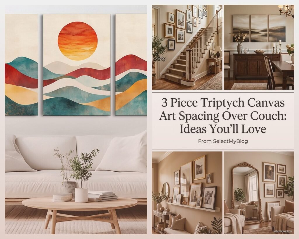
Behind a sofa is the obvious one but there’s a trick to it. You want the total width to be about two-thirds to three-quarters of your sofa width. I put one that was too small behind my friend’s sectional and it just looked… sad? Like a postage stamp on a wall. We ended up moving it to her bedroom and it was perfect there.
Dining room walls are actually amazing for triptychs, especially the hinged ones. Something about the formal three-panel thing matches the vibe of a dining table. I have this abstract landscape triptych in my own dining room and literally every dinner guest mentions it. It’s from this Etsy shop that does custom sizes but I’m blanking on the name right now.
Bedroom above the bed works if you go horizontal format. The vertical ones are gonna look weird unless you have like cathedral ceilings or something. I made that mistake in a client’s master bedroom and we had to return it, which was a whole thing because it was custom-made.
The Corner Trick Nobody Talks About
Wait I forgot to mention – you can actually position hinged triptychs in corners and it looks intentional instead of like you ran out of wall space. The two outer panels angle back along each wall and the center one sits right in the corner. I discovered this by accident when I was rearranging my office and now I recommend it all the time. Super dramatic for awkward architectural features.
Materials and What Actually Holds Up
So there’s basically three main types I’ve worked with:
Canvas on wooden frames is the most common. These are lightweight which is good because you’re not gonna rip your drywall out, but the hinges can be flimsy. Check that the hinges are actual metal, not those fabric ribbon things that some cheaper versions use. I had one of those fabric-hinged ones literally fall apart after six months.
Wood panels are heavier but they last forever. I have one that’s probably eight years old now and it still looks brand new. The hinges on these are usually more substantial because they have to be. Downside is they’re harder to hang – you definitely need two people and probably wall anchors, not just nails.
Metal or mixed media can be really stunning but you gotta see them in person first. I ordered one online that looked amazing in photos and when it arrived it was like… aggressively shiny? Not in a good way. Ended up returning it. If you’re going this route, make sure the return policy is solid.
Hanging These Things Without Losing Your Mind
Okay so funny story, I’ve hung maybe twenty of these at this point and I STILL sometimes get it wrong on the first try. Here’s what actually works:
You need to find the center point of your wall or the center point above your furniture. Not where you think it is – actually measure it. I use painter’s tape to mark the spot because pencil marks are a pain to erase later.
Most hinged triptychs have one hanging mechanism in the center panel. Some have two hooks, one on each outer panel, which is actually more stable but harder to hang level. The single-hook ones are more forgiving.
The height thing: General rule is center of the artwork at 57-60 inches from the floor, which is “gallery height” or whatever. But honestly if you’re putting it above furniture, I go with 6-8 inches above the furniture piece. Looks more intentional and connected.
Use a level. Like seriously. Your eye will trick you. I thought I could eyeball it and ended up with a triptych that was tilted for three days before my client pointed it out and I wanted to die.
Wall Anchors Yes or No
If it’s over 10 pounds total, use wall anchors or find a stud. I learned this when a canvas triptych fell off my client’s wall at 2am and scared the crap out of their cat. It wasn’t even that heavy but the regular nail just slowly worked its way out of the drywall.
The toggle bolt style anchors are my favorite for this. They’re annoying to install but once they’re in, that artwork isn’t going anywhere.
Style Choices That Don’t Look Dated in Two Years
This is gonna sound weird but I actively avoid anything too trendy. Like those word art triptychs that say “Live Laugh Love” or whatever across the three panels… just no. They were everywhere in 2015 and now they scream “I decorated from a catalog.”
Abstract landscapes are pretty safe. They work with most decor styles and you won’t get sick of them. I have a blue and gray abstract seascape one that’s been in three different rooms as I’ve moved and redecorated.
Black and white photography is classic for a reason. Architecture photos, nature shots, whatever. The three-panel format makes even simple images look more artistic.
Botanical prints are having a moment but honestly they’ve been popular forever so I don’t think they’ll look dated. Just avoid the super trendy stuff like those pink and green palm leaves that are literally everywhere right now.
Geometric patterns can be really cool if you keep the colors neutral. I saw one with gold line art on a navy background that was stunning, but the neon geometric ones feel very 2020 to me already.
Custom vs Ready-Made
I’ve done both and here’s the real talk:
Ready-made is obviously cheaper and faster. You can get decent ones from HomeGoods, Target, even Amazon. The quality varies wildly though. I’ve bought three different triptychs from Amazon and one was great, one was okay, and one looked like it was printed on cardboard.
Custom is worth it if you have a specific vision or weird wall dimensions. I worked with this printer who does custom triptychs from your own photos and the quality was insane. Cost like three times more but it was exactly what we needed for a client’s office – photos from their travels split across three panels.
Oh and another thing – some artists on Etsy will do semi-custom where they have existing designs but can adjust the size or colors. That’s kind of the sweet spot between affordable and personalized.
The Hinge Maintenance Thing
Nobody tells you this but hinged triptychs need occasional tightening. The screws work loose over time from the weight and movement. Every six months or so, I go around and check all the hinges on mine with a small screwdriver. Takes like two minutes and prevents the panels from getting wonky.
If a hinge actually breaks, you can usually replace it from a hardware store. Get the same size and style, remove the old one, attach the new one. I’ve done this twice and it’s honestly easier than it sounds.
Lighting Makes or Breaks It
I cannot stress this enough – the lighting situation will completely change how your triptych looks. I had one in my bedroom that looked muddy and dark until I added picture lights above it. Total game changer.
Track lighting or spotlights work great if you have them. Wall sconces on either side can be really dramatic. Even just making sure there’s enough ambient light in the room helps.
Natural light is tricky though. Direct sunlight will fade colors over time, especially on canvas or paper prints. I use UV-protective glass on anything valuable or positioned near windows.
What Size Actually Fits Your Space
This is where people mess up the most, myself included. Measure your wall space and then subtract at least 12 inches from the total width. That gives you breathing room on either side.
For above furniture, measure the furniture width and multiply by 0.66. That’s roughly your maximum triptych width. You can go smaller but not bigger without it looking off-balance.
Height is less critical but I try to keep the total height under 36 inches for most residential spaces. Taller than that and it starts to overwhelm the room unless you have really high ceilings.
Mixing Triptychs with Other Wall Decor
You can totally do this but it requires some restraint. I usually treat the triptych as the anchor piece and keep everything else smaller and simpler around it.
Gallery wall with a triptych in the center can work if you use lots of white space and keep the surrounding pieces minimal. I did this in my living room with black and white photos around a colorful abstract triptych and it actually looks pretty good.
Don’t put another major piece directly next to it though. The triptych needs room to breathe or it just looks cluttered.
Price Ranges and What You Actually Get
Under $100: Usually printed canvas, lightweight, basic hinges. Fine for rental apartments or temporary spaces. Quality is hit or miss.
$100-300: Better printing quality, sturdier frames, more reliable hinges. This is where I shop for most client projects. Good balance of quality and budget.
$300-800: Hand-painted or high-quality prints, solid wood frames, premium hinges. Worth it for permanent homes or featured walls.
Over $800: Original art, custom work, or designer pieces. I’ve splurged on these for my own home and special client projects but it’s not necessary for most people.
The biggest thing I’ve learned is that really cheap triptychs look cheap, but you don’t need to spend a fortune to get something that looks expensive. That middle range is the sweet spot.
Anyway that’s basically everything I’ve figured out through way too much trial and error. My coffee’s cold now and I should probably actually get some work done today, but yeah – hinged triptychs are way more forgiving than separate panels and they make a huge impact for relatively minimal effort once you know what you’re doing.