
Wall Art Guide, Wall Art Tutoriels
Yellow Wall Art: Sunny Bright Cheerful Golden Designs
Nov
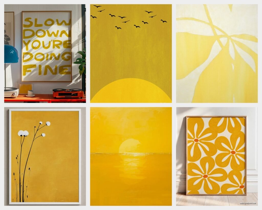
So I was literally reorganizing my studio yesterday and realized I’ve accumulated like fifteen different yellow art pieces over the past year, which is kinda ridiculous but also perfect timing for this because I’ve learned SO much about what actually works vs what just looks good on a screen.
The Shade Makes or Breaks Everything
Okay so first thing – and I cannot stress this enough – yellow is NOT just yellow. I made this mistake in my own living room three years ago and ended up with this mustard piece that looked amazing in the gallery but made my whole wall look jaundiced. Not cute.
Here’s what I tell everyone: hold up paint swatches next to your wall in the actual room. Sounds basic but the amount of people who skip this step and then call me panicking is wild. Pale buttery yellows work in north-facing rooms because they warm things up without going neon. The golden honey tones are your friend in spaces with lots of natural light – they catch the sun and literally glow during golden hour.
Bright lemon yellows though? Those need to be used strategically. I’ve got one in my bathroom and it’s perfect there because it’s a small dose, but my client last month put a huge lemon yellow abstract in her bedroom and couldn’t sleep because it was too stimulating. We moved it to her home office and suddenly it was perfect.
Size and Placement That Actually Makes Sense
The biggest mistake I see is people buying art that’s too small. Like way too small. If you’re putting something above a sofa, the general rule is it should be about two-thirds to three-quarters the width of the furniture. I know that sounds weirdly specific but trust me on this.
For yellow pieces specifically, you can sometimes go slightly smaller than you would with other colors because yellow POPS. It commands attention even in smaller formats. I’ve got this tiny 12×12 inch yellow and gold geometric piece in my hallway and people always notice it first, even though there’s a massive black and white photograph right next to it.
Gallery walls with yellow are tricky but doable. What works:
- One yellow piece as the anchor with neutrals around it
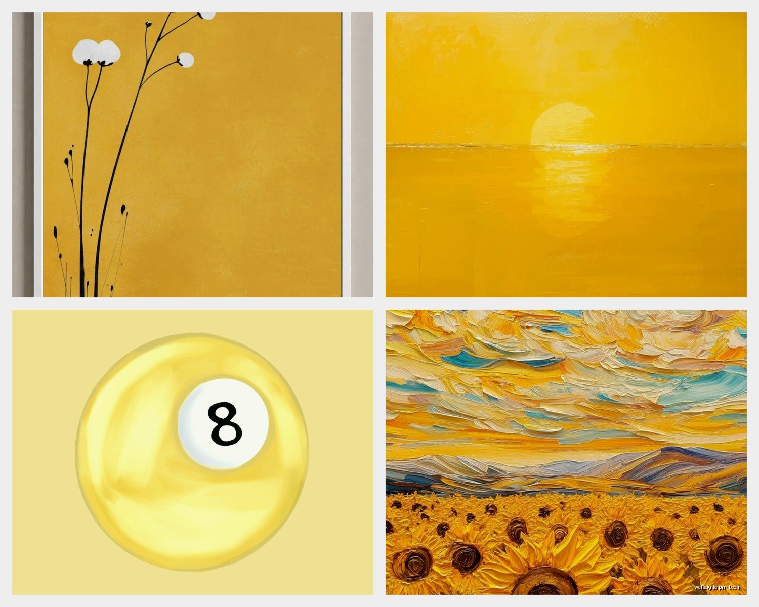
- Multiple yellow pieces but in different shades – like pale lemon with deep gold with mustard
- Yellow mixed with one other accent color max, usually navy or gray works best
What doesn’t work:
- All bright yellow everything unless you’re going for a maximalist vibe and even then it’s risky
- Yellow mixed with too many other bright colors – it gets chaotic fast
- Random yellow pieces scattered with no visual connection
Different Styles and When They Work
Abstract yellow art is probably the easiest to work with because it’s forgiving. You can find pieces that blend yellow with white or gray and they act almost like a neutral-plus. I curated a show last spring that was all abstract expressionism and the yellow pieces sold first, which tells you something about their appeal.
Floral yellow art is having a moment right now but be careful – it can skew really traditional really fast. The modern botanical prints with yellow flowers on white backgrounds are gorgeous and work in contemporary spaces. Those vintage-looking sunflower prints? Harder to pull off unless your whole aesthetic is farmhouse.
Geometric designs in yellow are *chef’s kiss* for modern and mid-century spaces. I just installed three yellow geometric prints in a client’s office and the transformation was insane. They’re crisp, they’re clean, they don’t feel childish.
Oh and another thing – typography art in yellow can be really impactful. Song lyrics, quotes, whatever. Just make sure the font isn’t too cutesy. I learned this the hard way when I bought this “you are my sunshine” print that looked adorable online but felt very kindergarten classroom when it arrived.
Materials Matter More Than You Think
Canvas prints are fine but they can look cheap if you’re not careful. The texture helps with yellow because it adds depth, but make sure you’re getting good quality canvas. I’ve seen too many where the yellow looks flat and plasticky.
Framed prints under glass are my go-to recommendation. The glass adds a level of sophistication and protects the piece. For yellow art specifically, go with white mats – they make the yellow pop without competing. Black mats can work but only with deeper golden yellows, not bright ones.
Metal prints are surprisingly amazing for yellow designs. The metallic finish makes yellows look luminous and the durability is great for high-humidity spaces like kitchens or bathrooms. I’ve got a yellow abstract metal print in my kitchen and my cat knocked it off the wall last month (long story, involving a moth) and it was totally fine.
Acrylic prints give you this high-gloss modern look that can be stunning with the right yellow piece. They’re pricey though, so make sure you really love it first.
Mixing Yellow Art With Your Existing Stuff
This is where people get nervous and honestly, I get it. Yellow feels bold. But here’s the thing – it’s actually one of the most versatile colors if you think about it right.
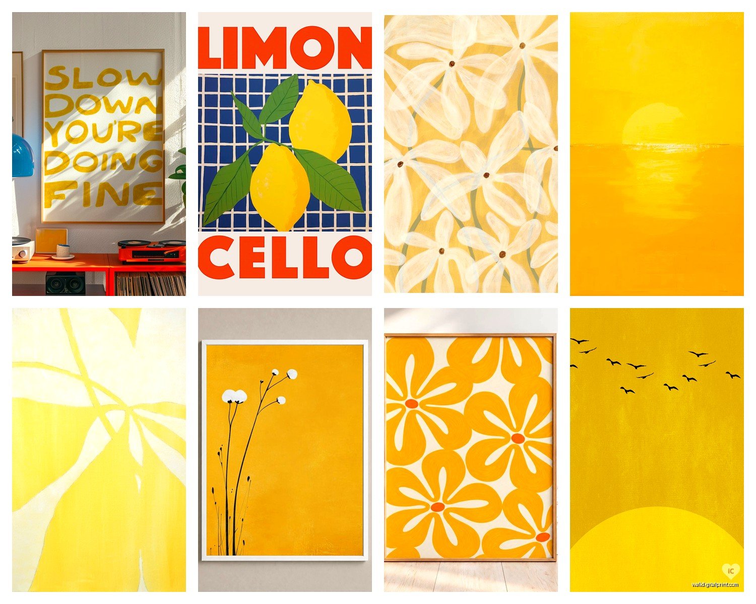
Yellow plays well with:
- Gray everything – light gray, charcoal, you name it
- Navy and yellow is classic for a reason
- White obviously, creates a fresh clean vibe
- Natural wood tones, especially lighter woods
- Black for high contrast drama
- Blush pink if you want something unexpected but sophisticated
- Teal or turquoise for a more energetic combo
I recently did a whole living room around a large yellow abstract piece and used gray sofas, white walls, and added navy throw pillows. Then brought in brass hardware and fixtures which echoed the golden tones in the art. The whole thing felt cohesive but not matchy-matchy.
Wait I forgot to mention – lighting is HUGE with yellow art. You need proper lighting or it can look muddy, especially with deeper yellows. I always recommend picture lights or track lighting aimed at the piece. Natural light is great during the day but you need a plan for nighttime too.
Where to Actually Hang Yellow Art
Living rooms are obvious but think about the mood. Bright yellows are energizing so they work great in spaces where you entertain or hang out during the day. Softer yellows can work for evening relaxation too.
Kitchens and dining rooms are perfect for yellow – it’s literally associated with happiness and appetite. I’ve got a set of three small yellow prints in my breakfast nook and they make morning coffee feel more cheerful, which sounds cheesy but it’s true.
Home offices need that energy boost and yellow delivers. I switched out my office art to include more yellow pieces last year and I swear my productivity improved. Could be placebo effect but who cares if it works.
Bedrooms are tricky. Soft buttery yellows can work, but avoid anything too bright or it might mess with your sleep. One of my favorite bedroom installations was a large pale yellow and cream abstract above the bed – calming but still interesting.
Hallways and entryways are actually ideal for yellow art because you’re not spending hours there. It creates impact without overwhelming you. That’s where I’d put your brightest, boldest yellow pieces.
Shopping Tips From Someone Who’s Bought Too Much
Online shopping for yellow art is gonna show you colors that aren’t accurate like 80% of the time. Monitors display colors differently, lighting in product photos varies, it’s a whole thing. I always check return policies before buying yellow pieces online.
Look for sellers who show the art in actual room settings, not just white backgrounds. And read reviews specifically mentioning color accuracy. If multiple people say “it’s more orange than yellow” or “it’s really pale in person” – believe them.
Etsy has amazing options for yellow art, especially if you want something unique or customizable. I’ve found some of my favorite pieces there. Just communicate with the seller about exact shades if you’re picky.
Society6 and similar print-on-demand sites are hit or miss with yellow. The quality varies depending on what product you choose. Their art prints are generally good but I’ve been disappointed with their canvas options.
Local art fairs and markets are underrated for finding yellow art. You can see the exact color in person, talk to the artist, and often get custom sizes. Plus supporting local artists feels good.
This is gonna sound weird but – don’t be afraid of thrift stores and estate sales for yellow art. I’ve found vintage pieces with these amazing faded yellows that you can’t replicate new. Sometimes they need reframing but that’s easy enough.
DIY Options If You’re On a Budget
Okay so if you’re not ready to invest in original art or expensive prints, there are ways to get yellow on your walls without looking cheap.
Print digital downloads from Etsy – like $5 to $15 usually, then frame them yourself. Get decent frames though, don’t skimp there. Target and IKEA have good affordable frame options.
Paint your own abstract yellow art. I’m serious. Get a canvas, some yellow acrylic paints in different shades, and just go for it. Abstract expressionism is forgiving and yellow is hard to mess up. Add white and gold for depth. My first apartment had three pieces I painted myself and people always complimented them.
Use yellow fabric as art. Stretch interesting yellow textiles over canvas frames or put them in large frames. I did this with some vintage yellow floral fabric I found at an estate sale and it looks intentional and curated.
Create a yellow photo wall with your own photos matted on yellow backgrounds or printed with yellow filters. Personal and affordable.
Maintaining Your Yellow Art
Yellow fades faster than other colors when exposed to direct sunlight. UV-protective glass is worth it for valuable pieces or if you’re hanging in a sunny spot. I learned this the hard way with a print that went from sunny yellow to sad beige in like two years.
Dust regularly with a soft cloth. Sounds obvious but dust buildup can make yellows look dingy. For framed pieces under glass, just use glass cleaner. For canvas, be gentle and barely damp if you must clean it.
Rotate your art seasonally if you’ve got the option. Yellow art is especially perfect for spring and summer but might feel wrong in winter depending on your climate and preferences. I swap some of mine out and it keeps things fresh.
Common Mistakes to Avoid
Don’t hang yellow art above or near anything orange-toned. The colors clash in a way that makes both look worse. I see this all the time with orange-brown leather furniture and bright yellow art – just no.
Avoid yellow art in rooms with yellow-toned lighting. It becomes too monochromatic and loses impact. Cool white or daylight bulbs work better.
Don’t go all-in on a yellow theme without testing first. Buy one piece, live with it for a week, see how you feel. Then add more if you still love it. I’ve seen too many people buy a whole yellow collection and then realize it’s too much.
Stop trying to match yellows exactly across multiple pieces unless they’re meant to be a set. Different yellows in the same space actually create more visual interest than trying to get everything identical.
My dog just knocked over my water bottle so gonna wrap this up but honestly, yellow art is one of those things that seems intimidating but becomes addictive once you figure out what works for your space. Start small, pay attention to undertones, and don’t be afraid to move pieces around until they feel right.
