Wall Art Guide, Wall Art Tutoriels
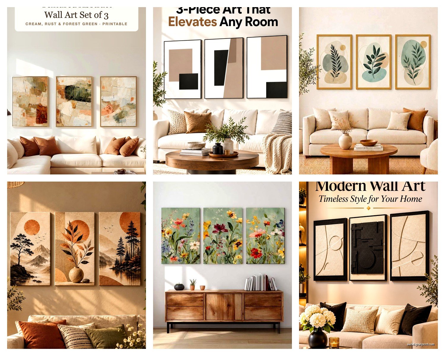
Set of 3 Wall Art for Living Room: Triptych Main Space

Nov
So I just hung three massive abstract pieces in my living room last week and my neighbor literally stopped mid-conversation to ask about them, which never happens because she usually just complains about parking. But here’s the thing about triptych wall art that nobody tells you until you’re standing there with a hammer feeling like an idiot…
The spacing is everything. Like, EVERYTHING. I’ve done this wrong so many times for clients and myself that I actually have a cheat sheet taped inside my toolbox now. You want 2-4 inches between each panel for a cohesive look, but here’s where it gets tricky – it depends on your wall size and the actual dimensions of the pieces. My living room is about 14 feet wide and I went with 3 inches between panels because anything wider made it look like three separate artworks that accidentally ended up on the same wall.
Oh and another thing, measure your couch or whatever furniture is underneath first. The total width of your triptych should be roughly 60-75% of whatever’s below it. I learned this the hard way when I bought this gorgeous set of beach photography prints that were way too small for my sectional and it looked like I’d just given up halfway through decorating.
Start with your center panel. This is gonna sound obvious but I’ve watched people (okay, my sister) start with the left panel and then everything ends up crooked because you’re trying to measure outward in both directions. Hang the middle piece first at eye level – which is typically 57-60 inches from the floor to the center of the artwork. That’s museum standard, though if everyone in your house is super tall or you’re all hobbits, adjust accordingly.
The level thing… okay so I have this laser level that cost like $25 on Amazon and it’s changed my life. Before that I was using a regular bubble level and somehow still ending up with wonky arrangements. My cat knocked it off the shelf last month and I immediately bought another one because trying to hang multiple pieces without it is basically torture. You need to mark where each panel goes with pencil – light pencil that you can erase – before you start drilling anything.
For the actual hanging hardware, this depends on what you bought. A lot of triptych sets come with sawtooth hangers already attached, which are fine for lightweight pieces but if your art is heavy (like those thick canvas prints or framed pieces with glass), you’re gonna want D-rings and picture wire. I use heavy-duty picture hanging hooks rated for at least double the weight of each panel because walls are unpredictable and I don’t want a 2am crash situation.
Wait I forgot to mention – find your studs if possible. There’s this stud finder app on my phone that actually works pretty well, or you can use an actual stud finder from the hardware store. If you can anchor at least your center panel into a stud, do it. The outer panels can use drywall anchors if needed, but that center support makes everything more secure.
Color coordination is where people get paralyzed and honestly? It’s easier than Instagram makes it look. Your triptych should pull at least one or two colors from your existing room palette. I had this client who bought a gorgeous blue and gold abstract set but her entire living room was warm terracottas and creams, and it just… fought with everything. She ended up adding blue throw pillows and a gold side table, which worked, but it would’ve been simpler to choose art that already fit.
That said, sometimes you fall in love with art that doesn’t match and you make it work. I have this teal and coral geometric triptych that has absolutely nothing to do with my gray and white color scheme, but I added a coral blanket draped over the couch and some teal books on the coffee table and now it looks intentional instead of random.
Lighting makes such a difference and nobody talks about this enough. If your living room has weird lighting or the wall where you’re hanging the triptych is in shadow, consider adding picture lights or even LED strip lighting above it. I installed these battery-operated puck lights above my set and you can actually see the texture in the paint now, which was the whole point of buying textured canvas in the first place.
The style thing gets complicated because there are so many options. Abstract triptychs are super popular right now – lots of those fluid art pieces with gold leaf accents or those big gestural brushstroke ones. They work in pretty much any decor style from modern to transitional. I’m personally obsessed with black and white photography triptychs lately, especially architectural shots or nature scenes split across three panels.
Botanical prints are having a moment too, like those oversized leaf prints or vintage botanical illustrations. They’re good if your living room skews traditional or if you’re into that organic modern thing everyone’s doing. Just make sure the scale is right – delicate little ferns look weird blown up to massive proportions unless that’s specifically the vibe you want.
Oh, and there are those motivational quote triptychs but honestly… I find them kinda cheesy for a main living space? They work better in home offices or bedrooms. Your living room art should be more about visual impact than reading material, at least that’s my take. Though my friend has this “Live Laugh Love” variation that’s actually beautiful typography and somehow doesn’t make me cringe, so exceptions exist.
Frame vs. frameless is another decision point. Frameless gallery-wrapped canvas is very contemporary and casual – the image wraps around the edges so you don’t need a frame. It’s lighter weight and usually cheaper. Framed pieces look more formal and finished, especially with matting, but they’re heavier and more expensive. I’ve got frameless in my living room because the space is pretty casual and I didn’t want the weight of three heavy frames.
If you go framed, match the frames exactly. Like, exact same color, width, and style across all three panels. I saw someone try to do a “mix and match” frame situation with a triptych and it just looked messy, not eclectic.
Okay so funny story – I was watching this home makeover show while shopping for triptychs online and realized that probably 80% of the living rooms featured had horizontal triptychs. That’s the standard orientation because most living rooms are wider than they are tall. But if you have a narrow wall or high ceilings, a vertical triptych can look really striking. Less common, but can solve weird layout problems.
Size-wise, bigger is usually better for living rooms unless your space is tiny. A too-small triptych looks timid and indecisive. I’d say minimum 48 inches wide total for the set, and honestly 60-72 inches wide is better for average to large living rooms. My set is about 75 inches wide total and it anchors the whole room without overwhelming it.
The hanging template trick: some people cut out paper templates the exact size of their panels and tape them to the wall first. This lets you see the arrangement before making any holes. I did this once for a client who was super nervous about commitment and it actually helped a lot. We moved those paper pieces around for like twenty minutes before she was satisfied.
Command strips are an option if you’re renting or terrified of putting holes in your wall, but they have weight limits and I’ve had them fail before. They work better for lightweight unframed canvas prints. Just follow the weight ratings exactly and use more strips than you think you need.
Style mixing within a triptych – so this is technically possible but hard to pull off. Like having three different artistic styles that somehow relate thematically. I’ve seen it work with black and white photography where each panel is a different subject but similar composition. But generally, you want visual cohesion across all three panels. They should feel like parts of a whole, not three random pieces that happen to be near each other.
Where to buy is its own rabbit hole. HomeGoods and TJ Maxx sometimes have surprisingly good triptych sets for cheap, but it’s hit or miss. Etsy has tons of independent artists selling unique pieces, which I love for clients who want something nobody else has. Amazon has a massive selection at every price point – just read reviews carefully because quality varies wildly. Wayfair, Target, West Elm… basically everywhere sells them now.
I got my current set from an Etsy shop that does custom abstract pours and the quality is way better than the mass-produced set I had before. Cost about the same as a mid-range option from a furniture store but feels more special because it’s not in 10,000 other living rooms.
One more thing about color – if you can’t decide between a colorful triptych or neutral, go neutral. Neutrals are easier to live with long-term and you can always add color through other decor. I had a bright coral and turquoise triptych that I loved for about eight months and then suddenly found super annoying. Switched to a neutral abstract with just hints of gold and I’m way happier with it.
The rule about hanging art at eye level gets weird with triptychs over furniture. If it’s above a sofa, you want the bottom of the artwork to be 6-12 inches above the back of the sofa. This usually means the center of the art is higher than standard eye level, but it looks more intentional and connected to the furniture.
Also gotta mention that three separate pieces of art don’t automatically make a triptych. A true triptych is designed as a set where the image or theme flows across all three panels. You can buy three individual artworks and group them together, which is fine, but that’s more of a gallery wall situation than a triptych. The visual flow across panels is what makes a triptych work.
I’m running out of random things to tell you but… oh, actually, consider the undertones. If your walls are warm white, cool-toned art can look weird and vice versa. My walls are a warm greige and I had this beautiful gray and white triptych that looked amazing in the store but weirdly blue-ish on my wall because of the undertones. Returned it and got something with warmer grays and it made all the difference.
Hardware stores cut wire to length if you’re doing the D-ring and wire method yourself, which is cheaper than buying pre-wired frames. Just saying.
The whole process from unboxing to hanging usually takes me about an hour for a triptych if nothing goes wrong. Add extra time if you’re indecisive about placement or if your walls are plaster or brick, which require different hardware and more patience.