Wall Art Guide, Wall Art Tutoriels
Botanical Prints Wall Art: Plant Scientific Illustrations
Jul
So I’ve been absolutely obsessed with botanical prints lately and honestly it started because I needed to fill this massive blank wall in my apartment and didn’t want to spend like a thousand dollars on original artwork. My cat knocked over a plant that same week which felt like a sign or whatever.
Understanding What You’re Actually Looking At
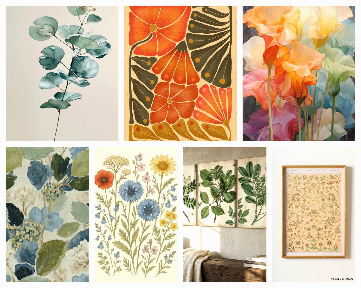
Okay so botanical prints are basically scientific illustrations of plants from like the 1700s-1900s when botanists were documenting every species they could find. Think really detailed drawings of flowers, leaves, roots, the whole thing. They’re labeled with Latin names and have this vintage academic vibe that somehow works in literally any room.
The ones you see everywhere now are usually reproductions of illustrations from old botanical encyclopedias. The most famous are probably from Pierre-Joseph Redouté who did all those rose books, and then there’s Curtis’s Botanical Magazine which ran for like 200 years. I spent way too much time going down a Wikipedia rabbit hole about this when I should’ve been writing blog posts.
Where to Actually Find Them
Here’s the thing about botanical prints – you can spend $15 or $1500 depending on where you look and honestly sometimes the cheap ones look just as good once they’re framed.
Etsy is gonna be your best friend for this. So many sellers just scan pages from old botanical books (which are public domain now) and sell digital downloads. You pay like $5-8, download a high-res file, and print it yourself at Staples or wherever. I’ve done this probably 30 times now and the quality is surprisingly good if you get the right file size.
For physical prints, I really like these sellers who specialize in vintage reproductions. They print on this slightly aged paper that makes it look more authentic. There’s this one shop I found – and I’m blanking on the name right now but it’s something like VintageFloraArt – they do museum-quality reproductions that are chef’s kiss.
Oh and another thing, actual antique prints exist but you gotta be careful. Went to an estate sale once and bought what I thought was an original 1890s print for $40 and turns out it was a 1990s reproduction. Still looked good though so whatever.
The Digital Download Route
If you’re doing digital downloads here’s what you need to know. Get files that are AT LEAST 300 DPI and sized for whatever frame you want. Most sellers offer different sizes – 8×10, 11×14, 16×20. I usually go for 11×14 because those frames are everywhere and not weirdly expensive.
You can print at FedEx, Staples, or even Costco if you have a membership. Costco is honestly the cheapest but their color calibration can be weird sometimes. Had them print a fern illustration that came out way more yellow than it should’ve been. For important pieces I use a local print shop that does archival printing.
Choosing Your Plants
This is where it gets fun but also kinda overwhelming because there are like thousands of options. I’m gonna break down what actually works in different spaces based on what I’ve tested in my own place and client homes.
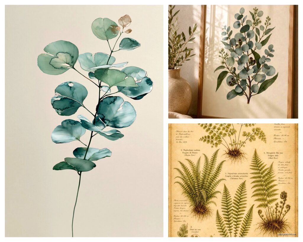
Ferns are the most versatile honestly. They work in bathrooms, bedrooms, offices, hallways. The fronds have this elegant shape that fills a frame nicely without being too busy. My favorite is the Asplenium fern illustrations – they’re delicate but still have presence.
Roses and florals can go either really romantic or surprisingly modern depending on how you frame them. In my bedroom I have three Redouté rose prints in simple black frames and it doesn’t read as grandma-cottage at all. The key is keeping the frames minimal.
Herbs and vegetables are perfect for kitchens obviously but I actually love them in dining rooms too. There’s something about a detailed illustration of an heirloom tomato that just works. Did a gallery wall of vintage vegetable prints for a client’s breakfast nook and it turned out so good.
Mushrooms and fungi – okay this is gonna sound weird but mushroom illustrations are having a moment. They’re slightly quirky without being too cutesy. Work great in offices or reading nooks. I have a set of four mushroom prints above my desk and I get compliments on them constantly.
The Framing Situation
So framing can make or break this whole thing. I’ve learned this the hard way after wasting money on frames that looked cheap or didn’t match the vibe.
Black frames are the safest bet for a modern look. Simple black wood or metal frames with white or cream matting. This is my go-to probably 80% of the time. You can get decent ones at IKEA (the RIBBA series works great) or Target’s threshold line.
Natural wood frames give you more of a organic, earthy vibe. I use these in spaces that have a lot of plants or natural materials already. The medium oak tones work really well with green botanical illustrations.
Gold or brass frames if you wanna go fancy. These work best with florals and make the whole thing feel more elevated. But you gotta commit – like one gold-framed botanical print looks trying-too-hard but a whole wall of them looks intentional.
Wait I forgot to mention – matting is actually super important. A print without matting can look cheap even in a nice frame. You want like 2-3 inches of mat around the print. White is classic, cream or off-white feels more vintage, and I’ve even done sage green matting with fern prints which looked amazing.
DIY Framing vs Professional
Okay so custom framing is expensive. Like shockingly expensive. A good frame shop will charge $150-300 per frame easily. BUT if you’re doing something special or have an odd-sized print it’s worth it.
For standard sizes though just buy ready-made frames. Michael’s always has sales – never pay full price there. You can get an 11×14 frame with matting for like $15-20 on sale.
I’ve also done the DIY route where you buy the frame, mat, and backing separately and assemble it yourself. It’s cheaper but kinda tedious. Did this for a set of eight prints once and it took me an entire Saturday afternoon while watching true crime documentaries.
Creating Gallery Walls
This is where botanical prints really shine because you can mix different plant types and create something that feels collected over time.
My formula that works every time: pick 2-3 types of plants (like ferns, florals, and herbs) and stick to similar coloring. Then use identical frames – this is key. Different prints but same frames makes it look cohesive instead of chaotic.
For layout, I always do the paper template thing first. Trace your frames on kraft paper, tape them to the wall, move stuff around until it looks right. Takes forever but saves you from putting 47 nail holes in your wall.
Grid layouts are the easiest – just line everything up evenly. Works best with the same size frames. I did a 3×3 grid of botanical prints in a client’s hallway and it’s so satisfying to look at.
Salon style is more organic and collected-looking. Mix different frame sizes but keep them in the same family (all black or all wood). Start with your largest piece in the center or slightly off-center and build around it.
Oh and funny story – I once spent three hours arranging a gallery wall only to realize I’d hung everything like two inches too low. Had to redo the whole thing. The center of your gallery wall should be at eye level which is roughly 57-60 inches from the floor.
Styling Different Rooms
Living rooms can handle bigger, bolder botanicals. I love doing a large-scale print above the sofa – like a 24×36 or even bigger. Palm fronds or tropical plants work really well for this. Makes a statement without being too loud.
Bedrooms should be calming so I usually go with softer florals or delicate ferns. Pairs of prints on either side of the bed are classic for a reason. Just did this in my own bedroom actually with two magnolia prints and it’s so peaceful.
Bathrooms are tricky because of moisture but if you have good ventilation it’s fine. Ferns are perfect here because they actually thrive in humid environments so there’s like a meta thing happening. Just make sure you’re using glass in the frame to protect the print.
Kitchens and dining rooms – herbs, vegetables, fruits, anything edible. I mentioned this before but it bears repeating because it just makes sense visually. Did a dining room with vintage citrus prints last month and the client sends me photos of dinner parties constantly.
Home offices can go a few ways. I like mushrooms and ferns for a sophisticated vibe, or you can do flowering plants if you want something more cheerful. Avoid anything too romantic or soft – you want it to feel professional-ish.
Mixing Styles and Periods
You don’t have to stick to one era of botanical illustration. I mix Victorian-era prints with mid-century ones all the time. The key is keeping your framing consistent and making sure the color palettes complement each other.
Like I have this one wall that’s a mix of 1800s hand-colored engravings and 1950s scientific diagrams and it works because they’re all in matching black frames with white mats. The different illustration styles actually make it more interesting.
Color Considerations
Most antique botanical prints have this faded, muted color palette that works with basically everything. The greens are never bright lime, they’re more sage and olive. The pinks are dusty rose not hot pink.
If your space is very neutral – whites, grays, beiges – botanicals add just enough color without overwhelming. If you already have colorful stuff going on, stick to more monochromatic prints like ferns or line drawings.
I’ve also done all black and white botanical prints which is a whole vibe. There are tons of vintage engravings that were never colored and they look super sophisticated. Works especially well in modern or minimalist spaces.
Matching Your Existing Decor
Okay so if you’re doing modern/contemporary, go for simple frames and maybe stick to one type of plant in a series. Like six different fern species all framed identically.
Traditional or classic spaces can handle the more ornate Victorian florals. Gold frames, detailed roses, the whole thing.
Farmhouse or cottage – herbs and vegetables, natural wood frames, maybe some vintage seed packet prints mixed in.
Bohemian spaces look great with a mix of everything – different plants, varied frame sizes, more eclectic arrangements.
Budget Breakdown
Since you’re probably wondering what this actually costs…
Super budget: $5-10 per digital download, $15-20 per frame on sale. You can do a whole gallery wall of 6 prints for under $150.
Mid-range: $30-50 per physical print, $40-60 per frame. Looking at maybe $400-500 for a good-sized collection.
Splurge: Original antique prints $100-500 each, custom framing $150-300 per piece. Yeah it adds up fast.
I usually recommend starting with the budget option and seeing how you like the style before investing in anything expensive. My first botanical prints were literally downloaded from Etsy and printed at Staples and they still look great two years later.
Maintenance and Care
Keep them out of direct sunlight because the prints will fade over time. Learned this the hard way with a beautiful rose print that’s now basically a ghost of its former self.
Dust the frames occasionally. Use glass cleaner on the glass but be careful not to get any moisture behind the glass where the print is.
If you live somewhere humid consider using frames with UV-protective glass. Costs more but worth it if you’re using valuable prints.
Where This Can Go Wrong
Biggest mistake I see is people buying prints that are too small for their space. A tiny 8×10 botanical print on a massive wall just looks sad and lonely. Go bigger than you think you need or do a grouping.
Also mixing too many different frame styles. Pick a lane and commit. All black, all wood, all gold – whatever but keep it consistent.
And please please please don’t buy those printed-on-canvas botanical prints. The whole point is the vintage scientific illustration vibe and canvas makes it look like you bought it at HomeGoods. Which is fine but it’s a different aesthetic entirely.
Anyway that’s basically everything I’ve learned about botanical prints over the past few years of obsessing over them. They’re genuinely one of the easiest ways to make a space look more pulled-together and they never really go out of style because they’re already vintage you know?