Wall Art Guide, Wall Art Tutoriels
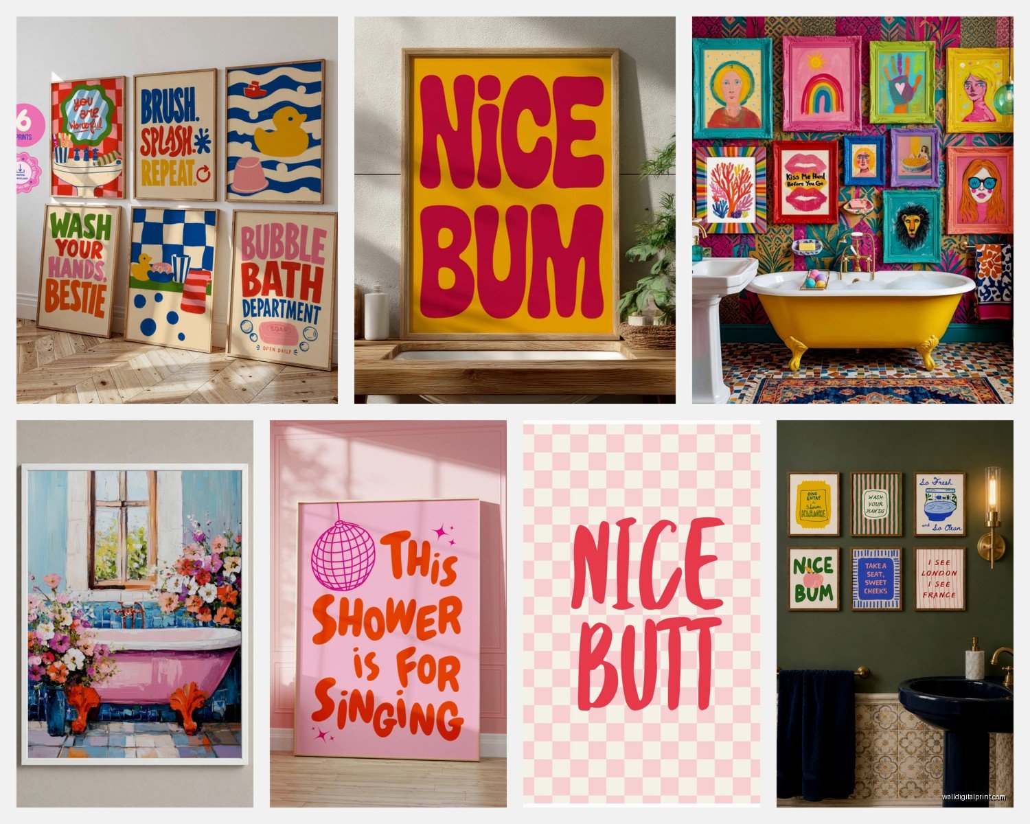
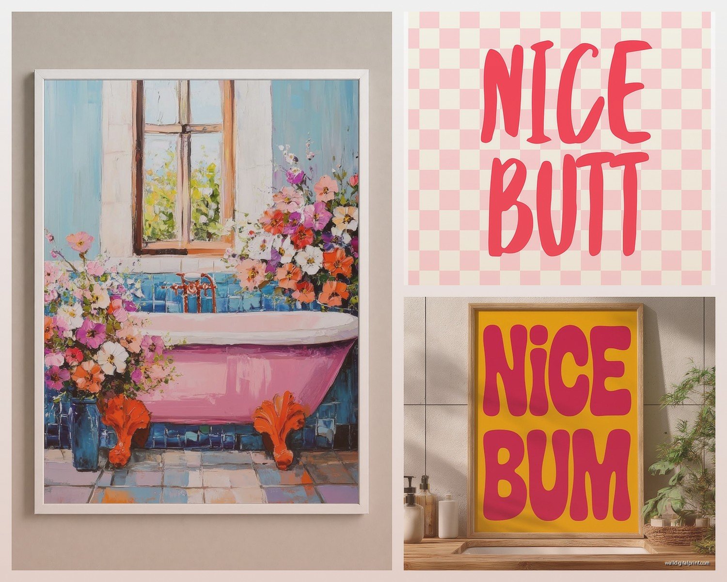
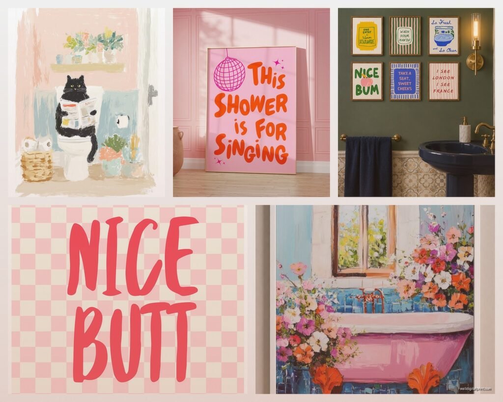
Colorful Bathroom Wall Art: Vibrant Bold Bath Space Designs
Sep
So I’ve been obsessing over bathroom wall art lately because honestly bathrooms are like the forgotten room when it comes to actual design, right? Everyone does their living room and bedroom but then the bathroom is just… beige with maybe a soap dispenser if you’re lucky.
Why Your Bathroom Actually Needs Real Art
Okay so here’s the thing – I was watching this renovation show last week while reorganizing my print storage and it hit me that bathrooms are probably the most personal spaces we have? Like you’re in there every single morning, it sets your whole mood for the day, and most people just slap up a generic “wash your hands” sign from Target and call it done.
The colorful art thing specifically works because bathrooms tend to be small and kinda sterile feeling. White tiles, chrome fixtures, maybe some builder-grade beige if you’re unlucky. A pop of actual vibrant color completely transforms the energy without you having to redo the entire space.
What Actually Works in Humid Spaces
This is gonna sound obvious but like… not all art survives bathroom humidity. I learned this the hard way when a client put an unframed watercolor print in their powder room and it literally started warping within two weeks. So here’s what actually holds up:
Acrylic Prints and Sealed Canvas
These are your best friends. Acrylic prints have this protective layer that moisture just slides right off. I’ve had one in my own bathroom for three years now – it’s this bright abstract piece with oranges and teals – and zero issues. The colors haven’t faded, no warping, nothing.
Canvas works too but it HAS to be sealed properly. Like you want either a UV-resistant varnish or one of those canvas prints that comes with a moisture barrier already applied. The cheap ones from certain online retailers… yeah those will get sad and droopy pretty fast.
Framed Prints Behind Glass
This works but you gotta be smart about it. Regular paper prints are fine IF they’re behind glass in a sealed frame. The glass creates a barrier between the humidity and the actual artwork. I usually recommend getting frames with that backing tape seal – prevents moisture from sneaking in through the back.
Metal prints are also ridiculously durable. They’re basically the image printed directly onto aluminum sheets. Super modern looking, completely waterproof, and the colors stay insanely vibrant.
Color Schemes That Don’t Make You Dizzy
Okay so when I say colorful I don’t mean like… explosion at the crayon factory. There’s a method here.
If your bathroom has cool tones (grays, whites, chrome), go with artwork that has pops of warm colors – coral, mustard yellow, terracotta, even hot pink. It creates this really nice contrast without clashing. I did this in a bathroom that was all white subway tile and brushed nickel fixtures, added three small prints with peachy-pink and gold abstract designs, and suddenly the whole room felt intentional instead of just… clean.
For bathrooms with warm tones (beiges, golds, wood accents), cooler artwork actually works better. Think teals, navy blues, emerald greens, deep purples. My friend has this vintage botanical print with these incredibly saturated blue-green leaves in her cream-colored bathroom and everyone asks where she got it.
The Three Color Rule Thing
So this interior design trick I picked up from a curator I used to work with – pick three main colors max for your bathroom art. One dominant color, one secondary, one accent. This keeps things from looking chaotic even when you’re using bold hues.
Like let’s say you find this gorgeous print with turquoise, coral, and white. Those are your three colors. You can add multiple pieces of art but they should all pull from that same palette. Keeps everything cohesive without being matchy-matchy boring.
Size and Placement Without Measuring Seventeen Times
I’m terrible at measuring honestly, my dog knocked over my tape measure last week and I still haven’t found it, but here’s what generally works:
For above the toilet – this is prime real estate. You want something that fills about two-thirds of the wall width. So if your toilet is 30 inches wide, you’re looking at artwork that’s roughly 20 inches across. Can be one large piece or a gallery wall situation.
Gallery walls in bathrooms are actually easier than in other rooms because the space is smaller so you need fewer pieces to fill it. I usually do odd numbers – three or five pieces. Start with the middle piece at eye level (that’s about 57-60 inches from the floor) and build around it.
The Shower Sight Line
Oh and another thing – think about what you see from inside the shower. If you have a clear shower door or curtain, the wall opposite your shower is what you’re staring at while shampooing. Put something interesting there! I have a client who hung this vibrant geometric print in yellows and oranges right where she can see it from the shower and she says it genuinely makes her morning routine better.
Specific Styles That Work Really Well
Abstract art is probably the easiest route for bathrooms because it doesn’t have to “mean” anything, it just needs to add color and visual interest. Those loose brushstroke paintings with bold colors? Perfect. Geometric patterns? Also great.
Botanical prints but make them vibrant – not the pale watercolor leaves everyone does, but like… deeply saturated florals or tropical leaves in unexpected colors. I found this print series once that was traditional botanical drawings but rendered in hot pink and electric blue instead of natural greens and it was *chef’s kiss*.
Photography Can Be Tricky But
Color photography works if it’s the right subject. Beach scenes, colorful buildings (like those rainbow houses in Charleston or San Francisco), market scenes with bright produce, abstract close-ups of colorful objects. What doesn’t work as well: black and white photography unless your whole bathroom is monochrome, and weirdly enough, sunset photos often read as too warm/orange in bathroom lighting.
Vintage travel posters are having a moment and they’re perfect for bathrooms. Super colorful, fun, conversation-starting, and the graphic design style from the 1950s-70s just works in smaller spaces.
The Lighting Situation Nobody Talks About
Bathroom lighting is usually terrible, right? Those harsh overhead bulbs that make everyone look vaguely deceased. But this actually matters for your art.
If you have cool-toned LED bulbs, warm-colored artwork will look even richer. If you have warm bulbs (the yellowish ones), cool-toned art gets this nice depth to it. You can actually use this to your advantage – test your art in the bathroom lighting before you commit to hanging it.
Wait I forgot to mention – if you have a windowless bathroom, go brighter and more saturated with your art choices. The artwork becomes one of the main sources of “visual light” in the space even though it’s not actually emitting light, if that makes sense? Your eyes are drawn to the bright colors and it makes the whole room feel less cave-like.
Where to Actually Find This Stuff
Society6 and Redbubble have tons of independent artists and you can get the same design in different formats – acrylic, metal, framed print, whatever. The quality is pretty consistent and the prices are reasonable.
Minted does more curated stuff, slightly pricier but the artist selection is really good. They have a whole bathroom art category now.
Local art fairs and markets – this is gonna sound weird but some of my favorite bathroom art finds have been from local artists selling small works. They’re usually already thinking about durability for smaller spaces and the pieces are unique.
Etsy is obvious but filter carefully. Look for sellers who specifically mention bathroom-safe materials or moisture-resistant options. Read the reviews about how pieces hold up over time.
The DIY Route If You’re Feeling Ambitious
You can also make your own if you’re into that. Get waterproof canvas boards, acrylic paints (they’re naturally water-resistant when dry), and just go wild with color. Abstract is forgiving – there’s no wrong way to do it. Seal everything with a spray varnish when you’re done.
I did this once with paint samples from the hardware store. Got like 20 different sample pots in various bright colors, used a palette knife to create this textured abstract piece, sealed it, framed it behind glass. Cost maybe $30 total and it’s still one of my favorite bathroom pieces.
The Gallery Wall Formula That Actually Works
Okay so if you wanna do multiple pieces, here’s what I do: pick one anchor piece (the biggest one), place it first, then arrange smaller pieces around it. Keep spacing consistent – about 2-3 inches between frames.
For bathrooms specifically, I like doing vertical arrangements because most bathroom walls are narrow. So like a column of three pieces stacked vertically instead of spread out horizontally.
Mix sizes but keep the frames similar. All black frames, all natural wood, all white – whatever matches your bathroom fixtures. The art itself should be varied and colorful, but unified frames keep it from looking chaotic.
The Template Trick
Cut paper templates the size of your frames, tape them to the wall, rearrange until it looks right, then hang the actual art where the templates are. Saves so many nail holes from trial and error.
Maintenance Real Talk
Colorful art in bathrooms needs basically zero maintenance if you set it up right initially. Maybe dust the frames every few weeks when you’re cleaning anyway. If you notice moisture building up behind glass, the seal probably failed – just replace that piece.
Run your bathroom fan during and after showers. This isn’t just for the art, it’s for everything, but it does help preserve your pieces longer.
Don’t hang anything directly in the shower spray zone. I know this sounds obvious but I’ve seen people try it. Even “waterproof” art will eventually have issues if it’s getting directly sprayed every day.
My Current Favorite Combinations
Jewel tones are really having a moment – deep emeralds, sapphire blues, ruby reds. These work especially well in white or light gray bathrooms. The contrast is insane and they feel luxurious without being fussy.
Neon brights in small doses. Like one small neon piece among more muted colorful pieces. Adds this unexpected punch of energy.
Earth tones but saturated versions – rust orange, deep olive, burnt sienna, golden yellow. These work in bathrooms with natural materials like wood vanities or stone counters.
The monochrome-plus-one approach where everything is black and white except for one piece of wildly colorful art. Very dramatic, very effective.
Honestly the biggest thing is just committing to actual color instead of playing it safe with beige motivational quotes. Your bathroom sees you at your most vulnerable – first thing in the morning, last thing at night – might as well make it a space that actually sparks some kind of feeling beyond “this is where I brush my teeth I guess.”
Test pieces in the actual space before hanging if you can, pay attention to how the colors interact with your existing fixtures and lighting, and don’t overthink it too much. Art in bathrooms should be fun and a little bit bold. It’s not a museum, it’s the room where you sing in the shower and test face masks.