Wall Art Guide, Wall Art Tutoriels
Daisy Wall Art: White Flower Simple Cheerful Garden
Aug
So I’ve been absolutely obsessed with daisy wall art lately and honestly it started because a client wanted something “cheerful but not childish” for her home office and I went down this whole rabbit hole. Let me tell you what I’ve learned because there’s actually more to think about than you’d expect with something as simple as white flowers.
Why Daisies Actually Work Better Than You’d Think
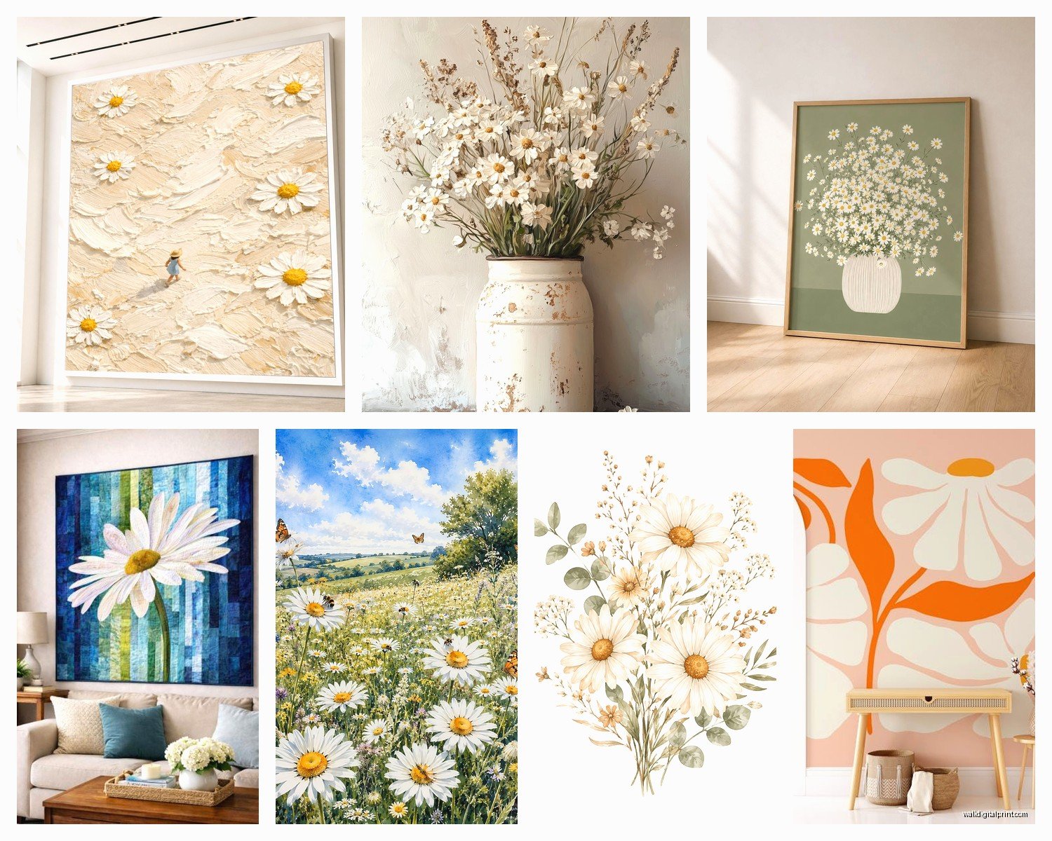
Okay so here’s the thing about daisy art specifically – it reads as simple and clean but doesn’t feel sterile like some minimalist stuff can. I’ve used tons of floral art in projects and daisies have this weird sweet spot where they’re recognizable enough to feel friendly but graphic enough to not look like your grandmother’s rose wallpaper. The white petals with yellow centers give you this built-in color scheme that works with basically everything.
I tested this theory in my own kitchen last month (was watching The Bear while rearranging everything at like 11pm) and moved a daisy print around to five different walls. Worked in every single spot. That almost never happens with art.
Choosing the Right Style Without Overthinking It
There’s basically four main styles you’re gonna see and they each do different things:
Photographic Prints
These are actual photos of daisies, usually close-ups or field shots. Super crisp, very literal. I use these when someone wants that garden feeling but lives in an apartment with no outdoor space. The key is finding ones where the photographer actually knew what they were doing with composition – you want depth of field, interesting angles, not just a straight-on snapshot.
Target and Society6 have decent options here but honestly I’ve found the best ones on Etsy from photographers who shoot macro florals. Search for “daisy macro photography print” and you’ll find stuff that looks way more expensive than it is.
Watercolor or Painted Versions
These give you more of an artistic vibe, less literal. Good for spaces that already have a lot of visual texture because they add softness. The problem I’ve run into is that cheap watercolor prints can look really washed out and sad. You want ones with actual color saturation in the yellows.
I grabbed one from Minted last year that’s this loose watercolor daisy bunch and it still looks good, hasn’t faded. Spent maybe $85 framed which felt like a lot but it’s held up.
Line Drawings and Minimalist Illustrations
Oh man, these are everywhere right now. Simple black line drawings of daisy outlines, very Scandinavian vibes. They work really well in modern spaces or when you’re trying to keep things from feeling too busy.
The trick with these is that they can read as generic if you’re not careful. I look for ones where the artist has some personality in the line work – maybe slightly imperfect circles or varied line weights. Desenio has a bunch of these and they’re affordable but you gotta frame them yourself.
Vintage Botanical Style
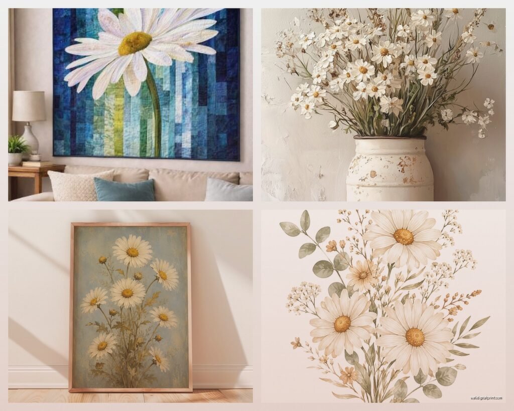
Think old-school botanical illustration vibes, kinda scientific looking with labels and detailed stems. These add instant sophistication and work surprisingly well in offices or dining rooms. They make daisies look more “serious” somehow.
Wait I forgot to mention – if you go this route, antique stores sometimes have actual vintage botanical prints for like $20-30 and they’re the real deal, not reproductions. Found one in Portland last spring that’s now in my hallway.
Size and Placement Because This Actually Matters
Okay so funny story, I once hung a tiny 8×10 daisy print on a huge blank wall and my client texted me a photo like “is this a joke?” So yeah, scale matters.
Small prints (8×10 to 11×14): These only work in gallery walls or small spaces like bathrooms, entryways, or above a nightstand. Solo on a big wall they look like you gave up.
Medium (16×20 to 18×24): This is your sweet spot for most rooms. Big enough to make a statement over a desk, dresser, or in a breakfast nook. Not so big that it overwhelms.
Large (24×36 and up): You’re committing to daisies being a focal point. I use these over sofas, beds, or in dining rooms. They need at least 6-8 inches of space on each side to breathe properly.
The rule I follow is that your art should take up about 2/3 to 3/4 of the width of the furniture below it. So if your couch is 90 inches, you’re looking at roughly 60-67 inches of art width. You can do one big piece or a grouping.
Framing Without Spending Your Entire Paycheck
Custom framing is gonna run you $150-400 easily and honestly for daisy prints it’s usually not necessary unless you’ve got something really special. Here’s what actually works:
IKEA frames: Yeah I know, but their RIBBA and KNOPPANG frames are legitimately good for the price. The white or light wood ones work perfectly with daisy art. I’ve used dozens of these in client homes and they look fine.
Framebridge: If you want something nicer but not custom pricing, this is where I go. You upload your print, pick a frame, they do everything. Usually around $75-150 depending on size. Their “gallery white” frame with daisy art is *chef’s kiss*.
Thrift store frames: Okay this is gonna sound weird but I find great frames at Goodwill constantly. Ignore the art inside, just look at the frame. Clean them up, spray paint if needed, pop in your daisy print. My cat knocked over a vase last week and broke a “vintage” frame I’d paid $6 for so the risk is low.
Matting Yes or No
White mats make daisy prints look more formal and gallery-like. No mat gives you a more modern, casual feel. I usually skip the mat for line drawings and minimalist styles, use it for photographic or watercolor prints. Mats also help if your print size is slightly off from standard frame sizes.
Where to Actually Buy Decent Daisy Wall Art
I’ve bought from probably 30+ places at this point so here’s what’s actually worth your time:
Etsy: Best selection, period. Filter by “ships from your country” to avoid weird customs delays. Look for shops with lots of reviews. I search “daisy art print digital download” because then you can print it locally at whatever size you need. Costs like $5-12 for the file.
Society6: Good quality prints, they handle framing if you want. Pricier than Etsy but more consistent quality. Sales happen constantly so wait for 20-30% off.
Minted: More curated, higher price point, really good framing options. When a client has budget this is where I start.
Target and HomeGoods: Hit or miss but I’ve found surprisingly good daisy prints at both. You gotta go in person and dig through stuff. Found a three-panel daisy set at HomeGoods for $40 that I used in a rental staging.
Print shops (local): If you download a digital file from Etsy, take it to a local print shop or even Costco. Costco printing is actually really good and cheap. Get it printed on premium paper, looks professional.
Making It Not Look Basic
Okay so the challenge with daisies is they can read as generic if you’re not careful. Here’s how I avoid that:
Mix them with unexpected art. I paired a big daisy print with a black and white architectural photo and a small abstract piece last month – the contrast made the daisies feel more intentional and less “I bought the first flower art I saw.”
Use interesting frames. A chunky natural wood frame or even a thin black metal one changes the whole vibe from sweet to sophisticated.
Go big or go home. One large statement daisy piece reads as confident. Three small matching ones can look like you decorated from a catalog.
Add texture nearby. Daisies are pretty flat visually, so I always put them near something with physical texture – a chunky knit throw, a jute rug, a rattan chair. Keeps the space from feeling too flat.
Color Combinations That Just Work
White daisies are obviously mostly white and yellow, so they’re super versatile but here’s what I’ve seen look best:
- Daisies with navy blue and natural wood – very calming, slightly nautical without being beachy
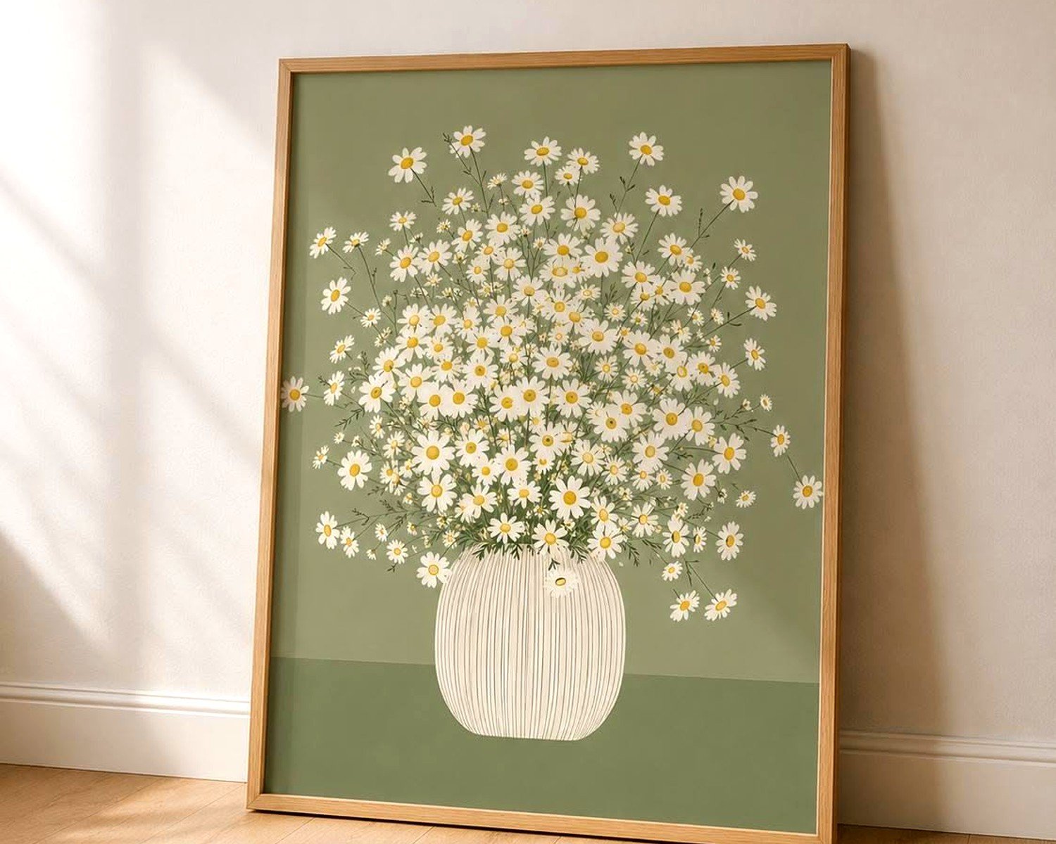
- Daisies with sage green and cream – organic modern, really fresh feeling
- Daisies with charcoal gray and brass accents – makes them feel more sophisticated and less cottage-y
- Daisies with terracotta and white – warm and welcoming, great for kitchens
- All white everything with daisies – if you wanna go full minimal, this works but add varied textures
Black frames or mats can make daisy art feel more graphic and modern. Gold frames make them feel more traditional (which might be what you want).
Specific Room Recommendations
Kitchen/Dining: I almost always use daisy art in kitchens because it’s cheerful without being too casual. A triptych of three daisy prints above a breakfast nook table is one of my go-to moves. Or a single large piece on the wall opposite your sink so you see it while doing dishes.
Bedroom: Over the bed is obvious but I actually prefer daisy art on a side wall in bedrooms, like above a dresser or reading chair. Keeps it from being the last thing you see before sleep if that’s not your vibe. Softer watercolor styles work better here than graphic ones.
Bathroom: Small daisy prints in white frames are perfect for bathrooms. The humidity won’t hurt them if they’re properly framed. I did a little gallery wall of four small daisy prints in a powder room and people always comment on it.
Home Office: This is where I use daisy art most often honestly. It’s uplifting without being distracting. A medium-sized piece on the wall you face while working, or behind you for video calls. Skip anything too detailed or busy – simple line drawings or clean photography works best.
Entryway: First impression energy matters and daisies say “this home is friendly and put-together.” Just don’t go tiny – you need something that registers as you walk in the door.
DIY Options If You’re Feeling Crafty
I’m not usually a DIY person but there’s a few things that actually work:
Press real daisies and frame them. Sounds precious but if you do it in a modern frame with clean matting it looks cool and organic. Put the flowers between heavy books for a week, then arrange and frame.
Print your own from free stock photo sites. Unsplash and Pexels have gorgeous daisy photos you can download free and print. Just make sure you’re getting high enough resolution – at least 3000 pixels on the shortest side for anything bigger than 11×14.
Paint your own if you’re going for abstract vibes. Honestly a white and yellow abstract that just suggests daisies can look more interesting than literal flowers. I can’t paint to save my life but I’ve seen clients do this successfully.
What Doesn’t Work – Stuff I’ve Tried and Regretted
Canvas prints from those cheap online print companies. They arrive super thin and flimsy. If you’re doing canvas, spend the money on proper gallery-wrapped canvas or just do paper prints instead.
Anything too cutesy with bees and butterflies and hand-lettered quotes. Unless you’re decorating a kid’s room, this reads as unsophisticated fast.
Prints that are too yellow. Some daisy art skews really warm and yellow-heavy and it can make a whole room feel jaundiced. Look for crisp whites and true yellows, not mustard yellows.
Plastic frames. Just no. Even IKEA’s cheapest frames are better than plastic. They cloud up and look bad within months.
Quick Styling Tips Once It’s Hung
Layer other stuff in front of it on a console or shelf – a plant, some books, a small object. Makes it feel more collected and less “I hung one thing on the wall.”
Light it properly if you can. Even a simple picture light or nearby lamp that casts light on the art makes it look more intentional. Most art looks flat in poor lighting.
Don’t center everything obsessively. Sometimes hanging art slightly off-center or in an unexpected spot makes a room feel more dynamic.
Change it seasonally if you want. Daisies feel very spring/summer to some people so you could swap in different art for fall/winter. I have a client who does this and stores off-season art under her bed.
Oh and another thing – if you’re renting and can’t put holes in walls, those Command picture hanging strips actually work now. Use the right weight rating and follow the directions exactly. I’ve had art up for years on those in my own place with zero issues.
The whole point is that daisy wall art doesn’t have to be complicated or expensive to look really good. It’s one of those things where simple choices usually win – good quality print, proper sizing, decent frame, done. Don’t overthink it into something precious and perfect. Just pick something that makes you smile when you see it and call it a day.