
Wall Art Guide, Wall Art Tutoriels
Dining Room Large Wall Art: Oversized Eating Space Pieces
Nov
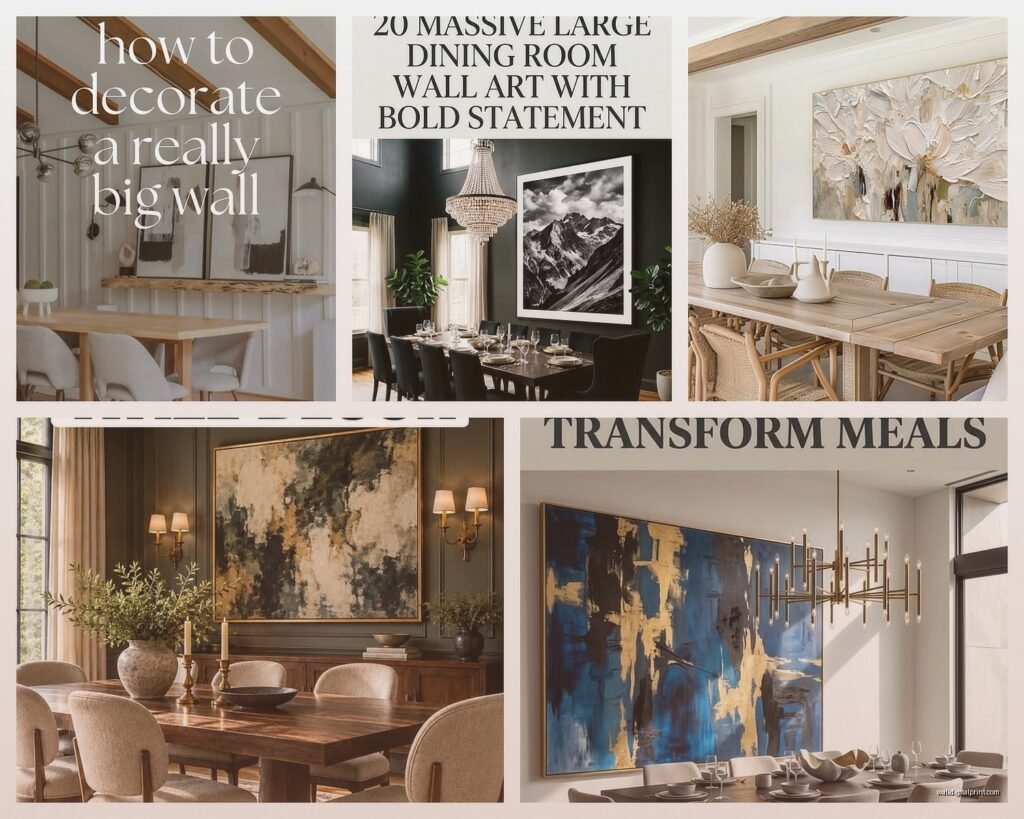
So I’ve been obsessing over dining room wall art lately because honestly, most people get this SO wrong and then wonder why their eating space feels off. Like my sister just bought this tiny 16×20 print for her massive dining wall and I had to physically restrain myself from saying something at Thanksgiving…
The biggest mistake everyone makes is going too small. I’m talking way too small. Your dining room can handle—actually needs—art that’s gonna make you second-guess yourself in the store. If you’re standing there thinking “hmm this feels big” it’s probably perfect. I learned this the hard way when I curated a show last year and had to explain to like fifteen different people that yes, a 60×40 piece is appropriate for an 8-foot wall.
Sizing This Thing Out (Without Math Because Who Has Time)
Okay so the rule I actually use: your art should take up about 60-75% of your wall space width-wise. But here’s what that looks like in real life—if your dining table is 6 feet long, you’re probably looking at art that’s somewhere between 48-60 inches wide. Maybe even bigger if your wall is empty otherwise.
Stand back from your wall like 10 feet. Hold your arms out to frame where you think the art should go. That frame you’re making with your hands? Add another 6-12 inches to it. Seriously.
I had this client who kept insisting on a 30-inch piece for her wall and I literally brought over three different sizes to show her the difference. We ended up with a 72-inch wide triptych and she texts me photos of it like every other month because she’s still obsessed with how it transformed the room.
Height Stuff That Actually Matters
The center of your artwork should be around 57-60 inches from the floor. This is the “gallery standard” or whatever but it genuinely works. But wait—if you have a buffet or sideboard underneath, ignore that rule. You want about 6-10 inches between the furniture top and the bottom of your art.
Here’s something weird but trust me on this: if your ceilings are really high (like 10+ feet), you can go higher with the placement. The art should relate to the room’s proportions AND the furniture, not just follow some arbitrary number.
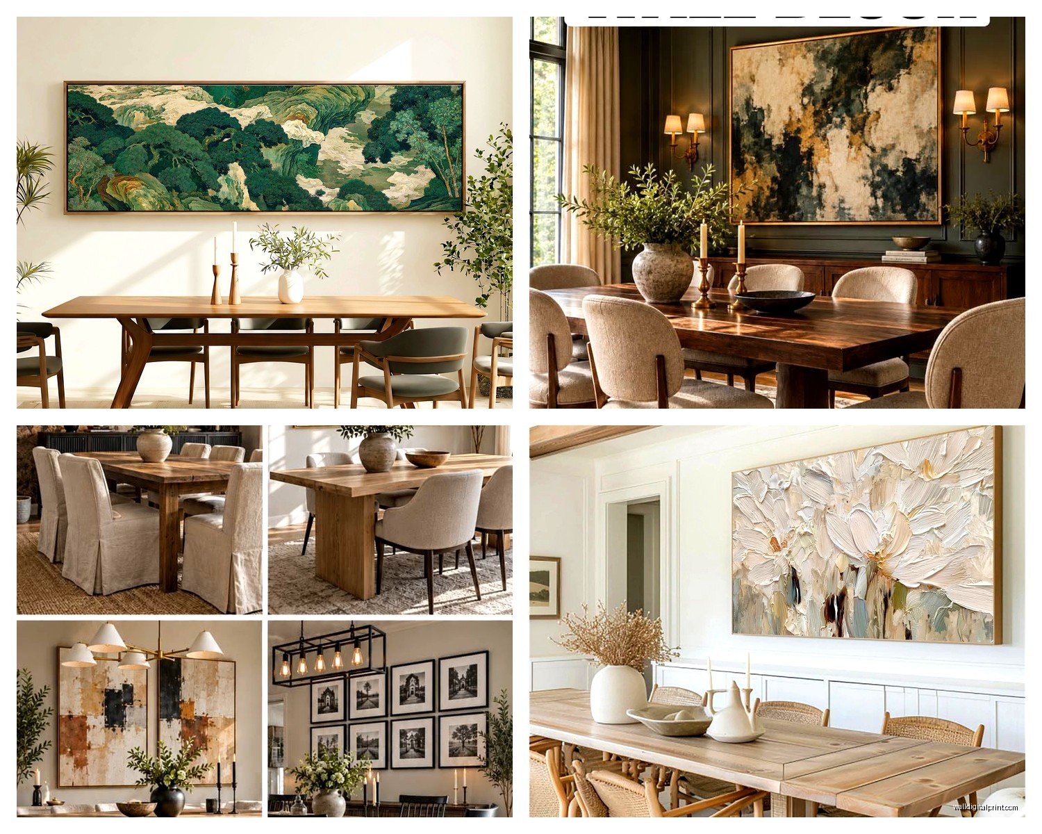
Oh and another thing—if you’re hanging art above a dining table, make sure it’s high enough that tall people (or tall centerpieces) don’t visually cut into it when people are seated. Learned that one when my 6’4″ brother-in-law came for dinner and basically blocked the entire bottom third of this gorgeous landscape piece.
What Actually Works in Dining Spaces
I’m gonna be real with you, not everything belongs in a dining room. You’re eating here, people are gathering here, there’s gonna be food smells and humidity and wine splashes (just me? okay).
Abstract pieces are honestly the MVP here. They don’t compete with your table settings, they work with literally any decor style, and they’re conversation starters without being distracting. I’ve used oversized abstracts in probably 60% of the dining rooms I’ve styled.
Large-scale photography works too—but pick carefully. Landscapes, architectural shots, black and white portraits…yes. Your cousin’s wedding photos blown up to 4 feet? Probably not. Food photography is tricky because it can be amazing or really cheesy depending on execution.
Botanical prints are having a moment and they’re actually perfect for dining rooms. Something about the organic shapes works with the whole breaking bread together vibe without being too literal about it.
The Multi-Piece Situation
Okay so if one giant piece feels too intimidating or expensive, you can do multiple pieces. But there are rules here that people mess up constantly.
For a gallery wall above a dining table: keep it contained. Use painter’s tape on the wall to map out a rectangular boundary and keep all your pieces within it. A scattered, organic gallery wall looks chaotic in a dining space where you want some level of formality.
Diptychs and triptychs (two or three panel pieces) are actually easier than you think. Leave 2-4 inches between panels. Not 6 inches, not 1 inch—that 2-4 inch sweet spot keeps them feeling connected but not cramped.
I just finished a dining room where we did three 24×36 vertical pieces in a row and it looked SO much more expensive than it was. Got them from this online place during a sale, maybe $400 total? Everyone assumes they’re original art.
Material and Texture Things
Canvas is fine but honestly kinda boring at this point. If you’re going oversized, consider:
- Framed prints with substantial frames (2-3 inches wide minimum for large pieces)
- Metal prints—they’re modern, durable, and the reflection catches light beautifully
- Acrylic face mounting which sounds fancy but just means the print is behind acrylic for this glossy depth
- Actual canvas but with a floater frame so it doesn’t look cheap
- Wood prints for a more organic vibe
My cat knocked over my coffee while I was researching wood prints last month and honestly that’s how I discovered this company that does gorgeous oversized wood-mounted pieces…but anyway, texture matters more in dining rooms than people think because you’re looking at this art during meals when lighting changes throughout the day.
Color Coordination Without Being Matchy-Matchy
You don’t need to pull exact colors from your art into your dining room. Actually please don’t do that—it looks staged and weird. Instead, pull the undertones.
If your art has warm undertones (reds, oranges, yellows, warm browns), make sure your dining space has some warm elements. If it’s cool-toned (blues, grays, purples, cool greens), same thing. But you can have a blue painting with warm wood furniture—the undertones just need to not fight each other.
This is gonna sound weird but I literally take photos of art I’m considering and text them to myself, then look at them on my phone in the actual dining room. The phone screen somehow makes it easier to see if the colors work? Maybe that’s just me being weird.
Where to Actually Buy This Stuff
Okay so you’ve got options at different price points and I’ve tried basically all of them:
Budget-friendly (under $300 for large pieces): Society6, Desenio, Minted during sales, IKEA’s BJÖRKSTA series which is actually shockingly good, Target’s Threshold collection sometimes has gems.
Mid-range ($300-800): Etsy for prints from actual artists, Artfully Walls, Saatchi Art, local art fairs where you can negotiate, West Elm during their 30% off sales.
Investment ($800+): Original art from local galleries, commission pieces from emerging artists, high-end photography prints, Tappan Collective.
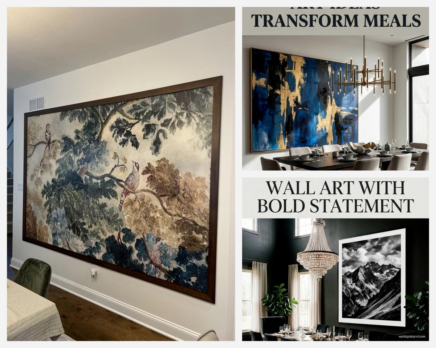
I got this massive 60×80 piece from an artist on Etsy for like $450 and it’s literally the first thing everyone comments on. Sometimes the mid-range option is the sweet spot where quality meets affordability.
Installation Because This Is Where People Panic
Large art is heavy. Like heavier than you think. Anything over 30 pounds needs serious anchoring.
Use wall anchors rated for at least double the weight of your art. So if your piece is 25 pounds, use anchors rated for 50. Find the studs if possible—there’s this $15 stud finder that’s saved me so many headaches.
For really oversized pieces (we’re talking 5+ feet in any direction), consider a French cleat system or those heavy-duty picture hanging strips that can hold up to 16 pounds per set. You’ll need multiple sets for big pieces.
Oh and measure from the floor up, not the ceiling down. Ceilings aren’t always level and you’ll end up with crooked art. Ask me how I know this.
Lighting Makes or Breaks This
Natural light is great but can fade artwork over time. If your dining room has big windows, consider UV-protective glass or acrylic.
For artificial lighting, picture lights are classic but honestly? A well-placed track light or adjustable can light does the same job for less money. I usually position lights at a 30-degree angle about 3-5 feet from the wall.
Dimmable lighting is clutch in dining rooms anyway, and being able to control how much your art is illuminated during dinner parties versus casual breakfasts makes a bigger difference than you’d think.
Stuff That Looks Good But Isn’t Practical
Gonna save you some mistakes I’ve seen (and made):
Mirrors aren’t wall art. They’re mirrors. A giant mirror in a dining room just means you’re watching yourself eat which is weird. Unless it’s an antique or specifically decorative mirror as an art piece, skip it.
Shelving with rotating small art pieces—sounds cute, ends up looking cluttered. Commit to one large statement or don’t.
Plates as art… look, I have opinions. If they’re genuinely beautiful or antique, maybe. If they’re decorative plates from HomeGoods, no.
Text-based art that says stuff like “Gather” or “Eat” or whatever—it’s fine if that’s your style but it’s also really trendy right now which means it’ll feel dated soon. Just something to consider if you’re investing in a large piece.
My Actual Current Favorites
Since you asked what to actually buy, here’s what I’m using in projects right now:
Large-scale botanical illustrations—think oversized fern or palm fronds in simple black frames. Classic but not boring.
Abstract landscapes that blur the line between recognizable and pure abstraction. They work in traditional and modern spaces which makes them versatile.
Black and white photography of architectural details or natural formations. The lack of color makes them sophisticated and they don’t compete with colorful table settings.
Oversized line drawings—super trendy but the simple ones will hold up over time. Think Matisse-inspired continuous line portraits or figures.
Textured paintings where you can see brushstrokes or palette knife work from across the room. Adds dimension that flat prints can’t match.
The Rental Situation
If you’re renting and can’t put massive holes in walls, there are options. Command strips work for pieces up to about 20 pounds if you use enough of them. Lean large art on a substantial sideboard or buffet—it’s actually a whole look right now and totally acceptable.
I styled a rental dining room last year where we leaned a 48×60 canvas on a console table behind the dining bench and it looked intentional and expensive. Just make sure it’s secure if you have kids or pets.
You can also look into tension rod gallery systems or those apartment-friendly picture rails that grip the wall without nails.
Okay I think that’s everything I’ve learned from probably too many hours thinking about dining room walls. The main thing is just go bigger than your instinct tells you and make sure it’s something you actually want to look at during meals because you’ll be seeing it a lot. My last client ignored my sizing advice, bought something too small, lived with it for two months, then called me back to help her find the right size…so yeah, just trust the process on the scale thing.
