Wall Art Guide, Wall Art Tutoriels
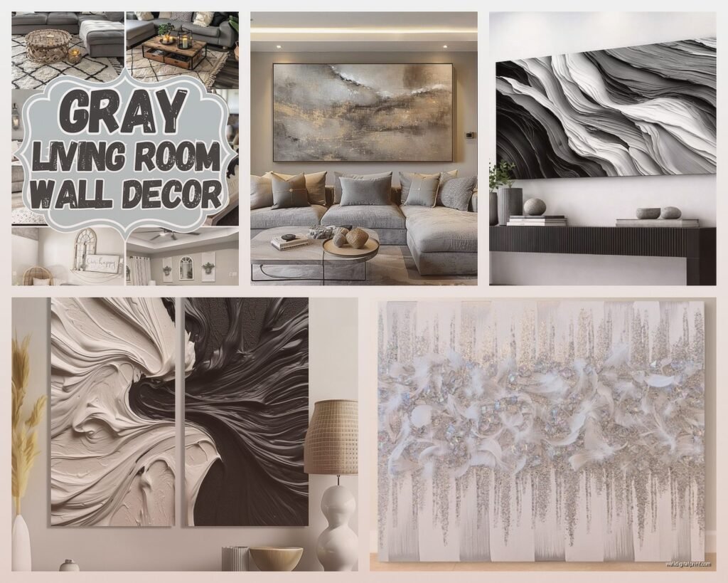
Gray Wall Art for Living Room: Neutral Main Space Designs
May
So I’ve been working with gray wall art in living rooms for like three years now and honestly it’s one of those things that sounds boring until you actually see it done right. My client last month was SO worried it would look like a dentist’s office but then we hung everything and she literally texted me at midnight saying she couldn’t stop staring at her walls.
The thing with gray art is you gotta think about undertones first. Like this is actually the most important part and everyone skips it. Gray isn’t just gray – it’s either warm gray (has brown or beige in it) or cool gray (blue or purple undertones) or true gray which is pretty rare honestly. Hold your art sample next to your wall in natural light AND at night with your lamps on because I’ve seen pieces that look perfect in the store and then you get home and suddenly everything looks dingy or cold.
Figuring Out Your Gray Situation
Your existing wall color matters SO much. If you’ve got Agreeable Gray or Revere Pewter or any of those greige colors everyone uses, you want warm-toned gray art. Cool gray art against warm walls looks muddy and kind of sad. I learned this the hard way in my own living room like four years ago and had to return three pieces to West Elm.
For true cool grays on your walls – thinking like Stonington Gray or Gray Owl – you can do cool-toned art OR high-contrast stuff with crisp white and charcoal. The cool-on-cool thing works better than you’d think as long as you have enough contrast in the actual artwork.
Scale Is Gonna Make or Break This
Okay so this is where people mess up constantly. They buy art that’s way too small and then wonder why their living room feels empty. The general rule is your main piece should take up about two-thirds to three-quarters of your sofa width. So if you’ve got an 84-inch sofa, you’re looking at roughly 56 to 63 inches of art width.
But here’s what I actually do instead of one massive piece – I’ll do a three-panel setup or a gallery wall within that measurement. It gives you more visual interest and honestly it’s easier to find affordable pieces when you’re not looking for one giant thing.
I was watching The Bear the other night (so good btw) and kept pausing to look at the restaurant walls and they do this thing where they cluster smaller pieces really tightly which actually reads as one large installation. You could totally do that with gray abstracts.
Abstract vs Photographic vs Geometric
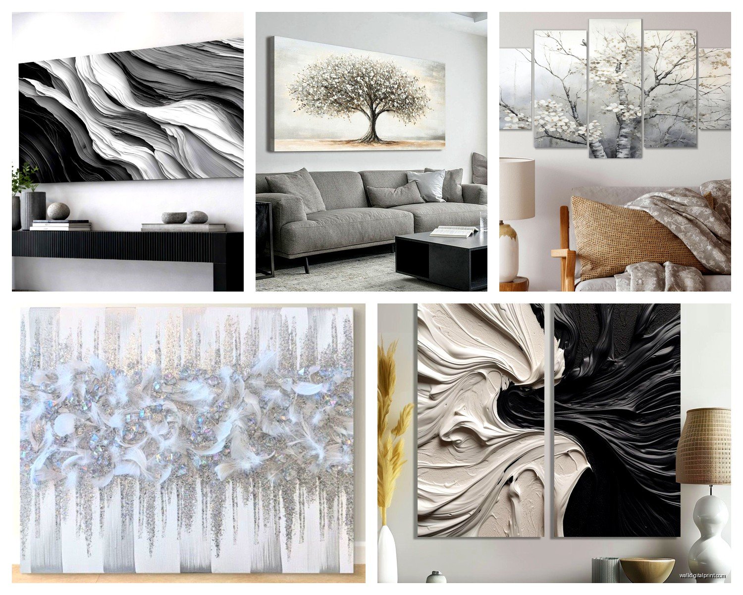
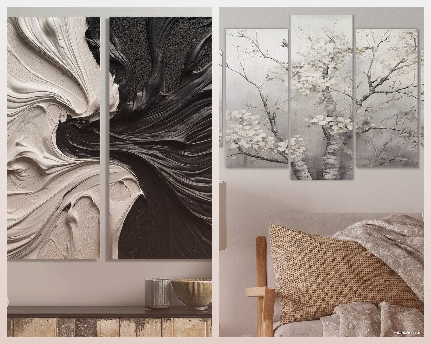
Abstract gray art is the safest bet for living rooms because it works with literally everything. I’m talking about those pieces with brushstrokes in varying shades of gray, maybe some white, possibly a tiny accent of another neutral. Etsy has tons of these as printables which is great if you’re on a budget – you can download and print at your local print shop for like $40 instead of $300.
Photographic gray art is trickier. Black and white photography can look amazing but it needs to be the right subject matter. I did a living room last year with this huge misty forest photo and it was perfect – moody but not dark. Beach scenes work too. But like… don’t do black and white portraits of random people unless it’s actually meaningful to you because that’s weird.
Geometric gray patterns are having a moment right now. Think mid-century modern inspired shapes, Scandinavian-style line art, that kind of thing. These work really well in modern or transitional living rooms. The key is making sure the lines are thick enough to read from across the room.
Mixing Textures Because Flat Is Boring
This is gonna sound weird but one of my favorite tricks is mixing different types of gray art materials in the same space. So maybe you’ve got a large canvas abstract print, but then you add a smaller framed pencil drawing, and then there’s a woven textile piece in charcoal.
The textile thing especially – I found this amazing macrame wall hanging in gray cotton at Target of all places and it added so much dimension to an otherwise flat gallery wall. Cost like $35. My cat immediately tried to climb it but that’s beside the point.
You can also do sculptural elements. There are these 3D geometric wall sculptures on Amazon made from painted wood or metal in gray tones and they cast shadows throughout the day which makes your wall constantly look different.
The Gallery Wall Formula That Actually Works
Okay so I’ve hung probably fifty gallery walls at this point and here’s what I do every single time. Start with your largest piece slightly off-center. Not dead center – that looks too formal. Then build around it with smaller pieces, maintaining roughly 2-3 inches between frames.
For gray art specifically I like mixing frame colors. All-gray art in all-gray frames can look washed out. Try black frames with gray mats, or natural wood frames, or even white frames if your walls are darker. The frames give your eyes something to anchor to.
Layout the whole thing on the floor first. I cannot stress this enough. Take a photo from above so you can reference it while hanging. Use painter’s tape on the wall to map out where each piece goes before you start making holes.
Lighting Makes Gray Art Come Alive
Here’s something nobody tells you – gray art needs good lighting or it disappears into your walls. I always add picture lights or track lighting aimed at the main pieces. Even just a couple of uplights from the floor can make a huge difference.
Natural light is tricky with gray because it can wash it out during midday but look gorgeous in morning and evening light. If your living room gets harsh afternoon sun, consider art with deeper charcoals and blacks mixed in so it doesn’t fade into nothing.
LED strip lights behind floating frames create this cool halo effect that works surprisingly well with monochromatic art. Saw this in a design magazine and tried it in my own space and wow.
Specific Pieces I Keep Recommending
There’s this artist on Minted called Julia Contacessi who does these gorgeous minimal gray landscapes that I’ve used in probably five living rooms. They’re like $150-300 depending on size which isn’t cheap but the quality is really good.
For budget options, honestly Ikea’s BJÖRKSTA series has some decent gray abstracts. The Archipelago print in particular is only like $70 with the frame and it’s huge. Looks way more expensive than it is if you hang it properly.
ProjectNordPosters on Etsy – they do downloadable line art and abstract prints mostly in black and gray. Super affordable since you’re just paying for the digital file. I usually get them printed at a local place that does architect blueprints because they have large-format printers and the quality is better than Staples.
Oh and another thing – thrift stores and estate sales. I’ve found incredible vintage gray-toned art for nothing. There was this one charcoal drawing I got for $15 that an appraiser later told me was worth around $400. You gotta dig through a lot of bad stuff but sometimes you strike gold.
Accent Colors to Add With Your Gray Art
So pure gray can feel cold if that’s literally all you have going on. I usually add one accent color through smaller art pieces or the matting. Warm terracotta is really popular right now – a gray abstract with rust-colored elements ties in beautifully with leather furniture or wood tones.
Sage green and gray is another combo I’m obsessed with lately. Very calming, works in traditional or modern spaces. You could do mostly gray art with one piece that has subtle green tones.
Navy and gray is classic and masculine without being too heavy. Gold accents in frames or within the artwork itself adds warmth without color.
But honestly you don’t NEED accent colors if you’ve got enough going on with furniture and textiles. Sometimes an all-gray art wall with a colorful sofa and pillows is the perfect balance.
The Oversized Single Piece Approach
If gallery walls stress you out just get one big piece and call it done. I did this in my own living room because my client canceled one day so I spent an hour comparing oversized options online and just went for it.
For above a sofa you want something that’s at least 40 inches wide, preferably bigger. Those really large canvases at HomeGoods and TJ Maxx can be hit or miss quality-wise but I’ve found some decent ones. Check that the canvas is actually wrapped around thick stretcher bars not just stapled to thin wood.
An oversized piece needs to hang at the right height – center of the artwork should be at eye level which is usually around 57-60 inches from the floor. Above a sofa you can go slightly lower so it relates to the furniture, maybe 6-8 inches above the sofa back.
Mixing Gray Art With Other Neutral Art
You don’t have to commit to ALL gray. I actually think mixing gray with cream, beige, black and white keeps things more interesting. The key is repeating the gray throughout so there’s cohesion.
Like maybe you’ve got a large gray abstract, a smaller black and white photo, and a cream-toned line drawing. As long as gray appears in at least 50-60% of your wall art, it’ll still read as your dominant neutral.
I’m working on a living room right now where we’re doing this exact thing and it’s looking really good. The homeowner was worried about it being too matchy but the variation in tones actually makes the space feel more collected and intentional.
Seasonal Switching If You’re Into That
Some of my clients like to rotate their art seasonally which sounds extra but it’s actually kinda nice. Gray art is perfect for this because it’s your neutral base – you could swap in warmer pieces for fall and winter, cooler tones for spring and summer.
I keep my backup art in those flat storage boxes under my bed. Makes it easy to switch things out when I get bored. This probably sounds high maintenance but it takes like 20 minutes twice a year and completely refreshes the room.
The other thing is you can test new pieces this way before committing to holes in different spots. Command strips work for lightweight frames if you wanna try different arrangements.
Common Mistakes I See Constantly
Hanging everything too high. I’ve seen so many living rooms where the art is practically on the ceiling. It should relate to your furniture and your sight lines when you’re actually in the room using it.
Matching your art too perfectly to one throw pillow or something. It looks staged and weird. Gray art should coordinate with your overall color scheme not match exactly to one specific item.
Using only printed posters without frames or mats. It can work in a bedroom or office but living rooms need more polish. At minimum get some simple frames even if they’re cheap ones from Amazon.
Being afraid to mix metallic frames with gray art. Silver and gold frames both look great with gray artwork – don’t overthink it.
Oh I forgot to mention earlier – if you have a fireplace in your living room, the wall above it is prime real estate for a statement gray piece. Just make sure it’s not too close to the heat source. I learned that one when a client’s print started warping because it was like 6 inches above the mantel.
The whole gray wall art thing really comes down to layering different shades and textures so it doesn’t feel flat. And honestly living with it for a bit before you commit to everything permanently. I’ve definitely bought pieces I thought I loved and then realized after a week they weren’t quite right. That’s what good return policies are for.