Wall Art Guide, Wall Art Tutoriels
Grey Wall Art for Living Room: Neutral Main Space Designs
May
So I’ve been deep in the grey wall art rabbit hole lately because three different clients asked about it in the same week, which like… never happens but then suddenly everyone wants the same thing. Grey art is actually trickier than you’d think because it can go SO wrong so fast.
Why Grey Art Actually Works in Living Rooms
Okay so the thing about grey is it’s not really one color, right? I was at this gallery opening last month and they had this whole section of “monochromatic grey” pieces and literally none of them looked the same. You’ve got warm greys that lean taupe or greige, cool greys that are almost blue, charcoal that’s practically black. The reason it works so well in living rooms is because it doesn’t compete with anything else you’ve got going on. Your throw pillows can be whatever, your rug can be bold, and the grey art just… exists peacefully with everything.
I tested this theory in my own space actually. Put up this massive grey abstract piece behind my couch and then spent like two months switching out every other element in the room. Emerald green pillows one week, burnt orange the next, then I went through a weird phase with mustard yellow (don’t judge). The art looked good with literally all of it.
The Undertone Thing You Can’t Ignore
This is gonna sound annoying but you HAVE to figure out if your grey has warm or cool undertones before you buy art. I learned this the hard way when I ordered this beautiful charcoal geometric print for a client and when it arrived it had these blue undertones that clashed horribly with her warm grey walls. Like it looked wrong in a way that made your eyes hurt.
Here’s what I do now: take a photo of your wall in natural light, then hold up white paper next to it. If the wall looks yellowish or brownish compared to the paper, you’ve got warm greys. If it looks bluish or purplish, cool greys. Then make sure your art leans the same direction. Warm with warm, cool with cool.
Size Matters More Than You Think
Everyone always goes too small with wall art and it drives me crazy. I had this client who bought these three tiny 8×10 grey prints for above her massive sectional and it looked like… I don’t even know, like someone stuck postage stamps on the wall?
The rule I follow is your art should take up about two-thirds to three-quarters of your furniture width. So if your sofa is 90 inches, you want something around 60 inches wide minimum. You can do one large piece or a gallery wall that spans that distance, but don’t go smaller. Just trust me on this.
Oh and another thing – hang it at eye level, which is usually around 57-60 inches from the floor to the center of the piece. Not to the bottom, to the CENTER. I see this mistake constantly and it makes rooms feel off without people being able to pinpoint why.
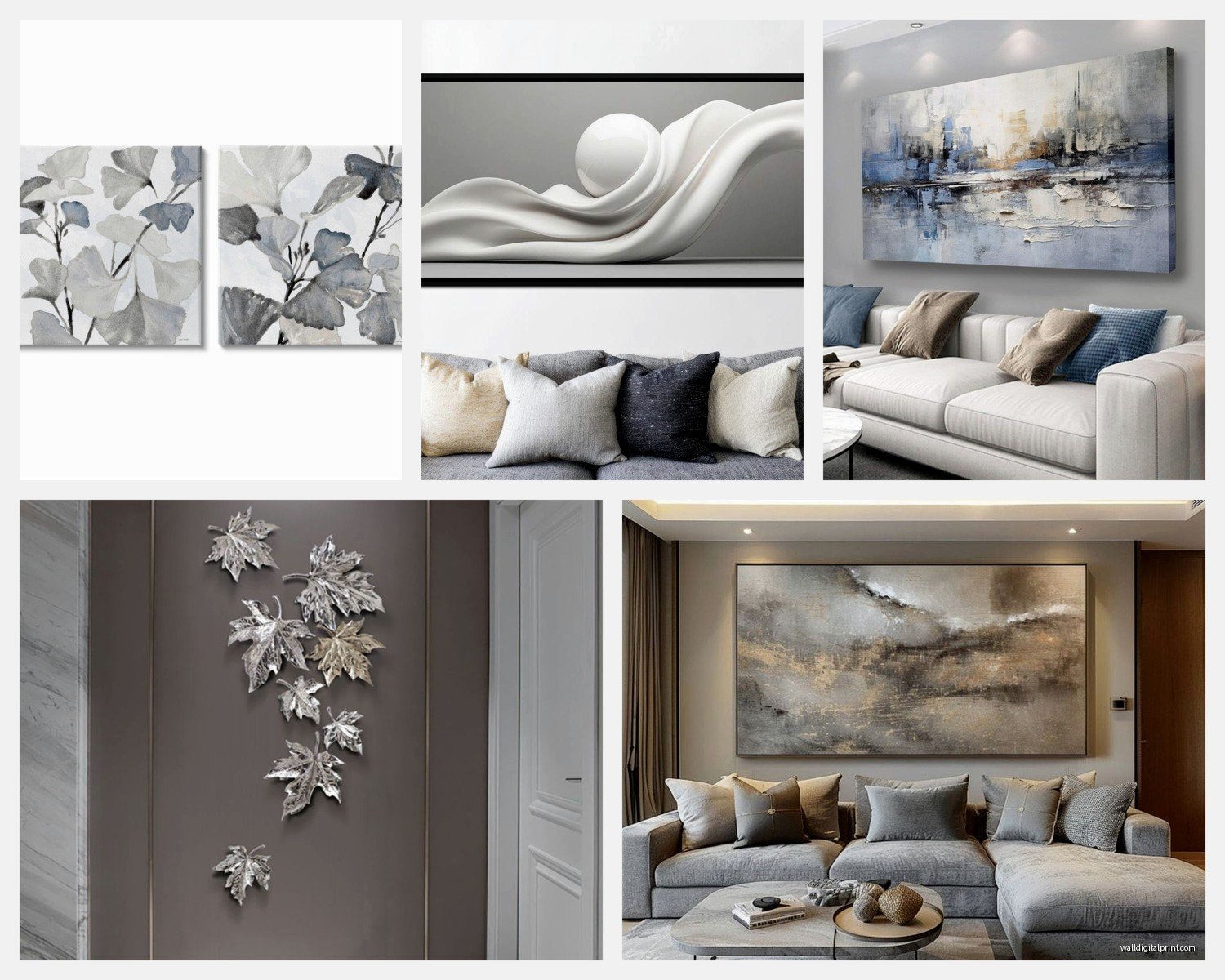
Types of Grey Art That Actually Work
Abstract Grey Paintings
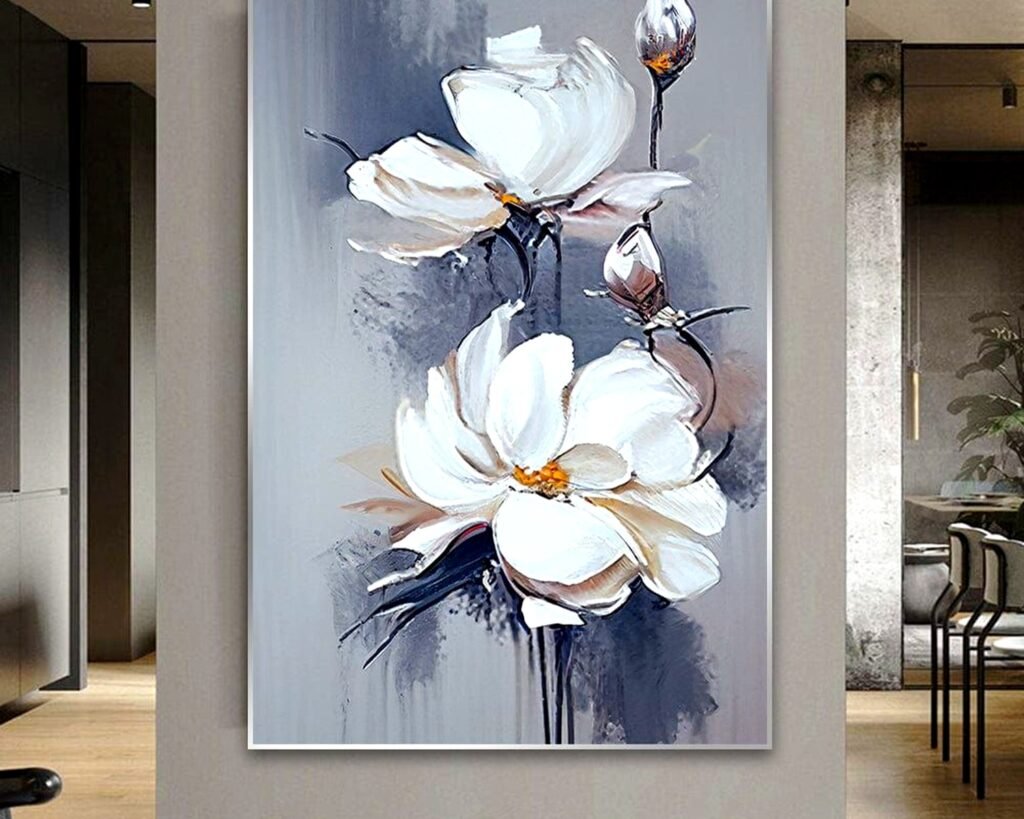
These are my go-to recommendation probably 70% of the time. Abstract grey art gives you texture and movement without being too literal or distracting. I’m obsessed with pieces that have multiple shades of grey layered together – like charcoal, silver, and dove grey all in one canvas. It creates depth that photographs don’t really capture.
The best ones have some kind of texture to them, either actual physical texture with thick paint or the illusion of texture through brushwork. Flat grey art can look kinda dead on the wall if you’re not careful.
Black and White Photography with Grey Tones
Okay so this works really well in modern or contemporary spaces. Nature photography especially – think misty forests, foggy coastlines, stormy skies. All that grey atmospheric stuff. I used a series of three grey-toned ocean photographs in a client’s living room last year and people literally ask about them every time they visit her place.
The key is making sure there’s actual grey in the photo, not just black and white that happens to have some grey. You want that soft, almost silvery quality.
Geometric Patterns in Grey
My cat just knocked over my coffee sorry, anyway – geometric grey art is perfect if your space is more traditional or if you’ve got a lot of curves and organic shapes in your furniture. The straight lines balance everything out. Hexagons, chevrons, linear patterns, all that works.
Just watch out for geometric art that’s TOO busy. You want patterns that read clearly from across the room, not stuff that turns into visual noise.
Minimalist Line Drawings
These are having a moment right now and I’m here for it. Simple line drawings in grey on white backgrounds or white lines on grey. Faces, bodies, plants, whatever. They’re sophisticated without trying too hard. I’ve been using these in living rooms that already have a lot going on because they don’t add extra visual weight.
How to Mix Grey Art with Other Colors
So this is where people get nervous but honestly it’s not that complicated. Grey is neutral, which means it plays well with basically everything. But there are combinations that look more intentional than others.
Grey + White + Black is the classic combo and yeah it works, but it can feel a bit cold if that’s ALL you do. I always add in at least one warm element – wood frames, a cream colored mat, something to keep it from feeling like a doctor’s office.
Grey + Navy is chef’s kiss perfection for a sophisticated vibe. The navy adds just enough color without overwhelming anything. Works especially well if you’ve got navy accents elsewhere in the room.
Grey + Blush or Dusty Rose creates this really elegant, almost romantic feeling that’s still modern. Not my personal style but I’ve used it for clients and it photographs beautifully.
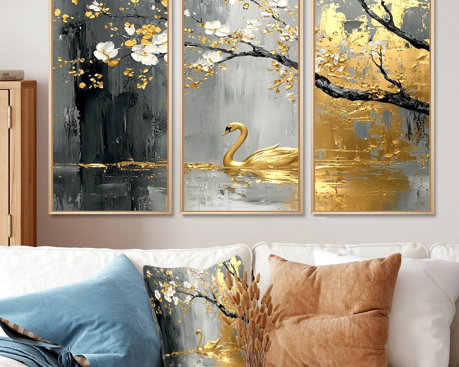
Grey + Emerald or Forest Green feels rich and expensive. This combo is trending hard right now and I get why – it’s unexpected but makes total sense once you see it.
Grey + Brass or Gold Accents through the frame adds warmth and luxury. Skip silver frames with grey art usually, unless you’re specifically going for that ultra-cool modern look.
The Gallery Wall Approach
Okay so funny story, I was watching this home renovation show while I was supposed to be working and they did this grey gallery wall that was actually… good? Usually TV designers get it wrong but this one worked.
For a grey gallery wall in your living room, start with your largest piece and build around it. That anchor piece should be slightly off-center, not dead center. Then add smaller pieces around it, mixing different sizes and shapes. I like doing a mix of framed art and maybe one or two canvas pieces for variety.
Keep your frames consistent though – all black, all white, all natural wood, whatever. Don’t mix frame colors in a gallery wall unless you really know what you’re doing, which like, if you did you probably wouldn’t be reading this at 10pm trying to figure it out.
Space pieces about 2-3 inches apart. Closer than that feels cramped, further apart and they don’t read as a cohesive group.
What to Avoid with Grey Wall Art
- Art that’s the exact same shade as your walls – it’ll just disappear and look weird
- Grey art in a room that’s already feeling cold or sterile – add warmth through other elements first
- Glossy or shiny grey art in rooms with lots of windows – the glare will drive you insane
- Muddy greys that look brownish in a bad way – test before you commit
- Too many different grey tones that don’t relate to each other – pick a family of greys and stick with it
Where to Actually Buy This Stuff
I’m gonna be honest, I’ve wasted so much money on grey art that looked great online and terrible in person. Here’s where I actually shop now:
Local art fairs and galleries let you see the actual texture and color in person, which is huge with grey art. Plus you’re supporting actual artists which feels good.
Minted and Artfully Walls both have good return policies and the quality is consistent. I’ve ordered from both multiple times.
Etsy is hit or miss but you can find really unique stuff. Just read reviews carefully and check if they show photos of the art in actual rooms, not just the print itself.
West Elm and CB2 for more affordable options that still look expensive. Their grey abstract stuff is particularly good.
Wait I forgot to mention – if you’re on a budget, you can DIY grey art pretty easily. Get a canvas, buy grey paint in 3-4 different shades, and just layer it on with a palette knife. Seriously, some of the best grey abstracts in my portfolio are ones clients made themselves after I showed them the technique.
The Lighting Consideration
This is SO important and people always forget about it. Grey art looks completely different depending on your lighting. Natural light brings out the undertones, warm artificial light can make cool greys look muddy, cool LED light can make warm greys look washed out.
I always recommend picture lights or track lighting aimed at your grey art if you’re serious about it looking good. It doesn’t have to be fancy, just something that illuminates the piece properly. The difference is dramatic.
Styling Around Your Grey Art
Once your art is up, you gotta style around it or it’ll look unfinished. I usually do a console table or credenza underneath with carefully chosen objects. Keep it simple – maybe a sculptural vase, a small plant, some books stacked horizontally. Everything should feel intentional but not cluttered.
If your art is above a sofa, your pillows should pick up on either the undertones of the grey or provide a complementary pop of color. I’m really into terracotta and rust colors with cool grey art right now, or sage green with warm grey art.
Throws are another opportunity to tie things together. A chunky knit throw in a slightly different shade of grey adds texture and depth. Or go with a completely different color that complements the grey – that navy I mentioned earlier, or a deep burgundy for something unexpected.
Making It Feel Cohesive with the Rest of Your Space
Your grey art shouldn’t exist in isolation, it needs to connect with other elements in the room. This doesn’t mean everything has to match exactly, but there should be a visual thread.
If your art has warm grey tones, make sure you’ve got other warm elements – maybe wood furniture, brass hardware, warm-toned textiles. If it’s cool grey, lean into that with chrome or nickel finishes, cool-toned fabrics, maybe some glass or lucite furniture.
I also like to repeat the grey from the art in smaller doses throughout the room. A grey throw pillow here, a grey vase there, maybe a grey rug if the art is high-contrast. It creates rhythm and makes the whole space feel more pulled together.
The goal isn’t matchy-matchy, it’s creating a conversation between different elements in the room. Your grey art is just one voice in that conversation, not the only one talking.