
Wall Art Guide, Wall Art Tutoriels
High Gloss Acrylic Wall Art: Shiny Reflective Plexiglass
Oct
So I’ve been working with high gloss acrylic wall art for like three years now and honestly? It’s one of those things that looks way more complicated than it actually is. Last week I mounted four pieces in a client’s dining room and her reaction was worth every moment I spent figuring this stuff out.
What You’re Actually Getting With Acrylic
Okay so first thing – when people say acrylic wall art they usually mean a print that’s been face-mounted to plexiglass. The image goes behind the clear acrylic sheet, which creates this insane depth and the colors just…pop in a way that regular framed prints don’t. My cat knocked over my coffee while I was researching this initially and I’m still finding the comparison charts I printed, but basically the gloss finish reflects light and makes everything look more vibrant.
The thickness matters more than you’d think. I’ve worked with 1/8 inch and 1/4 inch, and honestly the 1/4 inch is where it’s at if you want that really premium look. The 1/8 inch can look a bit flimsy on larger pieces, like anything over 20×30 inches starts to feel cheap even though it’s not actually cheap at all.
Why I Actually Love This Stuff
The reflective quality is what sells it. Regular glass has reflections too but acrylic just hits different – it’s clearer, lighter, and the way it bounces light around a room changes depending on time of day. I installed a piece in my own hallway that catches the afternoon sun and it literally glows. My neighbor asked if I’d installed accent lighting.
Also it’s shatter-resistant which is huge if you have kids or are just generally clumsy. I’ve dropped a small piece (accidentally, during install) and it didn’t break into a million dangerous shards.
Picking Your Image
This is gonna sound obvious but the image quality needs to be insane. Like, way better than what you’d need for a regular print. Because the acrylic magnifies everything – the good and the bad. I learned this the hard way with a beach photo that looked fine on my laptop but when it came back as a 30×40 acrylic print you could see compression artifacts that I swear weren’t visible before.
You want high resolution files, minimum 300 DPI at the size you’re printing. Abstract art and photography with bold colors work incredibly well. Landscapes are beautiful. Black and white can be stunning but make sure there’s good contrast.
Oh and another thing – images with a lot of depth or dimensional elements really benefit from the acrylic treatment. Florals, architectural photography, anything with layers. The glossy surface adds this weird 3D effect that makes flat images feel like they have depth.
Where to Actually Buy These
I’ve ordered from probably six different companies at this point. Some for personal projects, some for clients who had specific budgets.
High-end options: WhiteWall and Fracture are both solid. WhiteWall does face-mounting with different backing options and their quality is consistently excellent. Pricey though – you’re looking at $200+ for medium-sized pieces. Fracture does this thing where they print directly onto acrylic which is slightly different but the effect is similar and they’re a bit more affordable.
Mid-range: Bay Photo and Printique (used to be called AdoramaPix) both offer acrylic prints with good quality control. I’ve had mostly good experiences, one weird color shift issue with Bay Photo that they fixed immediately when I contacted them.
Budget-friendly: Okay so Nations Photo Lab and even Costco Photo Center do acrylic prints now. The Costco ones are…fine? They’re not gonna have the same crystal-clear perfection but for a first attempt or a less important space they work.
Mounting Options That Don’t Suck
This is where people get stressed and honestly I get it because there are like seventeen different ways to hang these things.
Standoff mounts are my favorite for the floating effect. Little metal hardware pieces that hold the acrylic about an inch off the wall. Looks super modern and gallery-like. Installation is straightforward if you’re comfortable drilling into walls – you mount the standoffs first, then the acrylic slides onto them. Just make sure you get the level right because there’s zero forgiveness with this method.
French cleats work great for larger pieces. One piece of wood on the wall, one on the back of the acrylic, they hook together. Super secure and you can adjust positioning easier than with standoffs.
Command strips – wait I forgot to mention – only work for smaller lightweight pieces. Like maybe up to 12×12 inches with the 1/8 inch acrylic. Anything bigger and you’re risking it crashing down at 3am which is not a fun way to wake up.
Some companies will add a backing board (like black foam core or white acrylic) which makes the piece sturdier and easier to hang. I usually go for this option because it just simplifies everything.
The Installation Process I Actually Use
Okay so funny story, the first time I installed acrylic art I didn’t account for the weight properly and used regular drywall anchors. The piece held for about three days before I walked past and heard this creaking sound. Upgraded to proper wall anchors immediately.
Here’s what actually works:
Find your studs if possible. Hanging into studs is always best for anything over 5 pounds and acrylic gets heavy fast. A 24×36 inch piece with backing can easily be 15-20 pounds.
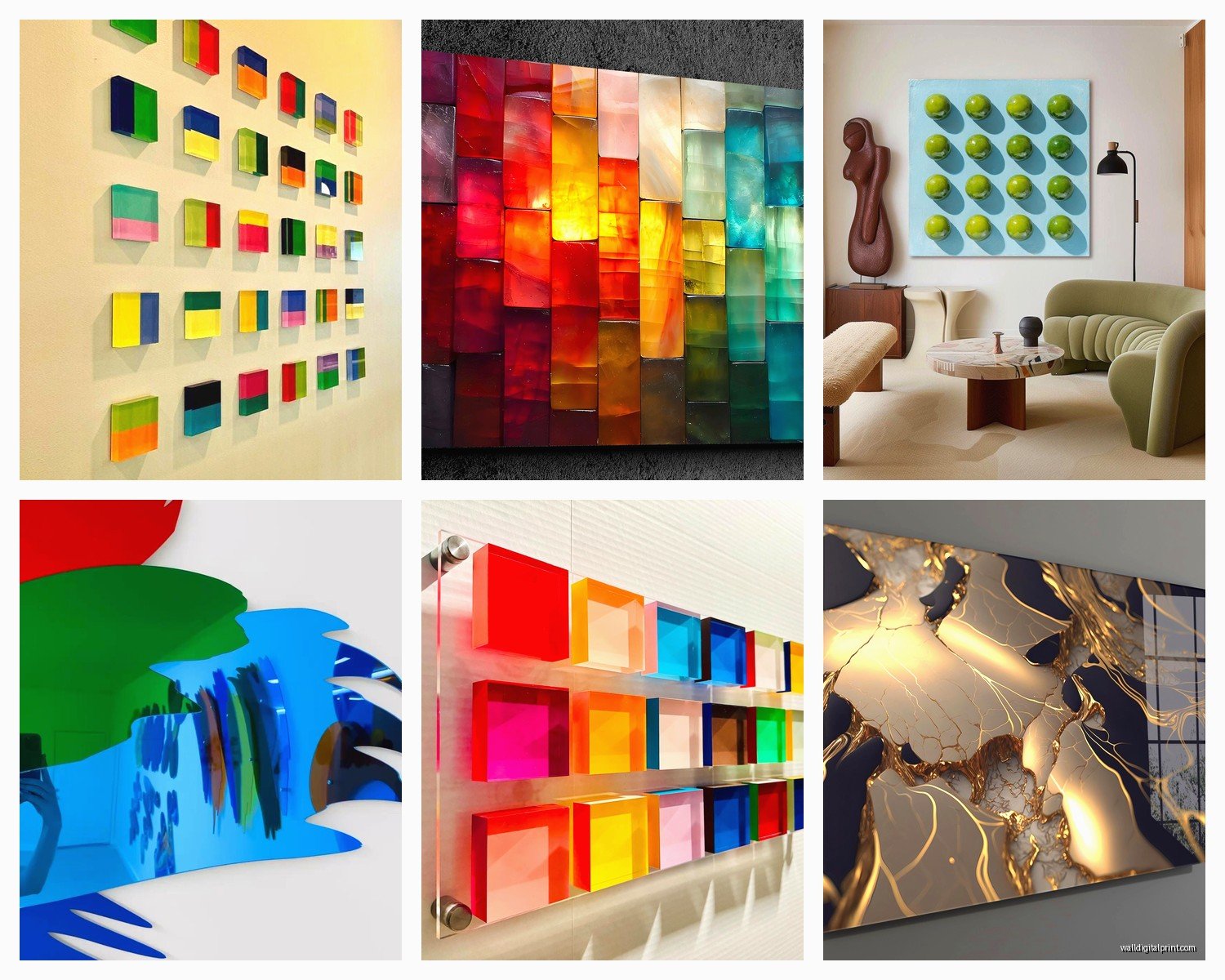
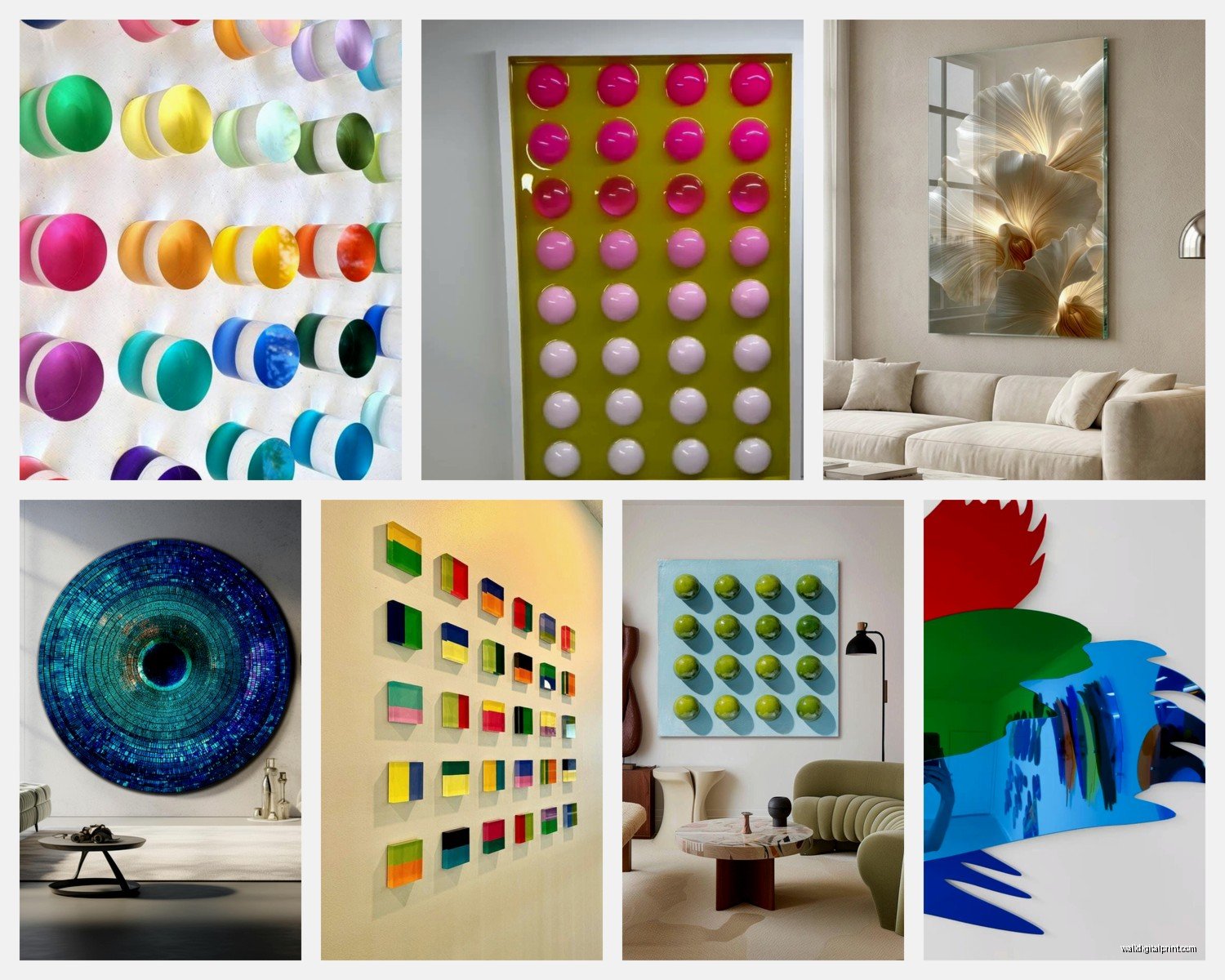
If you can’t hit studs, use heavy-duty wall anchors rated for at least double the weight of your piece. Toggle bolts or molly bolts, not those plastic expansion anchors that come free with everything.
Measure like three times because the reflective surface will make any crookedness super obvious. I use a laser level now after years of the regular bubble kind.
Clean the acrylic before hanging. Microfiber cloth only – paper towels will scratch. I learned this from watching someone else make the mistake thankfully.
Lighting Considerations You Gotta Think About
The reflective surface means you need to think about light sources. Direct overhead lighting can create glare that makes it hard to see the actual image. I usually position acrylic art where it’ll catch indirect natural light or place it perpendicular to windows rather than directly across from them.
Track lighting or picture lights work really well if you want to highlight the piece at night. The acrylic just eats up that light in the best way.
Avoid hanging them where they’ll get direct sunlight for hours every day. UV exposure will fade the print over time, even behind the acrylic. I mean it takes years but still, why risk it.
Caring For These Things
They’re actually pretty low maintenance which is nice. Dust with a dry microfiber cloth regularly. For smudges or fingerprints (which show up like crazy on the glossy surface) use a slightly damp microfiber cloth with maybe a tiny bit of acrylic cleaner.
Don’t use Windex or anything with ammonia – it can damage the acrylic over time making it cloudy. There are specific acrylic cleaners but honestly water works fine for most cleaning.
The edges can chip if you bang them against stuff during moving or installation, so just be careful. The corners are especially vulnerable.
Size and Scale Guidelines
This is super dependent on your wall space but here’s what I’ve found works:
Small pieces (8×10 to 16×20) are great for gallery walls or tight spaces like powder rooms. The acrylic makes even small art feel more substantial.
Medium (20×30 to 24×36) is the sweet spot for most residential spaces. Big enough to make a statement, not so big that it overwhelms.
Large pieces (30×40 and up) need serious wall space and the cost jumps significantly. But the impact is unreal. I did a 40×60 piece for a client’s living room and it became the entire focal point of the space.
Mixing Acrylic With Other Art
You don’t have to do all acrylic everything. I actually think it looks better mixed with other mediums. A high gloss acrylic piece next to a matte canvas or a textured oil painting creates nice contrast.
In gallery walls I’ll usually include one acrylic piece as the anchor and surround it with framed prints, photographs, maybe some dimensional objects. The shiny surface draws the eye and everything else supports it.
Common Problems I’ve Run Into
Color shifting: Sometimes what you see on screen doesn’t match the final print. This is true for all printing but the acrylic seems to amplify it. Always order a small test print first if you’re doing custom work with specific colors that need to match.
Bowing or warping: Cheap acrylic or pieces that are too large without proper backing can bow over time, especially in humid environments. The 1/4 inch thickness helps prevent this, as does proper backing.
Visible seams: If you’re doing a really large piece some companies will need to seam multiple sheets together. Ask about this upfront. Seams are usually pretty invisible but you should know they’re there.
Mounting hardware showing through: With clear acrylic and no backing, whatever mounting hardware you use might be visible from certain angles. Either use a backing or choose standoffs that look intentional and decorative.
Is It Actually Worth The Money
Okay so real talk – acrylic prints are expensive compared to regular framed prints. You’re easily looking at 3-5x the cost. But the look is so different that I don’t really think of them as the same category.
For spaces where you want that modern, high-end, gallery feel? Absolutely worth it. The depth and clarity and the way light interacts with the surface – you can’t get that with a regular frame.
For kids’ rooms or spaces where art is more decorative background? Probably not necessary. Save your money.
I tell clients to invest in one or two really good acrylic pieces for key spaces rather than trying to do every wall. Quality over quantity actually applies here.
My own apartment has three acrylic pieces and probably twenty other artworks in various mediums. The acrylic ones are in my entryway, above my dining table, and in my bedroom – places where I wanted something special.
Wait I forgot to mention the backing color makes a difference too. White backing makes colors pop and feel brighter. Black backing creates more drama and depth, makes the piece feel moodier. Clear backing with no backing at all gives you that see-through effect which can be cool but limits where you can hang it since the wall color shows through.
The whole process from selecting an image to having it mounted on your wall takes maybe 2-3 weeks if you’re ordering custom. Standard prints from places like Fracture ship faster, like within a week usually.
Just start with one piece, somewhere you walk past every day. That’s how I got hooked on this stuff – installed one in my hallway and couldn’t stop looking at how different it seemed throughout the day as the light changed. Now I’m the person everyone texts when they’re considering acrylic art and apparently I have a lot of opinions about it.
