Wall Art Guide, Wall Art Tutoriels
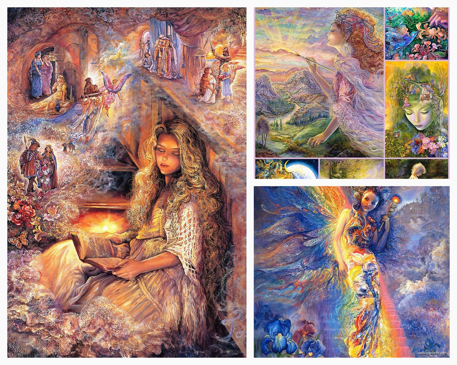
Josephine Wall Art: Fantasy Artist Fairytale Paintings

Sep
So I’ve been obsessed with Josephine Wall’s work for like three years now and honestly it started because a client wanted something “magical but not cheesy” for their reading nook and I fell down this rabbit hole of fantasy art that I’m still not out of.
Figuring Out Which Prints Actually Work in Real Spaces
Okay so first thing – her paintings are BUSY. Like really busy. When you see them online they look amazing but then you get a massive print and suddenly your entire living room is screaming at you with fairies and butterflies and cosmic swirls. I learned this the hard way with “Bubble Flower” which is gorgeous but was way too much for my client’s small bedroom.
The prints that actually work best in homes are usually her slightly simpler compositions. “Sadness of Gaia” sounds heavy but it’s actually more cohesive visually. “The Storyteller” is another one that reads well from a distance because there’s a clear focal point (the woman’s face) even though there’s tons of detail when you get close.
Size Matters Way More Than You’d Think
Here’s what I tell people – go smaller than your instinct says. I know, I know, you want that epic 40×60 statement piece but unless you have like a two-story entryway or something, it’s gonna be overwhelming. Most of her work looks best around 24×36 or even 20×30 for normal-sized rooms.
The exception is if you’re doing a gallery wall situation where you can balance it with other pieces, but honestly her art is so distinctive that mixing it with other artists looks weird? I tried pairing “Iris” with some botanical prints once and it just looked like two different people decorated the same wall.
Print Quality – This Is Where People Mess Up
Don’t buy from random Amazon sellers oh my god. I made this mistake exactly once with “My Lady Unicorn” and it showed up looking like someone printed it at Kinko’s in 2003. The colors were muddy, the details were blurry, you could see the printing dots.
Licensed prints are gonna run you more but the difference is insane. Josephine Wall’s official site has authorized sellers listed. I usually go through Art.com or AllPosters when they have sales, but I’ve also had good luck with direct purchases from galleries that specialize in fantasy art.
Giclee prints are worth it if you’re framing something for a main living space. Canvas prints can work but make sure they’re actually canvas and not that weird textured paper that pretends to be canvas – you can tell by the edges, real canvas wraps around the frame smoothly.
The Framing Situation Nobody Talks About
So her work has so much color and detail that the frame matters more than with like, a simple landscape or whatever. I’ve found that simpler frames work better – ornate gold frames seem like they’d match the fantasy vibe but they actually compete with the artwork itself.
Black or dark wood frames let the colors pop. White frames can work if the room is very modern and you want to create contrast, but it’s risky. I did a white frame with “Willow World” in a Scandinavian-style nursery and it worked because the whole room was intentionally mixing whimsy with minimalism, but that’s pretty specific.
Wait I forgot to mention – matting. You gotta have a mat. Her work needs breathing room or it feels claustrophobic on the wall. I usually do 3-4 inches of mat space, sometimes more if the print is smaller.
Where to Actually Hang This Stuff
Bedrooms are honestly the sweet spot for Josephine Wall art. It’s dreamy and escapist which works when you’re literally going to sleep and dreaming, you know? I’ve done “Daughter of the Deep” in three different master bedrooms and it always gets compliments.
Living rooms can work but you gotta commit to the vibe. Like, if your whole aesthetic is modern farmhouse or industrial, a Josephine Wall print is gonna stick out like crazy. But if you lean into bohemian, maximalist, or even dark academia vibes, it fits perfectly.
Kids’ rooms seem obvious but be careful – some of her pieces are actually kinda dark or complex for little kids. “The Three Graces” or “Joie de Vivre” are better for teens or adults. For actual children I’d stick with her more obviously cheerful stuff like “Wisteria” or pieces with clear narrative elements they can understand.
Lighting Makes or Breaks It
This is gonna sound weird but you need to think about natural light versus artificial light with her work. The metallic and iridescent effects she uses (especially in her newer pieces) look completely different depending on lighting.
I hung “Aurora” in a room with western exposure and the afternoon sun made it absolutely glow – but in the morning it looked flat and muddy. Ended up moving it to a wall with more consistent indirect light and it was perfect.
If you’re hanging in a room with lots of windows, test the placement at different times of day before you commit to drilling holes. Just lean it against the wall and check it morning, afternoon, evening. My cat knocked over a print while I was doing this once and I was SO glad it wasn’t actually hung yet because I realized the spot was terrible anyway.
Buying Originals vs Prints – Real Talk
Her original paintings sell for like $30,000 to $60,000+ so unless you’re way more successful than me, that’s probably not happening. But she does release limited edition prints that are signed and numbered, usually around $200-$500 depending on size.
Are they worth it? Ehhh it depends on what you want. For investment purposes, probably not – fantasy art doesn’t appreciate like other genres typically do. But if you’re a serious collector and you love her work, having a signed limited edition is cool. I have one client who has three and she loves showing people the signatures and certificates of authenticity.
For everyone else, regular prints are totally fine. Nobody can tell the difference when it’s on your wall anyway, and you can spend the money you save on better framing.
Resale and Secondary Market Stuff
Okay so funny story – I bought a signed print of “Love’s First Blush” thinking I’d keep it forever, but then I redecorated and it didn’t fit anymore. Tried to resell it on eBay and… it sat there for months. Eventually sold it for barely more than I paid after fees and shipping.
The secondary market for her prints isn’t great unless you have something really rare or an actual original. So buy what you love because you love it, not as an investment.
Common Problems and How to Fix Them
Problem: The colors look different than they did online
Solution: This happens constantly with her work because monitors display colors differently. If you can, order a small print first as a test, or look at in-person examples at galleries. Also check the return policy before buying.
Problem: It looks too busy/overwhelming on the wall
Solution: Try a smaller size, add a larger mat, or move it to a less cluttered wall. Sometimes the issue isn’t the print itself but that you have too much other visual stuff competing with it.
Problem: The print looks cheap or pixelated
Solution: You bought from a sketchy seller, sorry. Return it if possible and buy from authorized dealers. Check the DPI – should be at least 300 for quality prints.
Mixing Her Different Pieces Together
I’ve only successfully done this once, and it was tricky. Did a gallery wall with “Tree of Reverie,” “Willow World,” and “Wings of Love” – all had similar color palettes (lots of blues and purples) and the tree/nature theme connected them.
If you’re gonna display multiple Josephine Wall pieces together, they need something in common – color scheme, theme, or compositional style. Don’t just throw random ones together because they’re all her work, it’ll look chaotic.
Budget-Friendly Options That Don’t Suck
Look, not everyone can drop $300 on a framed print. Smaller prints (8×10 or 11×14) are way more affordable and you can create impact by grouping them. Three smaller prints in matching frames can look more intentional than one medium print anyway.
Watch for sales – Art.com does 50% off like every other week basically. Sign up for emails from poster retailers around Black Friday and you can get deals that make the prices actually reasonable.
DIY framing saves a ton if you’re handy. Buy the print, get a frame from IKEA or Amazon, cut your own mat if you’re feeling ambitious. I’ve done this for client mood boards and practice pieces tons of times.
Digital Versions for Different Uses
Some of her art is available as digital downloads for personal use, which is perfect if you want it for a phone background or computer wallpaper. Obviously don’t print these and frame them – that’s not cool and also they’re not high enough resolution.
But I’ve used digital versions to test whether I actually like a piece before buying a print. Set it as my desktop background for a week and see if I still love it or if it gets annoying. Saved me from buying “Spirit of Flight” which I thought I loved but turned out to be too busy for me to look at constantly.
Okay so my main advice after doing this for years – buy what genuinely makes you happy, not what you think is impressive or what other people like. Her catalog is huge and varied, from darker gothic pieces to super cheerful nature scenes. Take time browsing her full collection because the popular ones aren’t necessarily gonna be your favorites.
And don’t overthink the “is this too fantasy/childish” thing. If you love dragons and fairies and magical forests, put that on your walls. I’ve got “Shell Maiden” in my own bedroom and I’m 41 years old and it makes me happy every time I see it, so there.
Also frame your prints properly, seriously, it makes such a difference I can’t even – a $50 print in a $150 frame looks like a $500 piece of art, while a $200 print in a cheap frame looks like a college dorm poster.