Wall Art Guide, Wall Art Tutoriels
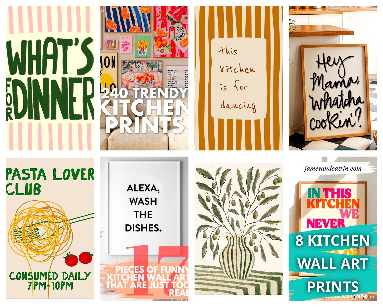
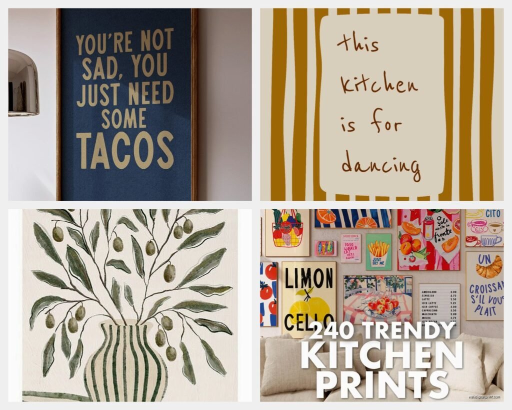
Kitchen Prints Wall Art: Cooking Food Poster Gallery
Oct
So I’ve been curating kitchen art for clients for like three years now and honestly the whole cooking poster thing has gotten SO much better than it used to be. Like, remember when it was just those weird pasta type prints or the fake vintage French advertisements? We’ve moved past that, thank god.
Figuring Out Your Actual Kitchen Style First
Okay so before you buy anything, and I know this sounds boring but trust me, take a photo of your kitchen right now. Just pull out your phone. Because what happens is you’ll fall in love with this gorgeous moody food photography print and then realize your kitchen is all white subway tile and chrome, and it’s gonna look weird. I did this in my own place and had to return like four prints because they clashed with my backsplash.
The main styles I see working are:
- Minimalist line drawings (herbs, vegetables, cooking tools in single-line art)
- Vintage-style botanical prints of ingredients
- Bold typography with cooking quotes or ingredient lists
- Food photography but like, the artistic kind not the stock photo kind
- Abstract stuff that just happens to be in kitchen-appropriate colors
My friend Sarah has this tiny galley kitchen and she went with all black and white line drawings of cooking utensils, and it’s actually perfect because it doesn’t compete with her colorful dishes and stuff on the counters.
Size and Placement That Actually Makes Sense
This is where everyone messes up, including me initially. You cannot just eyeball this. Well you can, but you’ll be wrong.
For above a breakfast nook or small dining area, you want something in the 16×20 to 24×36 inch range. Anything smaller looks like you just stuck a random postcard up there. I learned this the hard way in a client’s house where we had to go back and resize everything.
If you’ve got a big blank wall, like behind a kitchen island or a long wall without upper cabinets, you need to think gallery wall. But here’s the thing about gallery walls in kitchens—they get greasy. I know that sounds gross but the cooking steam and oil particles, they just migrate. So you either need to be okay with wiping down frames every month or so, or you position them far enough from the stove.
The Gallery Wall Formula That Works
I’m gonna give you my actual formula because I figured this out after arranging probably 50+ gallery walls at this point:
- Pick one larger anchor piece (like 18×24 or 20×30)
- Get 2-3 medium pieces (11×14 or 12×16)
- Add 3-4 small pieces (8×10 or 5×7)
- Keep the spacing between frames at 2-3 inches consistently
Start with the anchor piece at eye level (that’s about 57-60 inches from the floor to the center of the image). Then build around it. I literally use painter’s tape to map this out on the wall first because measuring after you’ve already put holes in the wall is… well, you can imagine.
Where to Actually Buy These Things
Okay so Etsy is obvious but you gotta be careful because the quality is all over the place. I’ve ordered from shops where the print quality was amazing and others where it looked like someone just printed it on their home inkjet.
Look for shops that specifically mention:
- Giclée printing or archival inks
- Paper weight (anything under 200gsm is too flimsy)
- Actual photos of the prints in real homes, not just mockups
Society6 and Minted are more consistent with quality but you’re paying more. The advantage is their prints are actually printed well and the colors match what you see online. I used Society6 for my own kitchen and the herb illustrations I got are still perfect two years later, no fading even though there’s a window nearby.
Oh and another thing, Desenio is this Scandinavian site that ships to the US and their kitchen prints are *chef’s kiss* for that modern minimalist vibe. Their shipping takes forever though, like 3 weeks, so don’t order if you need it fast.
Frames: Don’t Cheap Out But Also Don’t Overspend
So here’s my controversial opinion: you don’t need custom framing for kitchen art. I said it. Custom framing costs like $150-300 per piece and unless you’re framing something irreplaceable, it’s not worth it for what’s essentially decorative poster art.
IKEA frames are fine. Like actually fine. The RIBBA and SILVERHÖJDEN frames are my go-to. They’re simple, they come in standard sizes, and if you stick to all black or all white frames in a gallery wall, it looks cohesive and intentional.
But here’s the thing about IKEA frames—measure your prints first because their sizing can be slightly off from standard US dimensions. I once bought ten 12×16 frames for prints that were actually 12×18 and… yeah. Had to return them all.
If you want something slightly nicer, Target’s Threshold line and Amazon Basics frames are surprisingly decent. I’ve used both for client projects where the budget was tight.
For a more elevated look, try mixed materials. Like some black frames, some natural wood, maybe one or two with brass/gold details. My client Lisa did this in her farmhouse kitchen and it added visual interest without looking chaotic.
Matting: Yes or No?
I’m team yes-mat for most situations. A white or cream mat gives the art breathing room and makes even a cheap print look more expensive. The standard is a 2-3 inch mat border.
Without mats, everything feels cramped, especially in a gallery wall. But if you’re going for that salon-style hang where frames are really close together, skip the mats and just do frame-to-frame spacing.
Themes That Work (And What to Avoid)
So I’ve noticed certain themes just work better in actual kitchens vs what looks good on Pinterest.
What actually works:
- Single ingredient studies (like a really beautiful illustration of a tomato or garlic)
- Herb gardens and botanical prints
- Vintage recipe cards or handwritten recipe prints
- Abstract art in warm tones (terracotta, sage, mustard)
- Simple typography with measurements or cooking terms
- Coffee or wine themed stuff but only if it’s sophisticated
What looks dated or cheesy:
- Those “Live Laugh Love” type sayings but make it cooking
- Cartoon food characters (unless your kitchen is specifically quirky)
- Overly rustic “farmhouse” signs with distressed text
- Most things that say “Gather” or “Bon Appétit” in cursive fonts
Wait I forgot to mention, one trend I’m actually loving right now is vintage produce crate labels. They’re colorful, they’re graphic, they’re genuinely from the 1920s-1940s and you can find reproduction prints on Etsy. I did a whole wall of citrus crate labels in a client’s breakfast nook and it’s so cheerful without being cutesy.
Color Coordination Without Being Matchy-Matchy
This is gonna sound weird but I take a photo of my kitchen, upload it to my phone, and use it as reference when shopping online. I’ll screenshot potential prints and put them next to the kitchen photo to see if the colors vibe.
You don’t want everything to match perfectly—that looks staged and catalog-y. But you do want a color story. Like if your kitchen has blue cabinets, look for prints with blue accents or complementary oranges and creams.
My own kitchen is mostly white with wood counters, so I went with prints that have earth tones—olive green herbs, terracotta pots, cream backgrounds. It feels cohesive even though no two prints are the same.
The Practical Stuff Nobody Tells You
Glass vs acrylic: If you’re hanging anything near the stove or sink, go with acrylic. It’s lighter and if it falls it won’t shatter into a million pieces. I found this out when my cat knocked a frame off the wall at 3am and I’m so glad it was acrylic because I just heard a thunk instead of… well, disaster.
Hanging methods: For lightweight frames (under 5 pounds), those 3M picture hanging strips work great and don’t damage walls. For anything heavier, use proper picture hooks rated for the weight. I use the OOK brand hangers and they’ve never failed me.
Lighting matters more than you think. If your kitchen has warm lighting, prints with cool blue tones might look weird in person even if they looked perfect online. I always recommend people check their bulb temperature (warm white vs daylight) before committing to a color palette.
Maintenance Real Talk
You’re gonna need to dust these. Kitchen air is full of particles. I wipe down my frames with a microfiber cloth every couple weeks. If you’ve got glass, a little glass cleaner on a cloth works but don’t spray directly on the frame because it can seep behind the glass.
If you notice moisture building up behind the glass (this happens in humid kitchens), you need better ventilation or you need to move the art farther from steam sources. I’ve seen mold grow behind improperly sealed frames and it’s not cute.
Budget Breakdown From Someone Who’s Done This Too Many Times
For a small gallery wall (5-7 pieces):
- Prints: $8-25 each on Etsy, so roughly $50-150 total
- Frames: $10-30 each, so $50-200 total
- Hanging supplies: $15-30
- Total: $115-380 depending on your choices
For a single statement piece:
- Large print: $25-60
- Frame: $30-80
- Total: $55-140
I always tell people to start small. Get one or two pieces, live with them for a week, see how you feel. I’ve had clients who thought they wanted a huge gallery wall and then realized two prints were enough.
My Actual Recommendations If You’re Starting From Zero
If I had to start over tomorrow, here’s what I’d do:
Get three matching black frames from IKEA in different sizes (maybe 12×16, 11×14, and 8×10). Then go on Etsy and search “minimalist kitchen prints” or “botanical herb prints” and find a shop where you like multiple designs. Order all three from the same shop so the style is cohesive even if the images are different.
Hang them in a vertical line on a narrow wall, or in a horizontal row above a kitchen desk or coffee station. That’s it. Simple, clean, affordable, and you can always add more later.
Or if you want something easier, Society6 has pre-curated kitchen print sets that are designed to go together. They’re more expensive but you don’t have to think about it.
One last thing—don’t overthink this. I’ve spent hours agonizing over whether a print was “right” only to realize nobody else cares as much as I do. If you like looking at it while you’re making coffee, it’s the right choice. Your kitchen should make you happy, not stressed about whether the art is perfectly curated.
Okay I think that’s everything I’ve learned from doing this professionally and also screwing it up in my own home multiple times. Let me know what you end up getting because I’m always curious what people actually choose vs what they think they should choose.