Wall Art Guide, Wall Art Tutoriels
Long Wall Art Vertical: Tall Portrait Format Pieces
May
So I’ve been obsessing over vertical wall art lately because honestly? Most people get this completely wrong and then wonder why their walls look weird. Like last week I had a client with these gorgeous 14-foot ceilings and she’d hung three square pieces in a row and it just… died up there, you know?
Vertical art is tricky because your brain wants to go horizontal. We’re trained to think landscape format for everything. But tall portrait pieces can completely transform a space if you know what you’re doing.
Why Vertical Even Matters
Okay so here’s the thing about tall art—it draws your eye UP. Which sounds obvious but most rooms feel squat and wide because we put all our furniture horizontally (couches, consoles, beds) and then we slap horizontal art above it and wonder why the room feels flat. Portrait format pieces create vertical lines that make ceilings feel higher and spaces feel more elegant or something. I dunno, more intentional maybe?
I tested this in my own hallway last month. Had three 16×20 horizontal prints and swapped them for two 24×48 vertical pieces and my contractor literally asked if I’d done something to the ceiling. Same ceiling. Just better proportions.
Where Vertical Art Actually Works
- Narrow walls beside doorways or windows
- Between two windows that are vertically oriented
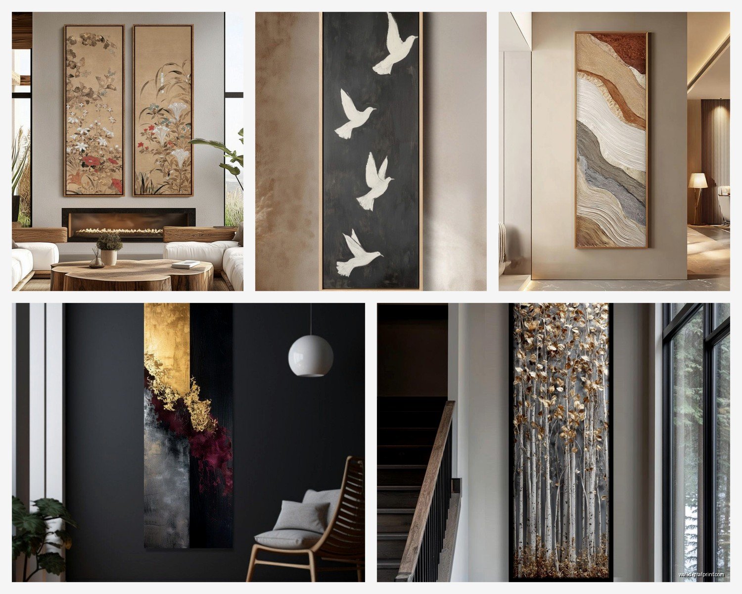
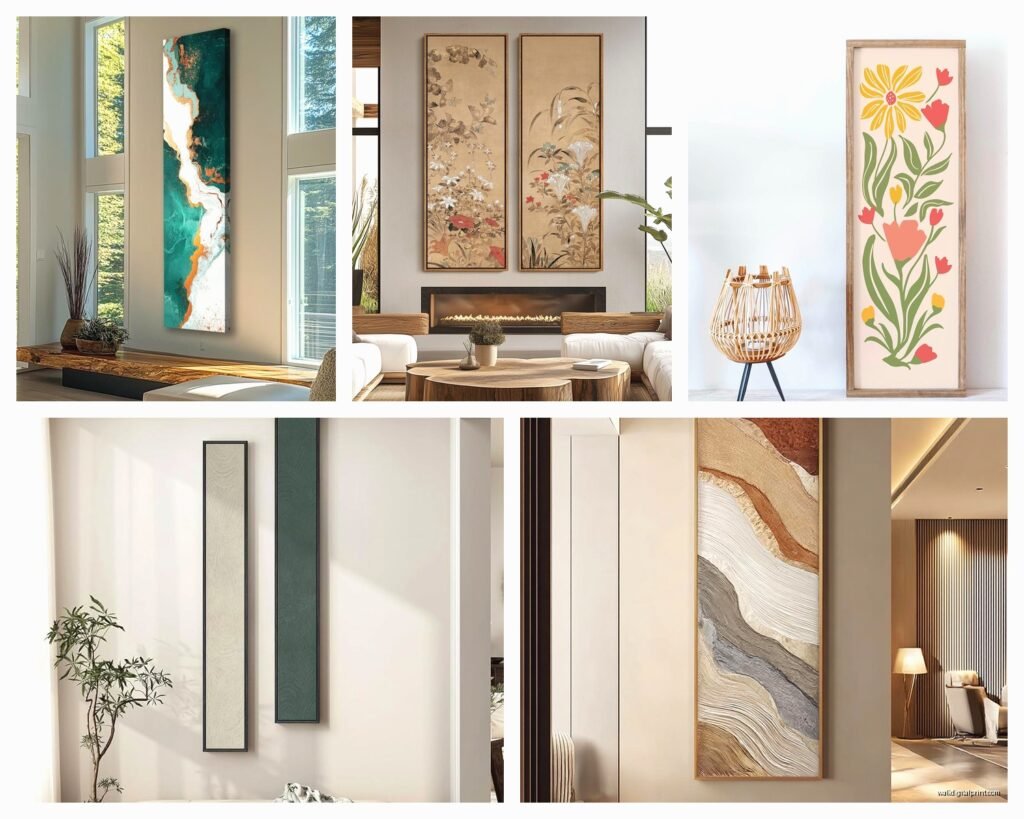
- Flanking a fireplace (two tall pieces work better than one wide one)
- End of hallways where you need to fill height without width
- Above console tables or narrow furniture
- Stairwell walls where you’re moving vertically anyway
- Bathroom walls—especially between shower and vanity
The mistake I see constantly is people putting vertical art above a sofa. Unless your sofa is like a loveseat or you’re doing a gallery wall situation, one tall skinny piece above a wide sofa looks lost. It’s gonna look wrong no matter how expensive the art is.
Sizing This Stuff Out
This is where everyone gets paralyzed. You’re standing in a store or scrolling online and you have NO idea what size will actually work.
For a single vertical piece, you want it to be roughly two-thirds the height of your wall space. So if you’ve got 8-foot ceilings and furniture that’s 30 inches tall, you have about 66 inches of wall space to work with. Your art should be around 44 inches tall. Give or take—this isn’t calculus.
Width-wise for portrait pieces, I usually go for artwork that’s one-half to two-thirds the width of the furniture below it. So above a 60-inch console, you want art that’s 30-40 inches wide. Anything skinnier starts looking like a bookmark.
Common Vertical Sizes That Actually Exist
- 12×36 inches—good for really tight spaces, flanking situations
- 16×48 inches—my personal favorite for medium walls
- 20×60 inches—dramatic, needs high ceilings
- 24×36 inches—the “safe” size that works almost anywhere
- 30×40 inches—classic portrait size, very versatile
- 36×48 inches—statement piece territory
Oh and another thing—if you’re buying online, some places list dimensions as width x height and others do height x width and I’ve literally ordered the wrong orientation twice because I didn’t check. Always confirm which dimension is which.
The Hanging Height Situation
Standard rule is center of the artwork at 57-60 inches from the floor. That’s “gallery height” or whatever. But honestly? I break this rule all the time with vertical pieces.
If you’ve got a really tall piece (like 48+ inches), centering it at 57 inches can make it feel floaty and weird. I usually hang these a bit lower so the bottom third relates to the furniture. The top can go higher—that’s fine, that’s literally the point of vertical art.
My method: measure up 8-10 inches from your furniture top, mark that spot, and make that the bottom edge of your frame. Then see how it feels. I keep those 3M command strips around for testing before I commit to nails because my walls look like swiss cheese from all my “testing.”
Hanging Two Vertical Pieces Together
If you’re doing two tall pieces side by side (which looks amazing flanking a fireplace or creating a statement), keep them 3-6 inches apart. Closer than 3 inches and they read as one piece that’s been split. Further than 6 inches and they feel disconnected.
I learned this the hard way when I hung two 20×60 pieces with 12 inches between them and it looked like they were in a fight. Moved them closer and suddenly they were a diptych.
What Kind of Art Works in Vertical Format
Not everything translates to portrait orientation obviously. Here’s what I’ve found actually works:
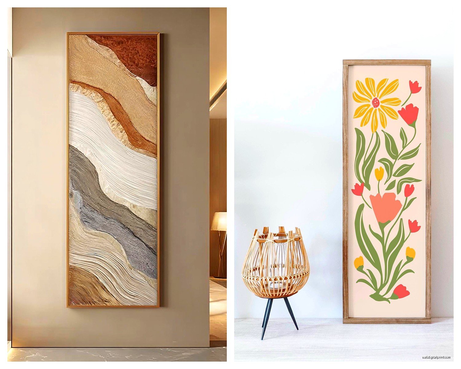
Landscapes with vertical elements: Waterfalls, tall trees, mountain peaks, city buildings. Basically anything that naturally draws the eye up.
Abstract pieces with vertical brushstrokes or lines: These emphasize the height and feel intentional rather than like someone cropped a square painting.
Figurative work: Portraits, fashion photography, standing figures. The human body is vertical so this makes intuitive sense.
Botanical prints: Tall stems, single flowers, palm fronds. I’m seeing these everywhere right now and they’re perfect for vertical spaces.
Typography/text art: Quotes or words stacked vertically can be really striking if you’re into that aesthetic.
What doesn’t work: panoramic scenes that are clearly meant to be wide, horizontal landscapes forced into vertical crops (looks amateurish), anything where the composition feels squeezed.
Framing Vertical Pieces
The frame matters MORE with vertical art because you’re emphasizing lines and proportion. A frame that’s too chunky will make a tall skinny piece look heavy and weird.
For pieces under 30 inches tall, I usually do 1-1.5 inch frames. For 30-48 inches, you can go up to 2 inches. Anything over 48 inches, I actually prefer thin frames again (1-2 inches) because the art itself is making the statement.
Metal frames work really well for modern vertical pieces—they’re thin and don’t compete with the height. Wood frames in lighter finishes (natural oak, maple, white) also work. Dark chunky frames can overwhelm unless your piece is genuinely massive.
Oh wait I forgot to mention—if you’re doing a gallery wall with multiple vertical pieces, mix your frame widths slightly. All the same exact frame can look too matchy and sterile. I usually do variations of the same color family but different widths. Like three black frames: one thin metal, one medium wood painted black, one flat black wood.
Mat or No Mat
This is gonna sound weird but I almost never mat vertical art anymore. The mat breaks up the vertical line and makes the actual artwork smaller, which defeats the whole purpose. If you need a mat for preservation (like with a watercolor or print), keep it minimal—1.5 inches max.
Exception: if your vertical piece is really narrow (like 12 inches wide), a mat can actually help it feel more substantial. But generally? Skip it.
Actually Finding Vertical Art
Here’s the frustrating part—most art is created in horizontal or square formats because that’s what sells. You gotta hunt for vertical pieces.
Where I actually find good vertical art:
Society6 and Minted both have filters for portrait orientation and they have tons of options at different price points. I’ve ordered probably 15 pieces from Society6 and the quality is consistent.
Etsy is obvious but search specifically for “vertical wall art” or “portrait orientation” plus your style (abstract, botanical, whatever). Lots of independent artists selling digital downloads you can print at your size.
Framebridge will print and frame anything you upload, so if you find art you like in the wrong orientation, you can sometimes find a vertical version of similar work and have them print it custom.
Artifact Uprising does really nice vertical photo prints if you’ve got your own photography. Their quality is solid.
Local art fairs and galleries—honestly I find the best unique vertical pieces in person because I can see the actual proportions. bought a 24×60 abstract from a local artist last fall and it’s my favorite piece in my house.
The Multi-Panel Vertical Approach
Okay so if you can’t find ONE perfect vertical piece or you want something more dynamic, consider multiple panels arranged vertically.
Like three 12×12 squares stacked vertically creates a 12×36 vertical line. Or two 18×24 pieces stacked creates a 18×48 vertical column. This gives you more flexibility because you can adjust spacing and you can find smaller pieces more easily.
I did this in my bathroom with three 10×10 botanical prints in matching frames, stacked with 2 inches between each frame. Total visual height of 34 inches, looks like one intentional vertical piece.
Spacing for Stacked Pieces
Keep it tight—2-4 inches between frames. Any more and they read as separate pieces that happen to be aligned. You want them to function as one vertical unit.
And make sure they align perfectly. Use a level. I know that sounds basic but I’ve seen so many stacked pieces that are slightly off and it drives me insane. My dog was barking at the mailman while I was trying to level three frames last week and I had to redo it twice because I got distracted.
Color and Style Considerations
Vertical art tends to feel more formal than horizontal art—something about the portrait orientation reads as more traditional or elegant. So if you’re going for a really casual relaxed vibe, you might want to choose vertical pieces that are more playful or abstract to balance that formality.
I usually pick vertical art in colors that are already in the room but maybe 2-3 shades deeper or lighter. This creates cohesion without being too matchy. Like if you have sage green accents, look for vertical art with deeper forest green or lighter mint.
All-white or neutral vertical pieces can feel too stark unless you have lots of texture in the room. If your space is minimalist, that might be exactly what you want. But if you’re adding vertical art to warm up a space, go for pieces with some color depth.
Lighting Your Vertical Pieces
Tall art needs different lighting than horizontal pieces. If you use picture lights, you need longer arms to illuminate the full height. I usually use track lighting or adjustable spotlights for vertical pieces over 40 inches tall.
For shorter vertical pieces (under 36 inches), regular picture lights work fine. Just make sure the light is positioned to hit the center of the piece, not just the top.
Natural light is great for vertical art near windows but watch for glare on glass. I’ve had to rearrange pieces because afternoon sun was hitting the glass at exactly the wrong angle and you couldn’t see the art at all.
Budget-Friendly Vertical Options
Real talk—custom framing for large vertical pieces gets expensive fast. Like $300+ for a 24×48 frame situation.
Cheaper alternatives that don’t look cheap:
Printable art from Etsy ($5-15) + printing at Staples or FedEx ($30-60 for large format) + simple frame from Amazon ($40-80) = under $150 total
Canvas prints from CanvasPop or Shutterfly during sales—they’re often running 50% off and a 20×40 canvas runs about $80-100 on sale
Poster prints in clip frames—sounds basic but if the art is good, a simple black clip frame looks modern and intentional. I have a 24×36 poster in a $15 clip frame and people always ask where I got it “framed”
DIY frame with lumber and corner brackets if you’re handy—I made a 20×60 frame for about $35 in materials and it looks way more expensive
okay so that’s basically everything I’ve figured out through lots of trial and error with vertical art… my walls have so many holes patched and repainted at this point but at least I know what works now