
Wall Art Guide, Wall Art Tutoriels
Masculine Wall Art for Living Room: Men’s Main Space Decor

Oct
So I’ve been helping my brother redesign his living room and honestly the whole masculine wall art thing is way less complicated than guys make it seem. He kept sending me those sad bachelor pad photos with one random poster and I was like okay we need to fix this.
Start With What Actually Interests You Not What Instagram Says
First thing – ignore those “rules” about what’s masculine enough. I had a client last year who was obsessed with vintage botanical prints and his girlfriend kept saying they weren’t manly and honestly? His living room looked amazing once we hung them. The whole masculine vs feminine art thing is kinda outdated but I get it, you want your space to feel like YOUR space.
The stuff that actually works well in most men’s living rooms:
- Black and white photography (cityscapes, architecture, vintage cars)
- Abstract geometric pieces with darker color palettes
- Maps – old world maps, topographic maps, nautical charts
- Music related art if you’re into that
- Industrial or minimalist metal pieces
- Sports stuff but done tastefully (gonna get to this)
Size Actually Matters More Than You Think
Okay so this is where most guys mess up. They buy art that’s way too small. I see it constantly. You’ve got this big empty wall and you hang like a 16×20 print and it just floats there looking sad. My dog does this thing where he tilts his head when something’s wrong and that’s literally what I do when I see tiny art on huge walls.
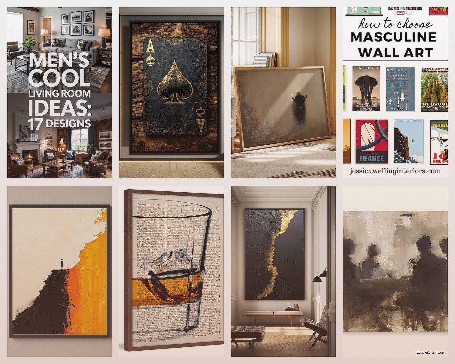
Here’s what actually works – for a standard sofa (around 7-8 feet), you want your art or art grouping to take up about two-thirds to three-quarters of that width. So we’re talking 4-6 feet of horizontal coverage. One large piece or a gallery wall situation.
I usually tell people to go bigger than feels comfortable because once it’s up, it’ll look right. Bought a 48×36 canvas for my brother’s place and he was like “that’s massive” but then we hung it and suddenly the whole room made sense.
The Three Size Strategies That Work
Single statement piece – something between 40-60 inches wide. This is easiest if you’re not into the whole gallery wall thing. Just one big bold piece centered over your couch or main seating area. Done.
Diptych or triptych – two or three panels that work together. These look more intentional than one piece and you can usually find affordable sets online. Leave about 2-4 inches between panels.
Gallery wall – harder to pull off but looks great when done right. I’ll get into this more in a sec.
Color Palette Without Making It Boring
So everyone defaults to black and white because it’s “safe” and yeah it works but you can add color without making your living room look like a kids playroom. I promise.
Stick with deeper, muted tones. Think navy, forest green, burnt orange, deep burgundy, charcoal. These read as sophisticated but still add visual interest. I curated this show last spring with all these moody landscape paintings and literally half the buyers were men furnishing their apartments.
One trick – pull a color from something else in your room. Your rug, a throw pillow, whatever. If you’ve got a leather couch and some warm wood tones, art with amber or cognac tones will tie everything together. If your space is more industrial with metal and concrete vibes, stuff with blue or steel gray undertones works.
Wait I forgot to mention – metallics are your friend. Gold, copper, or silver leaf prints add dimension without adding “color” in the traditional sense. Very masculine, very elevated.
Where to Actually Buy This Stuff
Okay so you’ve got options at every price point and honestly some of the expensive stuff isn’t even better quality.
Budget friendly (under $200): Society6, Minted, Desenio have tons of prints. The quality is decent for the price. You’ll need to frame most of them though. Target’s Threshold line has some surprisingly good pieces. I’ve used them in client spaces and nobody can tell they cost $40.
Mid-range ($200-600): West Elm, CB2, Artfully Walls. Better quality prints and canvases. More unique selections. This is where I shop for most of my clients who want something good but aren’t trying to spend thousands.
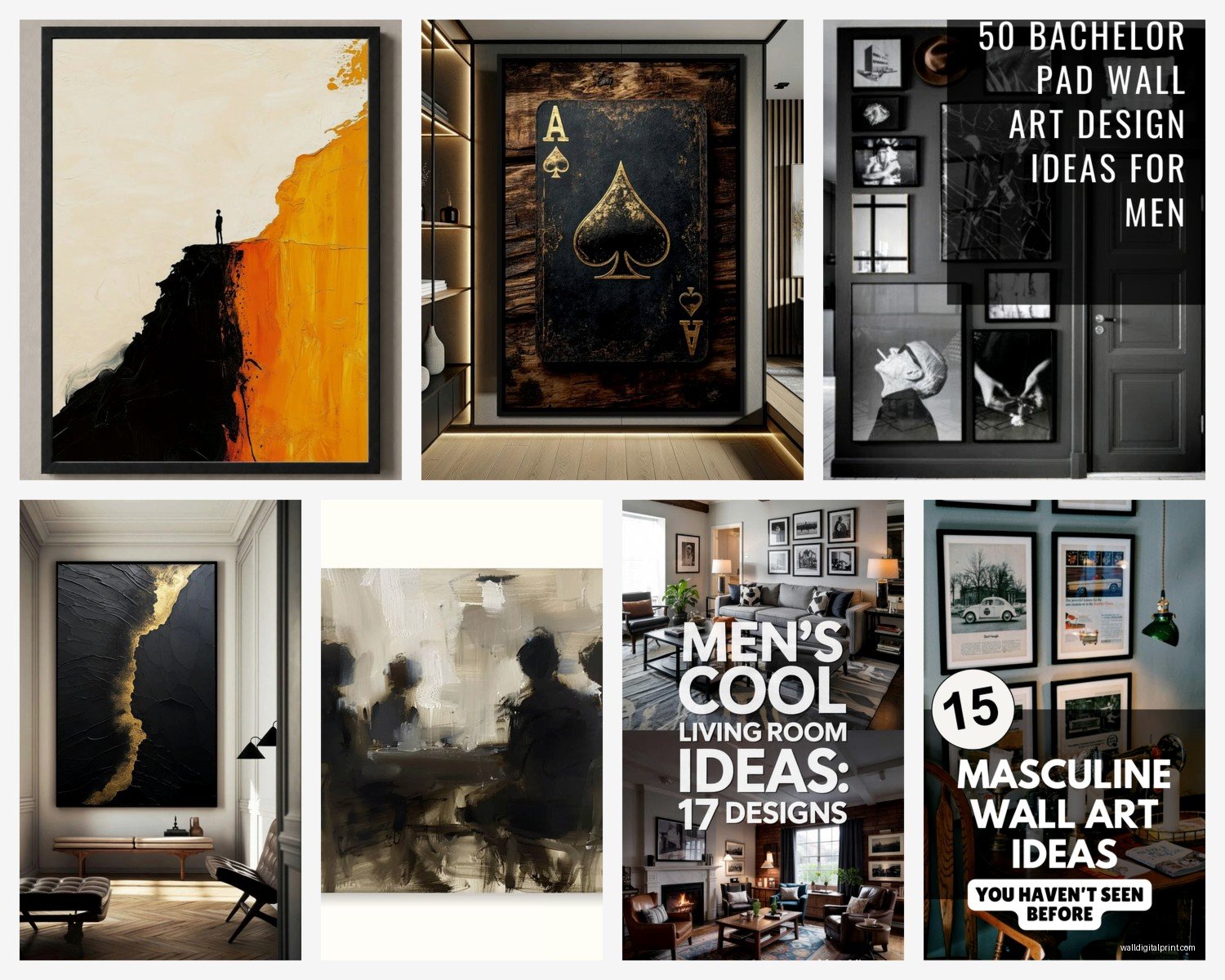
Investment pieces ($600+): Local galleries, Saatchi Art for original work, 1stDibs for vintage finds. If you’re gonna spend this much make sure you actually love it because you’ll have it for years.
Oh and another thing – Etsy is weirdly good for this. Lots of sellers doing custom work or vintage prints. Found an amazing set of architectural blueprints there for like $80 that would’ve cost $400 at a gallery.
The Sports Memorabilia Problem
Look I’m not gonna tell you to hide your jerseys or whatever but there’s a way to display sports stuff that doesn’t scream college dorm. My client last month had all these signed baseballs just sitting on a shelf and we got them in a proper shadow box display case with museum glass and suddenly it looked intentional instead of cluttered.
If you want sports art:
- Get it professionally framed with a matte and proper spacing
- Black and white action photography looks way more sophisticated than color
- Vintage sports posters have a cool retro vibe
- Stadium blueprints or architectural drawings are chef’s kiss
- Keep it to one wall or one area, don’t scatter it everywhere
Gallery Walls Without Losing Your Mind
This is gonna sound weird but I actually plan gallery walls on the floor first. Like literally arrange everything on the ground in front of the wall, take a photo, then hang it. Saved me so many extra nail holes.
The trick is mixing sizes but keeping some consistency. Maybe all black frames with different sized art. Or all the same matte color. Something that ties it together visually.
My favorite formula is the 3×3 grid – nine frames of the same size arranged in a perfect grid with equal spacing. Super clean, very masculine, easy to execute. Use a level and measuring tape and you’re golden.
Or do the “salon style” which is more organic – different sizes all grouped together. This one’s trickier. Start with your largest piece slightly off-center and build around it. Keep spacing consistent (I use 2-3 inches between frames). Stand back every few pieces to check the overall shape.
Hanging Height That Actually Works
Center of the art should be at eye level, which is generally 57-60 inches from the floor. But if you’re tall go higher, if you’re shorter go lower. You want to look at it comfortably when you’re standing in the room.
Above a sofa, leave 6-8 inches between the top of the couch and bottom of the frame. Any more and it looks disconnected, any less and it’s too cramped.
Frames Make or Break Everything
Cheap art in good frames looks expensive. Expensive art in cheap frames looks cheap. That’s just facts.
For masculine spaces, stick with simple frames. Black, walnut, natural wood, or metal. Skip the ornate stuff unless you’re going for a specific vintage vibe. I usually do thin black frames for modern spaces, chunkier wood frames for more traditional rooms.
Framebridge and Level Frames do good quality custom framing online if you don’t wanna deal with a framing shop. More expensive than Michaels but way better quality. Though honestly Michaels is fine if you catch a sale and use those 50% off coupons they always have.
Oh wait – floating frames for canvas prints are super clean looking. The canvas appears to float inside the frame. Very gallery-like.
Themes That Work Without Being Cheesy
So my brother wanted a “travel theme” and I was nervous it would look like a TGI Fridays but we made it work. The key is being specific rather than generic.
Instead of random world maps and Eiffel Tower prints, we focused on places he’d actually been. Got some custom prints from his Japan trip, a vintage poster from Barcelona, black and white photos he took in Iceland. It told HIS story instead of just being decorative.
Other themes I’ve done successfully:
Industrial/Urban: Architectural photography, blueprint style drawings, bridge construction photos, factory imagery. Pairs well with exposed brick, metal furniture, concrete elements.
Mid-century modern: Abstract geometric prints, vintage advertisement posters, Eames-era inspired art. Works with cleaner furniture lines and warmer wood tones.
Minimalist: Single line drawings, abstract black and white pieces, Japanese inspired art. Less is more here obviously. One or two really strong pieces.
Rustic/Mountain: Landscape photography, topographic maps, vintage national park posters, nature scenes in muted tones. Good for cabins or that outdoorsy vibe.
Music focused: Vintage concert posters, album covers (framed properly), music photography, instrument blueprints. Only works if you’re actually into music though don’t fake it.
Lighting Your Art Properly
Nobody talks about this enough but lighting makes such a difference. I was watching this restoration show the other night and they had these amazing paintings but you could barely see them because the lighting was terrible.
Picture lights mounted above each piece look super polished. Battery operated ones exist now so you don’t need an electrician. Track lighting or adjustable can lights work too if you’re doing a whole wall.
Natural light is tricky – it can fade art over time. If your living room gets tons of sun, use UV protective glass or acrylic in your frames. Worth the extra cost.
Mix Textures Not Just Prints
All flat prints gets boring fast. Mix in some dimensional stuff. Metal wall sculptures, wood pieces, maybe a woven textile piece. Creates more visual interest and makes the space feel more curated.
I did this living room last year with mostly photography but added these cool metal geometric wall sculptures between the frames and it completely elevated everything. The client was hesitant but then was like oh yeah this is way better.
Floating shelves with art leaning against the wall plus some books or objects is another option. More casual vibe, easier to switch things out.
What to Skip
Live laugh love anything obviously. Motivational quotes unless they’re like… actually meaningful to you personally. Generic beach scenes. Mass produced art from HomeGoods that everyone has. Those word collages. Anything your mom would buy you.
Also skip the super matchy-matchy sets where everything coordinates too perfectly. Looks catalog-like and staged. You want it to feel like you collected pieces over time even if you bought everything last weekend.
Quick Fixes If You Already Have Art That’s Not Working
Reframe it – seriously this fixes like 80% of problems. That poster from college might actually be cool in a proper frame with a matte.
Regroup it – maybe your arrangement is the issue not the art itself. Try different configurations.
Paint the wall – sometimes a dark accent wall makes mediocre art look way better. The contrast helps.
Add lighting – discussed this already but bears repeating.
Mix in something new – one strong piece can elevate everything around it.
So yeah that’s basically everything I’ve learned from doing this professionally for years plus furnishing my own place plus helping every guy friend who texts me photos of blank walls. Start with what you actually like, go bigger than you think, frame it properly, and you’re gonna be fine. My brother’s living room went from sad bachelor pad to actually impressive in like two weekends and maybe $600 total.
