Wall Art Guide, Wall Art Tutoriels
Minimalist Wall Art Printable: Free Simple Clean Downloads
Oct
So I’ve been downloading free minimalist printables for like three years now and honestly it’s such a rabbit hole once you start. Like last Tuesday my cat knocked over my coffee right as I was about to print this gorgeous line art piece and I just… anyway, let me tell you what actually works because there’s so much garbage out there mixed in with the good stuff.
Where to Actually Find Good Free Printables
Okay so first thing, Unsplash isn’t technically a printable site but hear me out. You can grab any high-res image there and if you find something super minimal—like a single branch against white space or whatever—that’s your printable right there. I do this all the time when I can’t find exactly what I want on the “official” printable sites.
The Paper Craft Pantry has this whole section of free minimalist prints and they’re actually… they’re really clean. Not that fake minimalist stuff where it’s still cluttered just in beige. I downloaded their abstract line collection last month and printed like six of them for a client’s hallway. She thought I commissioned them from an artist and I just smiled and nodded.
Creative Market does free goods every Monday. You gotta sign up for their newsletter which is annoying because then your inbox gets flooded, but I’ve found some incredible geometric prints there. Set a reminder on your phone for Monday mornings if you’re serious about this.
Oh and another thing, Etsy has tons of free printables if you filter correctly. Type “free minimalist printable” and then sort by price low to high. Designers offer freebies to get you into their shop and honestly? The quality is usually better than the paid stuff on some random blog.
File Formats That Won’t Screw You Over
This is gonna sound obvious but I’ve watched people struggle with this so many times. You want PDF or high-res JPG. That’s it. If someone’s offering a PNG that’s fine too, but if you see a printable only available as a low-res JPG or god forbid a Word document… just keep scrolling.
The resolution thing matters way more than I thought when I first started. You need at least 300 DPI if you’re printing anything larger than like 5×7. I printed this beautiful abstract piece once at 150 DPI thinking it would be fine and it looked pixelated and terrible. Had to redo the whole thing.
PDF files are usually your safest bet because they maintain quality when you resize. I use Adobe Reader to open them but honestly the preview app on Mac works just fine. Don’t overthink it.
Actually Getting Them Printed
So you’ve downloaded your files and now you’re staring at your home printer wondering if it can handle this. Maybe it can? I print most of my 8x10s and smaller at home on my Canon Pixma which cost like $80 three years ago and still works great. The trick is buying decent paper.
HP Premium Presentation Paper is my go-to. It’s not expensive, comes in matte or glossy, and the matte one specifically looks really high-end for minimalist prints. The glossy can look cheap depending on the design so I usually stick with matte.
For anything bigger than 8×10 I just… I don’t even try anymore. Staples or FedEx Office. Upload your file online, pick it up same day usually. An 11×14 print costs like $3-4 at Staples which is cheaper than the ink I’d waste trying to print it at home.
Wait I forgot to mention, some people use Printique or Shutterfly for this stuff but honestly that feels like overkill for minimalist prints? Those services are better for photos where color accuracy really matters. For simple line art or geometric shapes, the basic print shop is totally fine.
My Actual Favorite Sources Right Now
Desenio releases free printables sometimes and they’re the same style as their paid prints. Super Scandinavian, very clean. I check their site maybe once a month to see what’s new.
The Minimalist Vegan has a small collection of free prints that are exactly what they sound like. Very simple, mostly black and white, some with subtle text. I used one that just says “Still” in their bedroom and it’s perfect for that space.
Burlapandblue on Etsy—she rotates her freebies but there’s always at least two or three available. Her style is more farmhouse-minimal if that makes sense? Still clean but slightly warmer than stark modern minimalist.
Oh and this is gonna sound weird but check out Canva. I know it’s technically a design tool but they have templates you can customize and download for free. I made my own minimalist prints there when I couldn’t find the exact color palette I needed. Takes like ten minutes if you use their templates.
What to Actually Do With Them
Frames make or break this whole thing. I cannot stress this enough. A gorgeous minimal print in a cheap frame looks worse than a mediocre print in a nice frame.
Ikea frames are fine. The Ribba series specifically. They’re simple, they’re cheap, they don’t compete with the art. I have probably fifteen of them throughout my apartment and various client spaces. Black, white, or the wood ones all work depending on your vibe.
If you want something slightly nicer without spending a fortune, check Amazon for “gallery frames.” There are brands like Americanflat that make frames specifically designed to look expensive but cost like $15-20. The matting on these is usually pre-cut which saves you so much hassle.
Matting though… okay so this deserves its own thing. White mat with black frame is classic minimalist. Black mat with black frame is dramatic. No mat with a thin frame is very modern. I switch between all three depending on the space and the print.
Hanging Without Losing Your Mind
My client canceled last week so I spent an hour comparing hanging methods and I’m just gonna tell you what I landed on. Command strips for anything under 5 pounds. They work, they don’t damage walls, stop overthinking it.
For heavier frames or if you’re renting and paranoid about your security deposit, traditional picture hanging hooks are still the move. Get the ones rated for more weight than you think you need.
Gallery walls with minimalist prints are tricky because the whole point is simplicity but you’re putting multiple things together which creates visual noise. The trick is keeping everything in the same color family and using identical frames. I did a gallery wall with six different geometric prints, all black and white, all in matching black frames, and it works because of that consistency.
Avoiding the Stuff That Looks Cheap
Okay real talk, some free printables look free. You know what I mean? Like someone spent five minutes in Canva slapping together some shapes and called it minimalist art.
Red flags to watch for: overly trendy quotes (“but first coffee” type stuff ages terribly), too many fonts in one design, anything that says “farmhouse” and “minimalist” together unless you’re specifically going for that, and those prints that are trying to be minimal but have like eight different elements competing for attention.
The best minimalist prints are usually the simplest ones. Single line drawings. One or two shapes. A photograph with tons of negative space. Abstract brushstrokes in one or two colors. That’s it.
I have this one print that’s literally just a black circle on white paper and I get more compliments on that than on anything else in my living room. Sometimes the most boring-sounding option is actually the most impactful.
Mixing Free and Paid
This is totally fine to do by the way. I’ll download three free prints and buy one paid print to anchor a wall arrangement. Nobody knows which is which and it literally doesn’t matter as long as the overall aesthetic is cohesive.
The paid prints I do buy are usually from independent artists on Etsy or Society6. Not because free isn’t good enough but because sometimes I want something super specific or I want to support someone’s work. But for filling space or trying out a style before committing? Free printables are perfect.
Organizing Your Downloads
Create folders. Please just create folders on your computer. I have one called “Printables” with subfolders for Abstract, Line Art, Typography, Nature, etc. Because trying to find that one geometric print you downloaded four months ago when you didn’t rename the file is actual hell.
Rename files immediately when you download them. “minimalist-abstract-001.pdf” becomes “blue-arch-abstract.pdf” so future you knows what it is without opening every single file.
I use a Pinterest board too where I pin printables I might want later. Then when I’m working on a project I can scroll through and see everything visually instead of trying to remember what I saved where.
Color Printing vs Black and White
Most minimalist printables are black and white which makes printing at home super economical. You’re just using black ink, it prints fast, looks crisp, no color calibration issues.
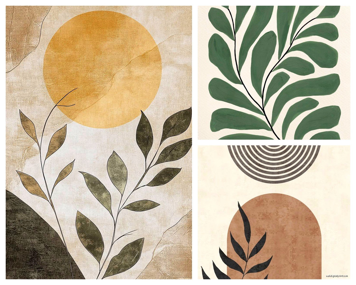
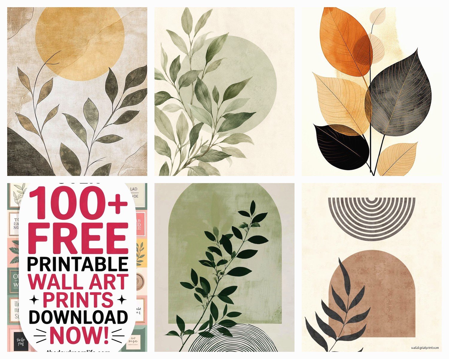
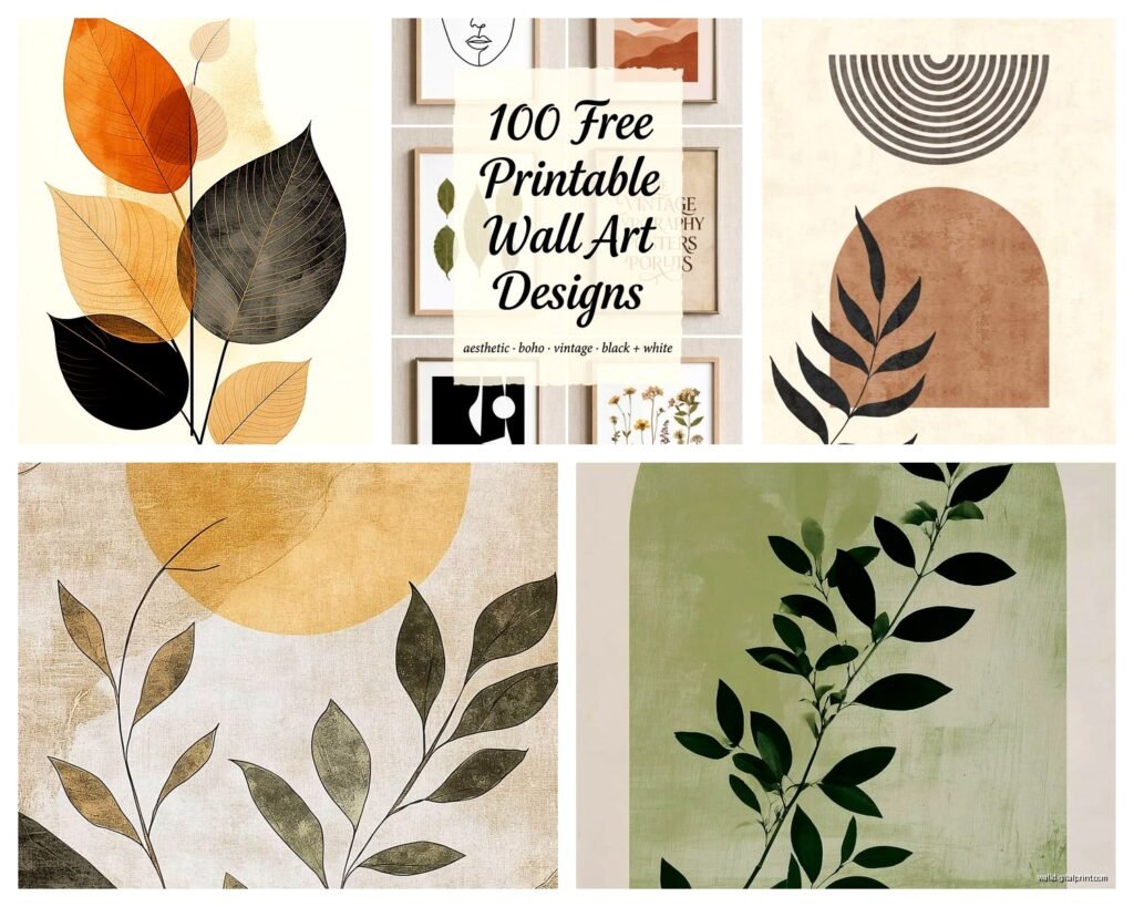
But when you do find color minimalist prints—like a single rust-colored arch or a muted sage green line drawing—those can be really stunning. Just know that printing colors at home rarely matches what you see on screen. Your monitor shows RGB colors and printers use CMYK which is a whole thing I don’t fully understand but basically colors shift.
For color prints I usually do a test print on regular paper first to see how it looks. If it’s way off I’ll adjust it in the print settings or just take it to a print shop where they can color-match better.
The TV is playing some home renovation show in the background and they just installed the most cluttered gallery wall I’ve ever seen which is funny timing because that’s exactly what you’re trying to avoid with minimalist printables.
Seasonal Rotating
One thing I started doing that’s actually really satisfying is rotating prints seasonally. Keep a little collection of different styles and swap them out every few months. It keeps your space feeling fresh without buying new stuff constantly.
I have a summer set that’s more line drawings and botanical prints. Fall I switch to warmer abstract shapes. Winter is stark black and white photography. Spring brings back some lighter geometric stuff. All downloaded for free over time, all in the same frames, just switching out what’s inside.
You gotta store the ones not currently displayed somewhere though. I use a flat storage box under my bed which works perfectly for keeping prints safe and flat.
Anyway that’s basically everything I’ve figured out through way too much trial and error. Start with one or two prints, see what you actually like on your walls versus what looks good online, and build from there. The beauty of free printables is you can experiment without any financial commitment and honestly some of them look just as good as the $40 prints you’d buy from a fancy online shop.