Wall Art Guide, Wall Art Tutoriels
Navy Wall Art: Deep Blue Naval Ocean Dark Designs
Sep
So I’ve been totally obsessed with navy wall art lately and honestly it’s become this whole thing where I’m constantly checking different pieces for both my own space and client projects. Like, navy is having such a moment right now but it’s not gonna fade out like some trendy colors do because it’s basically a neutral that actually has personality, you know?
Why Navy Actually Works When You Think It Won’t
Okay so here’s the thing about navy wall art that I didn’t get until I actually started using it everywhere – it reads almost black from a distance but has this depth that straight black doesn’t have. My client last month was SO hesitant about a large navy abstract piece I suggested because she thought it would make her living room dark, but once we hung it, the room actually felt bigger? It’s weird but the blue undertones reflect light differently than black or charcoal gray.
The trick is understanding where navy sits on the value scale. You want pieces that have some lighter elements mixed in – creams, whites, maybe some gold leaf if you’re feeling fancy. All-navy pieces can work but they’re trickier and honestly you need really good lighting to pull them off.
Types of Navy Pieces That Actually Look Good
Abstract Ocean Stuff
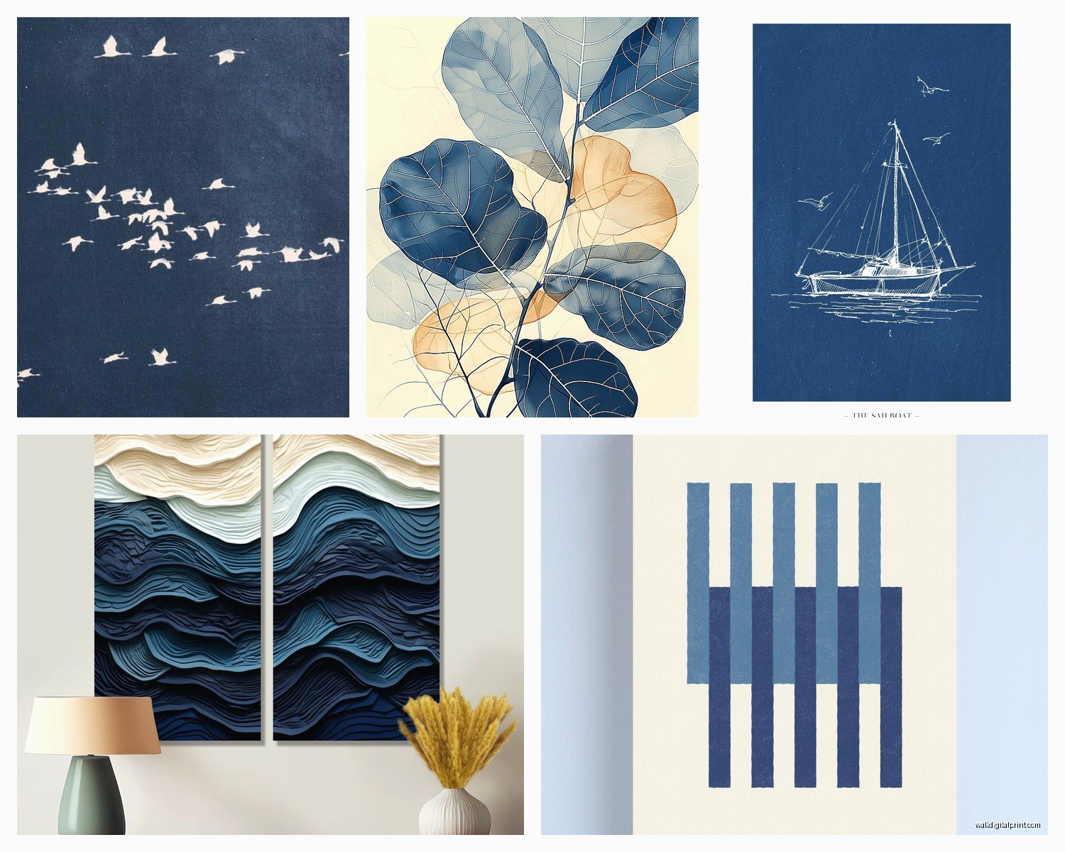
This is probably what you’re thinking of first. The wavy, fluid paintings that are supposed to look like ocean depths. I’ve bought like five of these for various projects and here’s what I learned – the ones with actual texture are worth the extra money. Flat printed canvas looks cheap up close, I don’t care what anyone says.
Look for pieces with:
- Actual brushstrokes you can see
- Multiple shades of blue layered together
- Some white caps or foam effects that break up the darkness
- Gold or silver metallic accents (but not too much, we’re not making a Vegas hotel)
I found this one piece on Etsy last month that has like seven different blue tones from almost-black navy to this perfect slate blue and it’s *chef’s kiss* but it was pricey. Sometimes you gotta just save up for the good stuff though.
Geometric Navy Designs
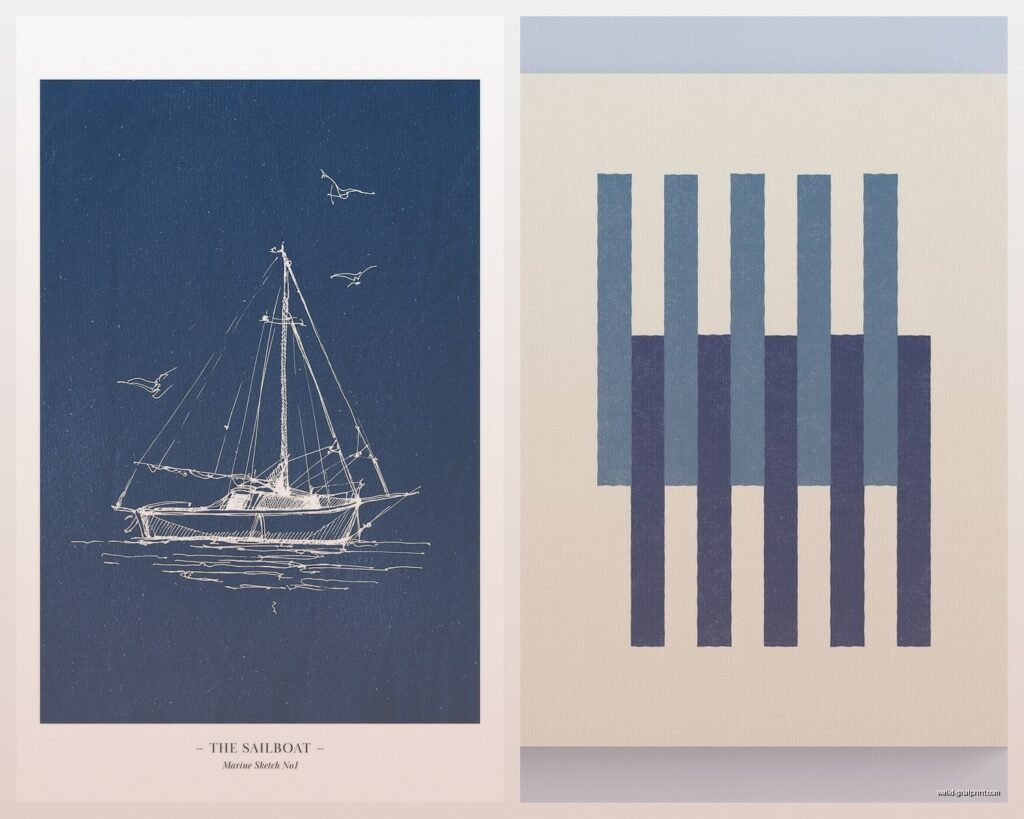
These are having a moment and I’m here for it. Think modern, clean lines, sometimes with brass or copper geometric shapes overlaid on navy backgrounds. They work really well in spaces that are otherwise pretty traditional because they add that contemporary edge without being too aggressive about it.
The Home Depot and Target actually have some decent options in this category if you’re on a budget. I grabbed a set of three for a client’s home office and they were like $40 each? Not hand-painted obviously but from across the room you honestly can’t tell.
Botanical Prints on Navy
Wait I forgot to mention these and they’re probably my favorite right now. White or cream botanical illustrations on navy backgrounds – ferns, leaves, those vintage scientific plant drawings. They’re sophisticated but still have personality and they work in literally any room.
I have a set in my own dining room and my cat keeps trying to bat at them because I guess she thinks the leaves are real, which is annoying but also kind of cute.
Size Matters More Than You Think
Okay so funny story – I once ordered what I thought was a 30×40 inch piece for above a client’s sofa and it arrived and was 30×40 CENTIMETERS. Read your measurements carefully and know whether they’re doing inches or cm because international sellers list differently.
Real talk about sizing:
- Above a sofa: you want the art to be about 2/3 the width of the sofa, maybe slightly less
- Above a bed: either one large piece that’s about half the bed width, or a gallery wall situation
- In a dining room: go bigger than you think, like seriously
- Small walls or narrow spaces: vertical pieces work better than horizontal
Navy reads as heavy visually so if you go too small it can look like a random dark spot on your wall instead of intentional art. I usually tell people to mock it up with painter’s tape first – just tape out the dimensions on your wall and live with it for a day or two.
What to Actually Pair Navy Art With
This is where people get stuck because navy is darker than most neutrals. You’re gonna want to think about the whole wall situation, not just the art by itself.
Wall Colors That Work
- White or cream walls – this is the safest and looks really crisp
- Light gray walls – adds sophistication
- Pale blush or dusty pink – I know this sounds weird but trust me, navy and blush is such a good combo
- Sage green walls – if you want something unexpected that still works
- Actually navy walls – but only if your art has significant lighter elements, otherwise it disappears
I tried navy art on a charcoal gray wall once and it was just… muddy looking. Dark on dark can work but you need really specific lighting and it’s not worth the hassle usually.
Frame Choices
Most navy pieces look best in:
- Natural wood frames – especially lighter woods like oak or ash
- White or cream frames for a coastal vibe
- Black frames if the piece has black elements in it already
- Gold or brass frames for glam situations
Skip silver frames with navy unless it’s a very modern geometric piece. Something about silver and navy together reads cold to me.
Where to Actually Buy This Stuff
Budget Options Under $100
Target’s Project 62 line has some decent navy abstract pieces. I’ve bought several and the quality is fine for the price. They’re printed canvas but they’re pre-stretched and ready to hang which is convenient.
HomeGoods is hit or miss but when they have good navy art, it’s really good and cheap. You just gotta go regularly because their inventory changes constantly. I was there last week looking for something completely different and found this amazing navy and gold leaf piece for $35.
Etsy has tons of printable navy art that you can download and print yourself. Get it printed at a local print shop on good paper and frame it yourself – total cost maybe $50-75 for a large piece if you’re smart about it.
Mid-Range $100-300
Anthropologie, West Elm, and CB2 all have beautiful navy pieces in this range. The quality is noticeably better – actual canvas, sometimes hand-embellished, better framing options.
I bought a set of two navy abstract pieces from West Elm for my living room and they’ve held up really well. The colors haven’t faded at all even though they get afternoon sun.
Society6 and Minted are good for this price range too, especially if you want something more unique or from independent artists.
Investment Pieces $300+
If you’re gonna spend real money, go for original art or very limited prints. Saatchi Art, Artfully Walls, and local galleries are your best bet.
I have one client who collects original navy abstracts and honestly her collection is stunning. There’s something about seeing actual brushstrokes and texture that you just can’t replicate with prints.
The Gallery Wall Situation
Navy works really well in gallery walls but you gotta be strategic about it. Don’t make everything navy or it becomes too heavy.
Try this formula:
- 2-3 navy pieces as anchors
- Some white or cream pieces to lighten it up
- Maybe one piece with a pop of another color – coral, mustard, or emerald green
- Mix in some simple line drawings or text prints
I did a gallery wall in my hallway last year with this mix and it’s the part of my house I get the most compliments on. The navy pieces ground everything while the lighter pieces keep it from feeling like a cave.
Oh and another thing – vary your frame sizes and styles in a gallery wall. All matching frames with navy art can look too corporate unless that’s the vibe you’re going for.
Lighting Is Everything
This is gonna sound obvious but proper lighting makes or breaks navy wall art. Dark art needs more light than you think.
If you have navy art in a room with only overhead lighting, it’s probably not showing up the way it should. I always recommend:
- Picture lights if you’re fancy and don’t mind the wiring
- A nearby floor or table lamp that casts light toward the wall
- Track lighting or adjustable ceiling fixtures aimed at the wall
- Natural light from windows (but not direct sun that’ll fade it)
My own bedroom has a large navy piece that looked totally flat and boring until I added a pair of wall sconces on either side. Now it has depth and you can actually see all the different blue tones.
Common Mistakes to Avoid
Okay so I’ve made basically every mistake possible with navy art, so learn from my failures:
Don’t put navy art in a room that’s already full of dark furniture – it’s too much heaviness in one space. You need some visual breathing room.
Don’t hang it too high. The center of your art should be at eye level, which is usually around 57-60 inches from the floor. I see so many people hang art way too high and it looks weird.
Don’t buy a piece just because it matches your throw pillows. I mean, coordination is fine, but your art should be something you actually love, not just a color-matching exercise.
Don’t forget about the mat if you’re framing prints. Navy prints usually look better with a white or cream mat around them – gives them some breathing room and makes them look more expensive.
The Matting Thing
Actually let me expand on this because it matters – if you’re buying navy prints to frame yourself, get them professionally matted. It costs like $30-50 extra but makes such a difference. The mat should be at least 2-3 inches wide, sometimes wider for larger pieces.
I learned this the hard way when I framed a bunch of botanical prints for a client without mats because she wanted to save money, and they looked cheap even though the actual prints were beautiful. We redid them with proper matting and suddenly they looked like expensive gallery art.
Mixing Navy with Other Art
You probably have other art already, right? Navy pieces can absolutely mix with what you’ve got.
Navy works with:
- Black and white photography
- Gold or brass abstract pieces
- Warm wood tones in art
- Other blues obviously
- Greens – both sage and emerald
- Coral or terracotta
- Cream or ivory pieces
It does NOT work well with:
- Bright primary colors usually
- Hot pink (unless you’re really committed to that look)
- Neon anything
- Purple – they compete with each other
I’m watching this home renovation show right now and they just put navy art with bright purple accents and I’m literally cringing. Some things just don’t need to happen.
Seasonal Considerations
Here’s something nobody talks about – navy art can feel different in summer versus winter. In summer with all the natural light, it feels fresh and nautical. In winter when it’s darker outside, it can feel cozy and moody.
If you’re worried about it feeling too dark in winter, make sure you have good artificial lighting and maybe some lighter accessories around it. I swap out my throw pillows seasonally partly for this reason – lighter linens in summer, maybe some cream or white near my navy art in winter to keep things balanced.
Anyway that’s basically everything I know about navy wall art after working with it constantly for the past couple years. It’s such a versatile choice and way more interesting than just doing all gray or all beige, but you gotta be thoughtful about how you use it.