Wall Art Guide, Wall Art Tutoriels
Paper Wall Art: Origami Cutout Layered Craft Designs
Sep
So I’ve been totally obsessed with paper wall art lately and honestly it started because I needed to fill this massive blank wall in a client’s reading nook and they had like zero budget left. Like literally told me “figure something out with paper maybe?” and I was like okay challenge accepted.
The thing about origami-inspired cutout designs is they look incredibly complicated but once you get the basic technique down it’s kinda therapeutic? I spent last Sunday making these layered geometric pieces while watching that new cooking show (the one with the dramatic timer sounds) and my cat kept trying to sit on the paper which… didn’t help but also made me laugh.
Materials You Actually Need
Okay so first things first, don’t go buying fancy origami paper right away. I made that mistake and wasted like forty bucks on these gorgeous Japanese papers that were too delicate for wall art. What you actually want:
- Cardstock in various weights – 65lb for delicate top layers, 110lb for base layers
- A proper craft knife (X-acto #11 blade is my ride or die)
- Self-healing cutting mat – don’t skip this, I ruined a vintage desk once
- Metal ruler with cork backing so it doesn’t slip
- Foam mounting tape or those 3D foam squares
- Pencil and good eraser
- Spray adhesive for when you need things FLAT
The craft knife thing is serious though. Those cheap multi-packs from random brands get dull so fast and then you’re sawing through paper instead of cutting and your edges look terrible. Just get the X-acto, replace the blade every 2-3 projects, you’ll thank me.
Starting With Simple Geometric Cutouts
I always tell people to start with basic geometric shapes because you’re gonna mess up. Like you’re definitely gonna mess up and it’s way less annoying when you’ve wasted 20 minutes instead of four hours on some intricate mountain landscape.
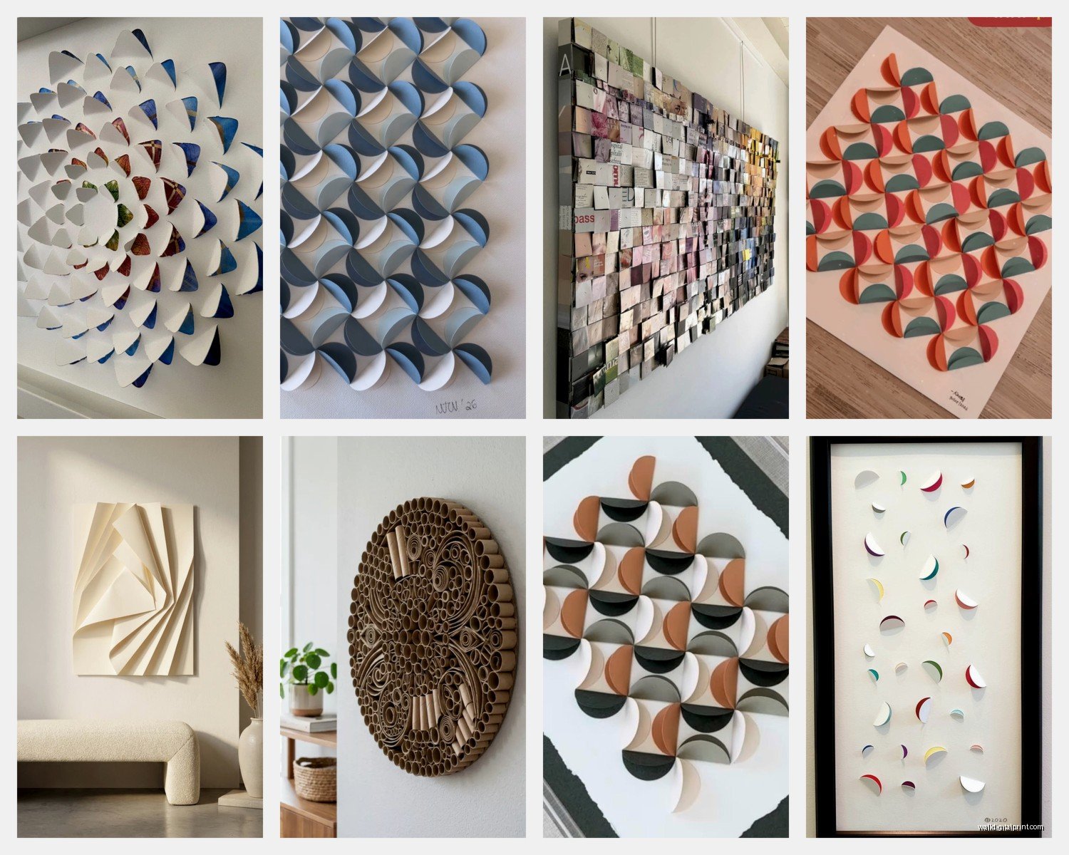
My first successful piece was just overlapping circles in different sizes. Cut them out of three different shades of blue cardstock, mounted them with those foam squares so each layer sits about 3mm above the one below. The shadows created by the layers are what make it look expensive and intentional.
Here’s how I approach it: sketch your design super lightly on the TOP layer first. This is the layer people see, so it needs to be the most detailed. Then work backwards planning what shows through from underneath. It’s kinda like… reverse engineering? You’re thinking about negative space as much as positive space.
The Actual Cutting Technique
Okay so this is where people usually give up but don’t. Your first cuts are gonna be wobbly and that’s fine.
Always cut AWAY from yourself – I know this sounds like something your middle school art teacher said but I’ve got a scar on my thumb that reminds me why this rule exists. Hold the knife like a pencil, not like you’re stabbing something. Light pressure, multiple passes. Don’t try to cut through in one go especially with thick cardstock.
For curves, rotate the paper not the knife. This felt so awkward at first but now I do it without thinking. Keep the blade moving smoothly and let the paper spin under your other hand.
Sharp corners are actually easier than gradual curves which surprised me. You just meet two cuts at a point. Circles though… circles are the worst. I sometimes cheat and use a circle cutter for anything bigger than like 2 inches.
Layering Strategies That Actually Work
So the magic of these pieces is in the dimension right? But you can’t just randomly stack stuff and hope it looks good.
I usually work with three layers max for wall art because more than that starts looking cluttered unless you’re going for a really intricate shadow box effect. And also it gets HEAVY. Paper adds up weight-wise.
Layer 1 (Back): This is your base, your anchor. Usually the largest shapes, solid colors. Sometimes I don’t even cut this one, just use a full sheet in a complementary color.
Layer 2 (Middle): Medium detail, this creates your main shadows. Cut out bigger shapes that frame what’s happening in layer 3.
Layer 3 (Front): Your detailed work, finest cuts, this is where you show off basically.
Wait I forgot to mention – always work on one layer at a time and finish it completely before moving to the next. I used to try to cut everything first then assemble and inevitably something didn’t line up right and I’d have to recut pieces and it was a whole thing.
Design Ideas That Look Harder Than They Are
Geometric mountains: Literally just triangles in graduating sizes and shades. Cut the front layer with the smallest peaks, middle layer with medium peaks slightly offset, back layer is the largest peaks. Use blues and grays and maybe a cream color. Looks like you spent days on it, takes maybe an hour once you’ve practiced.
Botanical cutouts: Ferns are the most forgiving plant to cut because they’re naturally imperfect? Like if your frond is a little wobbly it just looks organic. Monstera leaves are also surprisingly easy – those holes are big enough that you’re not doing fussy detail work.
Abstract overlapping circles: My go-to when I’m designing something for a modern space. Pick three colors that share an undertone (like three warm grays or three dusty blues). Cut circles in various sizes, arrange them so they overlap interestingly, mount at different heights.
Oh and another thing – negative space designs where you’re cutting OUT shapes and the wall color becomes part of the art? Those are actually easier than positive space designs and they look super sophisticated. I did one that was just organic blob shapes cut from black cardstock mounted on a white wall and people thought it was from a gallery.
The Foam Mounting Tape Trick
This is gonna sound weirdly specific but the thickness of your foam tape matters SO much. I use:
- 1mm tape between layer 1 and 2
- 3mm tape between layer 2 and 3
This creates a graduated shadow effect that looks way more professional than using the same thickness throughout. Also the 3mm foam squares are easier to work with than the tape for small pieces because you can place them exactly where you need support.
Some people use hot glue but honestly that’s messy and permanent and if you mess up the positioning you’re screwed. The foam tape lets you peel and reposition for like 30 seconds before it really commits.
Color Combinations I Keep Coming Back To
Monochromatic is your friend when you’re starting. Three shades of the same color creates instant cohesion. You literally cannot mess this up aesthetically.
But when I’m feeling bolder:
- Terracotta + sage + cream (very on trend right now)
- Navy + blush + gold metallic (the gold as tiny accent layer)
- Charcoal + rust + warm white
- Forest green + mustard + tan
Metallic cardstock is tricky to cut because it’s usually coated but used sparingly as a top layer accent it adds so much. Like just a few small shapes in gold or copper suddenly makes the whole piece look more expensive.
Scale Considerations Nobody Talks About
A design that looks great at 8×10 might look totally wrong at 24×36. I learned this the hard way when I scaled up a geometric pattern and suddenly all the negative space felt too empty and awkward.
For small pieces (8×10 to 11×14), you can do intricate detail work and it reads well up close. These are good for gallery walls or small spaces.
For medium pieces (16×20 to 20×24), you want medium-sized elements with some breathing room. This is the sweet spot for most wall art honestly.
For large pieces (24×36 and up), go BOLD. Bigger shapes, more negative space, stronger contrast. Detail gets lost at that size when you’re viewing from across a room.
Fixing Mistakes Because You Will Make Them
Okay so you’ve cut something wrong or your hand slipped or whatever. Don’t throw it out immediately.
If you’ve cut too far into a shape, sometimes you can just… incorporate it into the design? I accidentally cut through a leaf stem once and just made it look like two separate leaves. Nobody knew.
If a cut is wobbly, you can sometimes smooth it with fine sandpaper. This works better on lighter colors where the edge distressing looks intentional.
If you totally mess up a top layer, you can often make it a middle layer instead and cut a new top layer. The “mistake” becomes hidden depth.
I keep all my scraps in a big box because sometimes a piece I messed up becomes perfect for a completely different project. That leaf I ruined last month became part of a botanical collage last week.
Framing vs. Floating These Pieces
Standard frames with glass kinda defeat the purpose because you lose the shadow dimension. If you’re gonna frame them, use a deep shadow box frame – at least 1 inch deep, preferably more.
But honestly? I mount most of these directly on the wall. Use those 3M command strips on the back of the base layer. For heavier pieces, I attach a sawtooth hanger to a piece of chipboard and then attach that to the back.
The floating look is very “curated art collection” and lets people see the dimensional quality which is the whole point.
Quick Project You Can Do Tonight
If you wanna just try this right now to see if you like it:
Get three pieces of cardstock in coordinating colors. Draw a simple mountain range silhouette on the top layer – just five or six peaks, nothing complicated. Cut it out. On the middle layer, draw a similar mountain range but make the peaks taller and offset them a bit. Cut it out. Bottom layer stays solid.
Stack them with foam tape, step back, boom you’ve made dimensional wall art. Takes like 30 minutes max and if you hate it you’re out maybe three dollars worth of materials.
The thing about these paper projects is they’re so low-stakes financially that you can experiment freely. Not like when you’re buying canvas art and dropping $200 and it better be perfect. This is art you can remake, adjust, change seasonally if you want.
I’ve been doing a lot more of these lately because honestly the process is meditative and my clients love them and they’re genuinely affordable to make in bulk. Like I made seven pieces for a client’s hallway last month for less than fifty bucks in materials and probably eight hours of work spread over a few evenings.
Anyway start simple, use sharp blades, don’t stress about perfection, and honestly you’re gonna surprise yourself with how good these turn out even as a beginner.