Wall Art Guide, Wall Art Tutoriels
Pine Tree Wall Art: Evergreen Forest Mountain Decor
Aug
So I’ve been totally obsessed with pine tree wall art lately and honestly it started because a client wanted this whole mountain lodge vibe but didn’t want it to feel like a Bass Pro Shop exploded in their living room, you know?
The Basic Categories You’re Gonna See
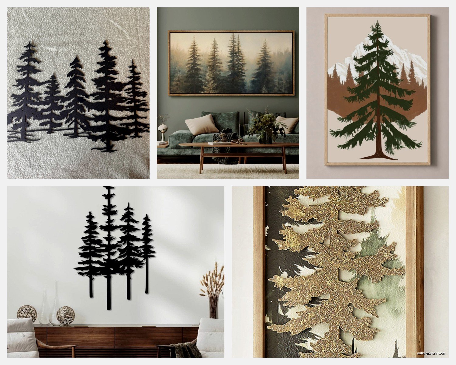
Okay so pine tree art basically falls into like three main camps. You’ve got your minimalist line drawings which are super trendy right now, then there’s the realistic photography stuff with actual forest scenes, and finally the more abstract geometric interpretations. I’ve tested all three in different spaces and they each do something completely different to a room.
The minimalist ones are deceptively tricky because you think “oh it’s just simple lines, whatever” but the line weight matters SO much. I hung this thin-line pine silhouette in my own bedroom and it just disappeared on the wall. Had to swap it for one with bolder lines and suddenly the whole room felt more intentional. Look for pieces where the lines are at least 2-3mm thick if you’re hanging it more than 6 feet away from where people usually sit or stand.
Size Actually Matters More Than You Think
This is gonna sound weird but I measure walls with my arms now because I’ve screwed this up so many times. Your wall art should take up roughly 60-75% of the width of whatever furniture is below it. So if you’ve got a couch that’s 84 inches wide, you want art that’s around 50-63 inches across. You can do a single large piece or a gallery wall situation.
I did a three-panel pine forest set above my client’s console table last month and we went with 20×30 inch panels with 3 inches between them. The total width came to about 66 inches which was perfect for their 90-inch console. But here’s what nobody tells you… if your ceiling is low (under 8 feet), vertical pieces actually make the room feel taller. Horizontal pieces work better in rooms with high ceilings where you need to bring the eye line down a bit.
The Triptych Dilemma
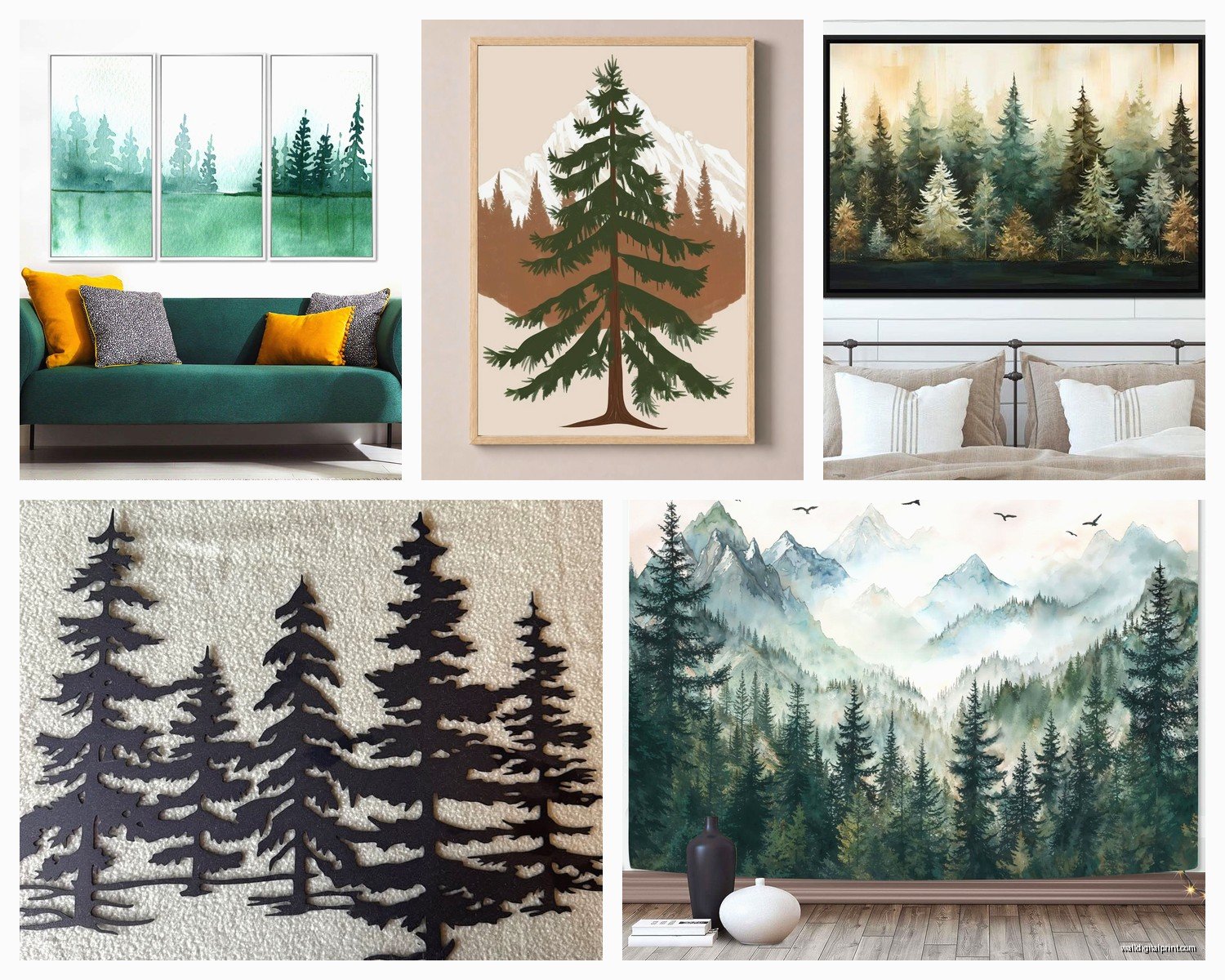
Oh and another thing, those three-panel sets are everywhere right now. The mountain scene that fades across three canvases? I have feelings about these. They look amazing in photos but hanging them level is actually a nightmare. You need a laser level, not just the bubble kind. I learned this the hard way when I eyeballed it at my sister’s place and one panel was off by like half an inch and it drove everyone crazy.
Also make sure the panels actually align content-wise. I’ve seen cheaper versions where the mountain peak doesn’t line up properly between panels and once you notice it you can’t unsee it.
Material Choices Because This Gets Confusing
Canvas prints are the most common and they’re fine, totally fine. But the quality range is wild. A good canvas should have the image wrapped around the edges (gallery wrap style) so you don’t see white borders from the side. Cheap ones just staple printed canvas to a wooden frame and leave the sides blank or white.
Metal prints though… okay so I was skeptical about these for nature scenes but I tried one with a foggy pine forest and the way it catches light is actually pretty cool. The colors look more saturated and it has this modern edge that works really well if you’re mixing rustic elements with contemporary furniture. My dog knocked one off the wall once and it didn’t dent which was impressive.
Wood prints give you that authentic cabin feel but they’re heavy. Like you definitely need proper wall anchors, not just the little nails that come with the frame. I used one above a fireplace and had to use two heavy-duty anchors rated for 50 pounds each because the piece was only 30 pounds but better safe than sorry.
Color Palettes That Actually Work
Most pine tree art comes in either realistic greens and browns, black and white, or these trendy blue-grey tones. Here’s what I’ve figured out: the realistic color versions work best in rooms that already have wood tones and natural textures. If your space is super modern with lots of white and grey, go with black and white prints or those blue-toned ones.
I made the mistake of putting a vibrant green forest print in a room with cool grey walls and it looked so off. The warm greens clashed with the cool greys. Switched it to a black and white version of basically the same scene and suddenly everything clicked.
Wait I forgot to mention the sepia-toned vintage style prints. These are actually genius for farmhouse or transitional spaces. They have that aged photography look and they don’t compete with other colors in the room.
Mixing Pine Art With Other Decor
You can totally mix pine tree art with other nature themes but there’s a limit. Pine trees plus mountains? Perfect. Pine trees plus ocean scenes? Weirdly doesn’t work as well as you’d think. I tried it because a client loved both and it just felt geographically confused.
What DOES work surprisingly well is mixing pine tree art with geometric patterns or abstract pieces in the same color family. I did a gallery wall with two pine photographs and three abstract pieces in black, white, and forest green and it looked way more sophisticated than a wall of all forest scenes.
Where to Actually Hang This Stuff
Living rooms are the obvious choice, especially above sofas or fireplaces. But I’ve been putting pine tree art in bedrooms lately and it’s really nice. Something about the vertical lines of pine trees makes a bedroom feel more restful? My client canceled last week so I spent an hour comparing different bedroom layouts with tree art and the best position is actually on the wall you see when you first walk in, not above the bed.
Dining rooms are tricky. Large-scale forest scenes can work but they need to be calming, not too busy. Nobody wants to eat dinner while staring at a chaotic wilderness scene. Go for misty forests or simple silhouettes in dining spaces.
Bathrooms though… okay this is gonna sound weird but a small pine tree print in a bathroom can actually be really nice if it’s properly sealed. I’m talking about a small 8×10 above the toilet or on a side wall. It brings that spa-like natural vibe without being too literal about it.
The Frame Situation
If you’re buying unframed prints (which are way cheaper), you gotta think about frames. Black frames are the safe choice and they work with literally everything. But natural wood frames in walnut or oak tones make pine tree art feel more cohesive, like the frame is part of the forest theme.
White or light wood frames work for minimalist pine line drawings but they can make realistic forest photos look washed out. I learned this when I bought these beautiful white-washed frames thinking they’d look beachy-rustic and they just made my forest print look faded and sad.
Floating frames (where there’s a gap between the art and frame) are having a moment and they work really well with pine tree art because they give it this gallery quality. But they’re pricey, like $80-150 for a decent sized one.
DIY Framing Tips
Michael’s and Hobby Lobby do custom framing but wait for the 50% off sales that happen basically every other week. I’ve never paid full price there and I’ve framed probably 30 pieces over the years. Also their quality is actually pretty good despite being a chain craft store.
For standard sizes (like 16×20, 18×24), just buy ready-made frames from Target or Amazon. Way cheaper and they look fine if you’re not doing a gallery-level installation.
Lighting Makes or Breaks It
This is something I didn’t understand until recently but the lighting on your pine tree art changes everything. If you have a dark forest scene and no light hitting it, it just becomes a black hole on your wall. I installed picture lights above two forest panels in a hallway and suddenly they became actual focal points instead of just dark rectangles.
Natural light is trickier because it can fade prints over time. Keep really vibrant or valuable pieces out of direct sunlight. I have blackout curtains in my living room partially because the afternoon sun was bleaching my forest print.
LED strip lights behind canvas prints create this cool floating effect. I was watching this home renovation show while installing them and it’s easier than you’d think. Just stick-on LED strips from Amazon for like $15 and suddenly your art has this subtle glow.
Mixing Styles Without Looking Chaotic
So you can mix minimalist pine line drawings with realistic photos but you need a unifying element. Usually that’s either matching frames or a consistent color scheme. I did a wall with four different pine pieces, all completely different styles, but they were all in black frames on a white wall and it worked.
The rule I follow is no more than three different art styles in one sight line. So if you can see your living room and dining room wall from the same spot, those walls should coordinate somehow.
Budget Breakdown
Cheap options (under $50): Prints from Etsy or Society6, basic canvas prints from Amazon, DIY with downloaded art and cheap frames. These are totally fine for testing out the style or for spaces you’re not super committed to.
Mid-range ($50-200): Framed prints from West Elm or CB2, quality canvas sets from Wayfair, custom framing from craft stores. This is the sweet spot where you get decent quality that’ll last.
Splurge ($200+): Original paintings from local artists, high-end metal or acrylic prints, custom photography prints. Worth it for main living spaces or if you’re really committed to the look.
I’ve bought from all three categories and honestly the mid-range stuff usually offers the best value. The cheap Amazon prints can look really obviously cheap in person, like pixelated or weirdly colored. But spending $500 on wall art feels excessive unless it’s a really special piece.
What Actually Happens Over Time
Canvas prints can sag or warp if they’re in humid environments. My bathroom canvas developed this weird ripple after about a year. Metal and wood hold up better in bathrooms or kitchens.
Colors will fade eventually, especially if there’s any sun exposure. I’ve had prints lose their vibrancy after 3-4 years in sunny spots. This is just something to expect and budget for replacing them eventually.
The frames get dusty like you wouldn’t believe. Especially if they have texture or carved details. I wipe mine down maybe every two months with a dry microfiber cloth.
Common Mistakes I See People Make
Hanging art too high is the biggest one. The center of your art should be at eye level, which is around 57-60 inches from the floor. I see so many people hang stuff way up near the ceiling and it makes the room feel awkward.
Buying sets where all three pieces are basically identical. Like three prints of the same pine tree from slightly different angles. That’s boring and doesn’t add visual interest. Better to get a set that progresses through a scene or shows different perspectives.
Not considering the rest of the room. If your space is already busy with patterned rugs, colorful furniture, and lots of decor, a complex detailed forest scene might be too much. Go simpler in busy rooms, more detailed in minimal rooms.
Oh and trying to make pine tree art work in every single room. It’s okay to have different themes in different spaces. My bedroom has pine trees, my living room has abstract art, my kitchen has food prints. They don’t all have to match.
Seasonal Flexibility
One thing I love about pine tree art is it doesn’t feel super seasonal. It works year-round unlike some nature themes. But you can lean into different vibes depending on what else you style with it. Add cozy throws and warm lighting in winter, lighter textiles and plants in summer.
I swap out smaller accent pieces around my main pine tree art to keep things fresh. Different throw pillows, candles, or small decorative objects change the whole vibe without requiring me to take down the art itself.
The evergreen theme also means it works for holiday decorating without being explicitly Christmas-y. Just add some string lights or pinecones nearby and suddenly it’s festive.
Honestly the best advice is to start with one piece and see how you feel about it. Don’t commit to a whole gallery wall until you’re sure you love the vibe. I’ve returned so many art pieces because they looked different in my space than I expected and there’s no shame in that.