Wall Art Guide, Wall Art Tutoriels
Sage Green Wall Art: Soft Herb Green Nature Calm Color
Nov
So I’ve been completely obsessed with sage green wall art lately and honestly it started because a client wanted to redo their entire living room but didn’t want it to feel too trendy or whatever, and sage green just… it works? Like it’s not trying too hard.
Okay first thing – sage green isn’t actually one color and this is where people mess up. You’ve got your cool-toned sages that lean blue-ish, your warm ones that are almost olive, and then the straight-up herb greens that look like you literally crushed dried sage leaves. When you’re shopping for wall art in this color, you gotta figure out which direction you’re going because mixing them looks… not great. I learned this the hard way when I bought three prints online and they arrived and I was like oh no these are completely different greens.
The easiest way to test is look at your existing stuff. If your room has warm woods, gold accents, terracotta – you want the warmer sage. If you’ve got silver fixtures, cool grays, white oak – go cooler. Sounds obvious but my dog knocked over a plant while I was figuring this out for my own place and I realized I’d been overthinking it.
Where to Actually Find Good Sage Green Art
Etsy is gonna be your best bet for affordable prints. Search “sage green abstract art” or “sage green botanical print” and you’ll get tons of digital downloads. The digital downloads are like $5-12 and you just take the file to a print shop or use an online service. I use Printique a lot because their color matching is consistent – super important with greens because they can shift weird when printed.
Society6 has sage green stuff but it’s pricier. The advantage is they print and frame it for you which saves time if you’re lazy like me. Quality is pretty good though I had one print arrive with slightly washed out colors once.
Target actually has some decent sage green wall art now in their Threshold line. Not gonna lie, I’ve bought their stuff for staging projects and it looks way more expensive than it is. The frames are basic but functional.
Original Art vs Prints
If you want original paintings, check local art fairs or Instagram artists. Search hashtags like #sagegreenaart #neutralartwork #organicabstract. I found this amazing artist who does sage green watercolor pieces for like $150-300 which is reasonable for original work. Her name’s… wait I gotta find her handle… anyway if you DM me I can send it.
Original art has texture and depth that prints just don’t, but you’re paying for it. For most rooms, a good quality print in a nice frame reads as expensive enough that people don’t question it.
What Actually Looks Good
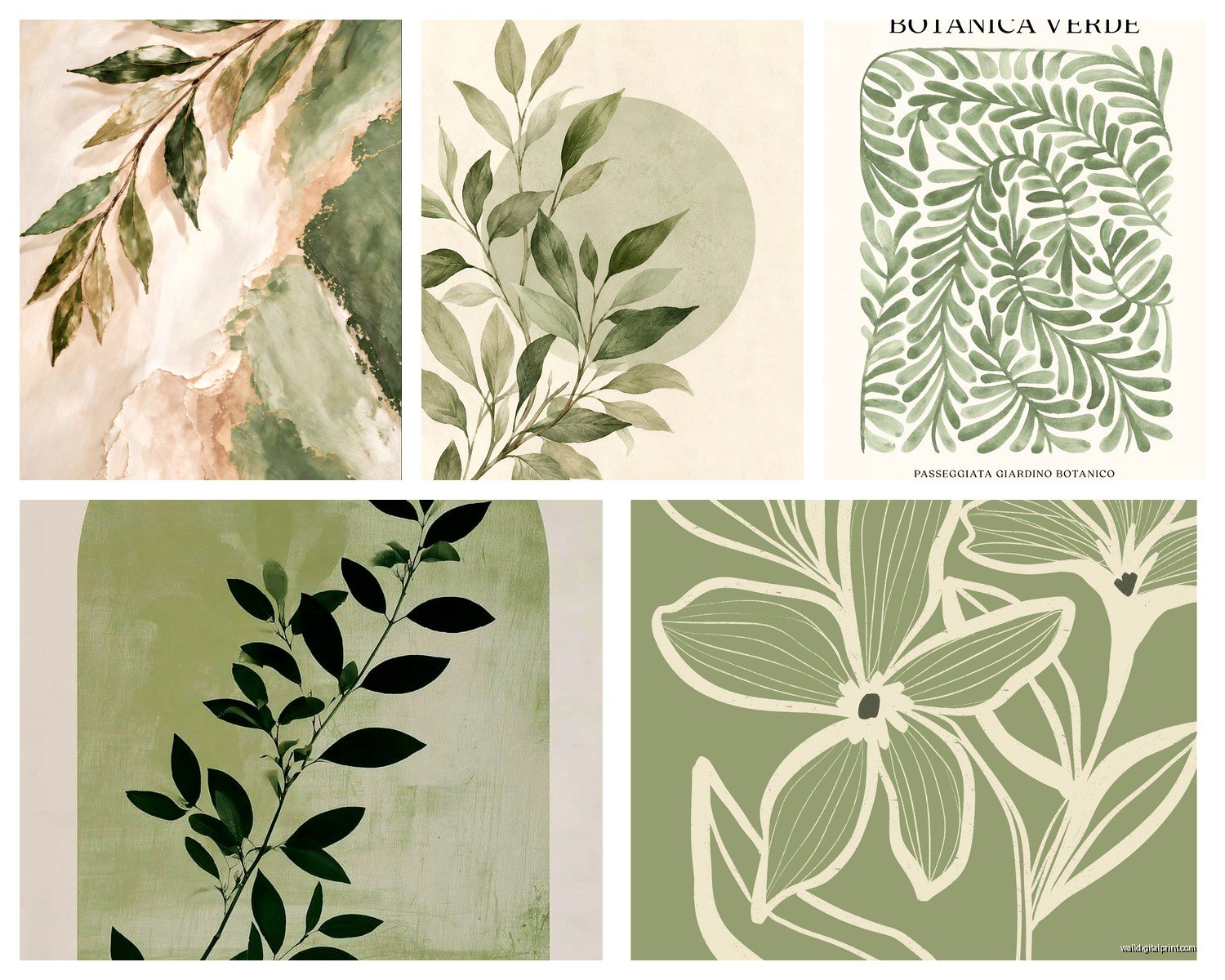
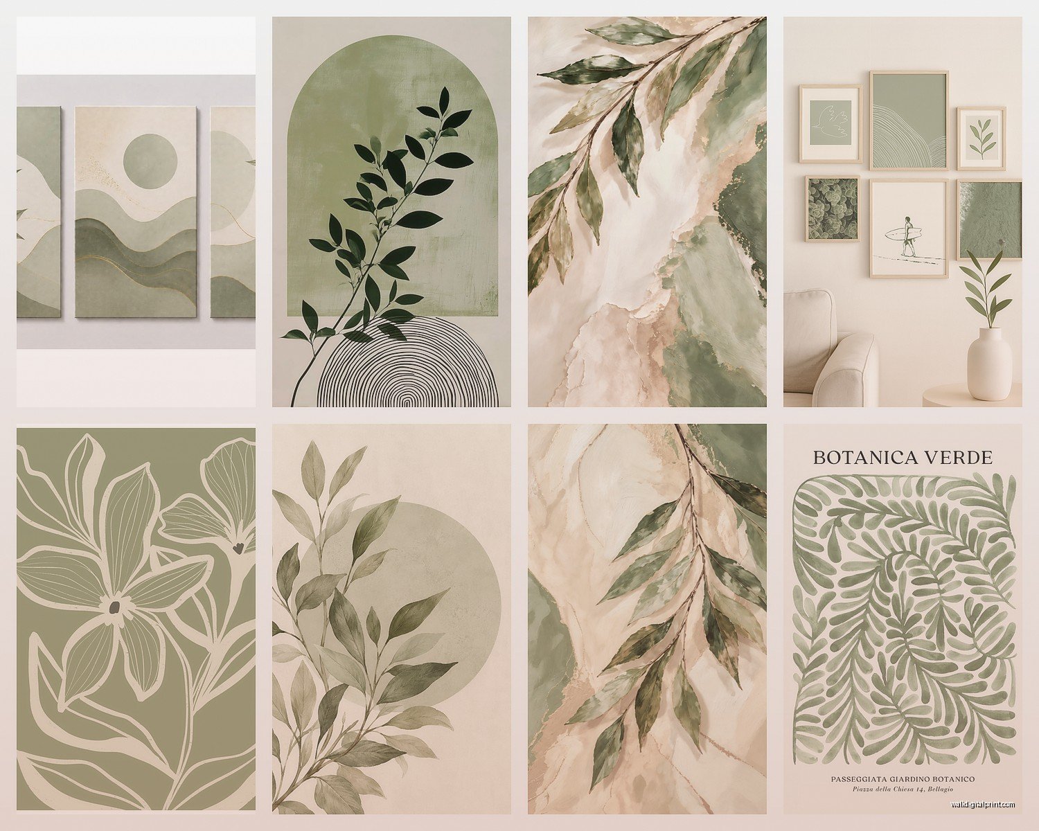
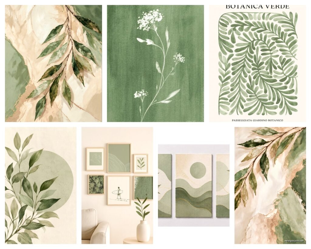
Botanical prints in sage green are the obvious choice and yeah they work, but they can feel a little basic if that’s all you do. I like mixing in:
- Abstract organic shapes – like those blob/arch paintings that are everywhere but in sage instead of terracotta
- Line drawings with sage green accents
- Vintage-style landscape prints with muted sage tones
- Geometric patterns using sage as the dominant color
- Textured pieces – think watercolor washes or brushstroke-heavy abstracts
The key is varying your styles if you’re doing a gallery wall. All botanicals gets boring fast. Mix a fern print with an abstract piece and maybe a landscape and suddenly it looks curated instead of like you bought a matching set from HomeGoods.
Size Matters and People Get This Wrong
One big piece (like 30×40 or larger) makes more impact than a bunch of small ones usually. Unless you’re doing a proper gallery wall, in which case you need at least 6-9 pieces to make it look intentional.
For over a sofa, your art should be roughly 2/3 the width of the sofa. So a 90-inch sofa needs art that’s about 60 inches wide total. You can do one big piece or a diptych or triptych to get there.
Oh and another thing – hang art at eye level, which is usually 57-60 inches from the floor to the center of the piece. I see so many people hang stuff way too high and it just floats up there looking awkward.
Framing Because It Actually Matters
Natural wood frames look amazing with sage green. Light oak, maple, even bamboo frames complement the earthy vibe without competing. I’m obsessed with the frames from Framebridge right now – they have this “light wood” option that’s perfect.
White frames work if your room is more modern/minimalist. Clean and simple. Black frames can work too but they create more contrast so the sage green becomes more of a statement.
Gold frames are tricky with sage green… they can look really elegant if you go for a thin delicate frame, but chunky gold can overwhelm the softness of the color. My client tried thick gold frames once and we had to return them because it looked too formal.
Skip the matting unless your print is really small. Sage green looks better with the color going all the way to the frame edge in most cases. Creates more impact.
DIY Options That Don’t Suck
Okay so funny story, I was watching The Great British Baking Show and decided to try painting my own sage green abstract art during an episode and it actually turned out decent?
You need:
- Canvas from Michael’s or Amazon (get the pre-stretched kind)
- Acrylic paint in sage green – mix your own using white + forest green + tiny bit of gray/blue
- Big brushes or palette knives
- Maybe some metallic gold paint for accents
Just do organic shapes, blobs, brushstrokes, whatever. The beauty of abstract art is no one can tell you it’s wrong. Layer different shades of sage for depth. Let it dry between layers.
I’ve also done the thing where you buy cheap botanical prints and paint over parts of them with sage green gouache to customize them. Sounds weird but it looks cool and artistic.
Pressed Botanical Frames
If you’re crafty, press your own herbs and leaves and frame them. Actual sage leaves, eucalyptus, ferns – press them in a book for a few weeks, then arrange them on sage green cardstock and frame. Super easy and it brings in real texture.
Styling Your Sage Green Art
This is where people get stuck. You bought the art, now what?
Layer it with other neutrals. Sage green plays nice with:
- Cream and ivory
- Warm whites
- Terracotta and rust
- Soft browns and tans
- Muted blush pink
- Gray (but keep it warm-toned)
- Natural wood tones
In my living room I have a big sage green abstract over the sofa with cream pillows, a rust-colored throw, and natural wood side tables. It feels calm but not boring.
Add plants obviously. Real ones ideally but good faux ones work too. The sage green in the art echoes the actual plant colors and makes everything feel cohesive.
Texture is huge – pair your smooth art with chunky knit blankets, linen pillows, rattan baskets, ceramic vases. The sage green becomes this grounding element while the textures keep it interesting.
Common Mistakes to Avoid
Don’t go monochromatic with sage green everywhere. Like sage walls + sage art + sage furniture = too much. Pick one or two places for the color to live.
Don’t pair sage green with bright whites if you want that calm natural vibe. Bright white makes sage look muddy. Use warmer off-whites instead.
Don’t put sage green art in a room with lots of cool blue tones unless you’re specifically going for that blue-green vibe. They can clash.
Also don’t buy tiny art for big walls. I see this all the time – someone buys an 8×10 print for a huge blank wall and it just looks lost. Go bigger than you think you need.
Lighting Considerations
Sage green can look completely different depending on your lighting. In warm incandescent light it’ll look cozier and more olive. In cool LED light it can look more gray-blue.
If you can, test your art in the actual room before committing. Most places have good return policies. I always tell clients to live with it for a few days at different times of day to see how the color shifts.
Picture lights can help if your sage green art is looking too dark or muddy. Those little brass picture lights add warmth and make the colors pop.
Room-Specific Ideas
Living Room: Go big or go home. Large scale abstract or a gallery wall. This is where sage green really shines because it’s calming but sophisticated enough for your main space.
Bedroom: Keep it soft and organic. Botanical prints, watercolor abstracts, anything that feels peaceful. Over the bed is the obvious spot but I also love art on the wall opposite the bed so it’s the first thing you see when you wake up.
Kitchen: Herb prints in sage green are perfect here and actually make sense thematically. Frame vintage botanical illustrations of sage, rosemary, thyme.
Bathroom: Smaller botanical prints or a single statement piece. Make sure you’re using real glass (not acrylic) in the frame because humidity can fog up acrylic over time.
Home Office: Sage green is supposed to help with focus and reduce eye strain so it’s great for work spaces. I like geometric prints or abstract landscapes here.
wait I forgot to mention – if you’re renting and can’t put holes in the walls, those Command picture hanging strips actually work pretty well for lightweight frames. Just follow the weight limits. Or get a picture ledge shelf and lean your art – that’s super trendy right now anyway.
Budget Breakdown
Cheap option: Digital download ($8) + print at Costco ($15 for 20×30) + IKEA frame ($20) = $43 total
Mid-range: Society6 framed print = $80-150
Splurge: Original painting from emerging artist = $200-500
I usually tell people to invest in one or two larger original or high-quality pieces and fill in with affordable prints. Nobody needs all original art unless you’re really into collecting.
The thing about sage green wall art is it’s having a moment right now but it’s also kind of timeless? Like it’s not gonna look dated in two years the way millennial pink or that really orange terracotta might. It’s based on nature and nature doesn’t go out of style.
My cat keeps sitting in front of my sage green art like she’s trying to camouflage with it which is annoying for photos but also cute I guess.
Anyway the main thing is just start with one piece and see how you feel. Don’t overthink it too much – if you like looking at it and it makes your space feel calmer, you picked the right thing.