Wall Art Guide, Wall Art Tutoriels
Ski Wall Art: Mountain Snow Winter Sports Alpine
Aug
So I’ve been completely obsessed with ski wall art lately and honestly it started because a client wanted to turn their basement into this whole alpine lodge vibe without spending like twenty thousand dollars. Figured I’d share what actually works because I’ve made some expensive mistakes you can totally avoid.
Figuring Out What Style Actually Fits Your Space
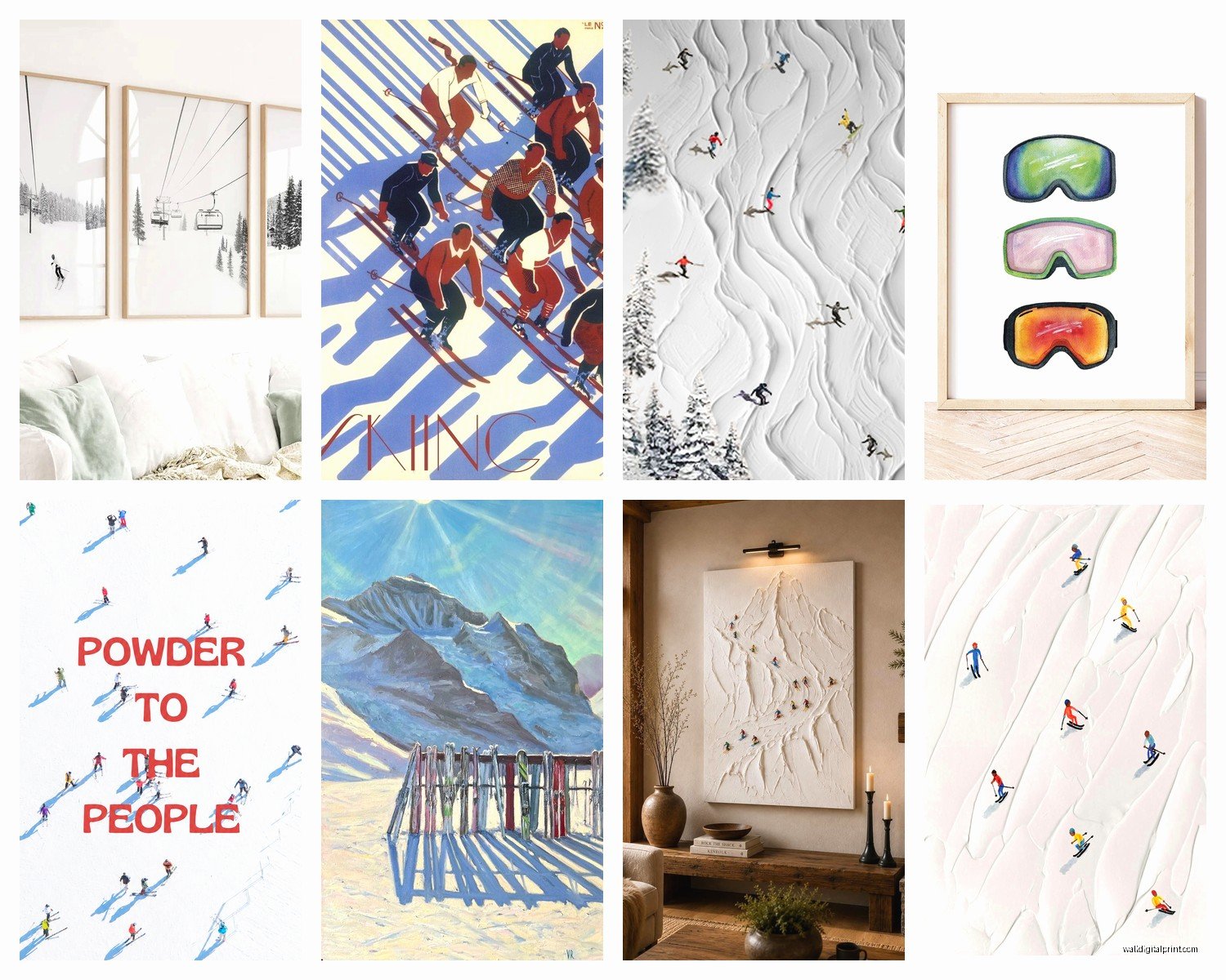
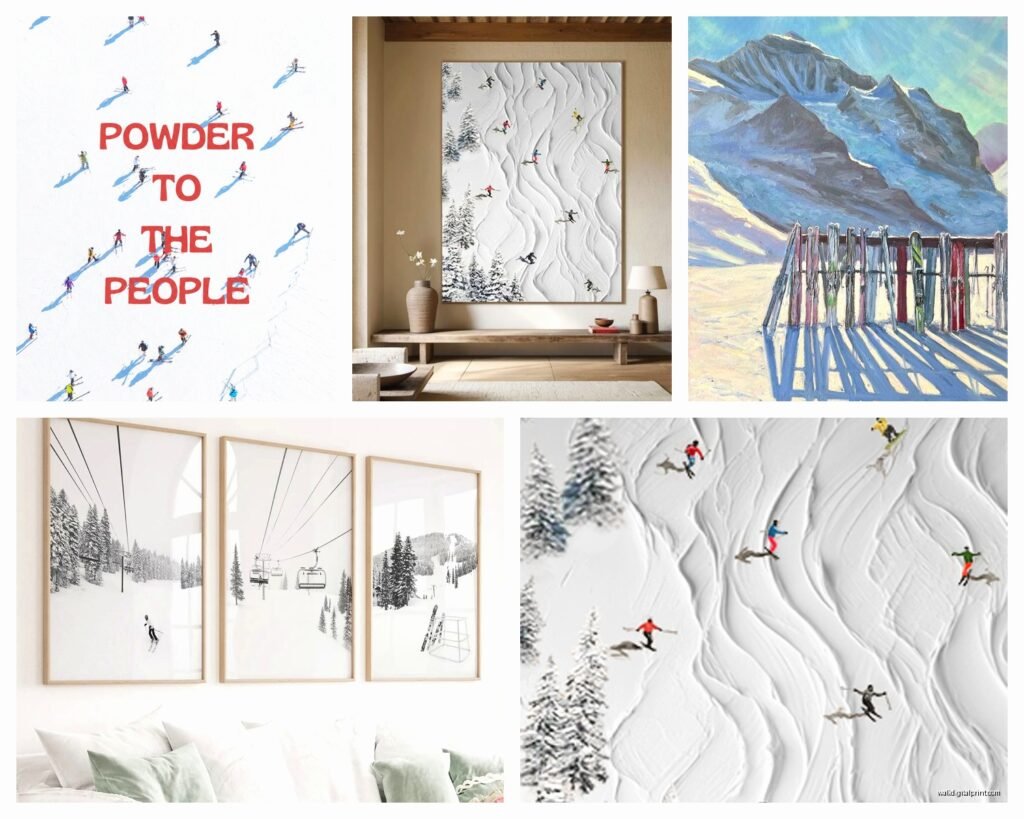
Okay so first thing – you gotta decide if you want vintage ski posters or modern photography or like abstract mountain stuff. I spent way too long on Etsy at 2am last week and here’s what I learned. Vintage ski posters from places like Chamonix or Aspen from the 60s and 70s? They’re amazing but the reproductions can look cheap if you don’t get them printed right. The colors need to be saturated enough or they just look washed out and sad on your wall.
Modern photography is where I actually ended up going for most projects. There’s this whole thing with aerial mountain shots that look incredible when they’re printed large – like 40×60 inches. But and this is important – you need a wall that can handle that scale. I made the mistake of ordering a massive print for a client’s living room and when we hung it the room felt completely overwhelmed because the ceilings were only 8 feet.
Vintage Reproduction Prints
If you’re going vintage route here’s what actually matters. Get them printed on matte paper not glossy. Glossy looks like a poster from a college dorm room no matter how much you spend. I use a local print shop that does giclée printing and yeah it costs more but the difference is wild. You’re looking at maybe $80-150 for a good 24×36 print versus $25 on Etsy but the Etsy one will look like $25.
Also those old Olympic ski posters? Chamonix 1924, Innsbruck, all those – the originals are gorgeous but make sure you’re getting an actual licensed reproduction or at least a high-res file. I found this seller on Etsy called… wait let me check my orders… VintageSportsPosters or something similar who has really clean files.
Size and Placement Without Making It Weird
This is gonna sound weird but I actually mock everything up in Photoshop first now after I hung a series of three prints and they were like 2 inches too far apart and it drove me insane for months. You can also just use painter’s tape on the wall to map out where frames will go.
For ski art specifically:
- Above a couch – go for one large piece 40-50 inches wide OR a gallery wall with 5-7 smaller pieces
- Hallways are perfect for a series of narrow vertical shots like skiers in motion
- Bedroom – I love putting a huge mountain landscape above the bed, really moody and atmospheric
- Home office or den – this is where vintage poster collections work great, you can do a whole wall of different ski resorts
The rule everyone says is hang art at eye level but honestly in a room where you’re sitting a lot hang it slightly lower. I learned this from a gallery curator friend and it changed everything.
Where to Actually Buy This Stuff
Okay so after testing like fifteen different sources here’s what’s worth it:
Etsy – Great for vintage reproductions and digital downloads. If you buy a digital file you can print it yourself at Costco for cheap or take it to a real print shop. I do both depending on the project budget. Search for “vintage ski poster printable” and you’ll find tons.
Society6 and Redbubble – The quality is consistent which is nice. Not amazing but consistent. Good for modern designs and abstract mountain stuff. Their framing options are actually decent now, I used to hate them but they upgraded something in the last year.
Local photographers – This is my secret weapon honestly. Find someone in Colorado or Utah or wherever who shoots mountains and reach out directly. They usually have prints available way cheaper than galleries and you’re supporting actual artists. Plus you can often get custom sizes.
Framebridge and Frame It Easy – For framing. I’ve used both extensively. Framebridge is more expensive but they’ll do the whole thing for you including hanging hardware. Frame It Easy is cheaper and you assemble yourself but it’s pretty straightforward.
The Digital Download Route
Wait I forgot to mention – if you’re on a tight budget just buy digital files and print them at a photo printing place. I’ve done this with probably 30 pieces now. You can get a 24×36 print at Costco for like $12. The quality isn’t gallery-level but for a basement or casual space it’s totally fine.
The trick is making sure the file resolution is high enough. You want at least 150 DPI at the size you’re printing, preferably 300 DPI. Most Etsy sellers will list this in the description.
Framing Options That Don’t Look Basic
So framing is where people either nail it or completely ruin good art. For ski stuff specifically I’ve found a few things that work really well:
Natural wood frames – Light oak or walnut for that alpine lodge feeling. Sounds obvious but it works. The wood grain adds texture without competing with the image.
Black metal frames – Super modern, makes colorful vintage posters pop. I use these a lot in contemporary spaces that want just a hint of ski culture.
No frame at all – Okay hear me out. Mounting prints directly on foam board or getting them printed on canvas gives this really clean look. My cat knocked over a framed print last month and shattered glass everywhere so now I’m kinda over glass for certain rooms.
For matting – white or off-white mats make vintage posters look more expensive and important. But for modern photography I usually skip the mat entirely and let the image go edge to edge.
Creating an Actual Gallery Wall
Gallery walls with ski art can either look amazing or like a weird ski shop threw up on your wall. Here’s what I do that actually works:
Pick a unifying element – either all black and white photos, or all vintage posters, or all the same frame style. Don’t try to mix too many different vibes or it gets chaotic.
Layout on the floor first. I cannot stress this enough. Arrange everything on the floor in the exact configuration before you touch a hammer. Take a photo of it so you remember.
Start with the center piece and work outward. Usually this is your largest or most important piece.
Keep spacing consistent – I use 2-3 inches between frames for a tight gallery wall, 4-6 inches for a more relaxed feel.
Oh and another thing – use a level. I hung an entire gallery wall slightly crooked once and had to redo the whole thing. My back hurt for days.
Theme Ideas That Work
I’ve done a bunch of different themed collections:
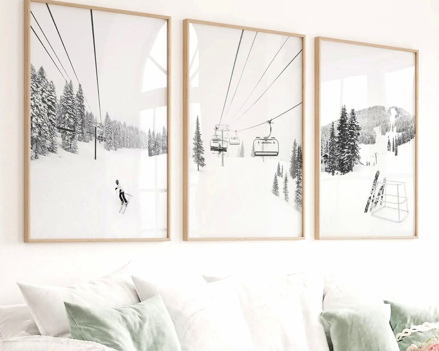
- Black and white action shots of skiers – super dramatic and works in modern spaces
- Vintage posters from different resorts – tells a story if you’ve actually been to those places
- Topographic maps of famous mountains – really cool and unexpected
- Sequential motion shots of ski tricks – perfect for a rec room or kid’s room
- Minimalist mountain silhouettes – great for Scandinavian or minimal interiors
The topographic map thing is having a moment right now. You can get custom ones made of specific mountains which is cool if you have like a special connection to a particular resort.
Colors and How They Actually Work in Rooms
Vintage ski posters usually have those saturated blues, reds, and yellows. They’re bold. If your room is already colorful this can be too much. I learned this the hard way in a client’s already-bright living room and it was just sensory overload.
Black and white mountain photography is way more versatile. Works with basically any color scheme and adds drama without competing with your furniture or other decor.
For rooms with neutral walls – gray, white, beige – you can go bold with color. That’s where those vintage posters really shine.
If you’ve got colored walls you gotta be more careful. I did a project with navy walls and we used black and white ski photos with black frames and it looked incredible. But colorful posters would’ve clashed.
Mixing Ski Art With Other Stuff
You don’t have to make it like a shrine to skiing. I actually think it looks better when you mix it with other elements. Some combinations I’ve done that worked:
Ski posters + landscape paintings + family photos in similar frames – creates this collected-over-time feel
Mountain photography + plants + natural textures like woven wall hangings – very Pacific Northwest cabin vibe
Vintage ski art + mid-century modern furniture + geometric rugs – unexpected but really cool
The key is not trying too hard to match everything perfectly. A little variety in frame styles and art types makes it feel more authentic and less like you bought everything in one shopping trip.
Lighting Considerations
This is something people forget. Art needs proper lighting or it just disappears into the wall. I’ve started using picture lights on bigger pieces – those little brass or black lights that mount above the frame. They’re like $30-60 and make such a difference.
For gallery walls track lighting or directional can lights work great. Just make sure you’re not creating glare on the glass if you have framed pieces.
Natural light is tricky with art because it can fade prints over time. If you’re hanging something in direct sunlight either use UV-protective glass or accept that it might fade and plan to replace it eventually. I usually reserve my cheaper prints for sunny spots.
Budget Breakdown Real Numbers
Since you’re probably wondering what this actually costs here’s what I typically spend:
Budget option:
- Digital downloads from Etsy: $5-15 each
- Printing at Costco: $10-20 per print
- Basic frames from Frame It Easy: $30-60 each
- Total for 3-piece gallery: $135-285
Mid-range:
- Quality prints from Society6 or photographers: $50-100 each
- Better framing from Framebridge: $100-200 per piece
- Total for 3-piece gallery: $450-900
Splurge:
- Original vintage posters or limited edition photography: $200-500+ each
- Custom framing from local shop: $150-400 per piece
- Total for 3-piece gallery: $1050-2700+
Honestly for most spaces the mid-range option is the sweet spot. You get quality that’ll last but you’re not spending mortgage payment money on wall art.
Mistakes I’ve Made So You Don’t Have To
Ordered a canvas print that was supposed to be a photo of the Alps but the resolution was garbage and it arrived looking pixelated and awful. Always check resolution specs.
Hung a heavy frame with those cheap sawtooth hangers and it fell off the wall at 3am and scared me half to death. Use proper picture hanging wire and wall anchors for anything over 10 pounds.
Bought matching frames for a gallery wall without measuring and they were all slightly different sizes even though they were labeled the same. Now I always measure frames before buying multiples.
Mixed warm-toned and cool-toned black frames in the same gallery wall thinking no one would notice. Everyone noticed. Stick to one undertone.
Put a vintage poster in direct sunlight and it faded to almost nothing in like eight months. That was a $100 lesson in UV protection.
Anyway that’s basically everything I’ve figured out about ski wall art through way too much trial and error. The main thing is just start with one piece you really love and build from there rather than trying to do everything at once.