Wall Art Guide, Wall Art Tutoriels
Starburst Wall Art: Retro Sunburst Geometric Patterns
Jul
So I’ve been totally obsessed with starburst wall art lately and honestly it started because a client wanted “something retro but not too Austin Powers” which made me laugh but also…I got it? Like there’s this fine line between cool mid-century modern and costume party, you know?
The thing about sunburst patterns is they’re basically geometric art that doesn’t take itself too seriously. I’ve hung probably fifteen different versions in the past year alone and here’s what I’ve actually learned from trial and error.
The Different Types You’ll Actually Find
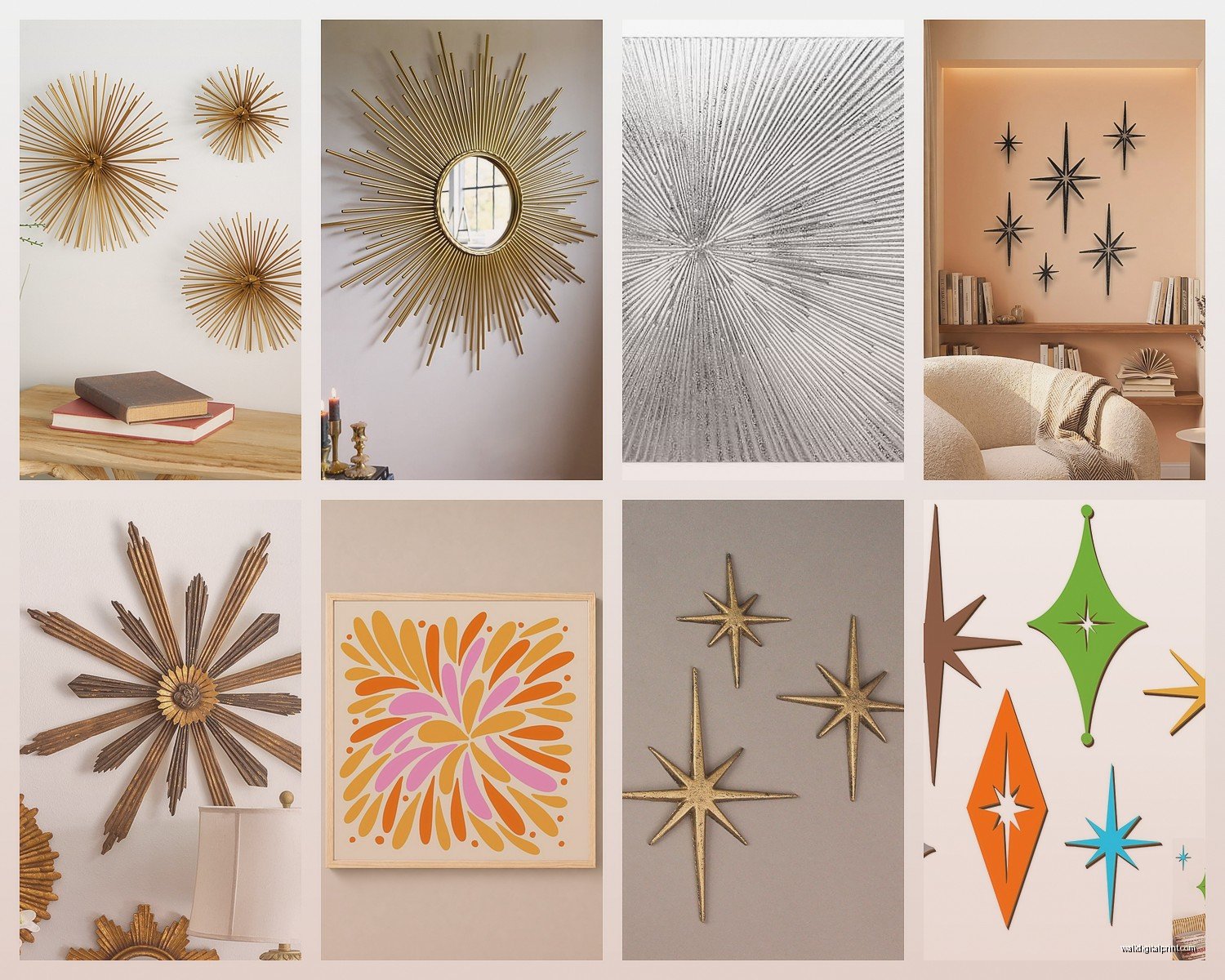
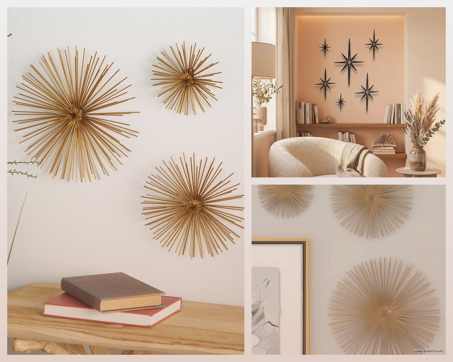
Okay so there are like three main categories and this matters more than you’d think. Metal sunbursts are the classic ones – usually brass or gold-toned, sometimes copper. They’ve got these rays shooting out from a center medallion and they catch light in this really specific way. I have one above my couch that I found at an estate sale and every time the sun hits it around 4pm my whole living room looks expensive.
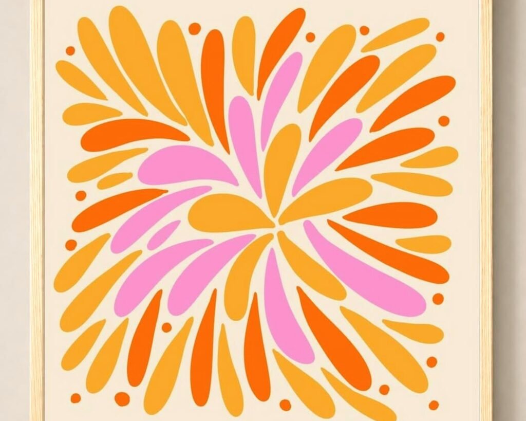
Then there’s painted wood versions which are having a moment right now. These tend to be flatter, more graphic, and you can find them in literally any color. I just installed a navy and gold one in a nursery and it works because it’s not shiny – less stimulating for a baby’s room but still that retro vibe the parents wanted.
The third type is like…mixed media? I’m seeing a lot of rattan or woven materials combined with metal, or acrylic pieces layered together. These read more boho-meets-retro and honestly they’re great if your space is already pretty maximalist because they add texture without being too loud.
Size Is Gonna Make or Break This
I cannot stress this enough – people always buy these too small. A 12-inch sunburst on a big empty wall just looks sad and confused. I learned this the hard way in my first apartment where I bought this cute little brass one and it just…disappeared.
For above a console table or dresser, you want at least 24 inches diameter. For a statement wall, go 36 inches or bigger. I have a 48-inch one in my entryway and people always comment on it, whereas the smaller ones kinda just blend in.
But here’s where it gets tricky – if you’re doing a gallery wall situation with multiple sunbursts (which can look amazing btw), then mixing sizes actually works. I did three different sized ones – 18, 24, and 30 inches – in a triangle formation and it created this cool dynamic thing. My cat knocked the smallest one down twice though so maybe secure them really well if you have pets.
Where to Actually Buy Them
West Elm has decent options but they’re pricey for what you get. I’ve found better deals at HomeGoods and TJ Maxx honestly – you just gotta go regularly because their inventory is random. Etsy is amazing for vintage ones but you’re paying for authenticity and condition. I got a 1960s original brass sunburst for like $180 and it’s legitimately my favorite piece of art I own.
Target surprisingly has some good affordable versions in their Project 62 line. They’re not gonna be heirloom quality but for like $40 you can test out the look before committing to something expensive.
Oh and another thing – check Facebook Marketplace and estate sales. Old people loved these things in the 60s and 70s, so when estates get liquidated there are always a few floating around. I found a pair for $30 total last summer and just spray painted them matte black and now they look totally modern.
Placement Is Everything Here
So the obvious spot is above furniture – sofas, beds, consoles, whatever. But I’ve learned that sunbursts work really well in unexpected places too. Above a doorway? Looks cool and draws the eye up. In a bathroom above the toilet? Adds personality to a boring spot. I even put one on the ceiling of a powder room once and people lost their minds over it.
The key is making sure there’s enough negative space around it. These are busy patterns by nature, so if you cram them into a cluttered area they just add to the chaos. I usually aim for at least 6-8 inches of clear space on all sides.
For entryways they’re perfect because they’re immediately eye-catching. I have clients who are terrible at decorating and I always suggest a sunburst for the entry because it’s like…instant style with zero thought required.
Mixing Metals and Finishes
People get really worried about this but honestly you can mix metals with sunbursts more easily than other decor. I have brass, copper, and black metal ones all in my house and it works because the shape is consistent enough to tie them together.
That said, if you’re doing multiple sunbursts in the same room, I’d pick a cohesive finish. All gold, all black, all natural wood – whatever. I tried mixing gold and silver in a bedroom once and it looked confused. Not terrible, just…off.
wait I forgot to mention – matte finishes are way easier to work with than shiny ones. Shiny brass can look dated really fast if you don’t style it right. Matte or brushed metals feel more current and also they don’t show fingerprints which is honestly the real concern.
Color Combinations That Actually Work
If you’re going with a colored sunburst (painted wood or powder-coated metal), here’s what I’ve seen succeed:
Navy or dark blue with gold – classic, sophisticated, works in literally any room
Emerald green with brass – very 70s glam, perfect for a dining room or bar area
Matte black with any wall color – this is the safest option and always looks intentional
Terracotta or rust with natural wood – warm and organic, great for boho or southwestern vibes
White or cream on a dark wall – creates contrast without being too bold
I did a blush pink sunburst in a little girl’s room and her mom was worried it would be too cutesy but paired with gray walls it actually looked really sophisticated. So don’t be afraid of unexpected colors if the rest of the room is fairly neutral.
The Gallery Wall Approach
Okay so funny story – I was watching this home renovation show while organizing my storage unit and saw them do an entire wall of just sunbursts in different sizes and finishes and I thought it was gonna be too much but then I tried it in my office and it’s like…my favorite thing now.
The trick is odd numbers and asymmetry. Three or five pieces work better than four. Cluster them tightly rather than spacing them far apart – that’s what makes it look intentional instead of random. I used 3M Command strips for mine so I could adjust without putting holes everywhere and I’m glad I did because I moved them around like six times before I was happy.
Mix materials too – some metal, some wood, maybe one with texture. All the same material can look too matchy and staged.
DIY Options If You’re Crafty
I’m not super crafty but I have made a couple of these and it’s easier than you’d think. You need:
- A round wood base (craft stores sell these)
- Wooden dowels or skewers
- Gold spray paint or whatever color you want
- Hot glue gun
- Something for the center – a mirror, decorative medallion, whatever
You basically just glue the dowels around the edge of the circle in a sunburst pattern, spray paint everything, add your center piece, and hang it. I made one in about two hours while binge-watching a true crime documentary and it cost maybe $15 in supplies.
There are tons of tutorials on YouTube but honestly you can kinda just eyeball it. The beauty of the sunburst is that it’s supposed to look a little chaotic and organic.
Common Mistakes I Keep Seeing
Hanging them too high – the center should be at eye level, around 57-60 inches from the floor. I see so many people hang them way up near the ceiling and it just looks weird.
Not considering the wall color – gold on beige walls disappears. You need contrast. Gold pops on navy, gray, white, or darker colors. Silver works on warmer tones. Just think about whether your piece will actually stand out.
Going too matchy with the room – if everything in your space is gold, adding a gold sunburst is just…more gold. Sometimes you need a different finish to create visual interest. I put a black sunburst in an otherwise warm-toned room and it totally elevated the space by adding that contrast.
Buying cheap ones that look cheap – listen, I’m all for budget decor but some of the really inexpensive versions are so flimsy and obviously fake looking that they actually make your space look worse. Better to save up for one good piece than buy three crappy ones.
Styling Around Them
Once you’ve got your sunburst up, the area around it matters. I usually keep the adjacent decor minimal because the sunburst is already a statement. Maybe a plant on the console below it, or a couple of small framed photos, but don’t overcrowd.
If it’s above a bed, simple bedding lets the art shine. I did a whole maximalist bedroom once with a bold sunburst and it worked but you gotta really commit to the maximalism – like multiple patterns, lots of color, gallery walls on other surfaces. Otherwise it’s too much.
For entryways I like pairing them with a simple mirror on an adjacent wall or a clean-lined console table. Let the sunburst be the personality and keep everything else functional.
Maintenance and Care
Metal ones collect dust like crazy in the crevices. I use a microfiber duster or honestly just a blow dryer on cool setting to blast the dust out. Works perfectly and takes like 30 seconds.
If you have brass that’s tarnishing and you want that aged look, leave it. But if you want it shiny, Brasso works great. I personally prefer the aged look because it feels more authentic and less “I’m trying too hard.”
Wood ones might need a light dusting but they’re pretty low maintenance. If you painted one yourself, you might need to touch it up every few years depending on the location.
When NOT to Use Them
This is gonna sound weird but I don’t love sunbursts in ultra-modern minimalist spaces unless you’re specifically going for that eclectic contrast thing. They have inherent personality and ornamentation that fights with stark minimalism.
Also if your space already has a lot of geometric patterns – busy wallpaper, patterned rugs, graphic textiles – adding a sunburst might be overkill. Sometimes you gotta let other patterns have their moment.
And honestly if you just don’t like them, don’t force it. I have a friend who thinks they’re tacky no matter how I style them and that’s fine – not every trend is for everyone.
Current Trends I’m Seeing
Oversized single statements rather than clusters – like one massive 60-inch piece instead of multiple smaller ones
Matte black metal is having a huge moment, moving away from the traditional gold
Organic materials like rattan and jute mixed with metal for that modern boho vibe
Colored mirror centers instead of plain medallions – adds an extra reflective element
Asymmetrical or irregular rays instead of perfectly even spacing – feels more contemporary and less retro costume
I just sourced a copper one with a convex mirror center for a client’s living room and it’s arriving next week, I’m curious to see how the convex mirror changes the whole dynamic of the piece. Might report back on that if I remember.
Anyway that’s basically everything I know about sunburst wall art from actually living with them and installing them in like dozens of spaces. They’re way more versatile than people think and honestly a pretty easy way to add personality without committing to anything permanent. You can always take them down and sell them if you get tired of the look, which you can’t really do with wallpaper or paint treatments.