Wall Art Guide, Wall Art Tutoriels
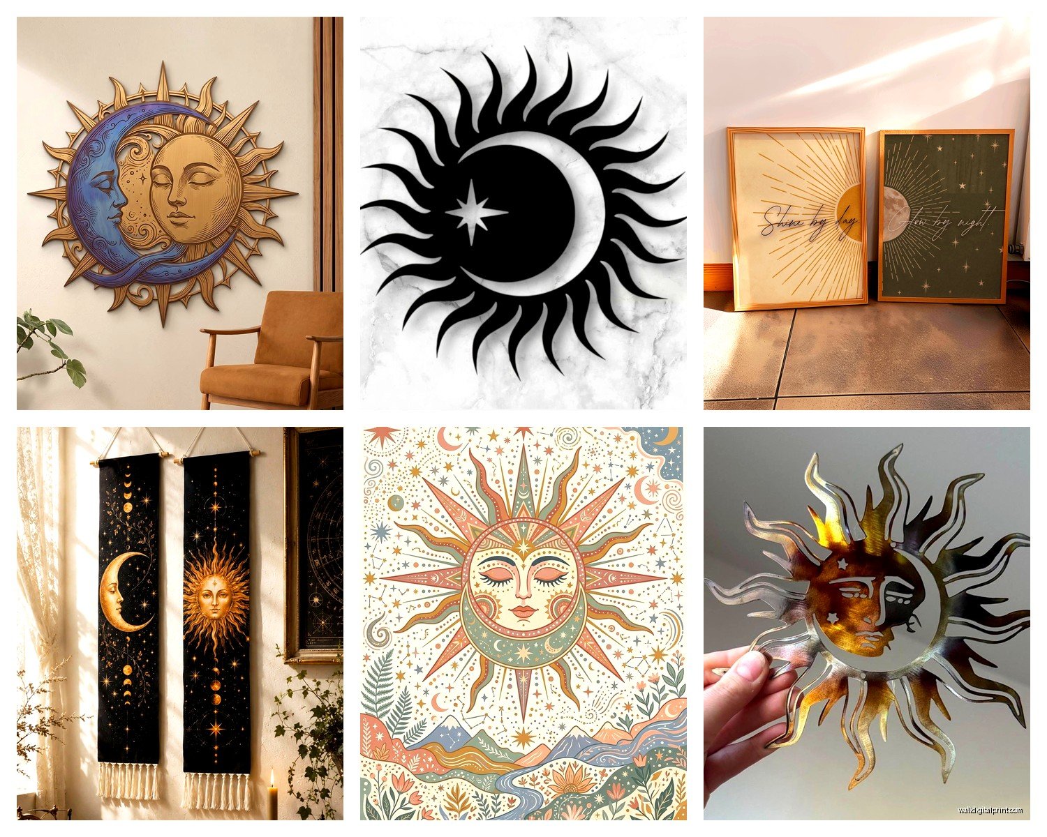
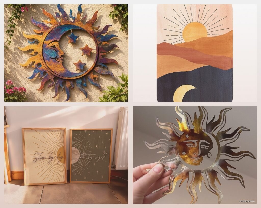
Sun and Moon Wall Art: Celestial Day Night Balance Symbol
Aug
So I’ve been totally obsessed with sun and moon wall art lately and honestly it started because a client asked me to source some for their meditation room and then I fell down this whole rabbit hole. Like I’m talking three weeks of saving screenshots and comparing pieces at 11pm while watching that Netflix show about interior design fails.
The thing about celestial art is it’s everywhere right now but most of it looks cheap or too witchy or like something from a college dorm in 2004. You gotta be really picky because the symbolism is beautiful but the execution can go so wrong so fast.
Finding Pieces That Don’t Look Like Hot Topic Threw Up
Okay so first thing – metal versus canvas versus wood. I’ve tested all three in different spaces and here’s what actually works. Metal sun and moon pieces look incredible but they need the right wall. I put this gorgeous brass celestial piece in my own hallway and it just disappeared against my cream walls. Moved it to a charcoal accent wall and suddenly it was the whole focal point. Metal needs contrast or it’s just gonna blend in and you wasted like $200.
Canvas is tricky because so many are just digital prints that look flat. You want texture. I found this one on Etsy – god I wish I could remember the shop name but it was something like MoonlightStudioArt or whatever – and it had actual painted texture over the print. That’s the key. If you’re going canvas, hold out for mixed media or hand-embellished stuff.
Wood burned pieces are having a moment and I’m here for it. There’s something about pyrography that makes celestial symbols feel more… grounded? Less floaty-spiritual-Instagram and more like actual art. Plus they work in basically any space. I put a wooden sun and moon mandala thing in a super modern kitchen and it didn’t look weird at all.
Size Actually Matters Way More Than You Think
This is where everyone messes up including me the first dozen times. A tiny 12-inch sun and moon piece above your bed just looks sad and confused. Like it doesn’t know why it’s there. You need to go bigger than feels comfortable when you’re shopping online.
For above a bed, you’re looking at minimum 36 inches wide. I usually tell people to go 48-60 inches for a queen or king bed. Yeah it feels huge when you open the box but trust me it’ll look proportional on the wall.
For a living room focal wall you can go absolutely massive. I did a 72-inch metal sun and moon installation for a client last month and we both stood there thinking “this is too much” when we unpacked it and then once it was up we were like oh. Oh that’s perfect actually.
Small pieces work for galleries or clusters. Like if you’re doing that whole constellation wall thing with multiple pieces, then yeah go with 10-12 inch individual elements. But one single small celestial piece floating alone on a wall? Nope. Looks like you gave up halfway through decorating.
The Whole Balance Symbolism Thing
So the reason sun and moon art is more than just pretty circles is the duality concept. Day and night, masculine and feminine energy, conscious and subconscious, all that stuff. I’m not super woo-woo but I do think there’s something to having visual reminders of balance in your space.
The best pieces show them interacting somehow. Either overlapping, kissing (yeah that’s a whole style), nested inside each other, or in some kind of yin-yang configuration. I’m less into the ones where they’re just sitting next to each other looking bored. The art should show relationship not just coexistence.
There’s also the eclipse style which I’m personally obsessed with. When the sun and moon are depicted mid-eclipse it’s just visually stunning plus it represents those rare moments when opposites perfectly align. Very metaphorical. Very pretty. Works great in an office or creative space.
Colors That Won’t Make You Cringe In Six Months
Metallics are safe. Gold, silver, bronze, copper – they’re classic and they’ll still look good when celestial art isn’t trendy anymore. My cat knocked over a gold sun piece last year and I literally gasped out loud because those finishes are timeless.
Black and white is also solid. High contrast celestial art has this graphic quality that reads as art-art not just decor. I’ve got a black and white moon phase print in my studio that’s been there for like five years and I still love it.
Where people get in trouble is with those sunset gradient situations. Teal and purple and orange all blended together. It looks amazing in the Etsy listing but in your actual house with your actual furniture it’s gonna clash with everything. Unless your whole space is neutrals, skip the rainbow celestial vibes.
Oh and another thing – glow in the dark elements can be cool or terrible depending on execution. I saw this moon piece that had subtle phosphorescent paint just on the craters and it was beautiful at night. But the ones that glow bright green like a 90s toy? Hard pass.
Placement Is Where The Magic Happens
Bedrooms are obvious but here’s what I’ve learned – don’t put super detailed intricate sun and moon art directly across from your bed where you’ll stare at it trying to fall asleep. Your eye will keep following the patterns. Put it above the bed or on a side wall.
Living rooms work great especially above a sofa or fireplace. The sun and moon thing brings this calm energy that balances out the social activity of the space. Sounds weird but I swear it works.
Bathrooms are underrated for celestial art. Think about it – bathrooms are about transformation and cleansing and cycles. A moon phase piece in a bathroom just makes sense. Plus the humidity won’t hurt metal or sealed wood pieces.
I put a sun and moon piece in my entryway and I love it because it’s like… you’re greeting both energies when you come home? Okay that sounds too spiritual but honestly it just looks cool and sets a vibe for the whole house.
Wait I forgot to mention – avoid putting sun art where it gets direct sunlight because depending on the material it can fade. Which is ironic. The sun art fading from sun exposure. But yeah it happens with prints especially.
Mixing With Other Decor
Celestial art plays surprisingly well with different styles. Mid-century modern looks great with clean geometric sun and moon designs. I paired a simple brass sun disc with a client’s Eames chair situation and it was chef’s kiss.
Boho is the obvious match but you gotta be careful it doesn’t get too cluttered. If you’ve already got macrame and plants and rattan everywhere, go with a simpler celestial piece. Let it breathe.
Minimalist spaces need celestial art that’s more about negative space. Those line drawing style sun and moon pieces where it’s just thin black lines on white? Perfect for minimalist vibes.
Even traditional spaces can handle it if you pick the right piece. I used an antique-looking bronze sun and moon medallion in a client’s very traditional dining room and it added just enough personality without clashing with the whole formal thing they had going on.
DIY Versus Buying
Look I’m all for DIY but sun and moon art is one of those things that’s hard to make look professional unless you’ve got serious skills. I tried to make a moon phase thing with paint pens once and it looked like a middle school project. Not in a charming way.
If you’re set on DIY, the easiest route is printing and framing. Find high-res celestial art (make sure it’s legal to print), get it printed at a good print shop on nice paper, frame it properly. That’s DIY in spirit without the crafting disasters.
Wood burning could work if you’re already into pyrography but don’t make celestial art your first project. The circles need to be perfect and the shading is tricky.
What does work DIY-wise is arrangement. Buy several smaller ready-made pieces and create your own constellation gallery. That way you’re designing without having to actually create the art itself.
Where To Actually Shop
Etsy obviously but you gotta dig past the first three pages of results. Set your filters to handmade only and sort by reviews. I’ve found my best pieces from sellers with like 47 sales not the huge shops with thousands.
Society6 and similar print-on-demand sites are hit or miss. The designs can be gorgeous but the print quality varies wildly. Always read recent reviews about the specific product type you’re ordering.
Local art fairs and markets are actually great for celestial art because it’s having such a moment. I’ve found incredible pieces at random craft fairs that I never would’ve discovered online.
Antique stores sometimes have vintage celestial pieces that are way cooler than new stuff. I found this 1970s copper sun wall hanging that’s one of my favorite things I own. It’s got this patina that you just can’t fake.
HomeGoods and TJ Maxx occasionally have decent celestial wall art but it’s totally random. I check every time I’m there which is probably too often but whatever.
Budget Real Talk
You can find okay sun and moon art for like $30-50 but it’s probably gonna be a basic print. Not terrible but not special either.
The sweet spot I’ve found is $80-150 for something actually good. At that price point you’re getting real materials, decent craftsmanship, something that’ll last.
Over $200 you’re getting into art-art territory. Hand-forged metal work, original paintings, custom pieces. Worth it if it’s a focal point in an important room but probably overkill for a guest bedroom.
I spent $340 on a hammered copper sun and moon piece for above my sofa and I don’t regret it at all. It’s the first thing people notice and I’ve had it for three years with zero signs of it feeling dated. Sometimes the investment is worth it.
Installation Without Destroying Your Walls
Heavy metal pieces need proper anchors. I learned this the hard way when a sun sculpture crashed down at 3am and I thought someone broke in. Use wall anchors rated for the actual weight, not what you hope will work.
For renters, command strips work for lighter pieces under like 5 pounds. Be honest about the weight though. A metal sun that says it’s 3 pounds is probably actually 5 pounds once you factor in the hanging hardware.
Picture hanging wire is your friend for pieces that need to hang flush but have weird backs. I keep a whole spool of it because so much celestial art has irregular backing situations.
Level everything. I know it seems obvious but circles are very unforgiving. If your sun is tilted even slightly it looks drunk. Use an actual level not your eyeball.
The spacing for multi-piece installations should be consistent. I use painters tape to map everything out first. Sounds annoying but it’s way less annoying than 47 nail holes you gotta patch later.
Oh and consider lighting. A little picture light or even just adjusting your existing fixtures to highlight your celestial piece makes such a difference. The shadows and dimension you get with proper lighting is what separates okay from incredible.