Wall Art Guide, Wall Art Tutoriels
The Last Supper Wall Art: Da Vinci Religious Masterpiece
Aug
So I’ve been totally obsessed with Last Supper reproductions lately because a client asked me to source one for their dining room and then backed out last minute, which meant I spent like three weeks deep-diving into every version available and now I know way too much about this.
The Thing About Da Vinci’s Original That Makes Shopping Confusing
Okay so here’s what nobody tells you upfront. The actual painting is a mural in Milan, and it’s been restored like a million times because Da Vinci used experimental techniques that started flaking basically immediately. This means every reproduction you see is someone’s interpretation of what they think it should look like, which is why you’ll find versions that look super different from each other. Some are really dark and moody, others are weirdly bright and sanitized looking.
I spent forever comparing options on my laptop while my cat kept walking across the keyboard, and honestly the color variation thing is huge. You gotta decide if you want the more authentic deteriorated look or the “cleaned up” version that probably never actually existed but looks better in modern homes.
Canvas vs Metal vs Wood Prints
Canvas is gonna be your most common option and probably what you’re picturing. It’s classic, works in most spaces, and doesn’t create glare which is important for something this detailed. I’ve ordered probably six different canvas versions for various projects and the quality range is WILD.
The cheap ones from Amazon that cost like $30 for a huge print? They’re printed on thin canvas that shows the wooden frame bars through the front if you look at it from an angle. The image gets stretched right over these bars and you can literally see the indent lines. Not worth it unless you’re doing a temporary installation or something.
Mid-range canvas (around $100-200) usually has thicker material and they add this gel coating that mimics brushstrokes which actually looks pretty convincing from a few feet away. I got one from a specialty religious art store and my mom thought it was an actual painting until she got close.
Metal prints are interesting for this piece because the metallic surface adds this almost ethereal quality to it. Makes it feel more contemporary, less Sunday school vibes. But here’s the thing – if your room gets direct sunlight at any point, the glare is insane. I tried one in a west-facing dining room and you literally couldn’t see half the apostles during golden hour.
Wood prints give it a rustic churchy feel which either works perfectly or feels really heavy-handed depending on your space. They’re usually printed directly onto wood panels or planks, and I’ve seen some where they intentionally leave gaps between the planks which creates this interesting effect but also means you’re missing parts of the image which seems… like a weird choice for an already deteriorating masterpiece?
Size Matters Way More Than You’d Think
The original painting is MASSIVE – like 15 by 29 feet. Obviously nobody’s got wall space for that unless you live in a literal castle, but the proportions matter. This is a really horizontal piece, and if you get one that’s too small, you lose all the detail that makes it interesting.
I’d say minimum 36 inches wide, but honestly 48-60 inches is where it starts to actually work as a statement piece. Anything smaller and it just looks like you bought something from the church gift shop. I made this mistake for a client’s breakfast nook thinking smaller would be cozier and it just looked… sad? Like we were trying too hard.
The flip side is don’t go too big for your wall. Standard rule is your art should take up about 2/3 to 3/4 of your furniture width, so if you’re hanging it over a dining table that’s 6 feet long, you want something around 4-5 feet wide.
Where to Actually Hang This Thing
Dining room is the obvious choice and honestly it works really well there thematically. Like you’re literally sitting at a table, they’re sitting at a table, it’s very meta. But it can also feel really on-the-nose, so you gotta own it. Don’t try to make it subtle with a bunch of other art around it – this piece demands to be the focal point.
I’ve also done it in home offices for clients who wanted something contemplative, and that actually works surprisingly well. There’s something about having those thirteen figures watching you work that’s either motivating or creepy depending on your perspective.
Bedrooms are tricky. I had one client insist on it above their bed and look, it’s their house, but having Jesus and the disciples staring down at you while you sleep is a choice. We ended up doing a really faded, almost ghostly version in soft blues and grays that felt less intense.
Living rooms work if your decor skews traditional or if you’re going for that eclectic maximalist thing where religious art mixes with modern pieces. I saw someone on Instagram who had a Last Supper print next to a neon sign that said “Holy Moly” and somehow it worked? Not sure I’d recommend that approach but points for commitment.
The Quality Markers You Actually Need to Check
Okay so when you’re shopping online which is probably where you’re gonna end up buying this, here’s what to look for in the product photos and descriptions:
DPI or resolution – should be at least 300 DPI for anything you’re hanging on a wall. Lower than that and it’ll look pixelated up close. Some sellers don’t list this which is usually a red flag.
Canvas weight – measured in GSM (grams per square meter). Anything under 300 GSM is gonna be thin and flimsy. 350-400 GSM is good quality. Over 400 is premium but probably overkill unless you’re really into this.
Frame depth – if it comes stretched on a frame, check if it’s 0.75 inch or 1.5 inch deep. The deeper ones look more substantial and you can hang them without an additional frame. Shallow ones sometimes need a floater frame to look finished.
Ink type – giclee prints use archival inks that won’t fade for like 100+ years. Regular inkjet prints will fade in a few years especially if they get any sunlight. This matters less if you’re planning to redecorate in five years anyway, but if you’re spending over $150 you want giclee.
The Framing Situation
Most canvas prints come ready to hang without a frame which is convenient and looks fine for contemporary spaces. But if your home skews more traditional or formal, you probably want an actual frame.
For something this classical, I usually go with either a simple black frame (1-2 inches wide, nothing ornate) or a gold frame if the space can handle it. Gold frames on religious art can go really dated really fast though, so make sure it’s a muted gold, not shiny brass looking.
There are these floating frames you can get where the canvas sits inside a frame with a small gap around it – looks really clean and modern while still giving it that finished gallery feel. Costs extra obviously but worth it if you’re putting this in a formal dining room or somewhere guests will see it a lot.
Versions and Variations You’ll Come Across
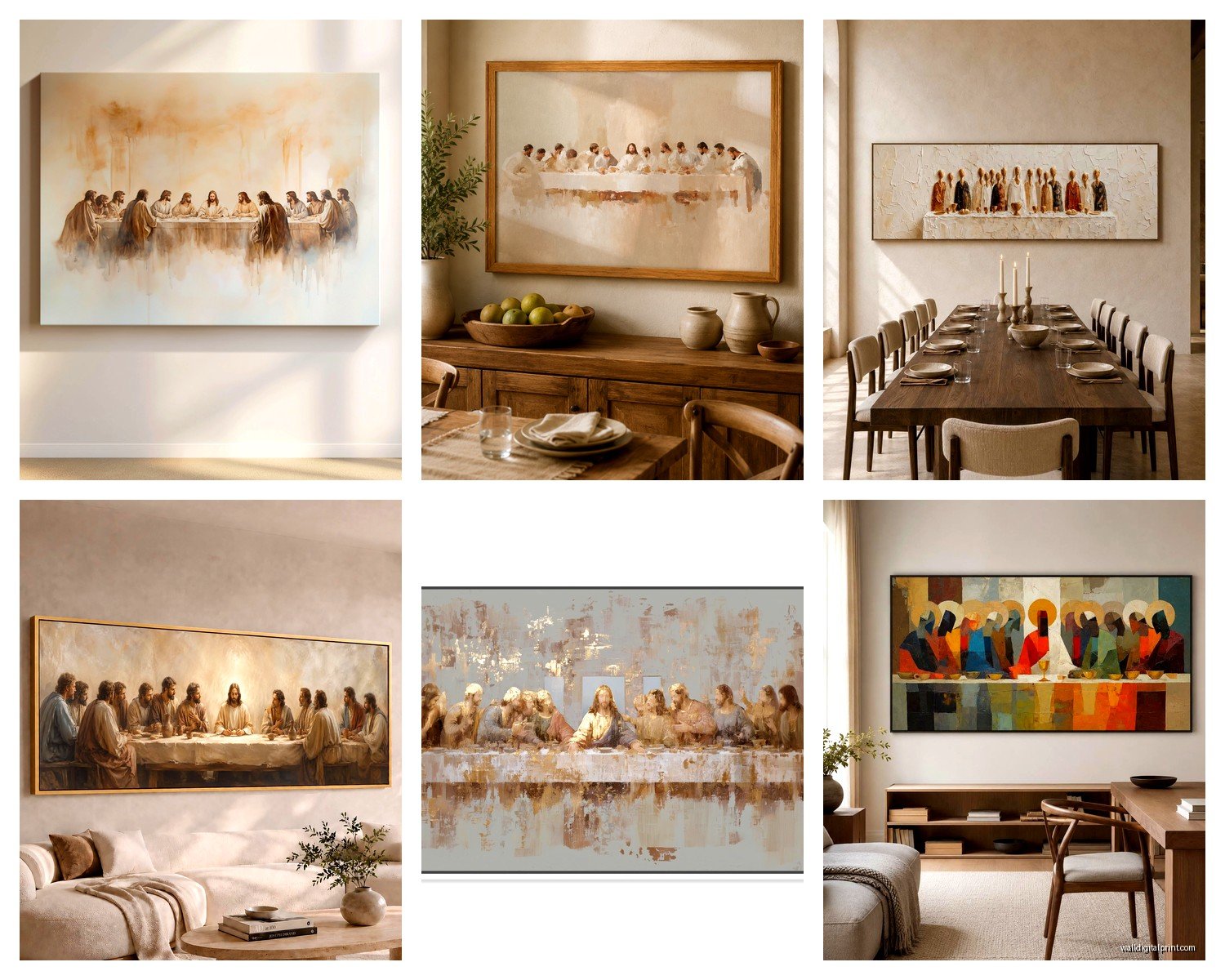
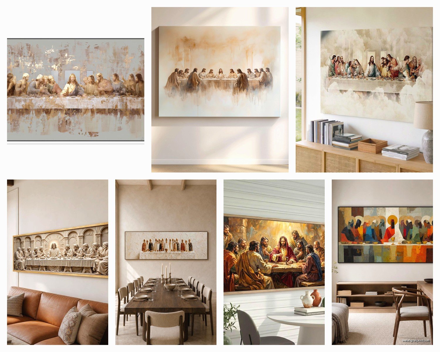
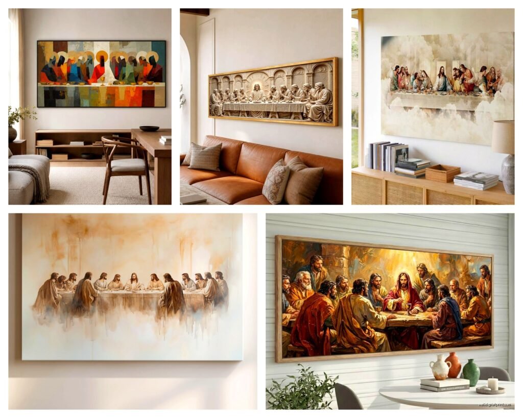
Wait I forgot to mention there are actually different “editions” of this painting you can buy reproductions of. The standard one everyone knows is the current state after the most recent restoration in the 90s. But some sellers offer:
The pre-restoration version which is darker and more deteriorated looking – honestly more historically accurate but also kind of depressing? Like you can barely make out some of the faces.
Black and white versions which actually look really sophisticated and work better in modern minimalist spaces. Takes away the religious intensity somehow and makes it feel more like fine art.
Colorized interpretations where artists have added modern color palettes – I’ve seen one in jewel tones that was actually stunning, and another in pastels that was absolutely horrible. This is very hit or miss.
Detail crops where it’s just a portion of the painting, usually focused on Jesus in the center or one grouping of apostles. These work better for smaller spaces where the full composition would be too cramped.
There’s also this weird trend of reimagined versions – like Last Supper with cats, or with superheroes, or modern celebrities. My nephew has one with Star Wars characters which is objectively ridiculous but he loves it so whatever. Not gonna cover those here because if you’re reading this you probably want the actual Da Vinci version.
Price Ranges and What You Actually Get
Under $50 – You’re getting a poster basically. Thin paper or very thin canvas, printed on demand, no quality control. Fine for a dorm room or temporary situation. Will probably arrive with bent corners.
$50-150 – Decent canvas print, probably shipped from overseas but acceptable quality. This is where most people end up and honestly it’s fine for most situations. The canvas will be real, colors will be reasonable, it’ll last a few years without fading too much.
$150-400 – Good quality reproduction. Proper giclee printing, substantial canvas or high-quality alternative, might include mounting or framing. This is what I usually spec for clients who want it to be a permanent installation.
$400-1000+ – Premium reproductions, sometimes hand-embellished by artists who add texture and paint details over the print. Museum quality materials. Only worth it if this is gonna be a centerpiece of your home for decades or if you’re just really into it.
I saw one listed for $3000 once that was supposedly done with the exact same pigments Da Vinci used which seems completely unnecessary but hey, if you’ve got money to burn.
Where to Actually Buy It
Amazon has a million options but quality is a total gamble. Read the reviews carefully and look at customer photos because the listing photos are always the best possible example.
Etsy is surprisingly good for this because you’re usually buying from smaller shops that specialize in art reproductions. You can message the seller directly and ask questions about materials and printing process. I’ve had really good luck here.
Religious supply stores online (like Catholic Supply or Monastery Greetings) carry reproductions specifically marketed to churches and religious homes. These tend to be more conservative in color and style but quality is usually solid.
Art.com and AllPosters have curated selections with better quality control than Amazon. Prices are higher but you know what you’re getting.
eBay if you want to gamble on vintage reproductions which can be cool if you find one from like the 60s or 70s with that specific aged look.
Installation Tips Nobody Mentions
This painting is really horizontal, so finding the right hanging height is tricky. Standard rule is center of the art at 57-60 inches from the floor, but for something this wide hung over furniture, you want the bottom edge about 6-8 inches above your table or sideboard.
Use two hanging points instead of one, especially for larger sizes. One hook in the center will cause it to shift crooked constantly and you’ll lose your mind adjusting it every three days. Trust me on this.
If you’re hanging it in a dining room where there’s food and potential splatters, consider getting a sheet of museum glass or acrylic to protect it even if it’s just a print. I learned this the hard way when a client’s teenager flung spaghetti sauce directly onto their $300 canvas.
The lighting situation is crucial. If you can, install a picture light above it or position track lighting to highlight it. This piece has a lot of shadow and depth that gets lost in flat overhead lighting. Makes a huge difference.
Styling Around It
Okay so you’ve got this massive religious masterpiece on your wall, now what? The temptation is to add other religious items around it – maybe some candles, a cross, whatever. But unless you’re specifically going for a chapel vibe, I’d resist this. Let the painting be the statement.
In a dining room, keep your table decor simple. White or neutral linens, simple dinnerware. The painting provides all the drama you need. I did one installation where we paired it with super modern Scandinavian furniture and it actually worked because the contrast was intentional.
If you need other art in the room, keep it small and unrelated. Abstract pieces work well, or landscapes, or personal photos. Just don’t put other religious art right next to it because then everything competes.
Plants nearby actually work really well – there’s something about bringing in natural organic elements that balances the formality of the piece. I’m watching The Great British Baking Show while writing this and just thought about how Paul Hollywood would probably have opinions about Last Supper reproductions and now I can’t stop laughing.
Common Mistakes I’ve Seen
Hanging it too high – people panic about the horizontal size and end up mounting it way too high on the wall where you have to crane your neck to see it properly.
Cheap frames that don’t match the formality of the subject. Like putting a $200 reproduction in a $15 plastic frame from Target. Just leave it unframed at that point.
Putting it in spaces with too much color competition. This painting has a lot going on compositionally – thirteen figures, tons of detail, complex color palette. If your walls are bright red or your furniture is really bold patterns, it’ll just become visual chaos.
Not considering the religious implications. I mean this is literally Jesus’s last meal before his crucifixion. If you’re not religious and just think it’s a cool classical painting, that’s totally fine, but be aware that religious guests might have feelings about it being in certain rooms or positioned certain ways.
Getting a size that doesn’t match your wall proportions. I’ve seen people cram a 6-foot wide version onto a 7-foot wall and there’s no breathing room, it’s just overwhelming.
Look, at the end of the day this is one of the most recognized paintings in Western art history, so you really can’t go too wrong with it as long as you get a decent quality reproduction and hang it thoughtfully. I probably spent way too much time researching this but now whenever someone asks me about it I’ve got opinions for days.
The version I ended up liking best for most situations is a mid-tone canvas print around 48-60 inches wide, with the colors adjusted to be slightly warmer than the super restored version but not as dark as the pre-restoration one. Costs around $150-200, looks expensive, works in both traditional and contemporary spaces if you style it right.
Just measure your wall space twice before ordering because returning a 5-foot canvas is a nightmare and shipping costs more than the actual print sometimes.