Wall Art Guide, Wall Art Tutoriels
Trippy Wall Art for Bedroom: Psychedelic Sleep Space Designs
Sep
So I’ve been setting up trippy wall art in bedrooms for like three years now and honestly it’s gotten way more mainstream than when I first started playing with psychedelic designs. My cat literally just knocked over my coffee but whatever, let me tell you what actually works because I’ve made some expensive mistakes.
Understanding What Makes Wall Art Actually Trippy
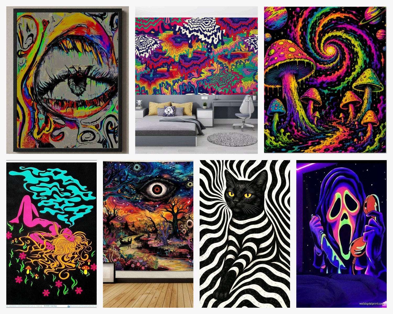
Okay so first thing, trippy doesn’t automatically mean those cheesy blacklight posters from college dorms. I mean it CAN be that if you’re going for full nostalgia, but there’s this whole spectrum. Fractals, geometric patterns, optical illusions, melting landscapes, abstract swirls that kinda mess with your depth perception. The key is movement even when nothing’s actually moving, you know?
I did this bedroom last month where the client wanted something intense but not overwhelming before sleep and that’s the balance you gotta find. You don’t want art that’s gonna keep your brain so activated that you’re lying there at 2am analyzing the patterns instead of sleeping.
Choosing Your Vibe Level
There’s basically three intensity levels I work with:
Subtle Trippy
This is like geometric mandalas, sacred geometry prints, those wave interference patterns that look cool but won’t freak out your grandmother. I put a large mandala tapestry behind someone’s bed last year and it reads as decorative during the day but when the lamp hits it at night the shadows create this whole other dimension. You can find good ones on Society6 or even Etsy if you search “geometric wall art” instead of “trippy” because the algorithm serves up better quality stuff.
Medium Intensity
This is where you get into actual psychedelic art reproductions, Alex Grey style visionary stuff, fractal prints, melting landscapes. Still beautiful and intentional but clearly meant to alter your perception a bit. I usually recommend one statement piece rather than multiple competing designs because your bedroom can start feeling chaotic real quick.
Full Send Psychedelic
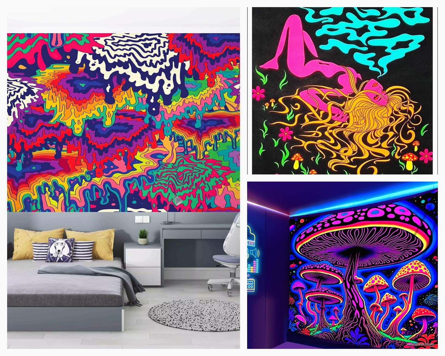
UV reactive everything, multiple tapestries, projection mapping, the works. Only do this if you’re genuinely committed because it becomes the entire personality of your room and there’s no ignoring it.
What Actually Works on Different Wall Types
Okay so funny story, I once ordered this massive canvas print for a client without asking about their wall texture and it looked TERRIBLE against their popcorn ceiling situation. The texture competed with the art pattern and it was just visual noise.
Smooth walls can handle basically anything. Detailed fractals, fine line work, whatever.
Textured walls need bolder designs with less fine detail. Go for larger color blocks, simpler geometric patterns, or tapestries that hang away from the wall surface.
My Go-To Art Types
Tapestries are honestly the easiest starting point. They’re affordable, you can move them around, and if you get sick of the vibe you’re not stuck with nail holes everywhere. I use these thumb tacks that are basically invisible or those Command strips if the fabric isn’t too heavy. The Sun and Moon tapestries are kinda overdone but there’s a reason they’re popular.
Canvas prints feel more permanent and polished. I order most from Redbubble or directly from artists on Instagram. The quality varies wildly though so always check reviews. This one time I got a print where the colors were SO much more saturated than the listing photo and it completely threw off the room’s color scheme.
Framed posters under glass can look really elevated if you’re going for that curated gallery vibe instead of dorm room energy. IKEA frames are fine honestly, or Framebridge if you wanna spend more.
3D wall panels are this thing I discovered last year and they’re incredible for adding actual dimension. There are these geometric foam panels you can paint and arrange in patterns. They create shadows that change throughout the day which adds to the trippy effect without being overwhelming.
Color Schemes That Don’t Destroy Your Sleep
Here’s where people mess up the most. They go full rainbow explosion and then wonder why they can’t wind down at night.
Blues and purples are your friends for bedroom psychedelic art. They’re still vibrant and can be super saturated but they don’t activate your brain the same way hot pinks and electric oranges do. I did a room with this deep blue fractal piece that had purple and teal accents and the client said it actually helped them relax.
If you want warmer colors, go for deeper tones. Burnt orange, deep magenta, rich golds. Save the neon brights for accent pieces or smaller art.
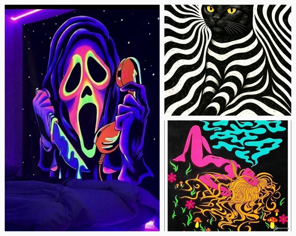
Monochromatic trippy art is super underrated. Black and white optical illusions or single-color gradient pieces can be just as effective and way more versatile with your existing decor.
Lighting Makes or Breaks Everything
Oh and another thing, the lighting situation is like 60% of whether your trippy art actually works. Regular overhead lighting is gonna flatten everything and make it look kinda dead.
LED strip lights behind your bed frame or around the art itself creates depth. You can get the color-changing ones for like thirty bucks on Amazon. I usually set them to slow fade mode rather than the seizure-inducing flash patterns.
Salt lamps or warm ambient lighting makes psychedelic art feel cozier somehow. The warm glow softens the intense patterns.
Blacklights are optional but if you’re gonna do it, get the LED ones not those purple tube lights from the 90s. And please get UV reactive art made for blacklights because regular art just looks weird and purple.
I had a client who installed a smart bulb system where they could adjust the color temperature throughout the day. Cool blue-tinted light in the morning made their geometric art pop, warm amber at night made it feel more meditative. Kinda extra but it worked.
Layout and Placement Strategy
Don’t just slap a tapestry on the wall wherever. There’s actually some thought that should go into this.
Behind the bed is classic for a reason. It’s your focal point when you enter the room but you’re not staring directly at it while trying to sleep. Go big here, like 80 inches wide minimum for a queen bed.
Opposite the bed is trickier because it’s what you see when lying down. I usually recommend something less intense here or nothing at all. Unless you specifically want something to look at while falling asleep, then maybe a galaxy scene or something with depth that you can kinda get lost in.
Side walls work for smaller complementary pieces. I’ll do a gallery wall of 4-6 smaller trippy prints in matching frames sometimes.
Wait I forgot to mention, ceiling art is a thing and it’s actually amazing for bedrooms. Those glow-in-the-dark star stickers are baby stuff compared to what’s available now. You can get these projection systems or actual tapestries mounted on the ceiling. Laying in bed looking up at a mandala or galaxy scene hits different.
Mixing Trippy Art with Normal Decor
Unless you’re going full psychedelic cave, you’re gonna need to balance this with regular furniture and stuff.
I usually keep the bedding simpler when the wall art is intense. Solid colors or subtle patterns. Let the art be the statement. Although I did see someone pull off psychedelic bedding WITH trippy wall art by keeping them in the same color family and it somehow worked.
Plants actually complement psychedelic art really well. The organic shapes play nicely against geometric patterns. I’m always adding pothos or monstera to these rooms.
Regular furniture in natural wood tones or simple black/white frames the trippy elements and keeps it from feeling like a head shop exploded.
Budget Options That Don’t Look Cheap
You don’t need to spend thousands on original Alex Grey paintings or whatever. Here’s what I actually recommend:
Fabric stores sometimes have wild printed fabrics that you can just staple to a wood frame. I’ve made “custom” art for like forty dollars this way.
Print your own if you find digital art with commercial licenses. Printful or your local print shop can do large format for way less than buying prints from art sites.
Thrift stores occasionally have trippy art from the 70s that’s genuinely cool. I found this velvet painting of a tiger in a cosmic landscape for twelve dollars and it’s perfect.
String lights behind sheer fabric creates this diffused glow effect that looks trippy without being actual art. Cheap and changeable.
What Doesn’t Work (Learned the Hard Way)
Okay so things I’ve tried that failed:
Too many competing patterns makes your eyes tired. Like genuinely fatiguing to be in the room. One major trippy piece plus subtle accents is the move.
Those cheap Amazon tapestries that are clearly just a pixelated image printed on thin fabric look exactly as cheap as they are. Spend the extra twenty bucks for actual quality.
Extremely busy fractals right above your bed can create this weird anxiety effect for some people. Test before committing to giant permanent pieces.
Mixing too many art styles reads as confused rather than eclectic. If you’re doing geometric, stick with geometric. If you’re doing organic melting landscapes, commit to that vibe.
Seasonal Rotation
This is gonna sound weird but I actually switch out bedroom art seasonally sometimes. Tapestries make this super easy. Warmer colors and sun imagery in winter, cooler tones and water themes in summer. Keeps the space feeling fresh and you don’t get desensitized to your art.
Actually Hanging the Stuff
For tapestries I use either small finishing nails with decorative heads or those adhesive hooks if the fabric is light enough. The trick is getting it taut without stretching it weirdly. I usually do top two corners first, then bottom corners while pulling gently, then fill in with hooks every 12 inches or so along the top.
Canvas prints need actual picture hanging hardware. Those sawtooth hangers that come attached to cheap canvases are trash and will fail. Get proper D-rings and picture wire.
For gallery walls I always lay the arrangement out on the floor first and take a photo. Then I make a paper template and tape it to the wall to mark nail positions. Sounds fussy but saves so many extra holes in your wall.
Heavy pieces need wall anchors, especially on drywall. Don’t trust just the nail, seriously.
Caring for Your Trippy Art
Tapestries collect dust like crazy. I vacuum mine with the upholstery attachment every few months or take them outside and shake them out. Some can be gently hand washed but check first because the dyes can run.
UV exposure will fade prints over time especially near windows. Those UV protective glass frames are worth it for expensive pieces.
Canvas prints just need occasional dusting. Don’t use cleaning products directly on them.
My dog once jumped on the bed and knocked a framed print off the wall behind it so now I use those earthquake-proof museum putty dots on the bottom corners of frames. Works great.
Honestly the whole trippy bedroom thing is more accessible now than ever and you can start small and build up. Get one piece you really connect with and see how it feels living with it before going all in. Some people think they want full psychedelic immersion and then realize they actually prefer subtle touches, and that’s totally fine.