Wall Art Guide, Wall Art Tutoriels
Wall Art Decor for Bedroom: Sleep Space Decorative Designs
Sep
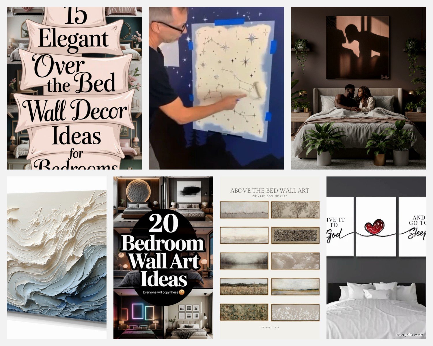
So I’ve been obsessing over bedroom wall art lately because honestly, it’s the one thing that can completely transform your sleep space without dropping thousands on new furniture. Like, my sister just moved into this rental with beige walls and she was losing her mind about how boring it looked, and I basically spent three days helping her figure this out.
Start With What Actually Matters in Your Bedroom
Okay so here’s the thing nobody tells you – bedroom wall art needs to be calming but not boring. I used to just throw up whatever looked pretty, but then I’d lie in bed staring at this super busy abstract piece and my brain would just… not shut off. You want something that doesn’t activate your stress response every time you look at it.
The rule I follow now is the 60-30-10 thing but for visual energy. 60% of your wall art should be calming (think landscapes, soft abstracts, simple line drawings), 30% can have a bit more interest, and 10% can be whatever bold statement piece you want. But that bold piece? Don’t put it directly across from your bed where you’ll stare at it while trying to sleep.
Size Actually Matters More Than You Think
This is gonna sound weird but I learned this from a client who kept buying tiny art for her massive bedroom wall. The general rule is your art should take up about 2/3 to 3/4 of the wall space you’re filling. So if you’ve got that space above your bed that’s like 6 feet wide, you need something around 4-5 feet wide total.
You can do this with:
- One large statement piece (easiest option honestly)
- A gallery wall with multiple smaller pieces
- A diptych or triptych which is just fancy talk for 2 or 3 matching panels
- A large piece with two smaller flanking pieces
I messed this up in my own bedroom for like two years. Had this dinky 16×20 print above my king bed and it looked absolutely ridiculous in photos. My dog kept photobombing my decor shots anyway so whatever, but still.
The Height Thing Everyone Gets Wrong
Hang your art so the center is at eye level, which is usually 57-60 inches from the floor. But wait – in bedrooms it’s different because you’re viewing it while lying down too. For art above your bed, leave 6-8 inches between the top of your headboard and the bottom of your frame. Any more and it looks like the art is floating away, any less and it feels cramped.
I actually use painters tape to map out where frames will go before I start hammering nails into walls. Saved me so many times from having to spackle over mistakes.
Gallery Wall Strategy
Oh and another thing – if you’re doing a gallery wall, lay everything out on the floor first. Take a photo. Live with that photo for a day or two. I know it sounds extra but I’ve redone gallery walls three times because I didn’t do this step and hated the spacing once it was up.
For spacing between frames, stick to 2-3 inches consistently. I use my fist as a measuring tool because it’s roughly 3 inches and I’m lazy. The whole gallery wall should still follow that 2/3 rule for the overall wall space.
What Actually Works in Bedrooms
From literally years of curating bedroom spaces, here’s what I’ve seen work consistently:
Landscape photography or paintings – Mountains, oceans, forests. Something with depth that your eye can wander into. There’s actual research about how nature imagery lowers cortisol but also it just feels nice to look at before bed.
Minimalist line art – Those simple one-line drawings of faces, bodies, abstract shapes. Super trendy right now but also genuinely calming. I have a one-line nude above my dresser and it’s sophisticated without being distracting.
Soft abstracts – Watercolors, muted acrylics, anything without harsh lines or super contrasting colors. Think blush pinks, soft grays, muted blues and greens.
Black and white photography – Classic for a reason. Architectural shots, vintage portraits, nature photography. Works with literally any color scheme.
What I’d Avoid
Anything too bright or stimulating – like those neon word signs everyone had for a while. They’re cute but not in a bedroom unless you want your brain buzzing at 11pm.
Super personal family photos right above the bed feels weird to me? Like I love family photos but scatter them around the room on dressers or a different wall. Something about sleeping under framed photos of people watching you is… anyway.
Anything that brings work energy into the space. Motivational quotes, cityscapes, really geometric busy patterns. Your bedroom should feel separate from productivity culture.
Color Schemes That Won’t Keep You Awake
This part took me forever to figure out. Your wall art should either complement your existing bedroom colors or introduce a calming accent color. I usually stick to:
- Blues and greens – literally proven to be calming colors
- Warm neutrals – beiges, taupes, warm grays
- Soft dusty colors – dusty pink, sage green, muted terracotta
- Monochromatic schemes – different shades of the same color family
My current bedroom is mostly cream and white with these gorgeous dusty blue abstract prints I found on Etsy, and it’s the first bedroom where I’ve actually felt calm. Before I had this whole jewel tone situation happening and while it looked cool, it was a lot.
Framing Matters More Than the Art Sometimes
Okay so funny story – I once bought these beautiful prints and put them in cheap plastic frames from the drugstore and they looked like college dorm decor. Upgraded to simple wood frames and suddenly they looked expensive and intentional.
For bedrooms specifically:
Wood frames work in literally any bedroom style. Light oak for Scandinavian/modern, dark walnut for traditional, weathered wood for farmhouse/boho.
Black frames are super versatile and make colors pop. They work especially well with black and white photography or colorful abstract art.
White or cream frames keep things light and airy. Perfect for smaller bedrooms or if you’re going for that coastal/minimalist vibe.
No frame at all – canvas prints or floating frames can work for a more casual modern look, but make sure the art quality is good enough to stand alone.
I usually avoid ornate gold or silver frames in bedrooms unless you’re going for a specific glam or traditional look. They can feel too formal for a sleep space.
Budget Options That Don’t Look Cheap
Listen, you don’t need to spend hundreds per piece. Here’s what actually works:
Print your own art from sites like Desenio, Minted, or Etsy. You can get digital downloads for like $5-15 and print them at your local print shop or even online through Printful. Frame them yourself and you’ve got custom art for under $50 total.
Society6 and Redbubble have tons of independent artists and you can get prints, canvas, or even tapestries. Quality varies so read reviews but I’ve found some gems there.
Thrift stores and estate sales are goldmines if you’re willing to hunt. I found this incredible vintage botanical print at an estate sale for $8, had it reframed for $40, and it looks like a $200 piece.
Your own photography – if you’ve taken any decent photos on trips or hikes, print those. Personal and free minus printing costs.
The Layout Formulas I Use Over and Over
The Classic Symmetrical
Two matching pieces flanking the bed, one on each side. Simple, balanced, works in traditional spaces. Each piece should be about 1/3 the width of the bed.
The Statement Piece
One large piece centered above the headboard. This is what I usually recommend because it’s foolproof and impactful. Make sure it’s substantial enough – I’m talking at least 40 inches wide for a queen bed, 50+ for a king.
The Asymmetrical Modern
Different sized pieces arranged in an asymmetrical way but still balanced visually. Like a large piece on one side with two smaller stacked pieces on the other side. This takes more planning but looks really current and interesting.
The Horizontal Gallery
A row of same-sized frames in a horizontal line. Super clean, works great in modern or minimalist bedrooms. Usually 3-5 pieces depending on your wall width.
Lighting Your Wall Art
Wait I forgot to mention this earlier but it’s actually important – how you light your bedroom art changes everything. Natural light is obviously ideal but for evening:
Picture lights mounted above frames look sophisticated and gallery-like. You can get battery operated ones now so no electrician needed.
Wall sconces on either side of the bed can illuminate art while providing reading light. Two functions, one fixture.
Track lighting or directional recessed lights can highlight art if you’re doing a renovation or have existing ceiling fixtures to work with.
Just avoid harsh overhead lighting directly on art with glass – creates glare and you can’t actually see the piece properly.
Common Mistakes I See All The Time
Hanging everything too high – seriously, people hang art like they’re decorating for giants. That eye level rule exists for a reason.
Matching your art too exactly to your bedding or paint color. You want coordination, not matchy-matchy. If your walls are gray, don’t get gray art. Get art with some gray IN it but also other colors.
Forgetting about the sides of the bed – everyone focuses on the wall behind the headboard but the walls on either side of the bed are prime real estate too. Smaller pieces, personal photos, or interesting sculptural elements work great there.
Buying everything from the same place at the same time. Your art collection should look curated over time, not like you ordered a bedroom set online. Mix sources, styles, and frames a bit.
Not considering what you see from bed – lie down and look at your walls before deciding on art placement. That weird corner you never notice while standing might be exactly where your eyes go when you’re trying to fall asleep.
Seasonal Switching
This might be extra but I actually swap out some bedroom art seasonally. Not everything, but like one or two pieces. Lighter, brighter stuff in summer, cozier tones in winter. It keeps the space feeling fresh and I store the off-season pieces in those flat storage bags under my bed.
My cat keeps trying to knock over the frames when I’m switching them out which is super helpful, obviously.
The Actual Installation Part
Use proper hardware. Picture hanging strips work for lightweight stuff under 8 pounds. For anything heavier, use actual wall anchors or find the studs. I’ve had art fall off walls at 2am and it’s terrifying.
Get a level. Your phone has a level app. Use it. Art hung crooked is all anyone will notice.
For gallery walls, I use those gallery wall kits with the templates and it’s so much easier than trying to measure and level everything individually. The Command brand makes one that’s pretty foolproof.
And look, if you’re renting and can’t put holes in walls, there are options – command strips rated for your frame weight, picture rail systems, leaning large pieces on dressers or the floor against the wall (actually a whole design trend right now).
You want your bedroom to feel like a retreat, and the right wall art is honestly one of the easiest ways to make that happen without renovation or major expense. Just take your time, don’t rush to fill every wall, and choose pieces that genuinely make you feel calm when you look at them. The technical stuff matters but ultimately it’s about creating a space where your brain can actually shut down at the end of the day.