
Wall Art Guide, Wall Art Tutoriels
Wall Art for Male Bedroom: Men’s Sleep Space Decor

Nov
So I’ve been helping guys figure out their bedroom wall art situation for years now, and honestly? Most of them overthink it or just throw up a random poster from college and call it done. Let me walk you through what actually works.
Start With Your Actual Vibe Not What Instagram Says
First thing – forget what you think a “masculine” bedroom should look like. I had this client last month who was convinced he needed black and white photography of cityscapes because that’s what every men’s decor blog shows. Turned out he was super into vintage cars and motorcycles. We ended up doing framed technical drawings of old Triumph bikes and the room actually felt like him, not a hotel.
Figure out what you’re actually into. Are you the guy who watches documentaries about space? Industrial design person? Into hiking and outdoor stuff? Music obsessed? Your walls should reflect that, not some generic “bachelor pad” aesthetic that doesn’t connect to anything real.
Size Matters More Than You Think
Okay so this is gonna sound obvious but I see this mistake constantly – people buy art that’s way too small. Like those tiny 8×10 frames scattered randomly. It looks unfinished and kinda sad honestly.
For above your bed, you want something substantial. I usually tell people to aim for a piece that’s at least 2/3 the width of your headboard. So if you’ve got a queen bed with a headboard that’s roughly 60 inches wide, you’re looking at a single piece that’s around 40 inches wide, or a gallery wall situation that fills that space.
If you don’t have a headboard, same principle applies – measure your bed width and work from there. A king bed can handle a really large statement piece, like 48×36 inches or bigger.
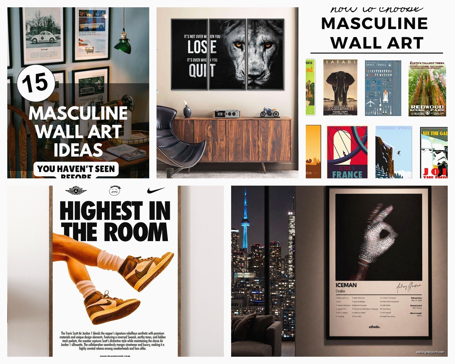
The Three Size Categories That Work
- Large statement piece: 36×48 inches or bigger, goes above the bed or on your main wall
- Medium pieces: 24×36 inches, good for flanking a door or above a dresser
- Small accent pieces: 16×20 inches, only works in groups of 3 or more
What Actually Looks Good in Male Bedrooms
I’m gonna break down the categories that consistently work well, based on what I’ve seen actually stay up on walls for more than six months…
Abstract and Geometric Art
This is my go-to recommendation for guys who don’t want anything too literal. Large abstract pieces in a limited color palette – think navy, charcoal, rust, deep green, black and white. The key is getting something with enough visual interest that it’s not boring but not so chaotic that it messes with your sleep.
I found this amazing abstract piece for a client’s bedroom last year, all these layered rectangles in grays and blues, and it completely transformed his space. Cost him like $180 framed from an online art retailer. Looked way more expensive than it was.
Black and White Photography
Yeah I know I just said don’t default to this, but it genuinely works if it’s the right subject matter. Architectural photography, landscape shots, vintage portraits, even abstract photography. The advantage is it goes with literally any color scheme you’ve got going on.
Skip the Eiffel Tower and generic city skylines though. Try to find something with more personality – abandoned buildings, close-ups of architectural details, dramatic landscape photography from places you’ve actually been or want to go.
Maps and Vintage Travel Stuff
Old maps are ridiculously popular right now and for good reason. A large vintage map of somewhere meaningful to you looks sophisticated without being pretentious. I’ve done framed nautical maps, topographic maps, even old subway maps.
You can find reproduction prints pretty cheap, or if you wanna spend more, actual vintage maps. Frame them simply – black or dark wood frames, no matting necessary for the oversized ones.
Music and Entertainment Posters
If you’re gonna do movie or music posters, please frame them properly. Those pushpin corners or tape situations need to end. Get actual frames with real glass or plexiglass.
Also consider going for vintage concert posters, album covers treated as art, or minimalist movie posters instead of the standard one-sheet everyone has. There’s this whole world of alternative movie posters that are way cooler than the official ones.

Nature and Landscape Photography
Mountains, forests, ocean scenes – this stuff works really well if you keep it dramatic and large-scale. Not the cheesy motivational poster version, but actual fine art landscape photography. Think Ansel Adams style black and whites or moody color photography.
I had a guy who was super into surfing, and we found these incredible oversized prints of wave photography. Huge prints, minimal frames, looked absolutely killer.
Framing Because It Actually Matters
Don’t skip the frame to save money. A $30 print in a $15 frame looks like a $15 frame. Same print in a $60 frame looks like a $200 piece of art.
For masculine spaces, I usually stick with:
- Simple black frames – matte black, not glossy
- Dark wood frames – walnut or espresso tones
- Metal frames – black metal or brushed steel
- Natural wood for more organic/rustic vibes
White frames can work too but they need the right space – lots of light, lighter walls, more minimal aesthetic overall.
Oh and another thing, get frames with actual hanging hardware already attached. Those sawtooth hangers are fine for smaller pieces, but anything over 24 inches should have D-rings and wire.
Gallery Walls Without Looking Messy
Gallery walls stress people out but they’re actually pretty forgiving if you follow a few rules. I literally spent three hours last week laying out frames on my living room floor while my dog kept walking through them, but once I got the arrangement right it took like 20 minutes to hang.
For a masculine bedroom, keep your gallery wall more structured. Not the scattered, organic look with mixed frames and sizes. That reads more feminine generally.
The Grid Method
Same size frames, arranged in a perfect grid. Super clean, very intentional. Works amazing with black and white photography or a series of prints with a common theme. Four pieces in a 2×2 grid, six pieces in a 2×3 grid, whatever fits your space.
Keep spacing consistent – I use 2-3 inches between frames usually.
The Linear Method
Line up 3-5 frames horizontally, all the same height, hung at the same level. Mix widths if you want but keep the heights identical. This works great above a dresser or along a long wall.
Colors That Don’t Mess With Sleep
Your bedroom is where you sleep, so super bright or aggressive colors probably aren’t the move. I generally steer people toward:
- Blues and teals – calming, classic, works with most bedding
- Grays and charcoals – neutral, sophisticated, hard to screw up
- Deep greens – having a moment right now, very grounding
- Earth tones – rust, terracotta, warm browns
- Black and white – obviously, always works
You can have pops of brighter color, but keep them as accents not the dominant thing.
Where to Actually Buy This Stuff
Okay so I’m gonna give you the real list of where I source art for clients, not just the obvious places…
For affordable prints, Society6 and Redbubble have tons of independent artists. Quality varies but you can find unique stuff. Etsy is hit or miss but great for vintage maps, concert posters, and custom work.
For photography, try Unsplash or similar sites where you can license high-res images cheap, then get them printed at a local print shop. Way cheaper than buying prints directly sometimes.
If you’ve got more budget, check out Saatchi Art or Artfully Walls. Also don’t sleep on HomeGoods and TJ Maxx – their wall art section can be surprisingly good if you’re willing to dig.
Local art fairs and student shows are another option. You can get original work for way less than you’d think, and it’s actually original which is cool.
Hanging It Without Destroying Your Walls
Use a level. Seriously, just use a level. Your eye will tell you something’s straight when it’s actually tilted.
For the height, the center of your artwork should be at eye level, which is roughly 57-60 inches from the floor. For art above furniture, leave 6-8 inches between the furniture top and the bottom of the frame.
Command strips work for lightweight stuff but anything substantial needs actual picture hangers. I use monkey hooks for drywall – they’re stupid easy and hold a surprising amount of weight.
Wait I forgot to mention – if you’re hanging a gallery wall, cut out paper templates of each frame, tape them to the wall, and adjust until it looks right. Then mark your nail holes through the paper. Saves so much time and extra holes.
What to Avoid
This is gonna sound harsh but I’ve seen enough bedrooms to have strong opinions…
Skip the motivational quote prints unless it’s something genuinely meaningful to you. “Hustle” and “Good Vibes Only” stuff reads very college dorm.
Avoid anything too busy or chaotic. Your bedroom should be calming. Save the super stimulating art for other rooms.
Don’t hang art too high. I see this constantly – art floating near the ceiling. It should relate to the furniture and the room, not the ceiling.
No posters without frames. Just no. You’re an adult with a bedroom, not a teenager’s basement hangout.
Skip the single tiny piece on a massive wall. It looks lost. Either go bigger or add more pieces.
Making It Feel Cohesive
You don’t need everything to match exactly, but there should be some thread connecting your pieces. Could be color palette, subject matter, frame style, or overall vibe.
I usually pick 2-3 colors that repeat throughout the room – in your bedding, curtains, rug, and art. Doesn’t have to be exact matches, just in the same family.
If you’re mixing different types of art, keep the frames consistent. All black frames or all wood frames helps tie everything together even if the art itself is varied.
This is gonna sound weird but I sometimes tell people to squint at their room. If the colors blur together in a pleasing way, you’re probably good. If something jumps out as jarring, that’s your clue to adjust.
Anyway, that’s basically everything I tell clients about bedroom wall art. Start with one good piece above your bed, make sure it’s properly sized and framed, then build from there if you want. You don’t need to fill every wall – sometimes less is actually more, especially in a bedroom where you want things calm and uncluttered. Just make sure whatever you put up actually means something to you instead of just filling space because you think you’re supposed to.
