Wall Art Guide, Wall Art Tutoriels
36×36 Wall Art: Three-Foot Square Canvas Guide
May
So I’ve been working with 36×36 canvases for like three years now and honestly they’re such a weird size that nobody talks about? But they’re actually perfect for so many spaces once you figure out the whole thing.
Why Three-Foot Squares Are Actually Genius
Okay so here’s what I learned after hanging maybe 40 of these in client homes. The 36×36 size hits this sweet spot where it’s substantial enough to anchor a wall but not so massive that you need a team to hang it. I can lift one myself which… matters more than you’d think when you’re trying to level the damn thing at 8pm because your client wants it done before their dinner party.
The square format does something interesting to rooms. It doesn’t pull your eye horizontally or vertically, it just sits there being present? Which sounds like design BS but I swear it works. I hung one in my own dining room last month and my sister came over and was like “when did this room get bigger” and nothing else had changed.
Measuring Your Wall Space
Right so before you buy anything you gotta do the whole measurement thing. Stand back from the wall you’re thinking about. Like actually walk to the opposite side of the room. A 36×36 piece takes up nine square feet of visual space which sounds obvious but people forget to account for the way your eye needs breathing room around it.
The rule I use is about 8-12 inches of empty space on each side minimum. So you need a wall that’s at least 52 inches wide, but honestly I like 60+ inches better. For height, hang it so the center is at 57-60 inches from the floor. That’s standard gallery height and it just works with how humans look at things.
Oh and another thing, corners are tricky with square pieces. They need more space from corners than rectangular art does. I keep them at least 12 inches from any corner or the whole thing looks cramped.
Living Room Placement
Living rooms are where I use these most. Above the sofa is the obvious spot but there’s rules nobody tells you. Your 36×36 should be about two-thirds to three-quarters the width of your sofa. So if you have a standard 84-inch sofa, one 36-inch square looks… fine? But kinda lonely.
This is gonna sound weird but I actually prefer using 36×36 pieces above loveseats or apartment-sized sofas in the 60-72 inch range. The proportions just sing. Or you can do what I did in this brownstone last year and hang two 36×36 pieces side by side with like 4-6 inches between them. Creates a dramatic horizontal that feels intentional.
Wait I forgot to mention the TV situation. If you have a TV on the same wall, don’t put a 36×36 near it. The competing squares make everything feel chaotic. Put it on an adjacent wall instead where it can be the focal point.
Behind Furniture Arrangements
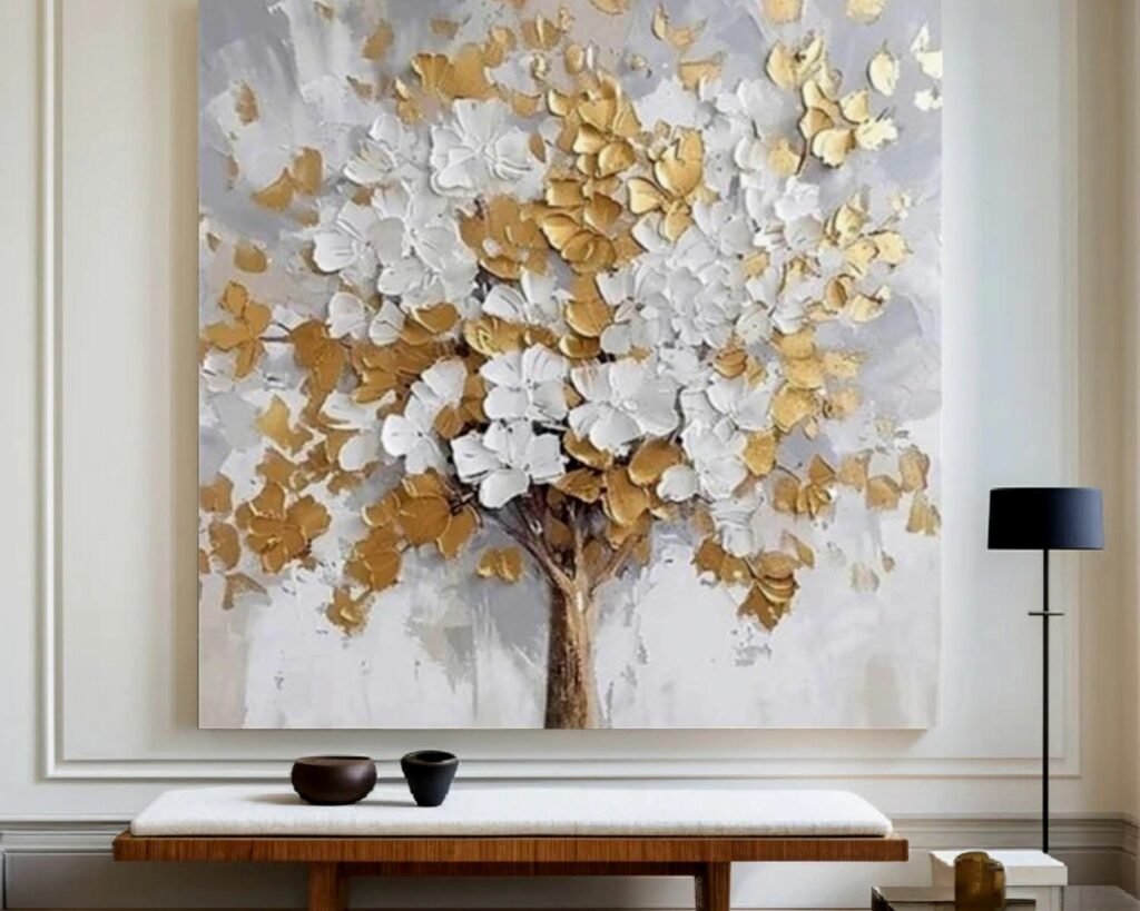
Console tables are perfect under 36×36 art. A standard console is 30-36 inches wide so a three-foot square sits right above it visually balanced. Leave 6-8 inches between the top of the console and bottom of the frame. I use 7 inches almost always and it hasn’t been wrong yet.
My client canceled last Tuesday so I spent an hour comparing how different heights looked above this credenza and the 7-inch gap just photographs better and feels better in person.
Bedroom Situations
Bedrooms are where people get nervous about large art but a 36×36 over the bed is actually less overwhelming than you’d think. Queen beds are 60 inches wide, kings are 76 inches. A single 36×36 looks best over queens. For kings you want either two pieces or you need to go bigger entirely.
Hang it about 8-10 inches above your headboard or mattress if you don’t have a headboard. I did a bedroom last month with just a low platform bed and hung the 36×36 about 9 inches up and it looked intentional instead of like we forgot to buy a headboard.
Side walls in bedrooms are underrated for square art. That wall opposite your bed when you’re lying down? Perfect spot. You’re staring at it every morning anyway.
Lighting Considerations
Okay so lighting is huge with canvases this size. You need either natural light hitting it at an angle or you need picture lights. I’m obsessed with those battery-operated LED picture lights now because no electrician needed. Mount them right to the frame or the wall above.
If you have a window directly across from where you wanna hang it, test the glare situation first. Take a piece of poster board that size, tape it up, look at it at different times of day. Canvas has texture that catches light weird and you don’t want a glare spot right in the middle.
What Actually Works Content-Wise
The content matters SO much with square format. Abstract work is the easiest because there’s no orientation issue. But I’ve learned some things about what reads well at 36×36.
Bold simple compositions work better than busy detailed ones. Your eye needs somewhere to land when looking at a three-foot square. Too much detail and it becomes visual noise from across the room. I hung this incredibly detailed cityscape piece once and you just couldn’t process it from the sofa. Had to walk up close which defeats the purpose.
Portraits and faces are amazing at this size. Like weirdly good. The square crop feels editorial and modern. I have this 36×36 portrait piece in my hallway that’s just a woman’s face and every single person who visits comments on it.
Color Strategy
Color is where I see people mess up most. They either go too matchy-matchy with their room or they pick something that fights everything else. Here’s what I do: pull 2-3 colors from your existing room palette and make sure at least one of them appears in the art. The other colors in the piece can be whatever.
My living room is basically gray and cream and I have this 36×36 abstract with gray, cream, rust, and teal. The gray and cream connect it to the room but the rust and teal make it interesting instead of boring.
Dark moody pieces work better in rooms with good natural light. I tried a really dark 36×36 in a basement guest room once and it just made everything feel heavy. Moved it to a sun-filled office and suddenly it was perfect.
Framing vs Unframed
So gallery-wrapped canvases (where the image continues around the sides) can hang unframed and they look fine. Actually they look better than fine in modern or minimalist spaces. The clean edge is part of the aesthetic.
But frames add like 3-4 inches to each dimension so suddenly you’re dealing with a 40×40 inch object which changes your spacing math. Floating frames are my favorite for canvas because they add polish without covering the edges. They sit about half an inch off the wall and create this shadow gap that’s really elegant.
White or natural wood frames are safest. Black frames work if your room already has black elements. I did a gold-leafed frame on a 36×36 abstract once for a client and it was gorgeous but very specific to that glam style she had going.
Installation Reality Check
Okay real talk about hanging these. A 36×36 canvas weighs anywhere from 8-15 pounds depending on the frame situation. That needs two D-rings and wire on the back, minimum. Or better yet, use a french cleat system which distributes weight across the wall better.
I always use two hooks on the wall even if the wire could theoretically balance on one. Belt and suspenders approach because I don’t want phone calls about fallen art. Space the hooks about 20-24 inches apart, level them, hang the wire on both.
Get a laser level. I resisted for years using the regular bubble level and my back hurt from crouching and standing and crouching again. Laser level is like $25 and you just turn it on and boom, level line on your wall.
Room-Specific Weird Spots That Work
Dining rooms are actually ideal for 36×36 pieces. Most dining rooms are smaller than living rooms so the scale works. Hang it on the wall your back faces when you sit at the head of the table. Everyone else gets to look at it during dinner.
Hallways can handle these if the hallway is at least 48 inches wide. Narrower and you’re gonna be walking too close to it. I have one in my hallway that’s only 52 inches wide and it works but just barely.
Oh and bathrooms, this is gonna sound weird but powder rooms or master baths with big walls are great spots for 36×36 pieces. Unexpected art in bathrooms feels fancy. Just make sure it’s not directly in the shower spray zone obviously.
Home offices need art at eye level when you’re sitting which is lower than standing eye level. So if you’re putting a 36×36 behind your desk where you face it while working, center it at like 48-50 inches instead of the usual 57-60.
The Multi-Piece Thing
Two 36×36 pieces together create a 72-inch horizontal span or vertical span. This works on really large walls where one piece would look lost. I did an entire grid of four 36×36 squares once, two high and two wide, with 3 inches between them. It was dramatic as hell and filled a massive wall in a loft space.
But spacing matters intensely. Less than 2 inches looks like a mistake. More than 8 inches and they read as separate pieces instead of a grouping. I stick to 3-5 inches for most situations.
You can also mix a 36×36 with smaller pieces in a gallery wall but the square needs to be the anchor. Put it lower and to one side with smaller pieces scattered around it. The 36×36 grounds everything else.
Budget Real Talk
Canvas prints at 36×36 range from like $80 for basic prints to $500+ for artist originals. The middle ground is giclee prints which are high-quality reproductions, usually $150-300. I think that’s the sweet spot for most people unless you’re collecting actual art.
Frame costs add another $100-200 if you want something decent. Those cheap plastic frames from big box stores look cheap, sorry. Wood or metal frames with actual weight to them photograph better and last longer.
Or just go frameless if the canvas is gallery-wrapped. I literally have my cat’s artwork framed in my office (long story, she stepped in paint during a project) and the frameless look works because it doesn’t take itself too seriously.
Common Mistakes I See
Hanging it too high is the number one issue. People think higher is more dramatic but you just end up with neck strain. The center at 57-60 inches rule exists for actual human ergonomic reasons.
Choosing art that matches your paint color exactly. It disappears into the wall. You want contrast or at least tonal variation.
Not considering the sofa back height. If you have a really tall sofa back, your art needs to be higher above it. Standard is 8-10 inches but high-back sofas need 12+ inches.
Putting it on a wall with weird architectural features. Like don’t center a 36×36 on a wall that has an off-center window. It’ll always look wrong. Pick a different wall.
The thing is these are just guidelines from what I’ve done over and over. Your space might break the rules and still look good. But if you’re stuck or something feels off, this is where I’d start troubleshooting.