Wall Art Guide, Wall Art Tutoriels
70s Retro Wall Art: Groovy Vintage 1970s Decor
May
So I’ve been totally obsessed with 70s wall art lately and honestly it started because a client wanted their living room to feel “less beige and more groovy” which… I mean who says groovy anymore but here we are and I kinda love it?
The thing with 70s decor is it can go wrong SO fast. Like you can end up with a space that looks like a Spirit Halloween store threw up everywhere or you nail it and people walk in and immediately feel relaxed and happy. The secret is honestly in the wall art because that’s what sets the whole vibe.
Starting with Color Palettes That Actually Work
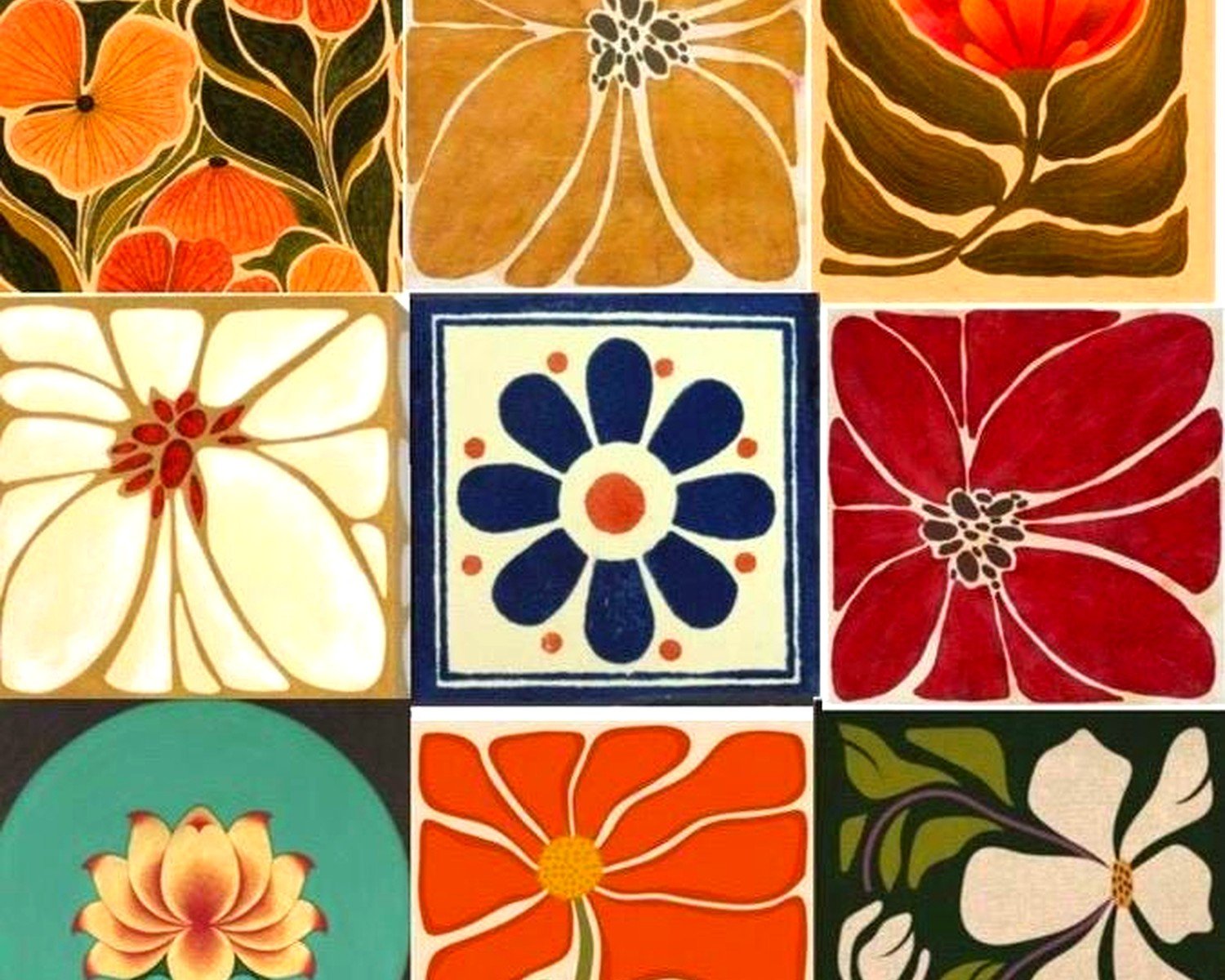
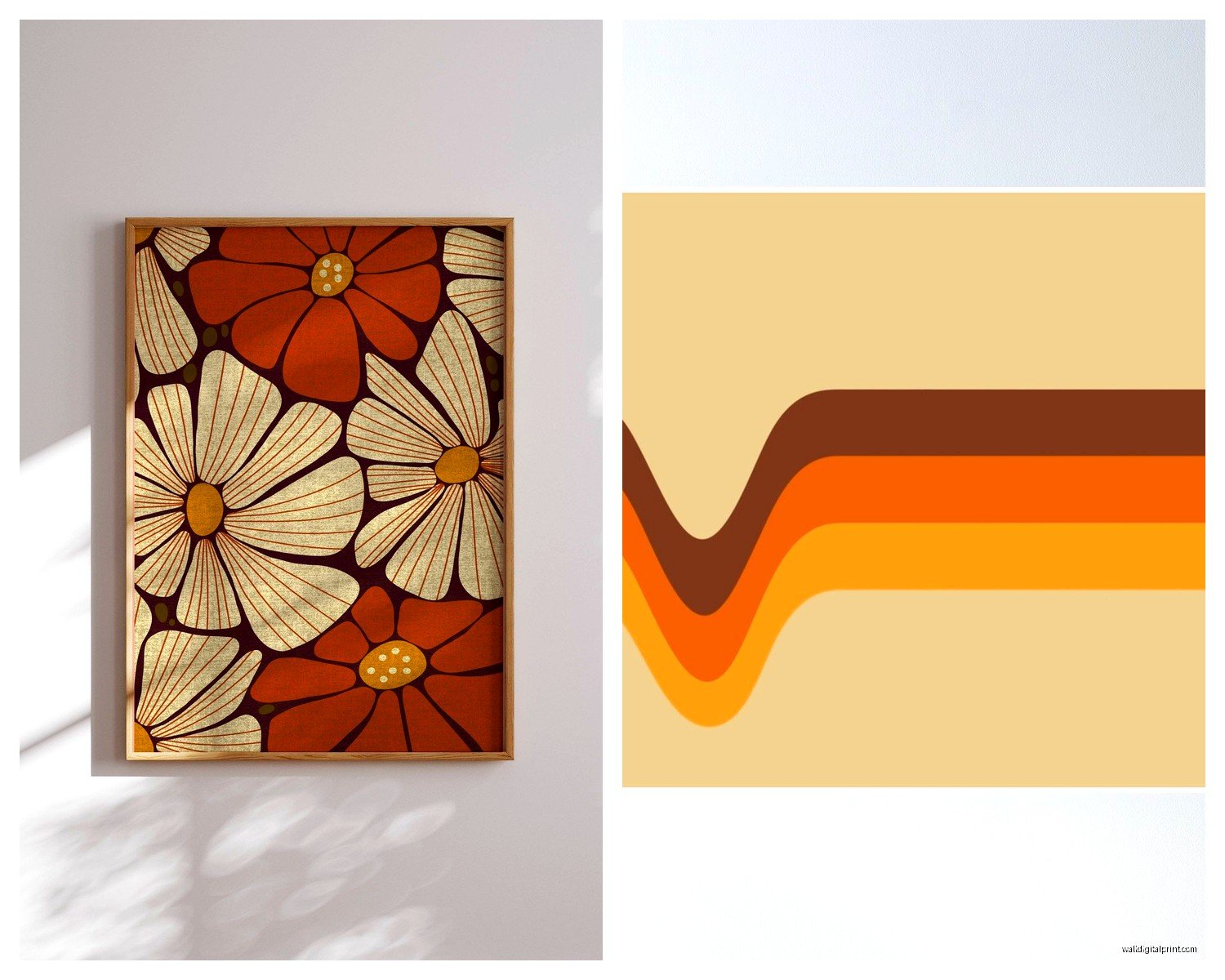
Okay so the 70s had this whole thing with burnt orange, avocado green, harvest gold, and brown. I know what you’re thinking – sounds hideous right? But when you use these colors in the RIGHT way they’re actually so warm and inviting. I did a gallery wall last month with vintage prints in these tones and my client literally cried she loved it so much.
The trick is not to use all of them at once. Pick like two or three max. I usually go with burnt orange and brown with maybe some cream or beige to balance it out. Or if you want something a bit more unexpected, that avocado green with mustard yellow is chef’s kiss.
You can find actual vintage posters on Etsy but honestly some of them are like $300 for a single piece which is insane. I’ve had better luck at estate sales and thrift stores. Last Tuesday I found three amazing mushroom prints at Goodwill for $8 total and they’re now in my own hallway because I couldn’t resist.
Macrame Wall Hangings Because Obviously
I cannot talk about 70s wall decor without bringing up macrame. It’s like… the most 70s thing ever? And it’s having such a moment right now. I’ve got a massive macrame piece above my couch that I actually made myself during lockdown when I was watching The Crown and needed something to do with my hands.
Here’s what you need to know about macrame:
- Size matters – a tiny piece on a huge wall looks sad and lost
- You want something with dimension and texture, not just flat braiding
- Natural cotton or jute only, nothing synthetic or dyed weird colors
- Hang it where it can move a little with air flow, it looks more alive that way
You can buy them from places like Urban Outfitters or Anthropologie but they charge like $200 for something you can make for $30 in materials. YouTube has a million tutorials. Fair warning though, it takes FOREVER. My first one took me probably 15 hours spread over two weeks.
If you’re gonna buy instead of DIY, check out Etsy sellers who do custom sizes. I have a seller I use for clients (lemme find the name… okay I can’t find it right now but I’ll remember later probably) who does really intricate patterns and ships super fast.
Placement Tips That Nobody Tells You
Don’t put macrame in the bathroom. I know it seems like a good idea because it’s bohemian or whatever but the humidity will destroy it and it gets mildewy and gross. Trust me on this one – learned that the hard way in my first apartment.
Best spots are above beds, above sofas, or on a wall opposite a window where natural light can hit it. The shadows the texture creates throughout the day are actually beautiful.
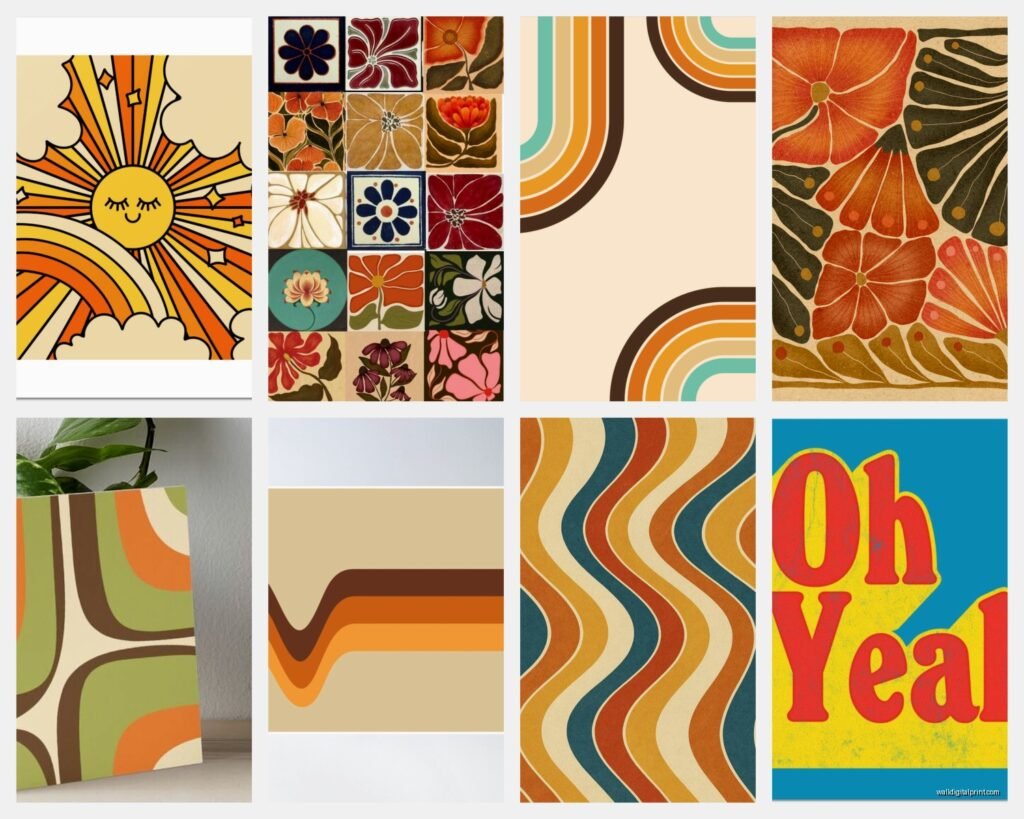
Geometric Prints and Patterns
The 70s were ALL about geometric shapes. Circles, arcs, waves, hexagons, those weird overlapping ring things. You can go modern with this or vintage – both work.
I found this amazing set of four prints on Desenio (they’re a Swedish company, really affordable) that are geometric but in 70s colors and they look authentically vintage even though they’re new. Sometimes that’s the move honestly because vintage paper can be yellowed or damaged and if you’re spending money on framing anyway…
Oh and speaking of framing – skip the black frames for this aesthetic. Go with natural wood, bamboo, or even those chunky light oak frames. The thin gold frames from the 80s and 90s can work too if you find them at thrift stores but make sure they’re not too shiny or ornate.
Creating a Gallery Wall That Doesn’t Look Chaotic
Gallery walls are having a moment but they can look really messy if you don’t plan them out. What I do is lay everything out on the floor first and take a photo from above. Then I use painter’s tape on the wall to map out where each piece goes before hammering any nails.
For a 70s vibe specifically:
- Mix sizes but keep an odd number (3, 5, 7 pieces)
- Include at least one textile element like a small woven wall hanging or framed fabric
- Don’t worry about perfect alignment – the 70s were more organic and flowing
- Leave some breathing room between pieces, like 2-3 inches
My own gallery wall in my bedroom has six vintage mushroom and botanical prints, one small macrame piece, and this weird ceramic sun face I found at a flea market. It shouldn’t work but it totally does.
Sunburst Mirrors and Metal Wall Art
Okay so sunburst mirrors are VERY 70s but also very 50s and 60s, so they span a few decades. For the 70s specifically you want the ones that are a bit more abstract and organic looking, not the perfectly symmetrical starburst ones.
I scored an amazing brass sunburst mirror from Facebook Marketplace for $45 last year. The seller had no idea what it was worth – I saw similar ones at a vintage shop going for $200+. So definitely check FB Marketplace and Craigslist regularly if you’re hunting for deals.
Metal wall art in general was huge in the 70s. Those copper wall sculptures of birds or flowers, brass geometric shapes, that kind of thing. A lot of it looks dated in a bad way but some pieces are genuinely beautiful. You gotta be selective.
What to look for:
- Brass or copper that’s developed a natural patina (don’t polish it off!)
- Abstract or nature-inspired designs
- Pieces with dimension that cast shadows
- Nothing too literal or cutesy
Vintage Travel Posters and Photography
This is gonna sound weird but vintage travel posters from the 70s have this specific aesthetic that’s so cool. The color palettes, the typography, the stylized illustrations of places… I used three vintage airline posters in a client’s home office and it completely transformed the space.
You can find reproductions on Etsy and AllPosters pretty easily. Search for “70s travel poster” or “vintage airline poster” and you’ll get tons of options. The real vintage ones are obviously more expensive but sometimes you can find them.
I also love black and white photography from the 70s paired with the more colorful elements. It grounds everything and keeps it from being too much. Look for architectural photography, street photography, or nature shots with strong contrast and composition.
Mixing Vintage and New
You don’t have to go 100% authentic vintage – in fact I usually recommend mixing in some new pieces that have a 70s vibe. It’s easier on your budget and honestly some new artists are doing really cool retro-inspired work.
Some artists and brands to check out:
- Minted has a whole retro section with prints that look authentically 70s
- Society6 has independent artists doing amazing retro geometric stuff
- Rifle Paper Co does some botanical prints with a vintage feel
- Search “70s abstract art” on Etsy and prepare to fall down a rabbit hole
The key is making sure the colors and style match. A super modern minimalist print in black and white isn’t gonna work next to an orange and brown mushroom poster, you know?
Textiles as Wall Art
Something I don’t see people talk about enough is using actual vintage textiles as wall art. Like you can frame fabric or hang it on a dowel rod and it looks amazing. I have a vintage 70s scarf with this insane paisley pattern in my dining room and everyone asks about it.
You can also use:
- Vintage tea towels (they made really cool graphic ones in the 70s)
- Pieces of vintage wallpaper in frames
- Old quilts or tapestries hung on a rod
- Vintage bandanas in shadow boxes
The cool thing about textiles is they add softness and texture to your walls in a way that paper prints can’t. And they’re usually pretty affordable at thrift stores and estate sales.
I found this amazing orange and brown geometric tablecloth at an estate sale for $3, cut it into three panels, hemmed them, and hung them on copper rods. Looks like I spent $300 on custom wall hangings but the whole thing cost me maybe $25.
Plant-Related Art Because the 70s Loved Plants
The 70s were obsessed with houseplants and that translated into wall art too. Botanical prints, mushroom art, nature photography, all of it. This works really well if you also have actual plants in your space because it creates this cohesive natural vibe.
I’m personally really into the mushroom print trend right now. I know it sounds weird but vintage mushroom illustrations are SO pretty and they have this magical cottagecore vibe that somehow still feels retro. You can find vintage mushroom guides and field guides at used bookstores and thrift stores, and the pages make amazing wall art when framed.
Same with fern prints, monstera leaves, palm fronds… all of that botanical stuff. Just make sure you’re going for a slightly more scientific or vintage illustration style rather than the super trendy watercolor millennial pink versions.
DIY Botanical Art
If you’re crafty at all you can make your own botanical prints by pressing actual plants and framing them. I did this with ferns from my backyard (my dog keeps digging them up anyway so might as well use them) and they turned out really cool.
You need a plant press or just some heavy books, parchment paper, patience, and then you mount them on nice cardstock and frame them. It takes a few weeks for the plants to fully dry but it’s a fun project and costs almost nothing.
Lighting Considerations
Okay so this is important but people forget about it – the lighting in your space completely changes how your wall art looks. 70s spaces tended to have warmer, softer lighting compared to the harsh white LEDs we use now.
I always tell clients to use warm white bulbs (2700K-3000K) in rooms where they have 70s decor. It makes the oranges and browns and golds look richer and more inviting instead of muddy.
Also consider adding picture lights above your favorite pieces or using wall sconces to create ambient lighting that highlights the texture of macrame or metal wall art. The shadows and dimension that creates is really beautiful.
Common Mistakes to Avoid
Things I’ve seen go wrong with 70s wall art:
- Going too literal with the theme – you don’t need disco balls and lava lamps everywhere
- Using too many patterns that compete with each other
- Hanging everything too high (eye level is usually best)
- Not considering the scale of furniture below the art
- Mixing too many different wood tones in frames
- Forgetting about negative space
The negative space thing is real. You don’t need to cover every inch of wall. Sometimes one really great piece makes more impact than five mediocre ones.
Where to Actually Shop
Real talk about where to find this stuff because that’s what everyone actually wants to know:
For vintage/authentic pieces: Estate sales are the absolute best, especially if you’re in an area where people actually lived through the 70s and still have their stuff. Facebook Marketplace, Craigslist, Goodwill, Salvation Army, local thrift stores, flea markets, antique malls.
For new stuff with vintage vibes: Etsy is your best friend. Also check out Urban Outfitters, Society6, Minted, Desenio, Juniqe, AllPosters.
For frames: Thrift stores first always, then IKEA for basics, and Framebridge or Level Frames if you want custom sizing.
I probably spend too much time browsing Etsy late at night but I’ve found so many good sellers that way. Just search “70s wall art” or “retro geometric print” or “vintage mushroom poster” and filter by your price range.
Oh and another thing – don’t sleep on eBay for vintage posters. I’ve found some amazing deals there, you just gotta be patient and check regularly.
The whole 70s aesthetic is really about warmth and personality and not taking things too seriously. It’s okay if it’s a little imperfect or eclectic – that’s kind of the point. My space definitely evolved over time as I found pieces I loved rather than trying to do it all at once, and I think that organic approach actually makes it feel more authentic anyway.