Wall Art Guide, Wall Art Tutoriels
Modern Abstract Wall Art: Contemporary Non-Representational Art
May
So I’ve been down this rabbit hole of abstract art lately because my living room was looking super boring and I kept staring at these blank walls thinking… something needs to happen here. And honestly, picking the right abstract piece is weirdly harder than it should be? Like there’s no “right” answer which makes it both liberating and completely overwhelming.
First Thing About Scale That Nobody Tells You
Okay so the biggest mistake I see (and made myself) is buying art that’s too small. I ordered this gorgeous blue and gray abstract piece online, was SO excited, and when it arrived it looked like a postage stamp on my wall. Here’s what actually works – measure your wall space and go for something that fills about two-thirds to three-quarters of the width. So if you’ve got a couch that’s 84 inches wide, you want art that’s somewhere between 56-63 inches across. Or do a gallery wall situation but that’s a whole other conversation.
For above a bed, I usually go for something that’s about 75% of the headboard width. Learned that one the hard way when I hung a tiny 24×36 canvas above a king bed and my sister literally laughed when she saw it.
The Sofa Thing Everyone Gets Wrong
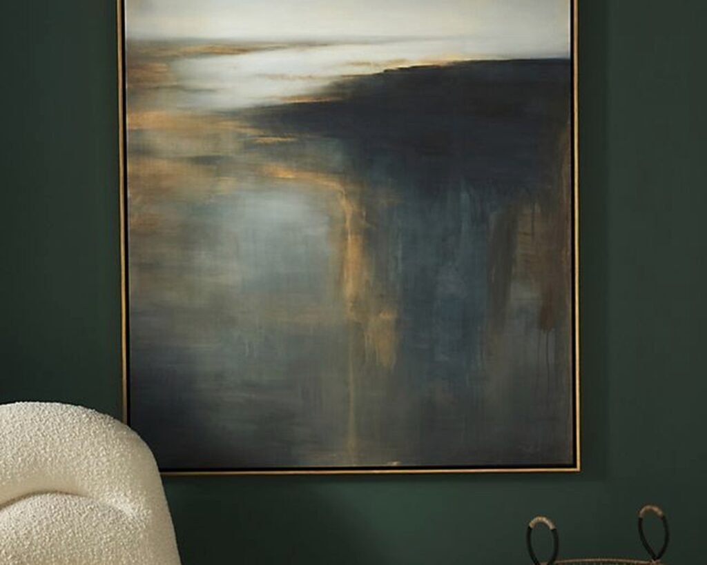
Your art should hang about 8-10 inches above your sofa back. Not 6 inches, not 15 inches. That specific range just… works. The bottom edge of the frame should be roughly at that height. I use painters tape to mark it out before I commit because I’ve patched too many unnecessary holes in my walls.
Color Matching Without Losing Your Mind
Here’s where it gets fun – you don’t actually need to match your art exactly to your room colors. In fact that usually looks kinda forced? What I do instead is pull one or two accent colors from the piece. Like I have this abstract with coral, navy, and cream swirls, and I just echoed the coral in throw pillows and the navy in a blanket. Done. The cream was already in my rug so it tied together without looking too matchy-matchy.
Oh and another thing – if your room is pretty neutral (grays, whites, beiges), you can go BOLD with your abstract art. That’s actually the perfect setup for it. My friend has this all-white minimal living room and she hung a massive red and black abstract piece and it’s literally the only color in the space. Sounds risky but it’s stunning.
The Undertone Situation
This is gonna sound weird but pay attention to whether your abstract piece has warm or cool undertones. I bought what I thought was a “neutral” abstract painting with grays and whites, but it had these warm beige undertones that clashed with my cool gray walls. It bugged me for weeks until I finally swapped it to a different room with warmer tones and then it looked perfect. You can usually tell by looking at the whites in the piece – are they crispy white or more cream? That tells you a lot.
Framing Options That Actually Matter
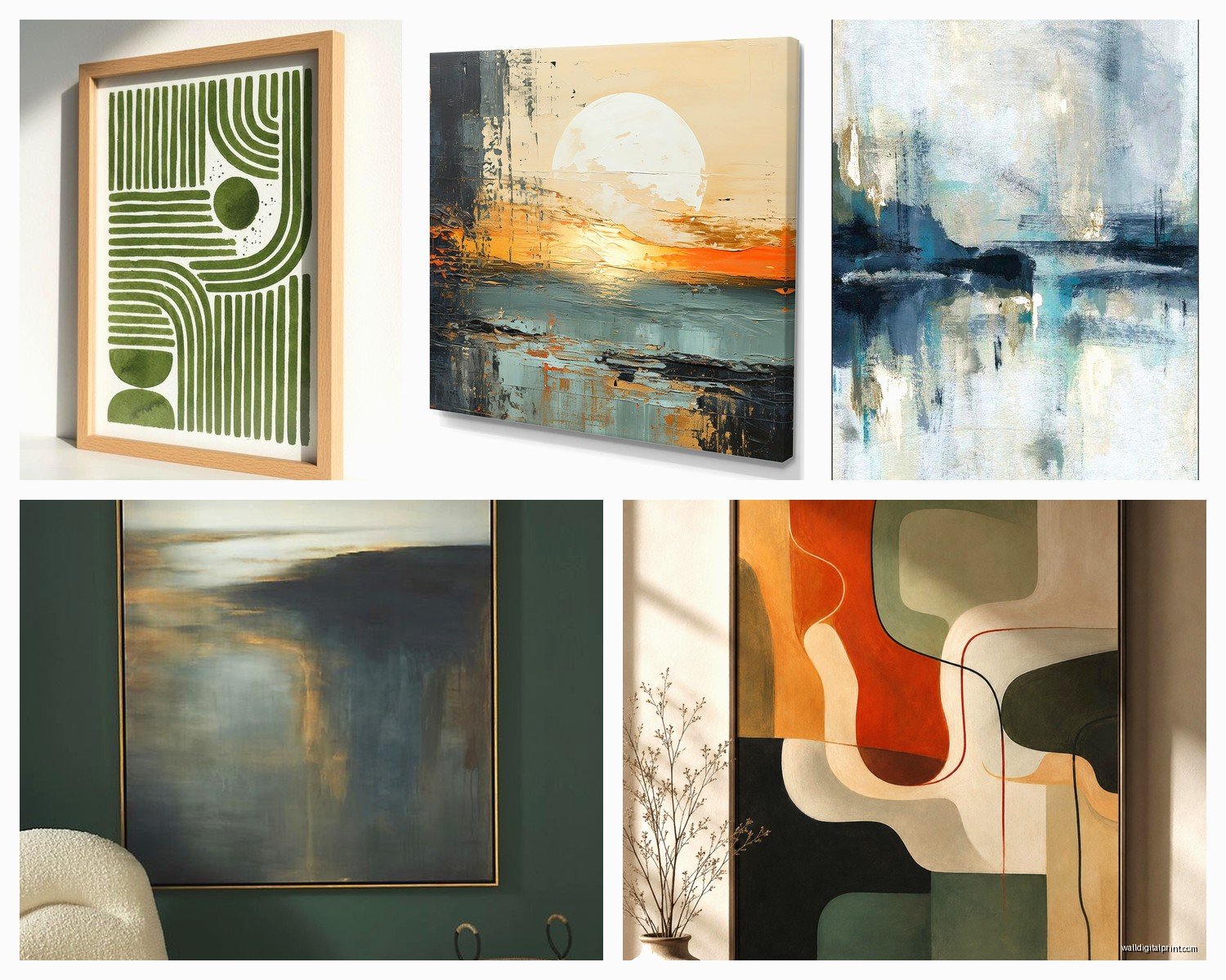
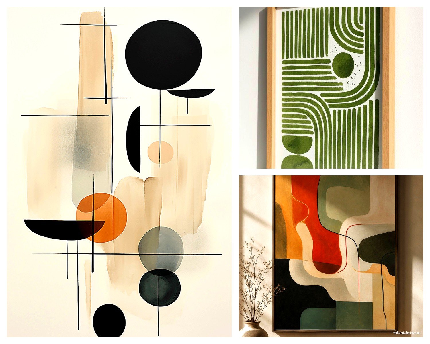
So floating frames are having a moment and I gotta say, they work really well with abstract art. The piece appears to float inside the frame with a gap between the canvas and the frame edge. It gives it this gallery vibe without being pretentious. They’re called floater frames if you’re searching for them.
For more contemporary spaces, I skip frames entirely and go with gallery-wrapped canvas where the image continues around the edges. Just make sure the sides are actually painted and not just white canvas or it looks unfinished and cheap.
Traditional frames can work too but stick with simple profiles – thin metal frames in black, gold, or silver. Nothing ornate unless you’re specifically going for that eclectic maximalist thing.
Where to Actually Buy This Stuff
Okay so I’ve bought from a bunch of places and here’s what I’ve learned. Etsy has amazing options from actual artists and you can often get custom sizes. I commissioned a 48×60 piece in specific colors for like $400 which sounds like a lot but comparable pieces at West Elm were $800+.
Society6 and Minted are good for prints if you’re on a budget. The quality is decent, not amazing, but for a guest room or home office it totally works. Just get the largest size you can afford because the small prints look sad.
For splurge-worthy investment pieces, I look at Saatchi Art and Artsy. You’re buying original work from emerging artists and the quality is significantly better. My client spent $2000 on an original abstract and honestly it transformed her entire dining room. Sometimes it’s worth it.
Wait I forgot to mention – check local art fairs and open studio events. I found an incredible abstract artist at a neighborhood art walk and got an original piece for way less than online galleries charge. Plus you meet the artist which is kinda cool.
The Print vs Original Debate
Look, I have both in my house and I’m not gonna pretend they’re the same. Originals have texture and depth that prints just don’t capture. But prints are totally fine for most spaces, especially if you frame them well and they’re good quality. I have prints in my bedroom and office and originals in my living room and entryway. It’s about budget and priority.
If you do go with prints, get them professionally printed on canvas or fine art paper. Those cheap poster prints from Amazon look… cheap. The $40-80 range usually gets you something that doesn’t immediately scream “print.”
Placement Beyond The Obvious Spots
Everyone thinks living room and bedroom, but I’ve been putting abstract art in unexpected places lately. My powder room has this small 16×20 abstract with gold leaf and it makes the space feel way more intentional. Hallways are perfect for gallery walls of smaller abstracts – I did five 12×12 pieces in my upstairs hallway and it turned a boring pass-through into something interesting.
Kitchen and dining spaces work great with abstract art too. Just avoid anything too textured or with fabric elements if it’s near cooking areas because grease and dust happen. Smooth canvas or framed prints are better there.
Lighting Makes or Breaks It
This is something I didn’t think about initially but proper lighting is HUGE. Abstract art needs good light to show the depth and color variations. I installed picture lights above my larger pieces and it completely changed how they look. Those battery-operated LED picture lights from Amazon work surprisingly well if you don’t wanna deal with wiring.
Natural light is great but watch for direct sun that hits the art for hours every day – colors will fade over time. I learned this when a print in my south-facing window faded noticeably after like 8 months. Now I use UV-protective glass for anything in bright spots.
The Directionality Thing
Some abstract pieces have an obvious orientation, others are more ambiguous. I actually have one painting that I’ve hung three different ways and it looks completely different each time. Horizontal pieces tend to make walls feel wider, vertical pieces make ceilings feel higher. So like, if you have a long low wall behind a sofa, horizontal works better. For a narrow wall space, go vertical.
And okay this might sound extra but I’ve rotated pieces between rooms based on seasons. That coral abstract I mentioned? It lives in my bedroom during fall/winter because it feels warm, then I swap it to the living room in spring/summer. My cat thinks I’m insane when I’m up on a ladder swapping art but whatever, it keeps things fresh.
The Multi-Panel Approach
Triptychs and multi-panel abstracts are having a moment and they solve a lot of problems. If you have a really wide wall space, one massive piece might be hard to find (or afford), but three panels that work together fills the space perfectly. Just make sure you hang them with consistent spacing – I do 2-3 inches between panels usually.
You can also buy individual pieces that weren’t meant to go together and create your own grouping. I have four different abstract pieces in similar colors arranged in a grid pattern and everyone assumes they’re a set. They’re not, I just curated them over time.
Texture and Dimension Considerations
Some abstract art is heavily textured with thick paint application (impasto technique), some is smooth and flat. The textured stuff adds another layer of interest and catches light differently throughout the day. I have a piece with raised gold paint that literally changes appearance from morning to evening light.
But textured pieces are harder to clean and can be damaged more easily. If you have kids or pets that might bump into things, maybe go with flatter options in high-traffic areas.
Mixed Media Abstracts
These incorporate different materials – paint plus metal leaf, or resin, or fabric. They’re usually pricier but the dimensional quality is pretty amazing. I’m obsessed with abstracts that have gold or silver leaf accents right now. They add just enough shimmer without being too blingy.
What Doesn’t Work (From Experience)
Tiny abstract art in large rooms – it disappears. Go bigger than you think you need. Also, buying art that matches your furniture exactly is usually a mistake because then when you change furniture (which happens), the art doesn’t work anymore. Better to choose art you genuinely like and build around it.
Abstract art with colors you don’t actually like just because it matches your current decor is another trap. I bought a green and brown abstract for my old apartment because it matched, but I don’t even like those colors together. It sat in my closet after I moved for two years.
Oh and super trendy specific styles – like there was that phase where everyone had those blue and gold agate slice abstracts? They dated pretty quickly. I try to choose pieces that feel more timeless even within contemporary abstract art.
The Commitment Issue
If you’re nervous about committing to a large expensive piece, try printable art first. There are Etsy shops that sell digital downloads you can print at Costco or a local print shop. Frame it and live with it for a month. If you love it, maybe upgrade to a nicer version or original. If you don’t, you’re only out like $30.
Command strips are your friend for testing placement too. I use the heavy duty ones to temporarily hang pieces before I commit to nailing holes. Has saved me so many times when I thought something would work and then realized it definitely didn’t.
Okay I think that covers most of what I’ve learned through trial and error. The main thing is don’t overthink it to the point where you never actually hang anything. Sometimes you just gotta pick something that speaks to you and go for it. You can always move it or swap it out later, walls aren’t permanent even though we treat them like they are.