Wall Art Guide, Wall Art Tutoriels
Pastel Wall Art: Soft Muted Gentle Color Palette
Mar
So I’ve been completely obsessed with pastel wall art lately and honestly it started because a client wanted their entire living room redone but didn’t want “baby colors” which is what everyone thinks pastels are, right? But like, there’s this whole world of sophisticated muted tones that read as calming without looking like a nursery exploded.
The Thing About Pastels That Nobody Tells You
Okay so first thing – pastels are NOT created equal. I spent like three weeks testing different prints in the same room (my own office became the guinea pig) and the undertones will absolutely make or break your space. You’ve got your warm pastels which have more yellow or peach undertones, and your cool pastels with blue or gray mixed in. I made the mistake of mixing a warm pastel pink with a cool pastel blue and it looked… honestly it looked like I couldn’t decide on a theme. My dog kept staring at the wall like something was wrong.
The key is picking your temperature first. Are you a warm pastel person or a cool pastel person? Your existing furniture will tell you. If you’ve got warm wood tones, brass fixtures, cream walls – go warm. If you’re working with gray, silver, white oak, cooler whites – stick to cool pastels.
Breaking Down the Actual Colors
Pastel Pink (But Make It Grown Up)
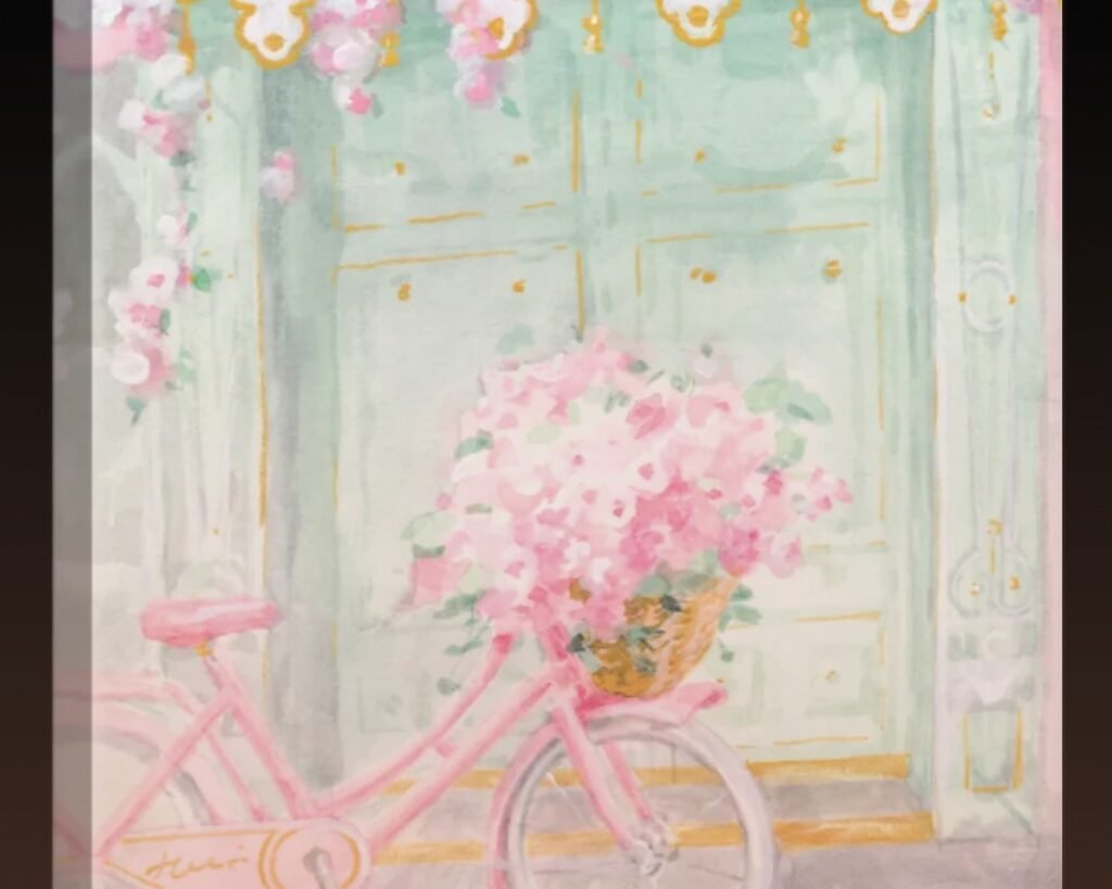
Listen, I was anti-pink for YEARS. Then I found this dusty rose/mauve situation that’s technically pink but reads more… sophisticated? It’s got enough gray mixed in that it doesn’t feel precious. The trick is avoiding anything that looks like bubblegum. If the pink reminds you of Pepto Bismol, run.
What actually works: blush tones with brown or gray undertones, dusty rose, that barely-there peachy pink that looks almost neutral. I hung a massive abstract piece in dusty rose and terracotta (still pastel-ish but grounded) above a client’s bed and she literally cried. Good tears though.
Where it fails: anywhere near orange-toned wood. I tried this combo in my own dining room and the pink looked radioactive next to my vintage table. Had to return everything.
Pastel Blue Situations
This is gonna sound weird but I have like seven different pastel blue art prints in my storage closet because I keep thinking I’ll use them and then the project goes another direction. Pastel blue is tricky because it can read really cold if you don’t balance it right.
The best pastel blues have just a tiny bit of green (makes them feel more grounded) or a touch of gray (stops them from feeling like a clear sky stock photo). I’m obsessed with slate blue, that faded denim color, and this one shade that’s almost lavender-blue but not quite purple.
Oh and another thing – pastel blue makes small rooms feel bigger but also colder, so if you’re working with a north-facing room that doesn’t get much light, maybe skip it. Or balance it with warmer accent colors. I did a gallery wall with pale blue as the main color but threw in some warm cream and soft terracotta pieces and it totally worked.
Mint and Sage Greens
Okay so mint can go very 1950s diner very fast. I learned this the hard way when I bought this “adorable” mint green geometric print and it made my client’s kitchen look like a retro ice cream shop. Which sounds cute in theory but wasn’t the vibe we wanted.
Sage though? Sage is where it’s at. It’s having this huge moment and for good reason – it works with literally everything. Warm tones, cool tones, modern spaces, traditional spaces. I’ve used sage green art in probably 15 projects this year and it never misses.
The difference is that mint leans blue and artificial, while sage leans gray and natural. Sage feels organic, mint feels synthetic. For wall art, you want that organic quality unless you’re specifically going for a vintage aesthetic.
Lavender and Lilac Territory
I’m gonna be honest, I avoided purple pastels for a long time because they felt too… I don’t know, teenage bedroom? But then I found this gorgeous lavender-gray that’s barely purple and it completely changed my mind. The key with purple pastels is keeping them really muted – like so muted you almost can’t tell they’re purple at first glance.
Lavender-gray works beautifully in bedrooms (obviously) but also in bathrooms and even home offices if you pair it with darker navy or charcoal pieces. I did a whole thing where I mixed lavender with slate blue and deep plum and it was *chef’s kiss*.
Where lavender fails: next to anything yellow. Just don’t. I watched HGTV while hanging art one day and got distracted and put a lavender piece near some yellow throw pillows and it looked like an Easter basket.
Peach and Coral Pastels
These are having a moment right now and I’m here for it. But you gotta be careful because peach can read very 1980s if it’s too saturated. You want those really soft, almost neutral peachy tones that look more like “skin tone” than “orange sherbet.”
I spilled coffee on a peach-toned print once (cool story: my client canceled so I spent an hour comparing prints at home and got clumsy) and honestly it kind of improved it? Like the stain added depth? I didn’t use it obviously but it made me realize that peach pastels need some variation in tone or they look flat.
The best peach wall art has multiple shades within the same piece – lighter peachy cream mixed with deeper terracotta-ish tones. All one flat shade of pastel peach looks unfinished somehow.
How to Actually Combine These Colors
Wait I forgot to mention the most important part – you’re probably not using just ONE pastel color right? Unless you’re doing a monochrome thing, which can work but is kinda boring imo.
The Two-Color Method
This is my go-to for clients who are nervous about color. Pick two pastels from the same temperature family. So like, blush pink + sage green (both have warm undertones) or powder blue + lavender-gray (both cool). Keep them in the same intensity – don’t pair a really soft pale pink with a vibrant mint, it’ll look off.
I did this in my own bedroom with dusty rose and sage and it’s so calming I actually sleep better. That sounds dramatic but I swear it’s true. The combination doesn’t stimulate your brain, it just exists peacefully.
The Three-Color Sweet Spot
Three pastels is like the magic number for gallery walls. You get enough variety to keep things interesting but not so much that it looks chaotic. My formula: pick one dominant color (this is like 50% of your art pieces), one secondary color (30%), and one accent color (20%).
Example that I literally just installed last week: dominant sage green, secondary blush pink, accent cream/ivory. The cream gives your eye a place to rest between the colors. Without that neutral, the pink and green were fighting each other.
Another combo I love: powder blue (dominant), peach (secondary), warm gray (accent). The gray is doing so much work here keeping the blue and peach from looking too pastel-y.
Going Full Rainbow Pastel
Okay so this is advanced mode. I only recommend this if you’ve got a really neutral room otherwise – white walls, simple furniture, minimal other decor. The wall art becomes THE moment.
If you’re doing multiple pastel colors (like 4+), they all need to be the exact same saturation level. This is where people mess up. They’ll mix a super pale pink with a more vibrant mint and a wishy-washy blue and it looks like they just grabbed random pieces.
I actually use my phone camera to check this – take a photo of all your art pieces together before hanging. If one color jumps out way more than the others, it’s too saturated for the group. Everything should blend harmoniously at first glance, then reveal its individual colors when you look closer.
Size and Scale With Pastels
This is gonna sound weird but pastel art needs to be bigger than you think. Because the colors are so soft, small pieces just disappear on the wall. I learned this when I bought these cute 8×10 pastel prints for above a console table and they literally vanished. You didn’t even notice them.
For a single statement piece, I don’t go smaller than 24×36 inches. For gallery walls, nothing smaller than 11×14, and even then that’s the smallest piece in a group of larger ones.
Oh and another thing – pastel art looks better with more white space around it. Don’t crowd your walls. If you’re hanging multiple pieces, give them room to breathe. I aim for 3-4 inches between frames in a gallery wall, more if they’re larger pieces.
Frame Colors That Actually Work
Okay so you spent all this time picking the perfect pastel art and then you’re gonna put it in the wrong frame? I’ve seen it happen so many times.
White Frames
Safe, clean, works with everything. But can look a little boring if your whole space is already neutral. White frames with pastel art is like… it’s fine. It’s never bad. But it’s not exciting either. I use white frames when the room has other interesting elements going on and the art is more of a supporting player.
Natural Wood
This is my favorite for warm-toned pastels. Light oak, ash, maple – anything with a blonde wood tone. It adds warmth without competing with the soft colors. I just did a whole series of peach and sage prints in light oak frames and the wood pulls out the warmth in both colors.
Don’t use dark wood with pastels unless you’re specifically going for contrast. I tried walnut frames with pastel blue art once and it was too harsh. The darkness made the pastels look washed out.
Metallic Frames
Gold or brass for warm pastels, silver or chrome for cool pastels. But keep the finish matte or brushed, not shiny. Shiny metallic frames make pastel art look cheap somehow, like you bought everything at HomeGoods. Which, no shade to HomeGoods, I shop there constantly, but you don’t want that specific look.
I did rose gold frames with blush pink art in a client’s bedroom and she loved it, but rose gold is tricky because it can read very trendy. Make sure you actually like rose gold and aren’t just doing it because Instagram told you to.
Colored Frames
Risky but can be amazing. I love a sage green frame with sage green art – it creates this tonal situation where the frame almost disappears into the art. Or a dusty pink frame with mixed pastel art that includes pink.
The rule here is the frame color should be one shade darker than the lightest color in your art. So if you have a print with pale pink, peach, and cream, a dusty rose frame works. A hot pink frame would be too much.
Matting Choices Matter More Than You Think
I’m gonna say something controversial: most pastel art looks better without matting. The extra white space (or cream, or gray, whatever mat color) waters down the already-soft colors. You want the art right up against the frame edge.
Exception: if you’re doing a gallery wall and need to make different sized prints look cohesive, matting can help standardize the frame sizes. But keep the mat really thin – like 1 inch max.
I did this whole gallery wall where I used cream mats with warm pastel art and it looked so much better than white mats would have. The cream picked up the warmth in the colors. White would’ve been too stark.
Lighting is Everything (Sorry)
Okay so you can do everything right with color selection and framing and then bad lighting ruins it. Pastels need good lighting or they just look muddy and gray.
Natural light is obviously ideal, but if your art is on a wall that doesn’t get much natural light, you need to add some. I’m obsessed with those battery-powered picture lights that stick right to the wall above the frame. They’re like $30 and they make such a difference.
Warm bulbs (2700-3000K) for warm-toned pastels, cooler bulbs (3500-4000K) for cool-toned pastels. I tested this extensively in my office (remember, that’s where I guinea pig everything) and the wrong color temperature completely changes how the art looks.
Also, avoid direct sunlight on pastel art if you can. The colors will fade faster because they’re already light. I learned this when a client’s beautiful blush pink print turned basically white after six months in a sunny window. Now I always mention this upfront.
Where to Actually Hang This Stuff
Living Rooms
Pastels work great in living rooms but you need some contrast or the space feels flat. I always include at least one darker element – navy throw pillows, a charcoal rug, dark furniture. The pastel art pops more when it’s not competing with other super-light colors.
My favorite spot is above the sofa (obviously) but also consider the wall opposite your windows. That wall usually needs light and brightening anyway, and pastels help reflect light around the room.
Bedrooms
This is where pastels really shine. They’re calming, they’re soft, they don’t overstimulate your brain when you’re trying to sleep. I use deeper pastels in bedrooms – think dusty rose instead of pale pink, slate blue instead of powder blue. You want enough color to read as intentional, not washed out.