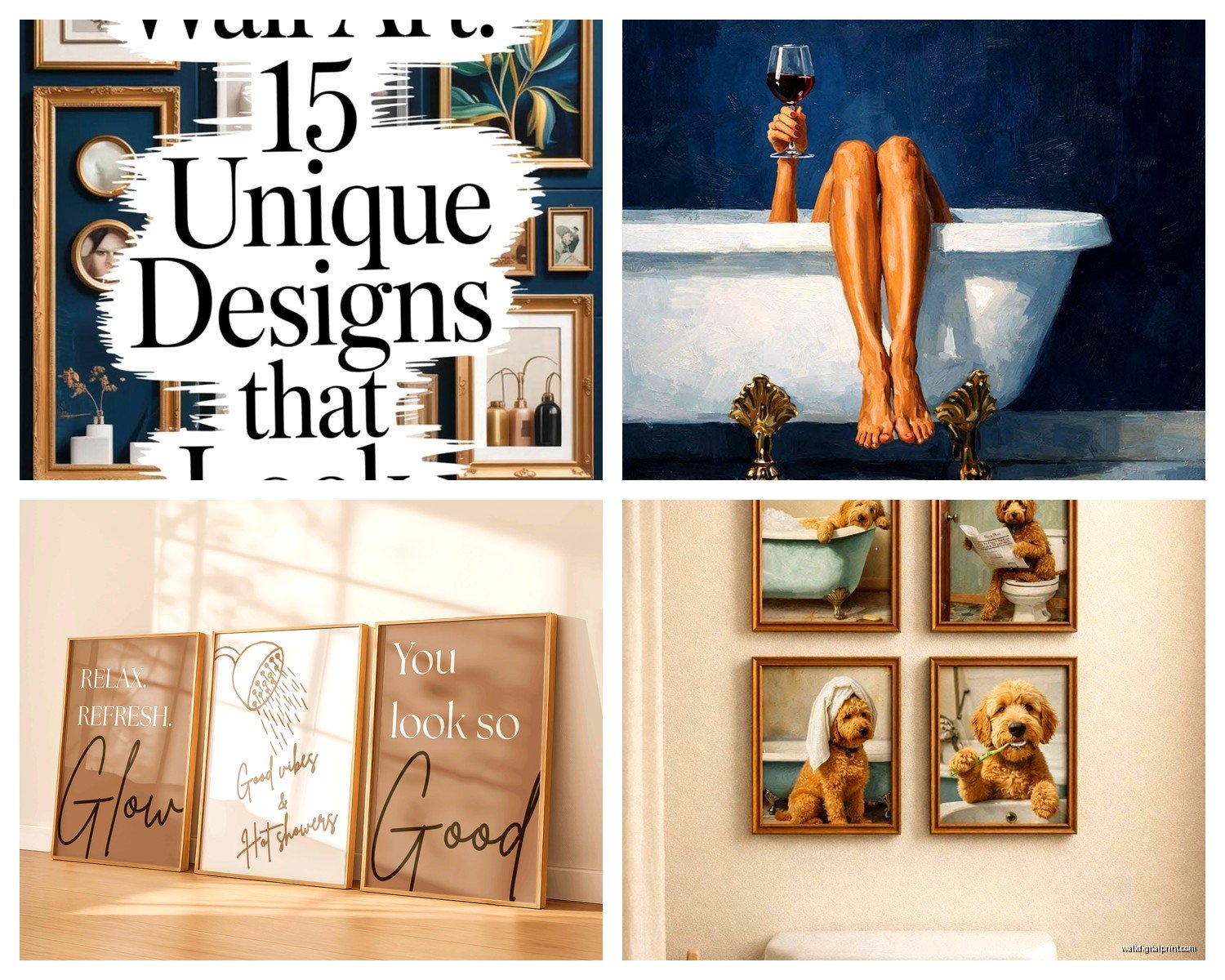
Wall Art Guide, Wall Art Tutoriels
Classy Bathroom Wall Art: Elegant Sophisticated Bath Decor
Apr
So I’ve been obsessing over bathroom wall art lately because honestly, it’s one of those spaces people totally neglect and then wonder why their bathroom feels like a hotel from 1987. Let me walk you through what actually works because I’ve made basically every mistake possible.
The Material Situation Nobody Talks About
Okay so the biggest thing with bathroom art is moisture, right? You can’t just hang your favorite paper print and call it a day because in like three months it’s gonna be warped and gross. I learned this the hard way with a vintage botanical print that cost me $200 and looked like a sad accordion within weeks.
Framed prints with actual glass or acrylic are your safest bet. But here’s the thing… you need a sealed back. Most cheap frames from Target or wherever have this cardboard backing that just absorbs moisture like a sponge. I always add a layer of clear packing tape around all the edges where the backing meets the frame. Sounds insane but it works.
Metal prints are actually amazing for bathrooms and nobody thinks of them first. They’re literally printed on aluminum sheets so moisture does nothing to them. I used one above a client’s soaking tub and it’s been there for two years looking perfect. The finish is slightly reflective which some people hate but I think it adds this modern gallery vibe.
Canvas: The Complicated One
Canvas is tricky because everyone wants that gallery-wrapped look but standard canvas absorbs humidity like crazy. If you’re gonna do canvas, you need gallery-wrapped canvas with a protective coating. Some companies sell bathroom-specific canvas prints with like three layers of sealant. Worth it.
Or just skip canvas entirely and go with… wait I’m getting ahead of myself.
What Actually Looks Classy vs What People Think Looks Classy
This is where I see people mess up constantly. They think classy means those generic “RELAX” “SOAK” word prints from HomeGoods and like, no. Just no.
Black and white photography is your secret weapon. Architectural shots, abstract nature, even tasteful figure studies if that’s your vibe. There’s something about black and white that automatically elevates a space. I have this one bathroom with three matching black frames containing B&W photos of European archways and it’s *chef’s kiss*.
Vintage botanical prints work if you do them right. Not the super bright colorful ones… I mean the muted, aged-looking scientific illustrations. The kind that look like they came from an old library book. You can find good reproductions on Etsy but make sure they’re printed on quality paper and properly sealed in the frame.
Oh and another thing, abstract art in muted tones is incredibly sophisticated for bathrooms. Think soft grays, taupes, dusty blues, maybe a hint of gold. I’m not talking about those mass-produced “abstract” pieces that are basically just random brushstrokes. I mean actual compositions with thought behind them.
The Size Question Everyone Gets Wrong
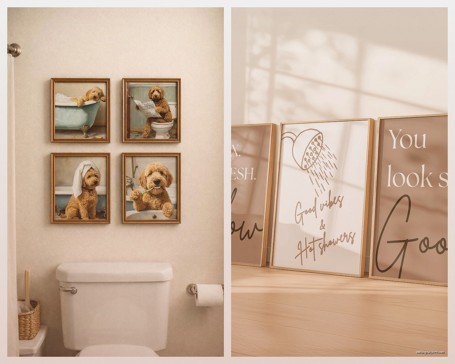
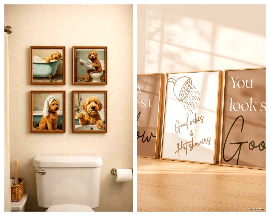
People either go too small or too matchy-matchy. If you have a big wall above your tub or toilet, one large statement piece (like 24×36 or bigger) looks way more intentional than a bunch of small frames. Unless you’re doing a proper gallery wall, which is a whole different conversation.
For powder rooms, you can go smaller because the space is smaller, but don’t go tiny. An 8×10 on a huge wall looks lost and sad.
My Actual Favorite Materials Ranked
- Metal prints – Literally moisture-proof, modern look, easy to clean
- Sealed framed prints under glass – Classic, versatile, widely available
- Acrylic prints – Super glossy and contemporary, basically waterproof
- Coated canvas – If you find properly sealed ones, they work great
- Ceramic or porcelain art tiles – More permanent but gorgeous if you’re renovating
I know ceramic tiles sound weird but hear me out. You can get these hand-painted decorative tiles that mount directly to the wall and they’re completely impervious to moisture because they’re literally made for wet areas. I used them in a client’s shower area (not IN the shower but nearby) and they’re stunning.
Frame Materials That Won’t Betray You
Wood frames can warp in bathrooms with poor ventilation. I’ve seen it happen. If you love the wood look, go for sealed or painted wood, not raw or lightly stained. Black painted wood frames are basically bulletproof and they look expensive.
Metal frames are obviously ideal. Aluminum, stainless steel, even brass if you’re going for that warm metallic vibe. They don’t care about moisture at all.
Plastic frames get a bad rap but honestly some of the high-quality ones look fine and they’re practical. Just avoid anything that looks obviously cheap because it’ll make your art look cheap too.
The Matting Debate
Matting adds sophistication but it also adds another layer where moisture can creep in. If you’re using mats, make sure everything is sealed properly. I usually prefer no mat for bathroom art unless it’s in a really well-ventilated space. The cleaner look actually works better anyway.
Specific Pieces I Keep Coming Back To
Okay so this is gonna sound weird but I have this ongoing list on my phone of bathroom art that actually works in real life, not just in theory.
Line drawings are having a moment and for good reason. Simple continuous line art of faces, bodies, plants, whatever… they look sophisticated without being stuffy. You can find them everywhere now but the quality varies wildly. Look for thick enough lines that they’ll read from across the room.
Vintage maps if you do them in a modern way. Not the super colorful tourist maps, but old nautical charts or city plans in muted colors. Frame them simply and they add this collected, well-traveled vibe.
Japanese woodblock prints or that aesthetic even if they’re modern reproductions. The composition and color palettes in traditional Japanese art work perfectly in bathrooms because they’re often water-themed anyway and the colors tend to be sophisticated.
What Doesn’t Work (Learned Through Pain)
Paper prints without protection will die. Just accept this.
Anything with a cardboard backing that isn’t sealed is living on borrowed time.
Super bright, saturated colors can look cheap unless your whole bathroom is designed around them. And even then it’s risky.
Word art unless it’s really really well done typography. Most of it reads as basic.
Anything too personal or specific like family photos feels weird to me in bathrooms but maybe that’s just me? My sister has family photos in her powder room and I guess it works but I can’t get behind it.
The Ventilation Factor Nobody Considers
Real talk, if your bathroom has terrible ventilation, even the best materials are gonna struggle eventually. Run your exhaust fan during and after showers. Crack a window if you have one. I know this seems obvious but you’d be surprised.
I had a client who complained that her bathroom art kept getting damaged and when I visited, the bathroom was like a sauna with zero airflow. We added a better fan and suddenly her art situation improved dramatically.
Placement Strategy
Don’t hang art directly above the shower where it’s getting constantly blasted with steam. I mean you can, but why make things harder?
The wall opposite the shower or tub is usually ideal. Or above the toilet (the classic spot for a reason). Behind the door works too if you have the space.
In powder rooms, the wall you see when you walk in should have your statement piece. Don’t waste that prime real estate.
Budget Real Talk
You don’t need to spend a fortune but you also can’t go super cheap if you want it to last. I’d rather have one good piece than three mediocre ones.
Printable art from Etsy can be great if you get it professionally printed and properly framed. You’re looking at maybe $30 for the file, $50-100 for professional printing, and $50-150 for a quality frame. So like $150-300 total for a custom piece that looks expensive.
Metal prints run about $100-200 for a decent size directly from printing companies. Worth it for the longevity.
Original art obviously varies but you can find emerging artists selling smaller originals for $200-500 that are actually good. I follow a bunch on Instagram and occasionally find pieces perfect for bathrooms.
Frame quality matters more than people think. A $20 print in a $100 frame looks better than a $100 print in a $20 frame. Just facts.
Installation Tips That Matter
Use proper wall anchors, especially in bathrooms where you might have drywall issues from moisture. I always use the screw-in anchors rather than the plastic expansion ones.
Level your art properly. Nothing makes a space look less classy than crooked frames. I keep a small level in my purse because I’m that person who will straighten art at restaurants.
Oh and if you’re doing a gallery wall, map it out on the floor first or use that trick with kraft paper templates. I’ve redone too many gallery walls because I just started nailing things up.
Cleaning and Maintenance
Wipe down frames monthly with a slightly damp cloth. Don’t spray cleaner directly on the art because it can seep behind the glass.
Check periodically for any moisture damage or warping, especially in the first few months after hanging something new.
If you see condensation forming on the glass, that’s a ventilation problem not an art problem.
My Current Bathroom Art Setup
Since you’re probably wondering what I actually have in my own space… my master bath has a large black and white photograph of a minimalist seascape in a thin black metal frame. Super simple but it makes the whole room feel more expensive.
The powder room has three small vintage botanical prints in matching brass frames arranged vertically. They’re sealed reproductions that cost like $40 each but everyone thinks they’re antiques.
I’m actually in the process of redoing my guest bath and I’m torn between a large abstract piece in grays and blues or a series of architectural line drawings. My cat keeps sitting on the samples I have leaning against the wall which is not helpful.
Where to Actually Buy This Stuff
Etsy for printable art and unique pieces from independent artists. Quality varies so read reviews.
Minted has good quality prints and they offer framing. A bit pricier but the quality is consistent.
Society6 for metal prints and canvas. Their bathroom-specific options are actually decent.
Local art fairs and galleries for original work. You can often negotiate prices and you’re supporting actual artists.
Framebridge for custom framing if you have a print you love but need it properly sealed for bathroom use. They’re not cheap but they do quality work.
Avoid Amazon for anything you care about looking good long-term. The quality control is just not there.
The Sophisticated Color Palette Thing
Sticking to a limited color palette automatically makes things look more curated. I usually tell people to pick 2-3 colors max for their bathroom art.
Neutrals with one accent color works great. Like black, white, and gold. Or gray, white, and navy.
All neutrals is sophisticated and safe. You literally cannot go wrong with black and white art in bathrooms.
Muted jewel tones can work if your bathroom has the right vibe. Deep teals, dusty roses, sage greens… but keep them muted, not bright.
Whatever you do, make sure the art palette works with your towels, bath mat, and other accessories. Everything doesn’t need to match exactly but it should feel cohesive.
Final Random Tips
Groupings of three work better than two or four for some reason. It’s just more visually pleasing.
Vertical orientation often works better in bathrooms because the walls are usually taller than they are wide.
Don’t be afraid of negative space. Not every wall needs art.
Change out your bathroom art seasonally if you’re into that kind of thing. It’s easy with the right hanging system.
And honestly, trust your gut. If you love something and it’s properly sealed and framed, it’ll probably work even if it breaks some design “rule” I mentioned.
I gotta run because I’m supposed to meet a client in twenty minutes and I’m still in my pajamas, but hopefully this helps you figure out what’ll actually work in your space without looking like a spa trying too hard or a doctor’s office waiting room.