Wall Art Guide, Wall Art Tutoriels
Emerald Green Wall Art: Rich Jewel Tone Luxe Designs
Mar
So I’ve been completely obsessed with emerald green wall art lately and honestly it started because a client wanted to redo her dining room and I was like, okay we need something that feels expensive but not stuffy, and emerald just… it does that thing where it looks luxe without trying too hard.
Why Emerald Green Actually Works (When Other Colors Don’t)
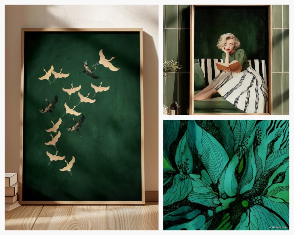
Okay so here’s what I figured out after hanging like fifteen different emerald pieces in various spaces over the past few months. Emerald sits in this weird sweet spot between blue and yellow-green, right? It’s got enough blue that it feels calm and sophisticated, but enough warmth that it doesn’t make a room feel cold like navy sometimes does. I tested this theory by putting an emerald abstract print next to a forest green one in my studio and the forest green just looked… muddy? The emerald had this depth that caught light differently throughout the day.
The jewel tone thing is real though. When people say jewel tone they usually mean saturated, rich, kind of glowy even when it’s matte. Emerald does this naturally. I had a piece in my hallway that I swear looked different every time I walked past it depending on whether it was morning light or evening. My cat knocked it off the wall actually (long story, involving a moth) and when I rehung it in a spot with different light exposure, it was like having a completely new piece.
What Actually Pairs With Emerald Without Looking Like Christmas
This was my biggest worry initially because green plus red equals holiday vibes and nobody wants their living room screaming December year-round. Here’s what I’ve tested that actually works:
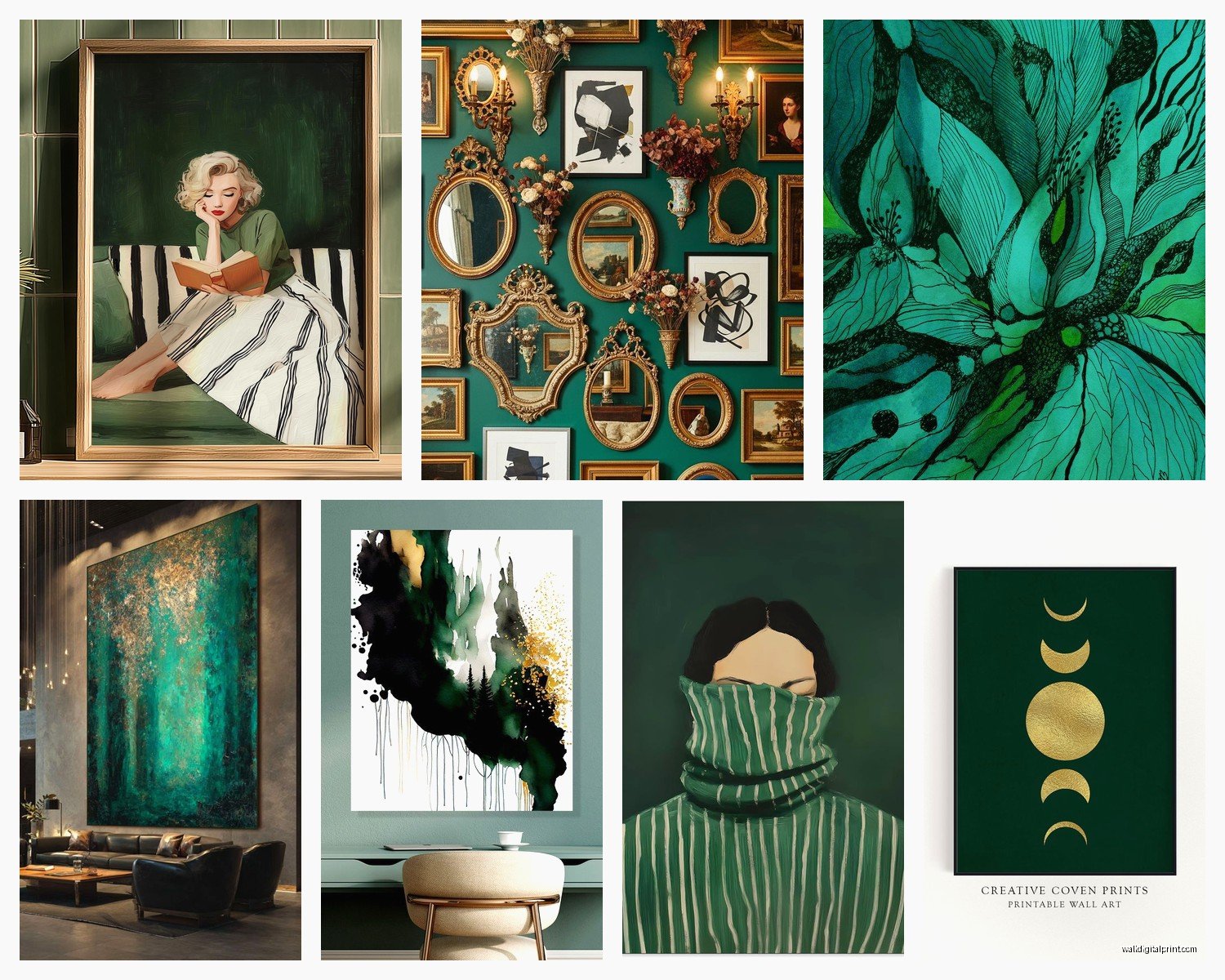
- Blush pink and emerald – sounds weird but it’s that contrast between cool and warm that makes both colors look more expensive. I did an entire gallery wall with emerald botanical prints and stuck one blush abstract in the middle and it totally elevated the whole thing
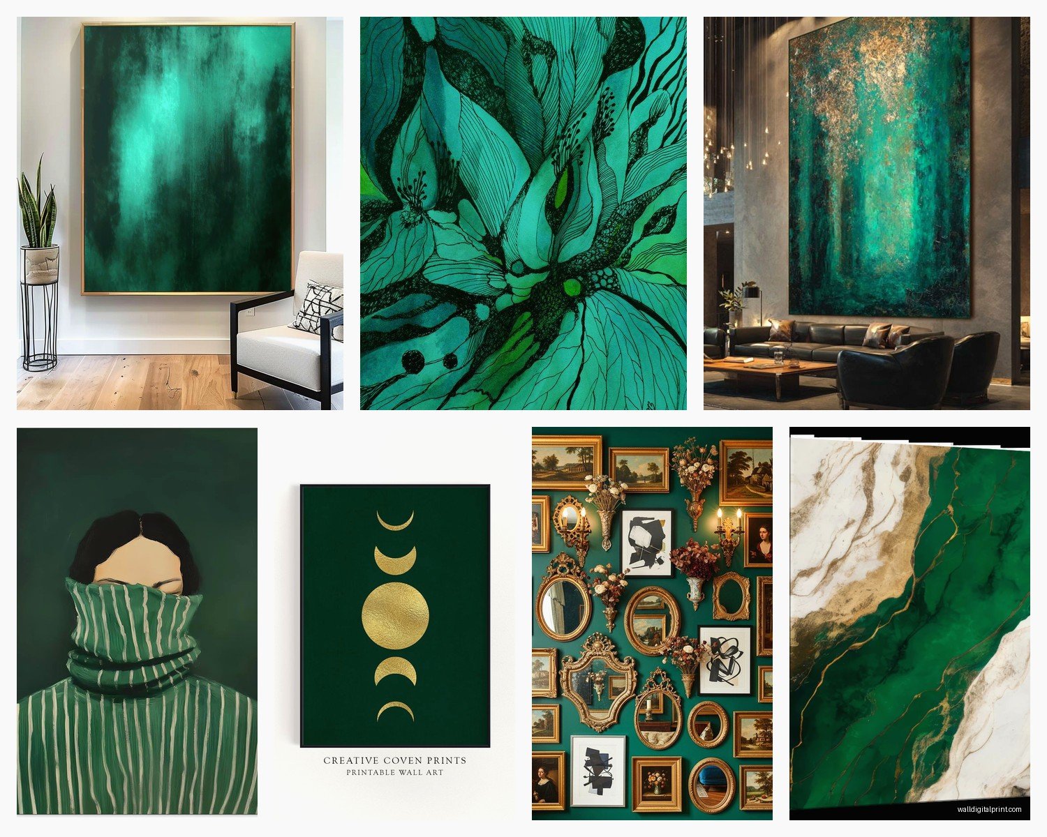
- Brass and gold metallics – this is gonna sound obvious but the warmth of brass frames or gold leaf details in the art itself makes emerald look richer. I found these emerald geode prints with gold veining and they’re ridiculously popular with my clients
- Deep navy or charcoal – for when you want drama. I put an emerald and navy abstract above a client’s credenza and it made this boring IKEA piece look like it cost thousands
- Cream and ivory – the safe choice but honestly it works. Emerald on cream background is classic for a reason. I have this vintage-style emerald palm leaf print on cream paper and it’s been in three different rooms in my house because it just works everywhere
- Other jewel tones – sapphire blue, amethyst purple, ruby burgundy. You gotta be careful here but when it works it WORKS. I did a jewel tone gallery wall last month and it looked like the inside of a jewelry box in the best way
Finishes and Textures That Make It Look Expensive
So finish matters way more than I thought it would. I ordered the same emerald abstract design in three different finishes to test this and the difference was wild.
Matte prints are sophisticated and modern. They don’t compete with other things in the room. I use these in bedrooms mostly because they’re calming and the lack of glare is nice. But they can look flat if your lighting isn’t great, which I learned the hard way in a basement reno project.
Canvas prints add texture and that gallery feel. The emerald looks deeper on canvas somehow, maybe because of how the fabric absorbs and reflects light differently than paper. I’ve got an emerald wave design on canvas in my bathroom (yeah, bathroom art, whatever) and the texture adds so much interest. Just make sure it’s actually gallery-wrapped canvas and not that cheap printed-then-glued-to-foam-board situation.
Glossy or glass-covered prints make the emerald almost glow. These work amazing in spaces with good natural light. I hung a glossy emerald agate slice print in a client’s entryway that gets tons of morning sun and people literally stop and ask about it. The downside is glare – you gotta position these carefully or you’ll just see window reflections.
Velvet or fabric art – okay this is more niche but I found this emerald velvet wall hanging situation and the way velvet catches light is unreal. It shifts and changes and feels super luxe. Not practical for every space but if you want to make a statement…
The Frame Situation
Frames can make or break emerald art and I’ve definitely broken it a few times before figuring this out. Black frames are safe and modern, they make the emerald pop. Gold frames add warmth and luxury but can veer into traditional territory fast. Natural wood frames in walnut or oak give it an organic sophisticated vibe. White frames… honestly I rarely use white frames with emerald unless it’s a very specific modern minimalist situation because the contrast is too stark for me.
I tested floating frames (where there’s space between the art and frame) with emerald prints and loved the effect. It adds dimension and makes even a simple print look gallery-worthy. Just more expensive obviously.
Scale and Placement (Or How I Stopped Hanging Things Too High)
Real talk, most people hang art way too high. I did this for years before someone finally told me. Eye level means the center of the art should be about 57-60 inches from the floor, which is lower than you think. With emerald pieces specifically, you want them positioned where people will actually see the color depth, not craning their necks.
Large scale emerald pieces (like 30×40 or bigger) work best as statement pieces. I hung a massive emerald abstract in a client’s living room above the sofa and it became the room. Everything else just supported it. The richness of emerald can handle being the focal point without overwhelming a space, which is rare for such a saturated color.
Medium pieces are versatile, obviously. I use these in groupings a lot. Three medium emerald prints in slightly different shades created this ombre effect in my office that I’m lowkey obsessed with. You can also mix medium emerald pieces with other colors or subjects for gallery walls.
Small emerald prints work for tight spaces or layered looks. I have a tiny emerald crystal print that I prop on a shelf against the wall behind some books and it’s just a little hit of luxury. Small doesn’t mean boring with jewel tones.
The Gallery Wall Formula That Actually Looks Good
Okay so I’ve done probably twenty emerald-focused gallery walls at this point and here’s the formula that consistently works:
- Start with one large emerald piece as your anchor (this is your main character)
- Add 2-3 medium pieces in coordinating colors or complementary jewel tones
- Fill in with smaller pieces, keeping at least 2-3 inches between frames
- Include at least one non-emerald piece to break it up (this is key, learned this after a gallery wall that looked too matchy-matchy)
- Use odd numbers – 3, 5, 7, 9 pieces total. Even numbers look too symmetrical somehow
I did mess this up once by using all the same size frames in emerald and it looked like a doctor’s office waiting room. Variation is your friend.
Different Emerald Art Styles and Where They Work
Not all emerald art is created equal and certain styles work better in different spaces. I’ve tested most of these at this point, sometimes in my own house because I got impatient waiting for client projects.
Abstract Emerald Designs
These are my go-to for modern spaces. Emerald watercolor washes, geometric designs, brushstroke art. The abstract nature lets the color be the star. I hung an emerald and gold abstract piece in a very minimalist client’s apartment and it added that warmth and personality the space needed without cluttering the aesthetic. Abstract emerald works in living rooms, bedrooms, offices, dining rooms… pretty much anywhere you want sophistication without being too literal.
Pro tip I learned – abstract emerald art with movement (like flowing shapes or dynamic brushstrokes) makes small rooms feel bigger because your eye follows the movement. Static geometric emerald pieces are better for large spaces where you want to define zones.
Botanical and Nature Emerald Prints
Palm leaves, ferns, eucalyptus, monstera – all those trendy plants rendered in emerald tones. These work great in bathrooms, kitchens, sunrooms, anywhere you want to bring nature vibes indoors. I have an emerald palm frond print in my guest bathroom and every single person comments on it. The emerald makes it feel more elevated than standard botanical prints.
The key with botanical emerald art is making sure it doesn’t read too literal or arts-and-crafts. I look for stylized or watercolor versions rather than photographic prints. Emerald works better when it’s interpretive.
Geode and Agate Designs
Oh man, emerald geodes are having a moment and I’m not mad about it. The natural veining and crystal formations in emerald with gold or white veining look expensive automatically. I used a huge emerald agate slice print in an entryway and it set the tone for the entire house – luxurious, natural, collected. These work amazing in entryways, powder rooms, above bars or credenzas, anywhere you want instant impact.
Warning though – some geode prints look really fake and cheap. Look for ones with realistic veining and color variation. I bought one on Amazon that was so obviously digitally created it looked like clip art. You want pieces where the emerald has depth and gradation.
Art Deco and Geometric Emerald Patterns
Emerald has this vintage glam thing that works perfectly with Art Deco designs. Think geometric patterns, fan shapes, angular designs in emerald with gold accents. I did an entire 1920s-inspired dining room around an emerald Art Deco print and it was *chef’s kiss*. These pieces work in dining rooms, home bars, glamorous bedrooms, anywhere you want that Old Hollywood luxury vibe.
The cool thing about Art Deco emerald pieces is they pair well with both modern and traditional furniture. I put an emerald geometric print in a room with mid-century modern furniture and it bridged vintage and contemporary perfectly.
Landscape and Scenery in Emerald Tones
This is trickier but when done right, landscapes with emerald as the dominant color are stunning. Think emerald forests, tropical scenes, emerald-toned seascapes. I found this print of a misty emerald forest that I hung in a client’s reading nook and it created such a peaceful, immersive vibe. These work best in bedrooms, studies, meditation spaces, anywhere you want to create a mood or escape.
The mistake I see people make is choosing landscapes that are TOO realistic – they end up looking like scenic calendars. Look for artistic interpretations or slightly stylized versions.
Animal and Wildlife Art in Emerald
Okay this sounds specific but emerald-toned animal art is surprisingly versatile. Peacocks (obviously), butterflies, birds, even abstract animal silhouettes work beautifully in emerald. The jewel tone gives it an luxe feel that straight-up wildlife photography doesn’t have. I used an emerald peacock print in a maximalist client’s living room and it held its own among all the other bold elements.
These work well in eclectic spaces, as a surprise element in otherwise minimal rooms, or in kids’ rooms where you want something sophisticated that’s still playful.
Lighting Considerations (Because I Learned This the Hard Way)
So I hung this gorgeous emerald abstract in what I thought was the perfect spot and it looked amazing during the day but at night with the overhead lighting it looked muddy and dark. Lighting changes everything with jewel tones.
Natural light is emerald’s best friend. North-facing light keeps the color consistent throughout the day. South-facing light can make it look lighter and more vibrant. East and west-facing light means the color will shift from cooler to warmer depending on time of day, which can be cool if you’re into that.
Warm artificial light (like Edison bulbs or warm LEDs) makes emerald look richer and more forest-like. This works well in cozy spaces like bedrooms or living rooms where you want that luxe intimate feel.
Cool artificial light (daylight LEDs) makes emerald look more vibrant and blue-toned. Better for modern spaces or rooms where you want the art to pop. I use this in offices and kitchens mostly.
Picture lights are kind of extra but they make emerald art look museum-quality. I installed brass picture lights over a pair of emerald botanical prints in a client’s hallway and it transformed the space into a gallery. The direct lighting brought out all the depth and variation in the color.
Working With Different Wall Colors
Okay so the wall color behind your emerald art matters a lot and I’ve tested this extensively because I’m neurotic like that.
White walls – the safe choice. Emerald pops on white, looks clean and modern. Can feel a bit stark if that’s your only color story though. I usually add other warm elements (wood furniture, textiles, plants) when doing emerald on white so it doesn’t feel cold.
Cream or off-white walls – honestly my favorite backdrop for emerald. The warmth in cream makes emerald look richer and more sophisticated. It’s that expensive classic look. I have emerald art on cream walls in my own bedroom and I love how restful it feels.