Wall Art Guide, Wall Art Tutoriels
Gold Wall Art Decor: Metallic Luxury Gilt Designs
Mar
So I’ve been working with gold wall art for like seven years now and honestly the color matching part is what most people completely mess up, which is why I’m gonna just walk you through what actually works versus what looks good on Instagram but terrible in your actual living room.
Understanding Gold Tones Because They’re Not All The Same
Okay so first thing – gold isn’t just gold. I learned this the hard way when I ordered what I thought was champagne gold for a client’s bedroom and it showed up looking like straight up orange brass. There are basically four main gold families you’re gonna deal with:
- Yellow gold (the classic stuff, very warm, kinda traditional)
- Rose gold (pink undertones, been trendy forever now)
- Champagne gold (softer, more beige-y, my personal favorite)
- White gold (cool toned, almost silver but not quite)
The thing nobody tells you is that your wall color changes everything about how these golds read. I had this piece in my own hallway that looked completely different on my greige walls versus when I moved it to the gallery space with bright white walls. Like completely different artwork basically.
Matching Gold with Wall Colors That Actually Work
This is where I see people panic and just slap gold on white walls thinking it’ll work. Sometimes it does but… let me break down what I’ve tested over like dozens of installs.
White Walls and Gold Art
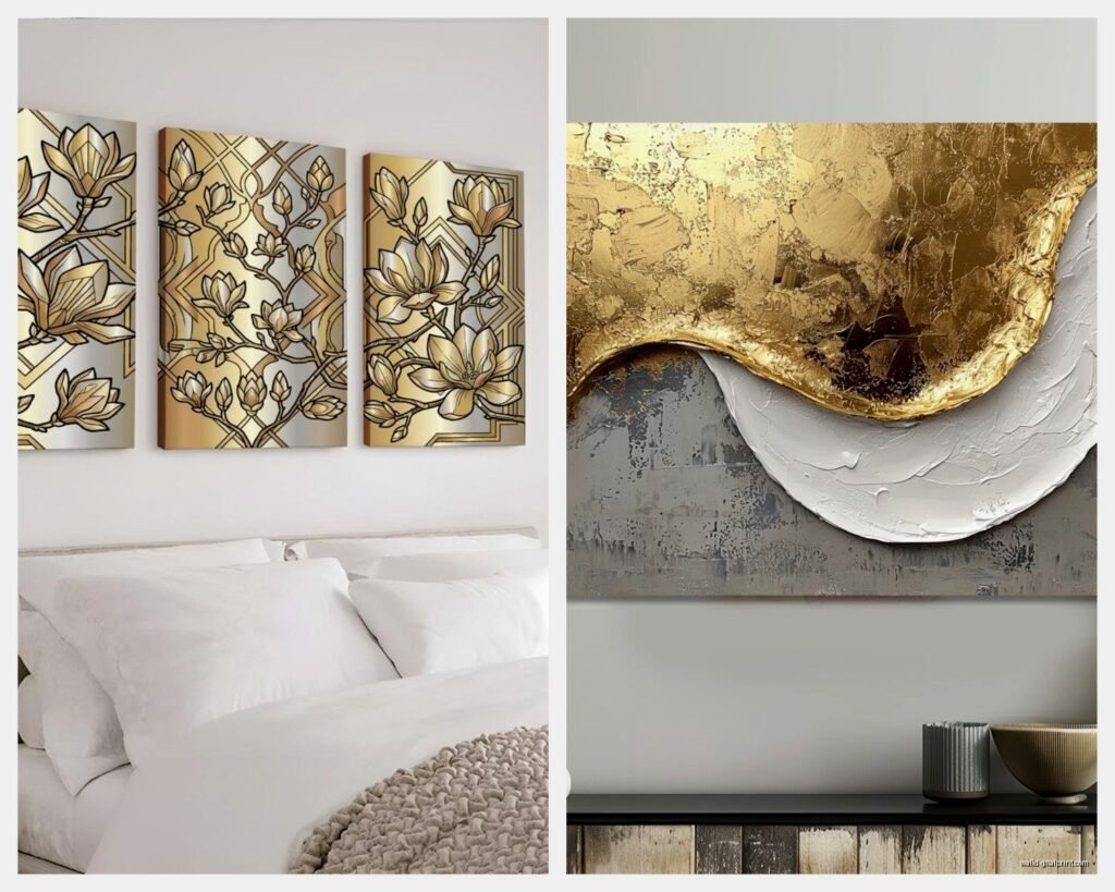
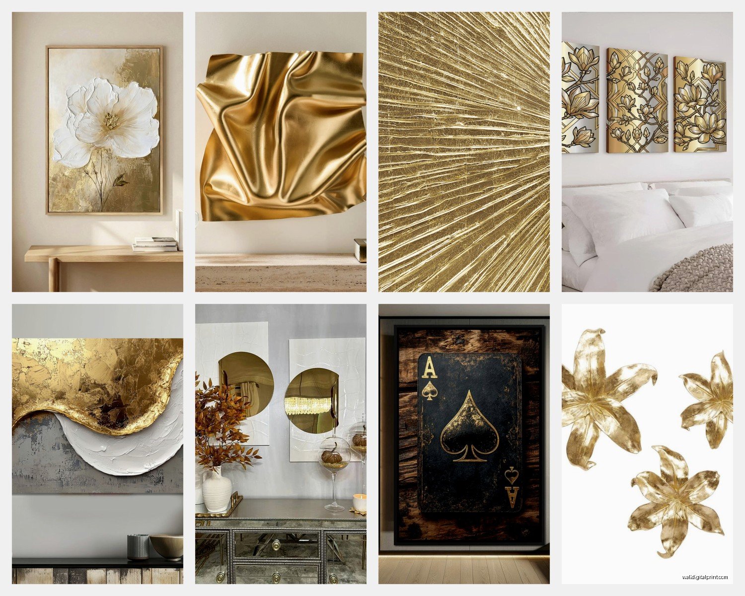
So white walls are tricky because the TYPE of white matters so much. Cool whites (the ones with blue undertones) work better with white gold or even rose gold. Warm whites (cream, ivory, those Benjamin Moore colors everyone uses) need yellow or champagne gold or else it looks weirdly mismatched.
I did a whole townhouse last year where the client insisted on bright white walls – like pure white – and we used white gold leafed pieces with just hints of yellow gold detail. Looked super modern and clean. But when I tried yellow gold on those same walls in the dining room it just looked… cheap? Like the gold was trying too hard.
Gray Walls Which Everyone Has Now
Gray is actually really forgiving with gold if you know the warm versus cool thing. My apartment is Agreeable Gray (yeah I’m basic) and I can use almost any gold except really orange-toned brass.

Cool grays – these are the ones that look almost blue in certain light – they love rose gold and white gold. I hung this rose gold geometric piece in a client’s bathroom that had cool gray walls and it was *chef’s kiss*. Yellow gold on cool gray can work but you need to balance it with warm wood tones or textiles otherwise the room feels confused.
Warm grays (greige basically) – champagne gold is your best friend here. Also yellow gold works great. I’ve got this vintage gilt mirror that’s very yellow gold and it looks amazing against greige because the undertones match.
Oh and another thing – if your gray has green undertones (some of those Farrow & Ball colors do this), be careful with rose gold. It can clash in a weird way that makes both colors look muddy.
Navy and Dark Blue Walls
Okay so this is gonna sound weird but navy is like the secret best background for gold art. Yellow gold on navy blue is such a classic combo – think traditional library vibes. The contrast is strong enough that the gold really pops but it doesn’t feel harsh.
I curated a show once where we had Hague Blue walls (Farrow & Ball, very deep) and we used all gold gilt frames with various artwork. The gold literally glowed against that blue. Rose gold also works here but it’s more subtle, more modern feeling.
White gold on navy is interesting – it’s very contemporary and a bit unexpected. Did this in a home office and the client was skeptical but it ended up looking really sophisticated.
Green Walls Because They’re Having a Moment
Green walls and gold is like… it just works on a fundamental level. Maybe because of the whole nature thing, I dunno. But here’s what I’ve found:
Sage green and lighter greens – champagne gold and rose gold are gorgeous here. Not too much contrast, very soft and elegant. I used this combo in a nursery and even though gold in a nursery sounds extra it was actually really sweet and calm.
Deep greens like emerald or forest – yellow gold all the way. This is where you can go really traditional with ornate gilt frames and it looks expensive and intentional instead of grandma’s house. The richness of both colors together is just…
My cat knocked over a plant onto one of my emerald green mood boards and honestly the dirt stain kinda helped me see how the color would look with less saturation – still worked with the gold samples I had pinned up which was good to know I guess?
Blush and Pink Walls
This combo needs a careful hand because it can go very teenage-bedroom very fast. Rose gold is the obvious choice but honestly it can be too matchy. I actually prefer champagne gold or even yellow gold with blush walls because the contrast in undertones creates more depth.
Did a powder room with dusty pink walls and this amazing yellow gold sunburst mirror and it was unexpected but really elevated the space. Rose gold would’ve been pretty but predictable.
The Lighting Situation That Changes Everything
Wait I forgot to mention – and this is SO important – your lighting completely transforms how gold reads in a space. Like completely.
Natural light makes gold look more true to color. North-facing light (cooler) will make warm golds look a bit more orange, south-facing light (warmer) makes everything look richer and more saturated.
I learned this when I installed this gorgeous champagne gold abstract piece in what I thought was perfect lighting, came back in the evening and it looked totally washed out under their LED bulbs. We switched to warmer temperature bulbs (2700K instead of their 3500K) and it looked right again.
Incandescent or warm LED bulbs (2700K-3000K) make gold look warmer and more yellow. Cool LED bulbs (4000K+) can make gold look greenish or just dull. If you’re using gold wall art you gotta use warm bulbs, there’s really no way around it.
Dimmer switches are also your friend because sometimes you want that gold to glow dramatically and sometimes you want it more subtle.
Mixing Different Gold Tones in One Space
Everyone asks me if they can mix gold tones and the answer is yes but carefully. The rule I use is pick one dominant gold (this is like 70% of your gold elements) and then accent with one other gold tone maximum.
Like in my living room I have mostly champagne gold – the main wall art piece, the coffee table legs, some decorative objects. Then I have a few rose gold accents in smaller pieces. It works because champagne is dominant and rose gold is just a whisper.
What doesn’t work is equal amounts of different golds all competing. I saw this in a client’s home before I worked with them – yellow gold chandelier, rose gold wall art, white gold frames, brass (which is its own thing) hardware. It was chaos. We edited down to mostly brass with some yellow gold accents and it immediately felt cohesive.
Brass Versus Gold Real Quick
Okay so brass is technically not gold but people confuse them all the time. Brass is more orange, more matte usually, more casual. Gold (gilt especially) is yellower, shinier, more formal.
You can mix brass and gold but they need to be separated enough in the space that they feel intentional. Like brass hardware on furniture and gold wall art works fine because they’re serving different purposes. Brass frame right next to gold frame looks like a mistake unless you’re doing a whole collected gallery wall thing where the variety is the point.
Pairing Gold Wall Art with Other Metallics
This comes up constantly. People want to know if they can have gold art and silver lamps or whatever.
The short answer is yes obviously people do it all the time. The longer answer is you need to be thoughtful about the ratio and the finish.
Gold and silver together can look really high-end if you do it right. I like keeping them in different finishes – like matte gold wall art with polished silver accessories. Or shiny gold gilt with brushed nickel. Mixing the finishes helps them feel like intentional choices instead of just random.
Gold and black metal (matte black is everywhere right now) is such a good combo. The black grounds the gold and keeps it from feeling too precious. I used this in a client’s dining room – gold abstract art with a matte black floating frame and black metal dining chairs. Very current but still warm.
Gold and copper is tricky because they’re both warm and can start to feel too orangey together. If you’re gonna do it, use cooler golds (champagne or white gold) with copper or make sure there’s enough contrast in the finishes.
Okay so funny story – I was watching The Great British Baking Show while working on a mood board for a client and they made this gold leaf dessert and I realized the way the gold looked against the white plate was exactly the vibe I needed for the client’s entryway. Ended up finding this perfect piece because of a TV show about cakes.
Size and Scale Stuff Nobody Thinks About
The amount of gold in a piece matters as much as the tone. Like a huge piece that’s entirely gold leaf is gonna read very differently than a piece with gold accents.
Large-scale gold pieces need the right wall color to not be overwhelming. I generally put big gold pieces on darker walls (navy, emerald, charcoal) because the contrast can handle it. Big gold on white can work but it needs to be the focal point of a pretty minimal room.
Smaller gold pieces or pieces with gold accents are more flexible. You can cluster them on lighter walls, mix them into gallery walls, put them in small spaces without it being too much.
I did this gallery wall in a stairwell where I mixed gold-framed pieces with gold-accented artwork and a few pieces with no gold at all. The overall effect read as golden but not overwhelming because no single piece was entirely gold.
The Gallery Wall Gold Ratio Thing I Figured Out
If you’re doing a gallery wall and want to include gold, I’ve found that about 30-40% gold elements is the sweet spot. Could be gold frames, could be artwork with gold in it, could be a mix.
More than 50% gold in a gallery wall starts to look like a gold wall that happens to have some art on it. Less than 20% and the gold feels random instead of intentional.
I literally tested this in my own hallway over like six months, kept adding and removing gold pieces until it felt balanced. My partner was so annoyed with all the nail holes but whatever, it was for research.
Specific Color Combos I Use All The Time
Let me just give you some tried-and-true combinations that I know work because I’ve used them multiple times:
Champagne Gold + Soft Gray + Cream
This is my go-to for clients who want something elegant but not too bold. The champagne gold adds warmth without being loud. Works in literally any room – bedrooms, living rooms, offices, whatever.
The key is keeping the contrast relatively low. You’re working with subtle variations in warm neutrals and the gold fits right in.
Yellow Gold + Navy + Crisp White
Classic and dramatic. The high contrast makes the gold really shine (literally). This works best in rooms with good natural light because the dark navy can make small spaces feel smaller.
I use this combo a lot in dining rooms and libraries. It’s got that traditional but not stuffy vibe.
Rose Gold + Blush + Gray
Okay I know I said earlier to be careful with rose gold on pink but when you add gray into the mix it works. The gray cools down the pink tones and the rose gold ties them together.
This is pretty feminine so it’s not for everyone but I’ve used it in bedrooms, dressing rooms, fancy bathrooms. It’s soft but sophisticated.
White Gold + Charcoal + Ice Blue
This is for people who want gold but like a modern, cool vibe. White gold is almost silver so it works with cool color palettes.
The ice blue keeps it from feeling too stark and corporate. I did a home office with this scheme and the client said it helped them focus better than their old beige office which… sure, maybe?
Champagne Gold + Emerald Green + Cognac Brown
Rich, warm, luxe. This is very jewel-tone library vibes. The brown (usually in leather furniture or wood tones) grounds everything and keeps it from being too saturated.
I’m gonna be honest, this is my favorite combo. I’ve used it in three different client projects and in my own space. It just works.
What Colors to Avoid with Gold Wall Art
Not everything works and I’ve learned this through some unfortunate mistakes.
Bright orange and gold – too much warm, it gets muddy and overwhelming. Unless you’re going for like a Moroccan or Indian-inspired vibe where that’s intentional, skip it.
Bright yellow and yellow gold – same issue, too similar in tone. It washes out and you lose the impact of both colors. If you want yellow in the space with gold, go for mustard or gold and use white gold or champagne gold instead.
Bright red and gold – can work if you’re going for a traditional Asian-inspired look or Christmas vibes, otherwise it’s a lot. Like A LOT. I tried this in a client’s space once and we ended up painting over the red within a month.