Wall Art Guide, Wall Art Tutoriels
Pink and Grey Wall Art: Feminine Neutral Soft Combo
Mar
So I’ve been working with pink and grey wall art combos for like three years now and honestly it’s one of those pairings that sounds super basic until you actually try to execute it and then you’re standing in your living room at 11pm holding up seven different prints wondering why nothing looks right.
Why This Combo Works (When It Actually Does)
The thing about pink and grey is that they’re both chameleons. Grey can read cold and corporate or soft and cozy depending on its undertone. Pink can go baby nursery or surprisingly sophisticated. I learned this the hard way when I ordered what I thought was a dusty rose print for a client’s bedroom and it arrived looking like straight-up bubblegum against her charcoal grey walls. We had to return it.
What actually makes this pairing successful is temperature matching. Your grey needs to have either a warm undertone (greige territory) or a cool blue undertone, and your pink needs to match that energy. Warm grey wants peachy pinks, dusty roses, terracotta-adjacent pinks. Cool grey wants blush with blue undertones, mauve, those almost-purple pinks.
The Ratios Nobody Tells You About
Okay so funny story, I did a whole gallery wall last year where I used equal amounts of pink and grey art and it looked like a Valentine’s Day display at Target. The ratio matters SO much.
What’s worked for me:
- 70% grey, 30% pink if you want sophisticated and grounded
- 60% grey, 40% pink for balanced but still clearly a “pink room”
- 50/50 only works if you introduce a third element (white, cream, black, gold)
- Going heavier on pink than grey gets tricky unless you’re doing a dedicated feminine space
I have one client who insisted on majority pink and we made it work by using really desaturated versions and a lot of white matting. But it took forever to source the right pieces.
Wall Color Context Changes Everything
This is gonna sound obvious but I see people mess this up constantly. If your walls are grey, you need your art to have enough pink to actually register as pink. I tested this in my own bedroom which has this grey with slight purple undertones, and any art piece that was too subtle just disappeared into the wall. You need contrast.
White or cream walls give you the most flexibility. You can go super soft with both colors or punch it up. Grey walls mean you gotta be intentional about your pink being saturated enough. Pink walls… honestly I usually steer people toward mostly grey art with pink accents if their walls are already pink, otherwise it’s too much.
Specific Pieces That Actually Work
I’m gonna share what I use repeatedly because I’ve tested a ridiculous amount of prints and most are disappointing in person.
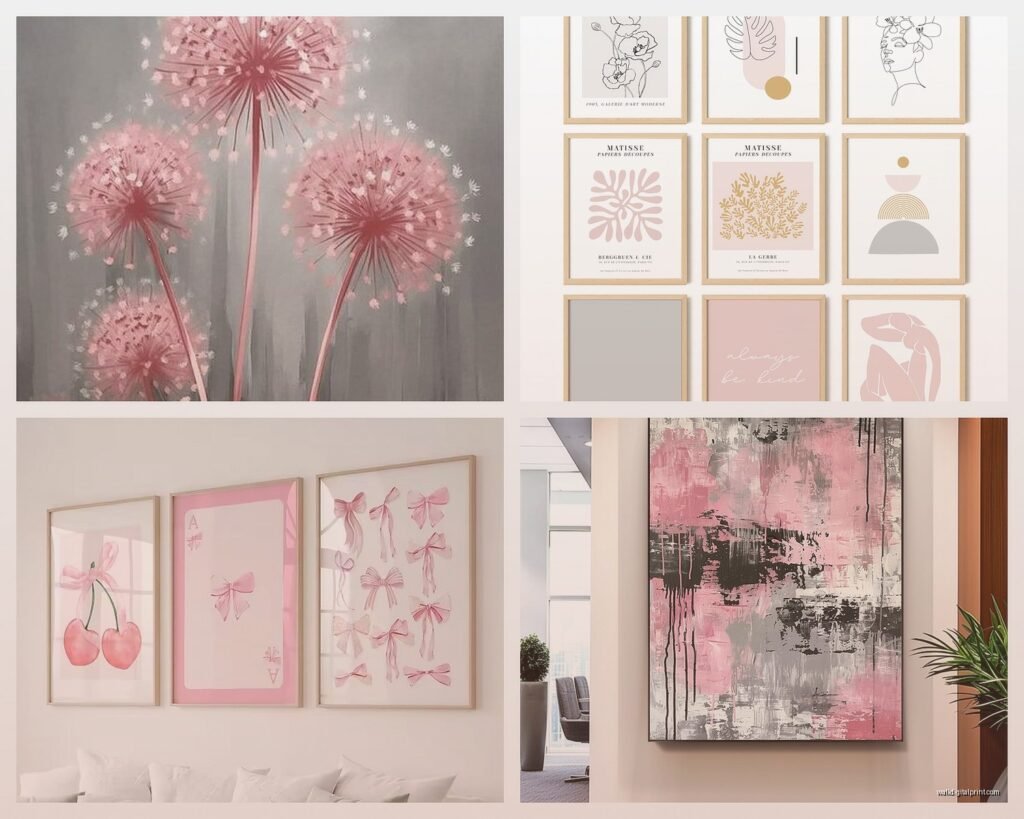
Abstract Watercolor Situations
Those fluid abstract watercolors in pink and grey are everywhere right now. The ones that actually look good have visible paper texture and multiple shades of each color, not just two flat tones. I learned this after ordering three different versions from different Etsy sellers. Two looked like printer paper with some pink blobs. The third had this beautiful gradation and you could see the water marks and pigment settling.
Look for pieces where the colors bleed into each other a little. That transition zone where pink becomes grey becomes white is what makes it sophisticated instead of craft-store-y.
Line Drawings with Color Blocks
There’s this whole category of minimalist line art with pink and grey geometric shapes or color blocking behind them. Super popular for Scandinavian-style spaces. What makes these work is restraint… the best ones have mostly white space with strategic pops of color.
I used a set of three above a client’s credenza last month. Simple black line drawings of faces with one pink circle and one grey rectangle per piece. Very graphic, very clean. Cost like $180 for all three framed which honestly wasn’t bad.
Marble and Agate Prints
Pink marble or agate prints with grey veining are basically foolproof if you want something a little more glam. The natural stone patterns give you built-in sophistication. Just make sure the pink isn’t too hot or neon… it should look like it could actually be a real stone even if it’s been color-enhanced.
Wait I forgot to mention, I have these in my office and my dog knocked one off the wall and the frame shattered but the print was fine so that was lucky. Anyway, these work especially well in spaces with metallic finishes like brushed nickel or rose gold.
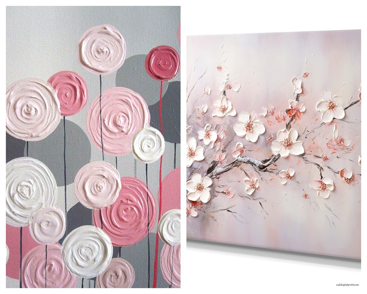
Botanical Prints
Vintage botanical illustrations with pink flowers on grey or greige backgrounds hit that sweet spot between feminine and studious. They work in so many contexts… I’ve used them in home offices, bedrooms, even a really elegant bathroom.
The key is finding ones where the grey is the dominant background color, not where pink flowers are just floating on white with a grey border. That reads totally different.
Framing Makes or Breaks This
Okay this is where I see people lose the sophisticated vibe they’re going for. Frame choice is critical with pink and grey because both colors are soft and can go saccharine fast.
What I default to:
- Thin black frames for maximum contrast and modern feel
- Light wood or bamboo frames if the space is warm-toned
- White frames only if your pink is very saturated, otherwise too matchy
- Brass or gold frames if you’re going glam (but these only work with cooler pinks and greys)
I almost never use grey frames with grey art even though it seems logical. It flattens everything. You lose definition. And pink frames are… I mean unless you’re doing a maximalist thing, probably skip them.
Mat Board Decisions
White mat board is your safest bet and creates breathing room around the art. I use it probably 80% of the time with this color combo. Grey mat board can work but it needs to be a shade or two lighter than the grey in your art, not darker. Pink mat board is almost always a mistake in my experience, just too sweet.

Oh and another thing, the width of your mat matters more than people think. I do at least 2.5-inch borders for anything smaller than 16×20. Skinny mats make pink and grey art look cheap somehow.
Gallery Wall Strategies That Don’t Look Chaotic
So I spent an entire Saturday morning once creating a pink and grey gallery wall while watching The Great British Bake Off and eating cereal, and I learned that you need an anchor system or it just looks scattered.
The Anchor Piece Method
Start with one larger piece that has both pink and grey in it. This is your anchor. Then build around it with smaller pieces that pull out either the pink OR the grey individually. Like one pink abstract, one grey botanical, one mixed piece. The anchor creates cohesion.
I did this in a client’s stairwell with a 24×36 abstract watercolor as the anchor (mostly grey with pink accents) and surrounded it with six smaller pieces in various combinations. It reads as intentional instead of “I bought random pink and grey things.”
The Diptych or Triptych Approach
If you don’t want a full gallery wall, multi-panel pieces in these colors are super effective. I’m obsessed with triptychs where the color shifts across the three panels… like left panel is mostly grey, middle is mixed, right is mostly pink. Creates movement and sophistication.
These work especially well above sofas or beds where you need to fill horizontal space. Just make sure the three panels are actually designed to go together, not just three random pieces you’re trying to force into a set.
Symmetrical Grid Layout
For people who get anxious about asymmetrical gallery walls (valid), a simple grid works beautifully with pink and grey. Four or six same-size frames in a geometric arrangement. Alternate your color dominance… top left is grey-heavy, top right is pink-heavy, etc.
The uniformity of the grid keeps it feeling organized even as colors shift between frames. I used this approach in a nursery once with 12×12 frames in a 2×3 grid and it was so clean and calming.
Mixing Styles Without It Looking Random
You can mix abstract with botanical with geometric with photography as long as you have a connecting thread. Usually that thread is your color palette (duh) plus one other element:
- All the same frame color/style
- All the same mat width and color
- All similar in tone (all soft, all bold, all vintage-feeling)
- All similar in their level of detail (all minimalist or all intricate)
I mixed a pink peony photograph with grey abstract brushstrokes with a pink and grey geometric print last year and it worked because they were all muted in saturation and all in identical black frames with white mats. The repetition of the framing treatment unified them.
Common Mistakes I See All The Time
Look, I’ve made most of these mistakes myself so this comes from a place of experience and minor trauma.
Going Too Pastel
Baby pink and baby grey together can read really juvenile unless you’re literally designing a baby’s room. If you want this combo to work in adult spaces, at least one of your colors needs some depth or saturation. Either a deeper charcoal grey or a more substantial dusty rose or mauve pink.
The super pale versions of both colors need a lot of texture or layering to keep them interesting. Flat pastel prints on pastel walls is gonna put people to sleep.
Ignoring Your Existing Textiles
Your art needs to work with your pillows, throws, rugs, curtains. I had a client buy a bunch of pink and grey art before I saw her space and when I got there, all her existing textiles were warm-toned beiges and terracottas. The cool-toned pink and grey art we’d selected clashed horribly.
We ended up returning everything and starting over with warmer versions of both colors. It was annoying but necessary. So like, look at what you already have before committing to specific shades.
Not Enough Contrast Between the Two Colors
If your pink and your grey are too similar in value (lightness/darkness), they’ll blur together from a distance. You need enough contrast for the colors to register as distinct. Either light pink with dark grey, or rich pink with light grey, or medium versions of both if there’s enough saturation difference.
I test this by taking a photo on my phone and converting it to black and white. If the colors look almost identical in grayscale, they’re too similar in value and won’t have enough pop in the actual space.
Forgetting About Lighting
Oh man, lighting changes everything with these colors. Grey can look totally different in warm vs cool lighting. Pink can look either fresh and pretty or weirdly orange depending on your bulb color temperature.
I always recommend people test their art in the actual space at different times of day before permanently hanging it. Natural daylight will show the truest colors. Warm incandescent bulbs will make grey look browner and pink look more coral. Cool LED bulbs will make both colors look bluer.
My own living room has terrible yellowy overhead lighting and I had to switch to 4000K bulbs to make my pink and grey art look right. Before that everything looked muddy and weird.
Print Quality Things Nobody Talks About
Not all prints are created equal and this matters especially with subtle colors like soft pink and grey.
Giclée vs Regular Prints
Giclée prints (fancy inkjet basically) have way better color accuracy and depth than standard poster-quality prints. The difference is really visible with pink… cheap prints can make pink look flat or slightly neon, while giclée gives you all those subtle tonal variations.
They cost more but for key pieces in your space, worth it. I use regular prints for smaller accent pieces and save the giclée quality for anything over 16×20 or anything that’s a focal point.
Paper Type and Texture
Matte paper is usually your best bet for pink and grey art because it doesn’t create glare and it has a softer, more sophisticated look. Glossy paper can make these colors look cheap and poster-like.
Textured papers (watercolor paper, cotton rag, linen texture) add so much richness to simple designs. I spilled tea on a print once (cool, very professional) and realized it was on this beautiful thick cotton paper that actually held up fine after I dried it. The texture is what made the piece special.
Canvas vs Framed Print
I’m gonna be honest, I rarely use canvas for pink and grey art unless it’s a really bold graphic design. Canvas wrap edges always show some of the image wrapping around and with soft colors it just looks unfinished to me.
Framed prints behind glass give you way more control over the final presentation and they protect the art better. Plus you can change the frame later if your style evolves, but you’re stuck with canvas unless you want to reorder the whole thing.
Where to Actually Find Good Pieces
Because “pink and grey wall art” on Amazon is gonna give you 10,000 results and 9,500 of them are terrible.