Wall Art Guide, Wall Art Tutoriels
Burgundy Wall Art: Deep Wine Red Maroon Rich Designs
Mar
So I’ve been working with burgundy wall art for like three years now and honestly it’s one of those colors that everyone thinks they want until they see it in their actual space and then panic, but lemme tell you how to actually make it work because I’ve dealt with this approximately a million times.
Understanding What Burgundy Actually Is In Your Space
Okay so first thing – burgundy isn’t just one color and this is where people mess up immediately. You’ve got your deep wine reds, your maroons that lean purple, your oxblood shades that are almost brown, and they all do completely different things on a wall. I had this client last month who ordered what she thought was burgundy art and it arrived looking practically brown in her north-facing living room. The lighting is EVERYTHING with these deep reds.
Here’s what I do – and this is gonna sound weird but it works – I take photos of burgundy art samples in different lighting conditions throughout the day. Morning light makes burgundy look more vibrant and red. Afternoon sun can wash it out or make it look muddy. Evening with warm lamps? That’s when burgundy really shines honestly. It gets this rich, almost glowing quality that lighter colors just don’t have.
The Undertone Situation Nobody Talks About
Burgundy has undertones and you gotta figure out which ones work with your existing stuff. Like:
- Purple-leaning burgundy works with cool grays, navy, silver accents
- Brown-leaning maroon pairs better with warm neutrals, gold, cream
- True wine red needs some breathing room and works with both but commits to neither
I learned this the hard way when I curated a gallery show last year and put purple-burgundy pieces next to warm beige walls and it looked… not great. The undertones were fighting each other the whole time.
Pairing Burgundy Art With Wall Colors
This is where it gets interesting because burgundy is dark enough that it actually creates its own color story on whatever wall you put it on.
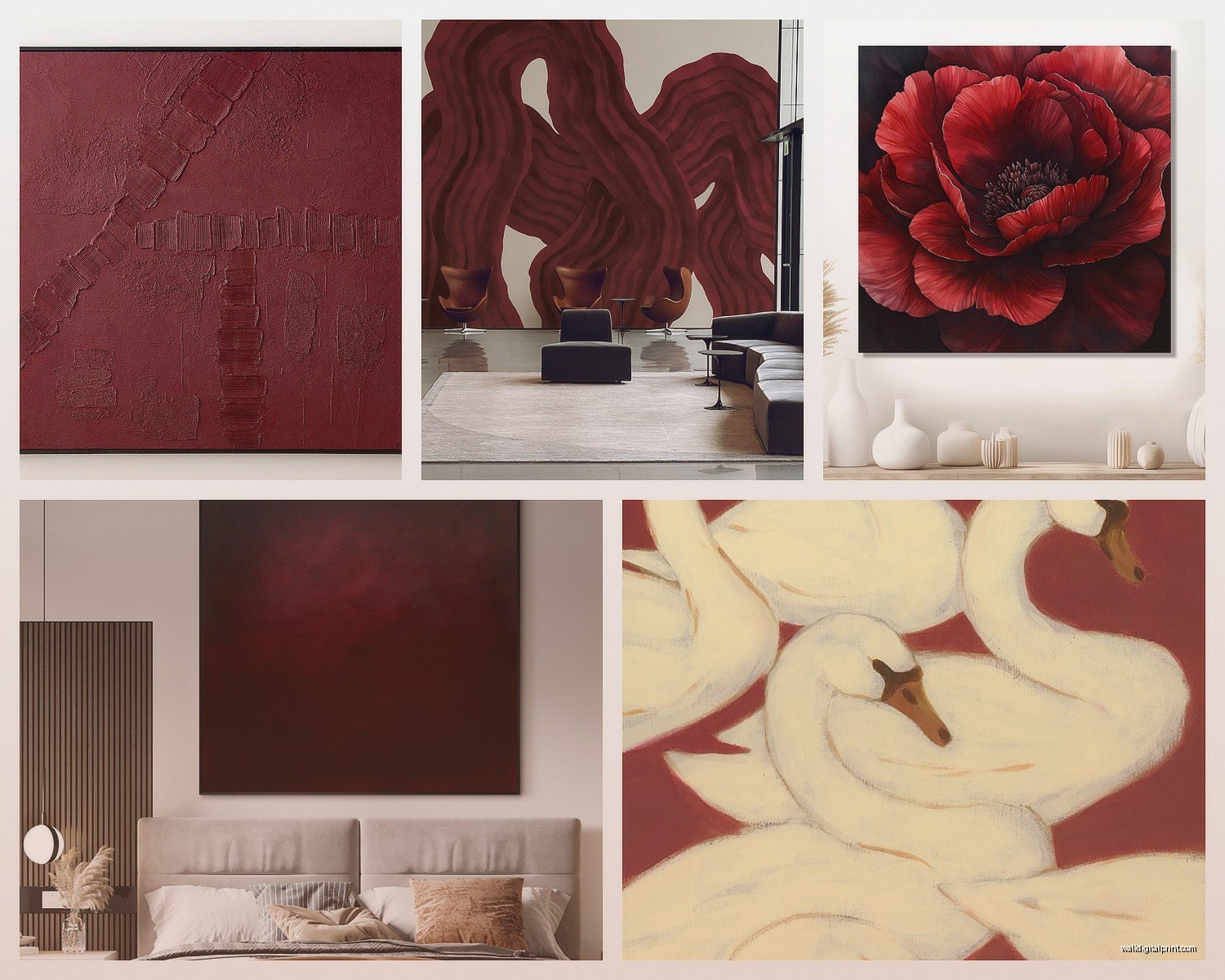
White or cream walls: This is the safe choice but also kind of the best choice? Burgundy pops like crazy against white. It looks intentional and gallery-like. I use this combo in probably 60% of my client projects because it just works. The art becomes the focal point immediately and you don’t have to overthink it.
Gray walls: Okay so gray with burgundy is chef’s kiss IF you get the right gray. Cool grays make burgundy look more sophisticated and modern. Warm grays (greige territory) can make it look dated if you’re not careful. I’d stick with something in the Benjamin Moore Stonington Gray range – it’s cool enough to let burgundy shine but not so cool that the room feels cold.
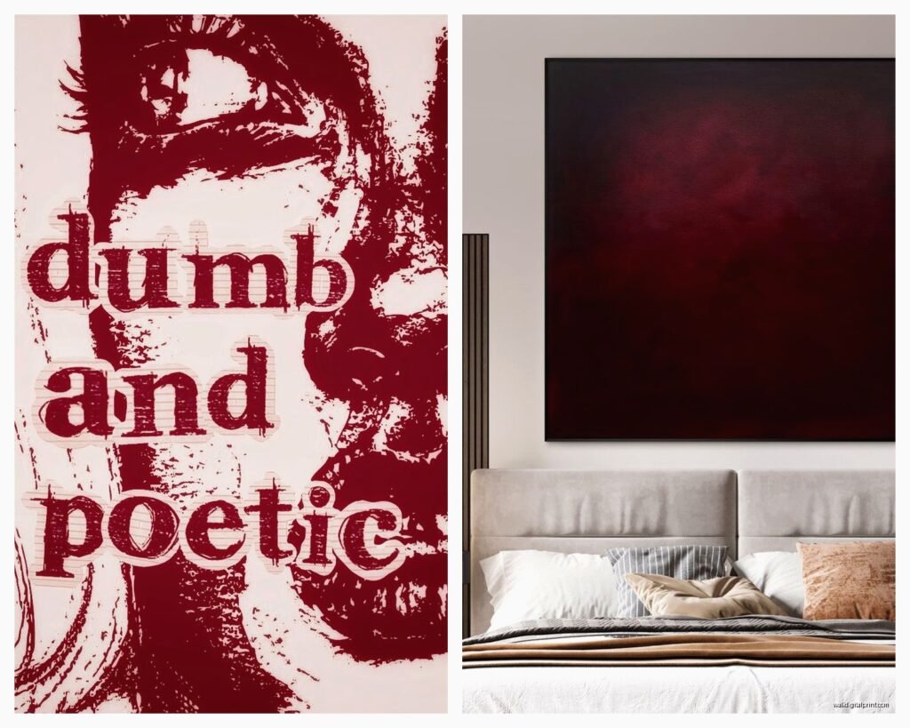
Navy or dark walls: This is my personal favorite but it’s risky. Dark on dark only works if you have really good lighting – both natural and artificial. The burgundy art needs to have enough contrast within the piece itself (like lighter elements or metallic accents) or it’ll just disappear into the wall. But when it works? It’s so dramatic and moody in the best way.
Beige or tan: Gonna be honest, this usually looks like a 90s hotel lobby unless you’re very deliberate about it. If your walls are beige, make sure your burgundy leans brown rather than purple, and add in some modern elements elsewhere in the room so it doesn’t feel stuck in time.
Size and Placement Strategy
Oh and another thing – size matters SO much with burgundy because it’s such a heavy color visually. A tiny 8×10 burgundy print is gonna look sad and random. You need some presence.
For a standard living room wall (let’s say 10-12 feet wide), I usually recommend:
- One large piece: 36×48 inches or bigger
- A gallery wall with the largest piece being at least 24×36
- A triptych where the total width is at least 60 inches combined
I made the mistake early in my career of putting these delicate little burgundy watercolors in a client’s dining room and they just got lost. We ended up replacing them with one massive burgundy abstract and the whole room came together.
The Eye Level Rule (That I Actually Follow)
Center your burgundy art at 57-60 inches from the floor to the center of the piece. This is standard gallery height and it actually works in homes too. I see so many people hang art way too high and then wonder why their room feels off. Your eye should naturally land on the art when you walk in, not on the wall space below it.
What Styles Actually Work In Burgundy
Not every art style translates well to burgundy tones and I’ve seen some disasters, so here’s what I’ve found actually works:
Abstract geometric: Yes yes yes. Burgundy geometric art feels modern and intentional. The clean lines keep it from feeling too heavy or traditional. I just finished a project where we used burgundy and gold geometric prints and it looked expensive even though the art was pretty affordable.
Floral: This can go either way. Realistic burgundy florals can feel very traditional grandmother-vibes. But stylized or abstract florals in burgundy? Those work great, especially in bedrooms. There’s something romantic about deep red flowers that isn’t too sweet.
Landscape/nature: Burgundy sunsets, wine country scenes, autumn landscapes – these are safe choices but can feel a bit predictable. They work best in dining rooms or wine cellars (if you’re fancy enough to have one of those).
Typography/quotes: Usually no. Burgundy text on white or vice versa often looks too corporate or motivational-poster-ish. Unless you find something really well-designed, I’d skip this category.
Marble or stone textures: Surprisingly good! Burgundy marble or agate prints have this luxe quality that works in bathrooms, entryways, or even kitchens. The natural variation in the stone pattern keeps it interesting.
Mixing Burgundy With Other Art Colors
You can’t just throw burgundy art on a wall by itself and call it done – well you can, but it’s better with friends. Here’s what plays nicely:
Gold and burgundy is probably the most classic combo and there’s a reason it’s everywhere. The warmth of gold balances the depth of burgundy. I use this in formal spaces like dining rooms or home offices where you want that established, sophisticated vibe. My cat knocked over a burgundy and gold print last week and I literally bought the same one again because the combo is that good.

Blush pink or dusty rose with burgundy creates this really interesting feminine-but-not-girly situation. Works amazing in bedrooms or dressing areas. The lighter pink keeps the burgundy from feeling too dark and heavy.
Navy and burgundy together is preppy in a modern way. Add some brass accents and white matting and you’ve got a whole east coast sophistication thing happening.
Cream or ivory is your neutral friend that goes with literally any shade of burgundy. When in doubt, add cream elements to your burgundy art collection – either in the art itself or through matting and frames.
What Doesn’t Work (From Experience)
- Burgundy with bright orange – just looks like fall decor year-round
- Burgundy with bright yellow – too much contrast, feels chaotic
- Burgundy with emerald green unless you’re going for a Christmas vibe
- Burgundy with black in small spaces – too dark, too heavy, too much
Frame Selection That Actually Matters
Okay so funny story – I once spent like two hours explaining to a client why her $500 burgundy art piece looked cheap and it was 100% the frame. The art was beautiful but she’d put it in this thin black plastic frame from a big box store and it just… killed the whole thing.
For burgundy art, you want frames that either complement or contrast intentionally:
Gold or brass frames: Classic, elegant, makes burgundy look expensive. Go for it if your space is traditional or glam. Even thin gold frames work if the art is modern.
Dark wood frames: Walnut, espresso, cherry wood – these create a cohesive, rich look with burgundy. Good for traditional or transitional spaces. They add weight and importance to the piece.
White or cream frames: Creates contrast and keeps things light. This is my go-to for smaller spaces or when I want the burgundy to pop without overwhelming the room.
Black frames: Can work but be careful – black plus burgundy gets heavy fast. I only use black frames with burgundy art if there’s white matting involved or if the piece has a lot of lighter elements in it.
No frame (canvas): Gallery-wrapped canvas in burgundy looks modern and casual. Works great for abstract pieces or when you want a more relaxed vibe.
Lighting Your Burgundy Art
Wait I forgot to mention – lighting can make or break burgundy art and I cannot stress this enough. I’ve literally had clients text me photos like “why does this look brown now” and it’s always the lighting.
Picture lights or track lighting aimed directly at burgundy art brings out the red tones and creates dimension. Without direct lighting, burgundy can look flat and muddy, especially in rooms without great natural light.
Warm LED bulbs (2700-3000K) make burgundy look rich and inviting. Cool LED bulbs make it look purple or dull. I switched all my client’s bulbs once and the art looked completely different – way better.
If you’ve got a dark wall with burgundy art, you absolutely need dedicated art lighting. The dark-on-dark situation needs that extra illumination or the art just disappears after sunset.
Where To Actually Use Burgundy Art
Living rooms: Above the sofa is classic for a reason. Burgundy adds warmth without being as aggressive as bright red. It makes the space feel grounded and collected.
Dining rooms: Perfect spot for burgundy because it’s sophisticated and appetite-friendly. Wine-themed burgundy art is almost too on-the-nose but people love it anyway.
Bedrooms: Burgundy creates this cozy, intimate vibe that works great in bedrooms. Just don’t go too dark with it – balance with lighter bedding and good lighting or it’ll feel like a cave.
Home offices: Burgundy reads as professional and established. It’s assertive without being aggressive like bright red would be. Pairs well with leather furniture and dark wood desks.
Entryways: Makes a statement immediately. One large burgundy piece in an entryway sets the tone for the whole house. Just make sure your entryway has decent lighting.
Bathrooms: Okay this might sound weird but burgundy marble or agate prints look really luxe in bathrooms, especially powder rooms. It’s unexpected and fancy.
Where I’d Skip It
Kitchens usually – unless you have a very specific traditional or wine-country aesthetic going on. Burgundy in kitchens can feel dated. Kids’ rooms – too sophisticated and dark for most children’s spaces. Basements with no windows – burgundy needs some light to look good, otherwise it’s just dark and depressing.
Shopping Tips From Someone Who’s Bought A Lot Of This Stuff
Order samples or swatches if possible because burgundy varies SO much between screens and real life. What looks like a beautiful wine red online might show up as brown-maroon in person.
Read the reviews specifically about color accuracy. If multiple people mention the burgundy looking different than expected, believe them.
Check return policies before buying because you might need to send it back if the color doesn’t work in your space. This isn’t a failure – burgundy is just tricky.
Consider print-on-demand services where you can customize the size. Sometimes the perfect burgundy art exists but not in the right dimensions for your wall.
Mix price points – you don’t need to spend a fortune on every piece. I usually do one investment piece (original art or high-quality giclée print) and then fill in with more affordable prints that complement it. Nobody can tell which is which once they’re all on the wall together anyway.
Look for artists who specialize in rich, deep colors. They understand how to create dimension and interest within dark color palettes. Burgundy art from someone who usually works in pastels often falls flat.
Honestly burgundy wall art is one of those things that seems intimidating but once you understand the basics it’s not that complicated. Just remember the lighting thing because that’s where most people mess up, and don’t be afraid to go bigger than you think you should with the size. Burgundy art needs presence to work properly and tiny pieces just look like an afterthought.