Wall Art Guide, Wall Art Tutoriels
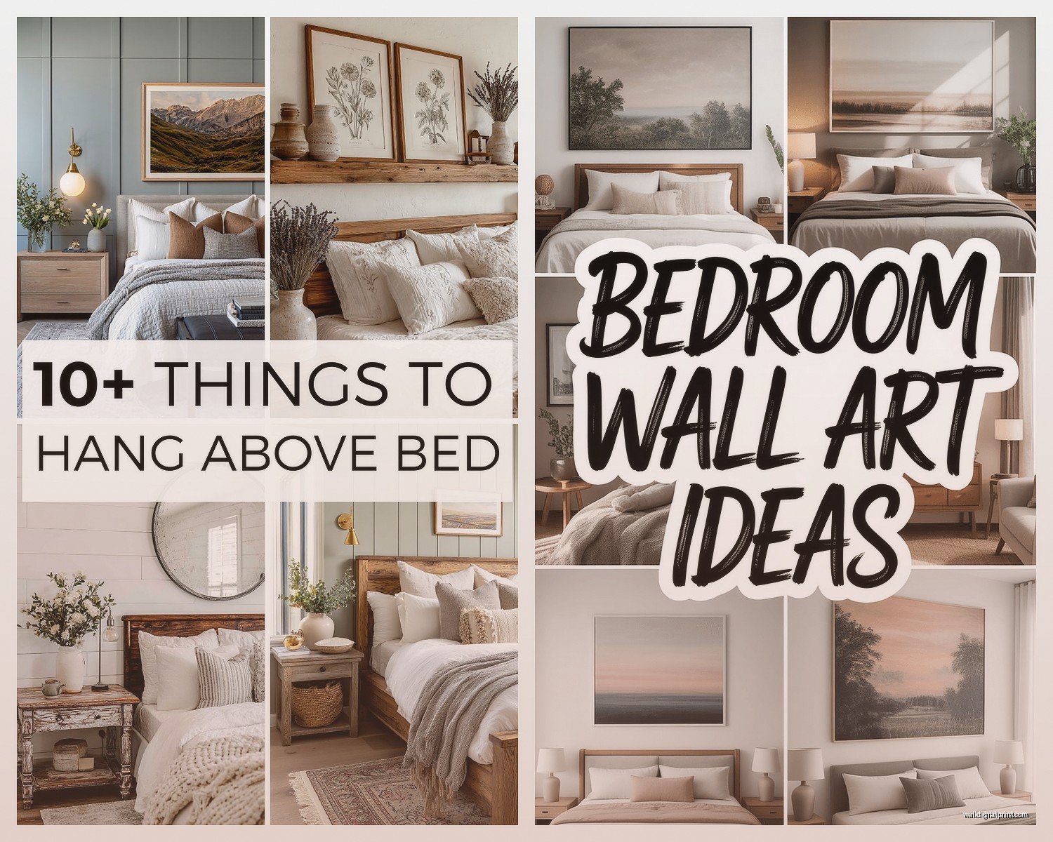
Master Bedroom Wall Art Above Bed: Headboard Focal Points
Apr
So I’ve been staring at bedroom walls for like 15 years now and the whole “what goes above the bed” question still trips people up constantly. Just last week my neighbor texted me a picture of three different art pieces asking which one and honestly none of them were gonna work with her headboard situation.
The thing nobody tells you is that the headboard and the art above it need to have this whole relationship going on. It’s not just slapping something on the wall because there’s space there. I learned this the hard way in my own master bedroom where I hung this gorgeous abstract piece that I LOVED but it completely disappeared behind my tufted headboard because the colors were too similar and the scale was all wrong.
Getting the Scale Right First Because Everything Else Depends On It
Your art should be roughly two-thirds to three-quarters the width of your headboard. Not the bed, the headboard specifically. I see people measuring their mattress width and that’s gonna give you art that’s way too big. My king bed has a 78-inch wide headboard and I used a 50-inch wide piece above it which hits that sweet spot.
If you’ve got a really tall headboard situation—like those dramatic floor-to-ceiling upholstered ones—you actually want to go wider rather than trying to fill the vertical space. Sounds counterintuitive but trust me. I worked with a client who had this 6-foot tall headboard and we went with a horizontal triptych that was 60 inches wide and only 24 inches tall. Looked absolutely perfect.
The Hanging Height Thing That Everyone Gets Wrong
Hang your art 6 to 12 inches above the top of your headboard. Not above your mattress, above the actual headboard. This is where people mess up constantly because they’re thinking about standard wall art rules which say center the art at 57 inches from the floor or whatever. Forget that entirely for above-bed situations.
I’ve found that 8 inches is the magic number for most setups. Less than 6 inches and it looks like the art is trying to sit ON the headboard. More than 12 inches and there’s this awkward gap that makes everything feel disconnected. My own setup is at exactly 8.5 inches and I measured it like four times before committing because I’d already put holes in the wall twice before.
Material Choices That Actually Work With Headboards
Okay so this is where it gets interesting because the material of your headboard completely changes what art materials work best above it.
Upholstered or Fabric Headboards
These are everywhere right now and they’re actually the easiest to work with. The soft texture means you want something with visual weight to contrast it. I’m talking:
- Framed canvas with a substantial frame—at least 2 inches wide
- Metal wall sculptures that have dimension
- Heavily textured acrylic pieces
- Photography in black frames creates really nice contrast
What doesn’t work is anything too delicate or wispy. I tried hanging this beautiful watercolor above my velvet headboard and it just got completely overwhelmed by all that fabric texture. Moved it to my office and put a bold abstract with thick brushstrokes in the bedroom instead.
Wood headboards are trickier because you’re dealing with an existing strong texture and color. If you’ve got a dark wood headboard you actually want lighter art to create separation. I worked on a bedroom last month with a reclaimed wood headboard and we used a large-scale black and white photograph in a simple white frame. The contrast was chef’s kiss.
For lighter wood like oak or pine you have more flexibility. Can go darker, can go colorful. Just avoid anything with a similar wood tone in the frame because it’ll blend together and look muddy.
Metal Headboards
These are having a moment again—very 2000s nostalgia or whatever—and they need art with substance. The metal is so linear and geometric that you want something organic to balance it out. Abstract florals work surprisingly well. So do landscape photographs.
What I wouldn’t do is metal art above a metal headboard unless you’re going for a super industrial look. And even then it’s risky. Saw someone try brass wall sculpture above a brass bed frame and it was just… too much metal happening.
Color Coordination Without Making It Boring
This is where people either play it too safe or go completely rogue. You don’t need your art to match your bedding exactly—that’s actually pretty dated looking—but you do want some kind of color conversation happening.
I use the 60-30-10 rule but loosely. Your dominant bedroom color should appear somewhere in the art but doesn’t need to be the main event. Like my bedroom is mostly grays and whites with navy accents. My wall art is this abstract piece that’s primarily rust and cream with small navy elements. The navy ties it together without being matchy-matchy.
Oh and another thing—if your headboard is a bold color or pattern, your art needs to be simpler. Patterned headboard plus busy art equals visual chaos. I curated a show last year where someone had a floral print headboard and wanted floral art above it and I had to gently talk them out of that situation.
When Your Headboard IS the Statement
Sometimes you’ve got a headboard that’s already doing a lot—carved wood, tufted velvet, cane detailing, whatever. In those cases your art should be more minimal. This is actually harder to execute than it sounds because minimal doesn’t mean boring.
I’m thinking solid color abstracts, simple line drawings, or even a large mirror which technically isn’t art but creates a focal point without competing. Used a 40-inch round mirror above an ornate carved headboard for a client and it was perfect because it reflected light without adding more visual complexity.
Practical Materials That Hold Up in Bedrooms
Nobody talks about this enough but bedrooms are actually kind of rough on art. You’ve got humidity from showers if you have an ensuite, temperature fluctuations, sometimes direct sunlight depending on your windows.
Canvas prints hold up really well and they’re affordable. I’m not talking about those cheap ones from big box stores that look pixelated up close—get proper giclée prints on canvas. They’re durable, don’t need glass which means less glare, and if you bump them with a pillow or something they’re not gonna shatter.
Framed prints under glass are classic but make sure you’re using UV-protective glass if you get any direct sun. Regular glass will let your art fade over time. Found this out the hard way with a print I loved that basically lost half its color intensity in two years.
Metal prints are having a moment and honestly they’re great for bedrooms. Waterproof, durable, modern look. The colors are super vibrant. Only downside is they can be reflective so if you have a lamp that shines directly on them you’ll get glare.
Texture Options That Add Dimension
Woven wall hangings are everywhere on Instagram for above-bed situations and they CAN work but you gotta be careful. They collect dust like crazy—I have to vacuum mine with the brush attachment monthly. Also if your bedroom is humid they can get weird and musty.
Macramé specifically needs to be a certain scale to work above a bed. Too small and it looks like you hung a plant hanger on your wall. Too big and it overwhelms everything. I’d say minimum 30 inches wide if you’re going this route.
Wood wall art—the kind that’s like geometric wood pieces arranged on a backing—is surprisingly practical. Easy to dust, adds warmth, works with almost any headboard material. Just make sure it’s sealed properly so it doesn’t warp with humidity changes.
The Multi-Piece Situation
Okay so instead of one large piece you might be thinking about multiple smaller pieces. This works but you need a plan. Can’t just randomly scatter frames up there.
Gallery wall above the bed is technically possible but it’s way harder to pull off than people think. You need odd numbers—three or five pieces usually—and they should share some unifying element. Same frames, same color palette, same subject matter, something.
I did a three-piece setup in my guest room with botanical prints in matching black frames. Hung them in a horizontal row with 4 inches between each piece. The whole arrangement was 54 inches wide and looked like one cohesive piece from a distance.
Diptych or triptych where it’s clearly meant to be multiple panels is easier because they’re designed to go together. Just make sure you’re spacing them correctly—usually 2 to 4 inches apart depending on the size. Closer spacing for smaller pieces, wider spacing for larger ones.
Leaning vs Hanging
Wait I forgot to mention—if you have a wide headboard with a flat top you can actually lean art on it instead of hanging it on the wall. This only works with certain headboard styles obviously but it’s super easy to change out and you don’t put holes in your wall.
I did this in my own bedroom for a while when I couldn’t decide what I wanted permanently. Leaned a 30×40 inch framed print against the wall on top of my headboard. Just make sure whatever you’re leaning is secure and not gonna slide off if someone bumps the bed. I used those museum putty dots on the bottom corners.
Budget Reality Check
You don’t need to spend a fortune on above-bed art. Like you really don’t. Some of my favorite bedroom art installations have used affordable options.
Printable art from Etsy can look really high-end if you get it properly printed and framed. I’m talking about downloading a digital file for like $8, getting it printed at a local print shop on quality paper for maybe $30, then framing it yourself. Total cost under $100 for something that looks custom.
Thrift store art is hit or miss but I’ve found some amazing pieces. My sister found this huge abstract painting at Goodwill for $12 that’s now the centerpiece of her master bedroom. Just needed the frame painted black and it looks like it cost hundreds.
DIY is also totally viable if you’re into that. Abstract art especially—you can make something that looks professional with acrylic paint and a large canvas. I made my own for my first apartment and honestly it was better than some stuff I’ve seen people spend $500 on.
When to Actually Invest
That said, if you’re gonna splurge on art anywhere in your house, above the bed is actually a smart choice because you see it every single day. First thing when you wake up, last thing before sleep. It should be something you genuinely love.
I invested in an original piece for above my bed three years ago—paid way more than I normally would—and I’ve never regretted it. It makes me happy every morning which sounds cheesy but it’s true.
Lighting Makes or Breaks Everything
Your art needs proper lighting or it’s basically pointless. Natural light is great but inconsistent. I added picture lights above my bed art and it completely transformed the whole situation.
Battery-operated picture lights are genius if you don’t want to deal with wiring. They last like six months on one set of batteries and you can adjust the angle to avoid glare. Cost about $30-40 for decent ones.
Or if you have overhead lighting make sure it’s positioned to illuminate the wall. My bedroom has two reading sconces on either side of the bed that also wash light up the wall which highlights the art perfectly.
What Doesn’t Work Above Beds
Gonna save you from some mistakes here. Mirrors directly above the bed feel weird to most people—you’re staring up at yourself which is just odd. Also feng shui people hate it apparently though I’m not super into that whole thing.
Anything too busy or chaotic isn’t great because your bedroom should be calming. I tried a really intense colorful abstract above my bed once and it was actually kind of stressful to look at before sleep. Moved it to my dining room where the energy made more sense.
Heavy sculptural pieces make me nervous above beds from a safety standpoint. Like yes it’s probably fine if installed correctly but do you really want to worry about that? I stick to lighter materials above sleeping areas.
Personal photos of yourself in your own bedroom is a vibe I personally can’t get behind but you do you I guess.
Okay I think that covers most of it. The main thing is just make sure your art relates to your headboard in size and doesn’t fight with it visually. And hang it at the right height because that makes or breaks the whole thing. If you send me a pic of your setup I can give you specific feedback but these guidelines should get you like 90% of the way there.