Wall Art Guide, Wall Art Tutoriels
Earth Tone Wall Art: Natural Brown Beige Green Palette
Mar
So I’ve been totally obsessed with earth tone wall art lately and honestly it started because I was helping this client redo their living room and they were like “I want it to feel natural but not like… cabin-y?” and that’s when I fell down this whole rabbit hole of brown, beige, and green palettes.
Why Earth Tones Actually Work
Okay so here’s the thing about earth tones that nobody really talks about – they’re basically foolproof if you understand the undertones. Like, you can’t just throw any brown with any green and call it a day, but once you get the system it’s actually way easier than trying to match like… jewel tones or whatever.
The key is thinking about where these colors exist in nature together. Browns and beiges from soil, sand, tree bark. Greens from leaves and moss. They already go together because they literally exist together outside. Your job is just to pick the right “season” basically.
Warm vs Cool Earth Tones
This is gonna sound weird but I literally keep paint swatches in my bag now because I got burned so many times ordering art online that looked perfect and then showed up looking completely wrong.
Warm earth tones have yellow or orange undertones – think terracotta, burnt sienna, golden beige, olive green. These work amazing in rooms with warm lighting or if you’ve got wood floors with those honey or orange tones.
Cool earth tones lean gray or blue – taupe instead of beige, sage green instead of olive, cooler browns that almost look like they have a hint of purple. These are better if you’ve got cooler lighting or gray-toned flooring.
I made the mistake once of putting a beautiful warm-toned abstract with lots of burnt orange and golden beige in a room with cool gray walls and white oak floors and it just looked… off. My cat knocked it off the wall two weeks later and honestly I wasn’t even mad because I needed to replace it anyway.
Picking Your Dominant Color
You gotta start with one dominant color and let the others support it. This is where people mess up – they try to do equal parts brown, beige, and green and it ends up looking muddy.
If brown is your dominant: You want deep, rich browns as the main focus. Think about art that has brown as like 50-60% of the piece. Then bring in beige as a lighter accent (maybe 20-30%) and green as little pops (10-20%). This creates really grounding, cozy spaces. Works great in bedrooms or studies.
If beige is your dominant: This is actually my favorite approach because it keeps things light but still earthy. Your art should be mostly beige/cream/tan with browns adding depth and greens adding life. This is perfect for smaller spaces or rooms that don’t get a ton of natural light because it won’t make the room feel dark.
If green is your dominant: Okay so this one’s tricky because green can go wrong fast. You want muted greens – sage, olive, moss, eucalyptus. Not bright grass green or emerald. The browns and beiges should ground the green and keep it from feeling too… I dunno, garden center-y?
Actual Patterns and Styles That Work
I spent like three hours last Tuesday just scrolling through art sites because my client canceled and honestly it was kinda therapeutic. Here’s what actually looks good:
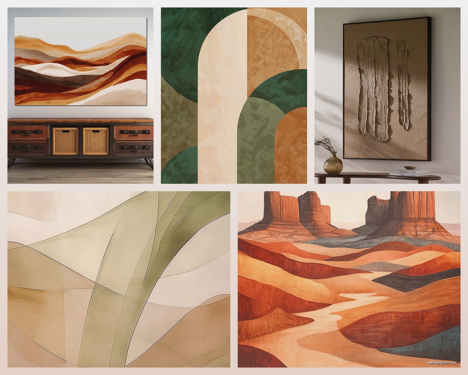
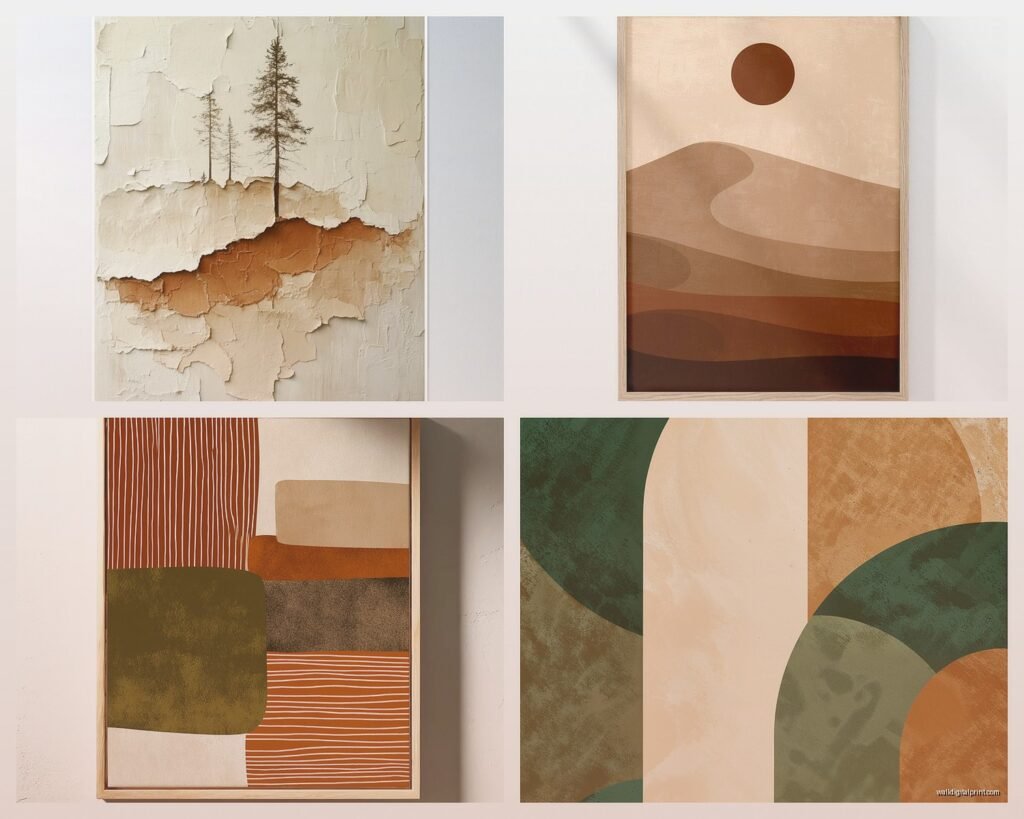
Abstract Organic Shapes
These are everywhere right now and for good reason. Think blobby, flowing shapes in your earth tone palette. They feel modern but natural at the same time. Look for pieces where the shapes overlap and create different tones – like a light beige background with brown and green organic forms layering over each other.
The key is making sure the shapes feel hand-drawn or painted, not too geometric. You want it to feel like it could be rocks or leaves or clouds, not like circles and squares.
Botanical Line Drawings
Simple line drawings of leaves, stems, branches in brown or dark green on beige backgrounds. These are super versatile and work in literally any room. I have one in my bathroom and one in my home office and they tie everything together.
Pro tip – get these in a warm brown ink rather than black if you’re going full earth tone. Black can feel too harsh against soft beiges and greens.
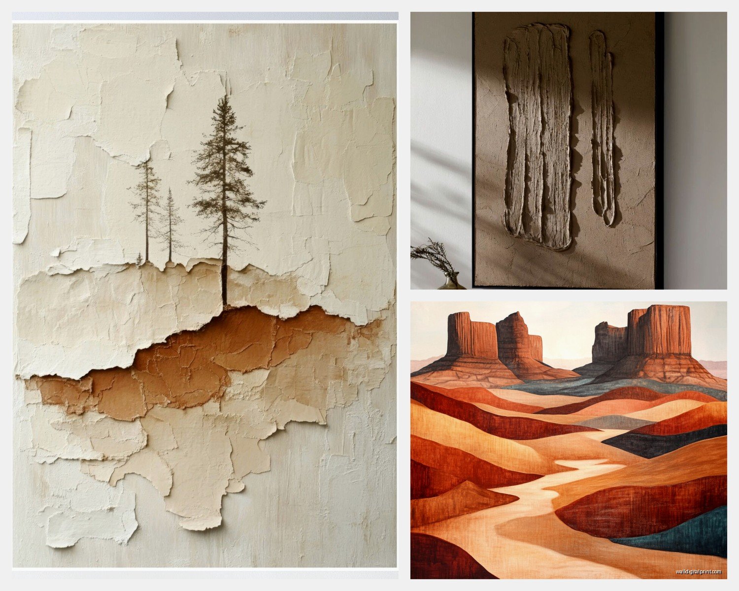
Landscape Photography or Prints
Desert scenes, forests, fields, sand dunes. But here’s what you need to watch for – make sure the photo has been edited or printed with a cohesive color palette. You don’t want random bright blue sky or super saturated greens throwing off your whole vibe.
I found this amazing print of sand dunes that was basically just gradients of beige to brown and it’s probably my favorite piece in my apartment. Cost like $40 framed.
Textured Neutrals
Sometimes the best earth tone art isn’t even obviously “art” – it’s textured pieces that play with different shades of brown and beige through material rather than color. Think woven fiber art, canvas with raised texture, or even those trendy clay relief pieces.
Size and Placement Strategy
Okay so this matters more than people think. Earth tones are subtle, which means if your piece is too small it’s just gonna disappear into your wall.
For a standard living room wall (like 10-12 feet wide), you want your main piece or gallery wall to take up roughly 2/3 to 3/4 the width of your furniture below it. So if you’ve got an 8-foot sofa, your art should span about 5-6 feet.
Single large pieces (like 40×60 inches or bigger) work great with earth tones because they create impact even with subtle colors. I actually prefer one large earth tone piece over a gallery wall sometimes because the colors can speak for themselves without competing.
Gallery Wall Approach
If you’re doing a gallery wall – and this is something I literally just figured out last month – stick to a maximum of three different mat/frame colors. Like maybe natural wood, black, and white. Or all natural wood in different tones.
Mix your sizes but keep your spacing consistent. I use 2-3 inches between frames. And here’s the thing… with earth tones you can actually mix different styles more easily than with bright colors. A botanical print next to an abstract brown piece next to a beige landscape photo? Totally fine because the color palette unifies them.
Lighting Makes or Breaks This
Oh and another thing – lighting is SO important with earth tones. These are subtle colors and they can look completely different depending on your light.
Warm white bulbs (2700-3000K) make browns and beiges glow and feel rich. They’re perfect if you want that cozy, grounded vibe. This is what I use in bedrooms and living rooms.
Daylight bulbs (5000K+) can make earth tones look washed out or gray. Not terrible, just different. More modern and crisp. Better for offices or kitchens maybe.
Natural light is obviously ideal but watch for afternoon sun – it can fade browns and greens over time. I learned this the hard way with a print I had in my old apartment right across from a west-facing window. After a year it looked completely different.
Picture Lights
If you’ve got a really special earth tone piece, adding a picture light above it can be gorgeous. The warm downlight brings out all the depth in browns and makes beiges look creamy instead of flat.
Mixing Metallics With Earth Tones
This is something people ask me about constantly. Yes, you can add metallics, but be strategic.
Brass and gold: Perfect with warm earth tones. Literally cannot go wrong. Brass frames on brown and beige art? *Chef’s kiss*
Copper: Same as brass but even warmer. Great if your browns lean more reddish.
Black metal: Works with both warm and cool earth tones. Creates nice contrast without being too shiny. This is my go-to for modern spaces.
Silver and chrome: Really only work with cool earth tones (taupe, sage, cooler browns). Can look weird with warm tones.
Common Mistakes I See All the Time
Okay wait I forgot to mention the stuff that doesn’t work because I see people do this constantly.
Going too matchy-matchy: If your walls are beige and your sofa is brown and your art is also beige and brown… it’s just beige and brown soup. You need some variation in tone or texture. Add some darker browns or brighter greens to create depth.
Ignoring scale: Little 8×10 earth tone prints floating on a big wall. They disappear. Go bigger or group them together.
Forgetting about texture: Earth tones are naturally subtle, so texture becomes super important. Mix smooth photography prints with textured paintings or woven pieces.
Wrong frame color: This is huge – a cheap white plastic frame can make even expensive earth tone art look like a hotel room. Invest in decent frames. Natural wood, black wood, or brass are your friends.
Budget-Friendly Options That Don’t Look Cheap
Look, not everyone can drop $500 on original art. I get it. Here’s what actually works:
Print-on-demand sites like Society6 or Minted have tons of earth tone options. Filter by color and look for artists who work in neutrals. You can get a decent 18×24 print for like $30-50.
Thrift stores and estate sales are goldmines for earth tone art because this palette has been popular since forever. I found an amazing set of three botanical prints from the 70s for $15 total and they’re still hanging in my entryway.
DIY is totally viable with earth tones because abstracts are forgiving. Get a canvas, some acrylic paint in browns, beiges, and greens, and just make organic shapes. Honestly some of my favorite pieces in my home are ones I made while watching TV. Nobody can tell.
Frame swapping is another trick – buy cheaper art but put it in nice frames. The frame matters SO much with earth tones.
Room-Specific Recommendations
Living room: Go bigger and bolder. This is where you can do a large abstract piece with all three colors or a gallery wall with mixed earth tone pieces. Layer in some green through plants to echo the green in your art.
Bedroom: Softer, more muted. I like mostly beige and soft brown here with just hints of sage green. Keep it calming. One large piece above the bed or two medium pieces flanking the bed.
Kitchen: Botanical prints or simple abstracts. Nothing too busy because kitchens already have visual clutter. Maybe a single large piece or a trio of matching prints.
Bathroom: Smaller spaces need lighter earth tones. Beige-dominant with touches of green. Botanical line drawings are perfect here. Just make sure frames can handle humidity.
Home office: This is where you can go a bit more structured. Geometric earth tone abstracts or landscape photography. I have this gorgeous print of a desert highway that’s mostly beige and brown and it’s somehow both calming and energizing.
The Whole House Approach
If you want earth tone art throughout your space – which honestly creates such a cohesive flow – vary the dominant color by room. Maybe your living room is brown-dominant, bedroom is beige-dominant, and office has more green. They’ll all feel connected but not repetitive.
Pairing With Other Decor
Earth tone art works with way more styles than you’d think. Scandinavian minimalism? Obviously. But also:
Mid-century modern – those warm wood tones love earth tone art
Industrial – the rawness of brown and beige softens hard edges
Bohemian – earth tones are literally the foundation of boho
Japanese minimalism – super natural fit
Even contemporary spaces – earth tones keep modern from feeling cold
The trick is letting your art be the soft element against harder furniture or vice versa.
This is gonna sound random but I was watching this home renovation show last night and they put bright colorful art in an earth tone room and it looked so jarring. Sometimes you just gotta commit to the vibe, you know?
Anyway, I think that covers most of what I’ve learned through way too much trial and error. The main thing is just understanding your undertones and not being afraid to go bigger than you think you need to. Earth tones reward confidence.