Wall Art Guide, Wall Art Tutoriels
Restaurant Wall Art: Dining Establishment Decor Ideas
Apr
So I was literally just at this Italian place last week where they had the most amazing wall art situation, and it got me thinking about how many restaurants totally miss the mark with their walls. Like, you walk in and it’s either completely bare or they’ve got some random generic prints that scream “I bought these at HomeGoods in 2015.”
Canvas vs. Metal vs. Framed Prints
Okay so here’s the thing about materials – canvas is still king for restaurants and there’s actually good reasons. I’ve worked with probably 15 different dining spaces now and canvas just holds up better in environments where there’s humidity from the kitchen, temperature changes, all that stuff. Metal prints look super sleek and modern, don’t get me wrong, but they show fingerprints like crazy and if you’ve got servers rushing around… yeah.
Framed prints under glass can work but you gotta use non-glare glass or you’ll have people taking photos of their food and your art just becomes this giant reflection. I learned that the hard way at a client’s cafe where we spent $800 on beautiful botanical prints and every Instagram photo looked terrible because of the glare.
Canvas pros: doesn’t need glass, lightweight so easier to hang, absorbs sound a bit which is actually huge in echoey dining rooms. Get the gallery-wrapped kind that’s at least 1.5 inches deep so it looks substantial.
Metal prints are great if you’re going for industrial vibes or really modern aesthetic. They’re wipeable which is clutch in restaurants. But they’re heavy – like you need proper wall anchors, not just nails.
Size Matters More Than You Think
This is gonna sound weird but I literally measure everything with my arms now because I’ve messed this up so many times. For a standard dining wall, you want pieces that are AT LEAST 30×40 inches. Anything smaller looks like you just stuck up whatever you had laying around.
I was helping this tapas place in downtown and the owner kept insisting on these 16×20 prints and I was like… no. We compromised with a gallery wall but honestly, one large statement piece would’ve been better. Restaurant walls are usually pretty tall, and small art just gets lost, especially once you add tables and people and all the visual noise.
For walls behind booths or banquettes – go horizontal. Like 48×24 or even bigger. It fills the space better and creates this nice flow above people’s heads.
What Actually Works Theme-Wise
Okay so I’ve seen what works and what doesn’t, and here’s my completely unscientific breakdown:
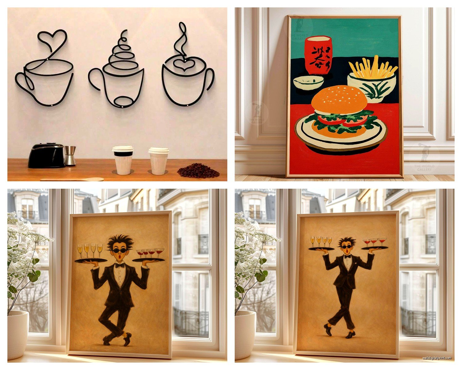
Abstract art works in like 80% of restaurants. It’s not polarizing, it adds color and energy, and people can interpret it however they want. I’m obsessed with these large abstract pieces with bold brushstrokes – they photograph well which matters SO much now. Your diners are gonna post photos and you want your walls to look good in the background.
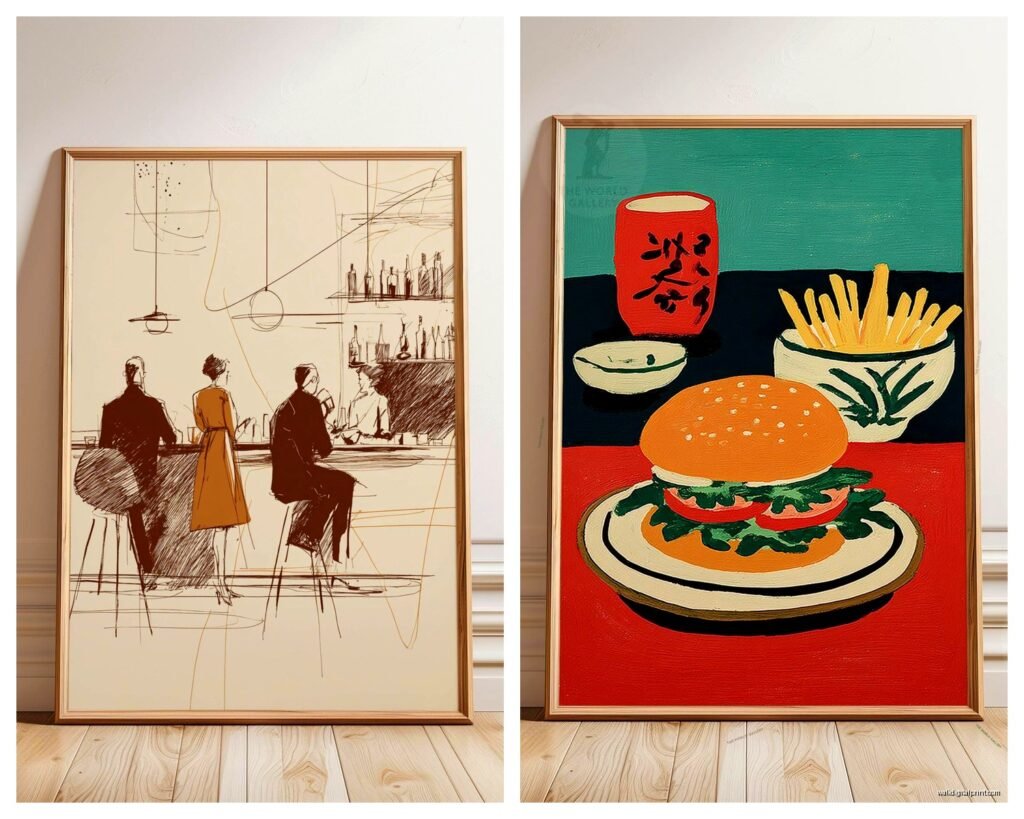
Food photography is tricky. It can work amazingly or look super cheesy. If you’re gonna do it, make it artistic – like close-ups of ingredients, farmers market vibes, stuff shot in black and white. Not literal photos of plated dishes unless you’re a super high-end place and you’ve hired an actual food photographer.
Local landmarks and cityscapes work great for building that neighborhood connection. But please, not the overprocessed Shutterstock versions. I found this amazing print shop that does line drawings of city skylines and they’re perfect for that local feel without being touristy.
Vintage posters – French bistro posters, old wine advertisements, travel posters – these are classics for a reason. Just make sure they match your vibe. Don’t put French aperitif posters in your sushi restaurant, you know?
My Current Favorite Sources
Wait I forgot to mention where to actually GET this stuff. So Etsy is surprisingly good for restaurant art because you can get large-scale prints for reasonable prices and there’s tons of variety. I’ve used this one shop called… hold on let me check my orders… okay I can’t find the name right now but search for “large abstract restaurant art” and you’ll find good options.
Society6 and Minted do custom sizes which is clutch when you’ve got weird wall dimensions. Their quality is solid – I’ve never had issues with fading or anything.
For metal prints, I’ve used Displate and the quality is really good. They have this magnetic mounting system that’s actually genius for restaurants because you can swap art seasonally without putting new holes in the wall.
Local artists though – this is actually my favorite route if you have any budget flexibility. You get original work, you can support your community, and it becomes a talking point. I connected a Mediterranean restaurant with a local artist who did these gorgeous olive grove paintings and now people literally ask about them. The owner paid like $1200 for three large canvases and it’s been worth every penny in terms of ambiance and conversation.
Practical Installation Stuff Nobody Tells You
Okay so this is boring but important – use proper hanging hardware. Restaurant walls take more abuse than you’d think from cleaning, people brushing against them, whatever. I always use heavy-duty picture hangers rated for way more weight than the actual piece.
For canvas, those sawtooth hangers that come attached are garbage. Replace them with D-rings and wire. It’s more secure and makes leveling easier.
Oh and another thing – plan your layout on the floor first. I cannot stress this enough. Lay everything out, take a photo from above, live with it for a day. I’ve hung stuff and immediately regretted the spacing or arrangement so many times.
Height-wise, center the art at about 57-60 inches from the floor, which is standard gallery height. But in restaurants you might want to go slightly higher because people are usually looking up from a seated position.
Gallery Walls vs. Statement Pieces
I go back and forth on this constantly. Gallery walls look amazing when done right but they’re SO easy to screw up. You need at least 5-6 pieces to make it work, and they need to have some common element – similar frames, coordinating colors, whatever.
Statement pieces are honestly easier. One large piece per wall, done. It’s cleaner, more modern, and way less fussy to install.
That said, I did this really cool gallery wall in a brunch spot where we mixed food photography, vintage utensils mounted in shadow boxes, and some abstract pieces with breakfast-y colors. It worked because everything had this cohesive morning vibe.
Color Strategy
Your wall art should either complement or intentionally contrast with your color scheme. Sounds obvious but you’d be surprised how many places just throw up random colors that fight with their whole vibe.
If your restaurant has neutral walls – grays, whites, beiges – this is your chance to add personality through art. Bold colors, dramatic blacks and whites, jewel tones, whatever fits your concept.
If you’ve already got colored walls or a lot of visual interest, keep the art more subdued. I worked with this Thai place that had these gorgeous deep teal walls and we did black and white photography with gold frames. It was *chef’s kiss*.
My cat just knocked over my coffee which is perfect timing I guess because I need to wrap this up anyway…
Budget Real Talk
You can totally do this affordably. For a small restaurant with maybe 6-8 walls to fill, here’s what I’d budget:
For like $800-1200 you can get decent large-scale prints, proper frames or canvas wraps, and good hanging hardware. Shop sales – places like West Elm and CB2 do restaurant/trade discounts sometimes if you ask nicely.
If you’ve got $2000-3000 to play with, mix in some original art from local artists, maybe do custom photography, get some really substantial pieces.
The mistake I see is people spending $50 on a bunch of small prints that look cheap. Better to have fewer, larger, higher-quality pieces than a bunch of mediocre stuff.
Maintenance and Longevity
Canvas needs dusting like every month or so – just use a soft brush or microfiber cloth. Don’t use cleaning products.
Metal prints you can actually wipe down with a damp cloth which is why they’re great near kitchen areas or anywhere that gets greasy.
Framed pieces under glass – Windex and paper towels, but watch out for moisture getting behind the glass if your restaurant is humid.
Replace or rotate art every 2-3 years. Trends change, your vibe might evolve, and honestly stuff just starts looking dated. I’ve got a storage unit full of restaurant art that’s been cycled out and sometimes we reuse pieces in new contexts.
Lighting Considerations
Okay last thing I promise – lighting makes or breaks your wall art situation. If you can swing it, add picture lights or track lighting aimed at your main pieces. It creates this whole elevated atmosphere and makes the art actually visible in dim restaurant lighting.
If you can’t add dedicated art lighting, just make sure your existing lights aren’t creating weird shadows or glare. I’ve moved pieces around just based on how the existing lighting hits them.
Also avoid putting art directly across from windows where it’ll get blasted with sunlight all day. UV damage is real and your prints will fade, especially if they’re not UV-protected.
The restaurant I mentioned at the beginning? They had these perfect spotlights on each piece and it made the whole space feel gallery-like while still being warm and inviting. That’s the goal – art that enhances the dining experience without being pretentious about it.